The main mission of any landing page is to deliver conversions. The more of them you get, the better your page is. But what makes a landing page outstanding? A clear product description, a catching CTA, and an easy structure are obvious components. However, headline placing, text fonts and formats, color schemes, and everything in between also play a vital role here.
A well-crafted page can drastically change the image of a brand. Back in the nineties, a website included an ordinary HTML and a couple of animations. Luckily, our modern digital era has introduced a plethora of advanced features and tactics that can brighten up your customer’s journey and drive more conversions. Even such common actions as centering the important information in the header, showcasing testimonials, and using contrasting colors can improve your landing page performance.
Today, we’re talking about landing page design inspiration and how to put it into practice so that your visitors don’t land in the wrong place.
In this article
- What makes a landing page high-converting?
- 1. Zenefits
- 2. Phrasee
- 3. Invisible
- 4. Neverbounce
- 5. Netflix
- 6. Jar
- 7. Omniconvert
- 8. Panoply
- 9. SignalHire
- 10. Salesforce
- 11. GetResponse
- 12. Shopify
- 13. Basecamp
- 14. Teambit
- 15. Optimizely
- 16. Platformly
- 17. Mailtrap
- 18. Zapier
- 19. BuildFire
- 20. Dropbox
- Bonus: Landing Pages Tips & Best Practices
- Conclusion
What makes a landing page high-converting?
A traditional landing page is meant for boosting conversion rates and turning prospects into leads. It’s a standalone web page that a user lands on after clicking an ad or a search result. Such pages are developed for the sole purpose: to convince customers to take a certain action (sign up, download, buy, etc). In a nonconventional way, a homepage can also be called a landing page.
Unfortunately, there’re no one-size-fits-all landing page templates on how to create an attention-grabbing piece. Though, there are some leading practices all effective landing pages share. So, consider these ideas before we get into specific examples:
- Minimize scrolling. Would you like to scroll for days to find a piece of information on a page? So wouldn’t your visitors. Let them see everything they want and catch the message of your page at once avoiding long-form pages. If you need to add extra details, consider using lightboxes to this end;
- Stay focused. Good landing pages have neither loads of menus nor bunches of external links. So, centering the entire page on one single offer and adding a CTA button will do its work – you don’t want your prospects to divert their attention. They came to your landing page to complete the call to action;
- Use engaging visuals. It’s not always about the text. A brilliant layout requires striking pictures to break up written parts. That’s why, if you include some bright images relevant for your brand, it’ll be a step up to motivate visitors to scan the landing page and settle on the CTA button;
- Add interactivity. An interactive landing page isn’t just about clicking some links and reading texts. It improves the user’s experience and customer retention. For instance, if your landing page includes a poll, the chances are your clients will stay with you longer.
Anyway, creating an eye-catching page may be a daunting challenge. Let’s cut to chase here and explore inspirational landing page examples.
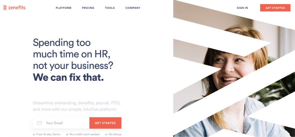
1. Zenefits
What we love about Zenefits’ landing page, is that it offers a compelling problem solution using a clear headline: with the help of their user-friendly platform, employers can manage their staff without wasting time on useless papers. They followed the main principles needed for crafting a headline that piques clients’ interest:
- This headline shows what problem they’re going to solve. And a subheadline demonstrates how an issue can be handled.
- Less is more: Zenefits keeps its headline up to 20 words.
This landing page is attractive to customers and the message boils down to how the business can handle the prospect’s biggest issue. This way, customers’ attention is held at once and they are interested in surfing the given landing page.
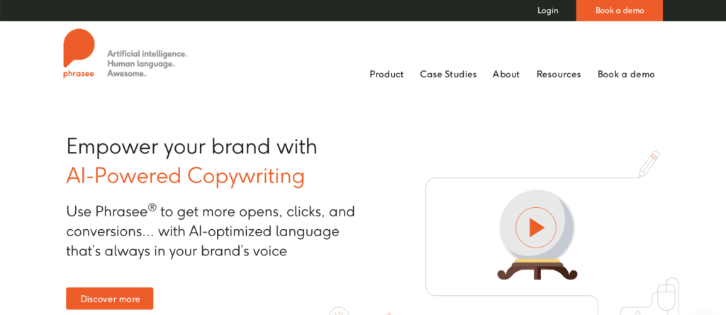
2. Phrasee
This landing page has caught our attention at once. Phrasee, AI-based copywriting service, lures a user to watch a video snippet right after they read a captivating headline and a subheadline. This is a quick intro to the company’s product with all the advantages highlighted in a skilful way.
In the given case, a video is a perfect way to explain Phrasee’s core AI principles within a minute. In fact, brands which incorporate visual elements into their marketing campaigns experience 49% higher conversion rates than those who disregard them.
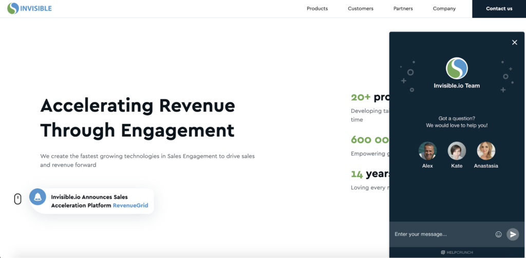
3. Invisible
A modern and thriving business usually adopts a forward-thinking approach. There’s a pile of factors to take into account when in search of conversion rate improvement. And proactive customer service is one of them.
Invisible has it all in its landing page. To provide its clients with an easy-to-notice way of contacting a support team, Invisible installs a live chat widget to its landing page. The thing is that clients just need to interact with another person to have their issues fixed. No FAQs, pop-ups, or other long forms will have a sought-after effect. That’s why, if visitors have a burning question, they will talk to a real customer support rep, which demonstrates the company’s commitment and respect.
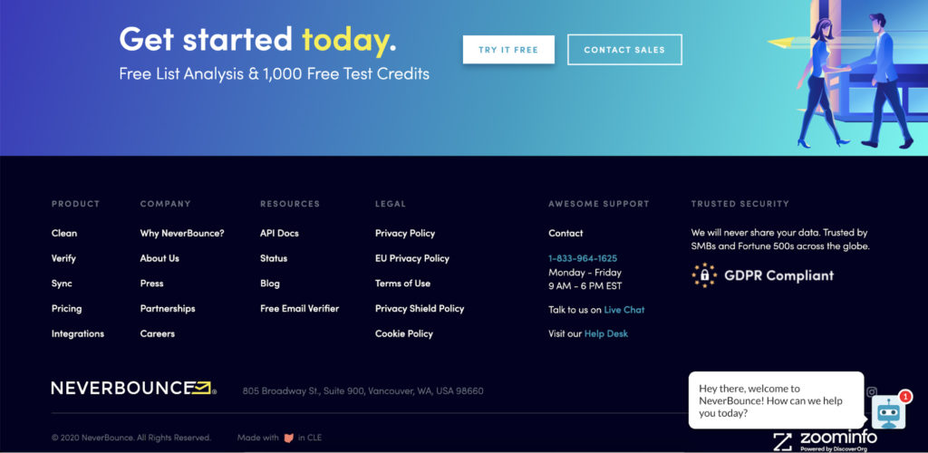
4. Neverbounce
The landing page from Neverbounce is brimming with authentic badges from credible companies. And they make it right as establishing credibility is a must for a brand. Do that if increasing client confidence is your top-of-mind priority.
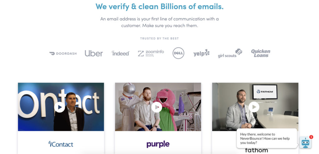
Putting authentic badges will be effective for those visitors who are coming across this brand for the first time. Seeing trust symbols can dispel their concerns and help them be at ease. Neverbounce demonstrates widely known brands that have already teamed up with it.
Moreover, this brand follows a certain data protection policy, which says that it will never let its client personal information go public. We believe that this is one of the most important criteria that allows a visitor to feel confident while on this landing page.
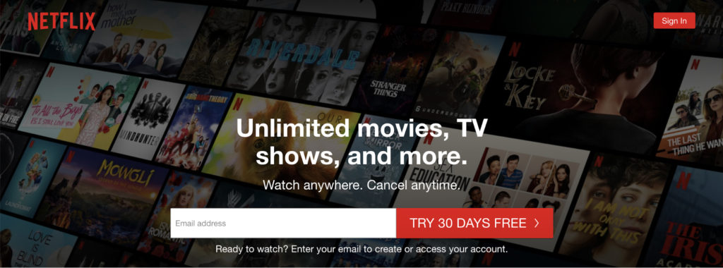
5. Netflix
Netflix lures its landing pages’ visitors with a tempting CTA. It depicts all the perks this company can give in several simple words. When a user comes to this landing page for the first time, a big red button with quite a compelling offer ‘Try 30 days free’ appears.
In the background, there’re most-in-demand TV shows that inspire a visitor to sign up. Everything that visitors have to do now is just enter an email address to enjoy their favorite films and other hits. Therefore, signing up for a 30-day trial is a tempting opportunity to watch movies and shows as much as you like.
Netflix thinks over what the service can give to the visitors. The CTA button is goal-oriented and noticeable. Plus, they don’t use generic phrases like ‘Submit’ or ‘Go’ which may have the biggest impact on sales.
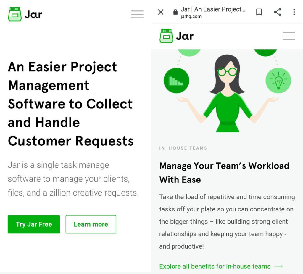
6. Jar
Mobile traffic has already outmatched desktop traffic. That’s why you might also want to shape an easy-to-surf landing page for smartphone users. Jar has actually nailed it. A convincing headline, a subheadline, and a bright ‘Try Jar Free’ button are within your eyesight, which stirs interest and encourages scrolling. Just a few more scrolls down – and you can take a closer look at all the benefits and features this company has to offer.
This landing page is fully designed for any portable device, like a tablet, too. That’s why, customers can surf it on the go hassle-free. Adopt this technique, and your landing page will convert leads in no time.
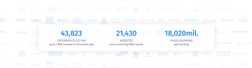
7. Omniconvert
Omniconvert helps businesses all across the globe optimize their marketing campaigns in a smart way. In fact, its landing page is crafted in keeping with the best practices, including CTAs, customer testimonials, trust symbols, and useful stats. Once you achieve the latter section, the numbers get animated. As a result, you see up-to-the-minute and accurate data.
This landing page displays specific numbers. Better yet, you don’t get too overwhelmed with digits here. So, the attention is grabbed and even if visitors will be unsure about Omniconvert’s products or services, some facts and infographics can push them to deal with this brand.
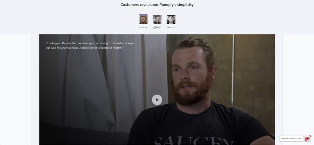
8. Panoply
Unlike some other examples we shared before, data analytics tool Panoply doesn’t have any visually attractive product or service to show off. Though, its landing page includes everything a perfectly designed page should have: clear CTAs, a tempting headline, social proof, and some reasons why the users should use Panoply.
If you scroll down, you’ll find customer testimonials. We find this section especially great as reviews are videotaped which make them easier to perceive. Moreover, this landing page shows a number of integrations and industry awards Panoply has. Demonstrating various awards is always a great idea.
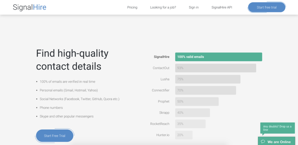
9. SignalHire
SignalHire is a tool that searches for and validates tons of emails and other contacts. This company has created a landing page with their customers in mind.
The CTAs ‘Start Free Trial’ and ‘Install extension’ are all over its landing page. That’s why, clients won’t have a chance to leave it without clicking these buttons. Plus, there’s a catchy animated visual element on your right which piques interest at the blink of an eye.
What’s more, SignalHire delivers the content that is visually structured. This trick adds to brand credibility and trust. All the information is laid out in bullet points. Who wants to read bulks of information in non-readable sentences?
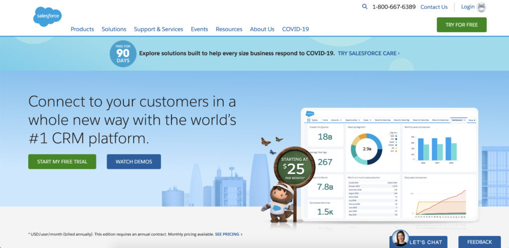
10. Salesforce
Salesforce, customer relationship management platform, does cut corners with its landing page. They break down exactly what their product is about by putting graphics and minimum words. The headline is easy to see and to the point which is one of the basic rules when it comes to creating an insightful landing page.
Coupled with all this imaginary, demo videos, and actual screenshots, this company does a little bit of everything while providing valuable information to its customers. What we also like about this landing page is that Salesforce uses its special mascot called Astro. It acts as a brand distinction, too.
By the way, their proactive live chat feature fits perfectly into the overall concept. So, whenever a user has questions, a customer support agent is here to lend a helping hand.
11. GetResponse
This all-in-one marketing solutions company moves with the times. Due to the recent events in the world, they have placed a luring sentence with a CTA for those who work from home now. This shows the company’s dedication and commitment to its customers.
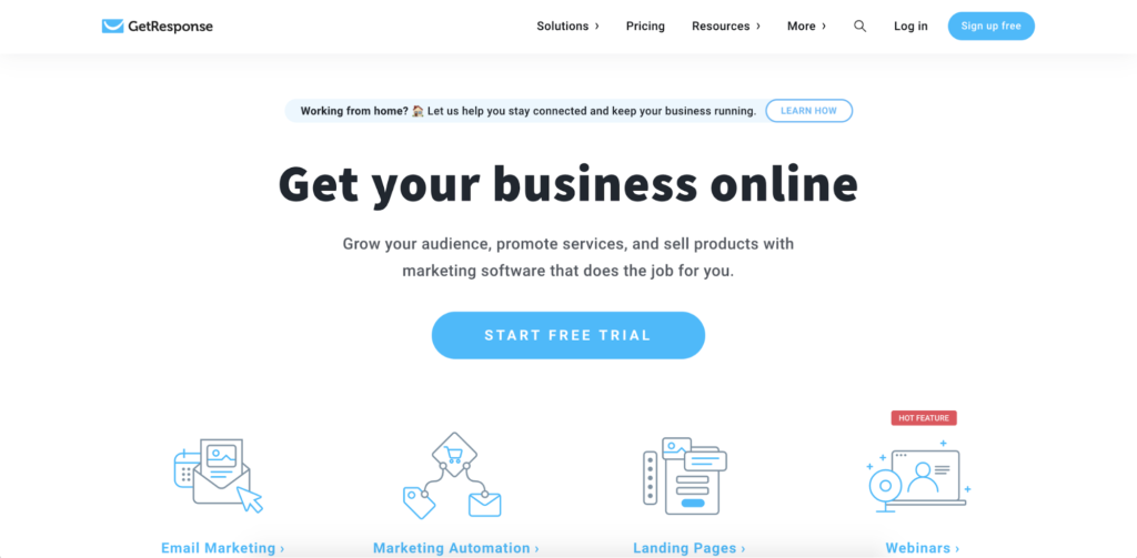
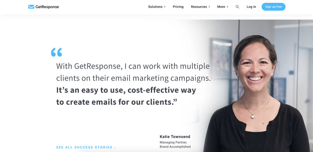
What GetResponse also does the right way is a headline and a subheadline saying what the company has to offer. Plus, all its features are depicted here and each of them has a clear explanation. If you scroll down, you can see one of the success stories GetResponse is proud of. It includes a full size picture and a quote — two main elements that all prospective clients should notice while on a landing page.
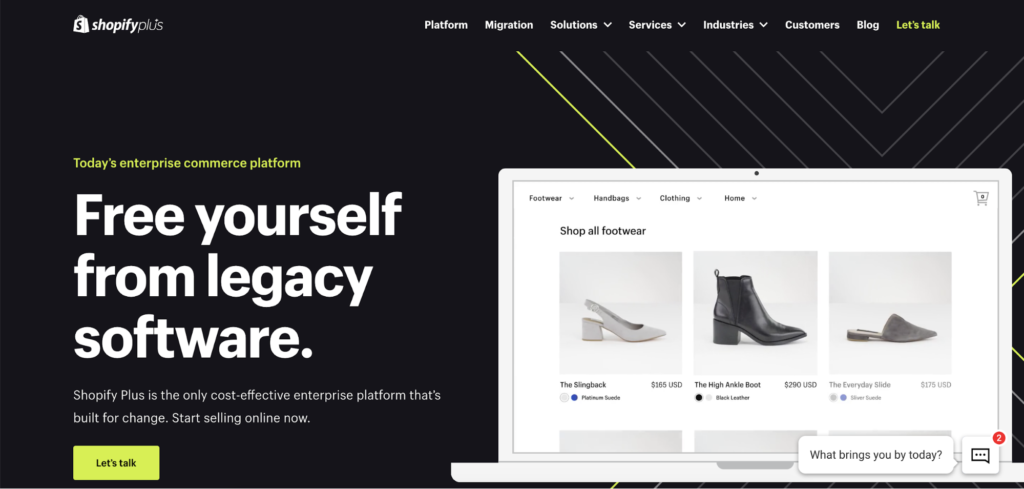
12. Shopify
Shopify is trusted by many industries all around the globe and is truly a leader. They use their landing page to drive sales and engage more customers year after year. One of the strategies Shopify follows is creating multiple landing pages for different campaigns. This allows them to focus on their target audience better and generate more conversions.
What the given page does well is, first of all, its headline and subheadline. They contrast with a dark background, which makes attention-grabbing immediately. Then comes the ‘Let’s Talk’ CTA button. It transfers us to a form where a user needs to write personal details and take action.
One of the most enjoyable things about this landing page is its minimalistic and bulleted copy. This makes it easier to navigate a page and bullet points help drive attention to the main benefits Shopify has.
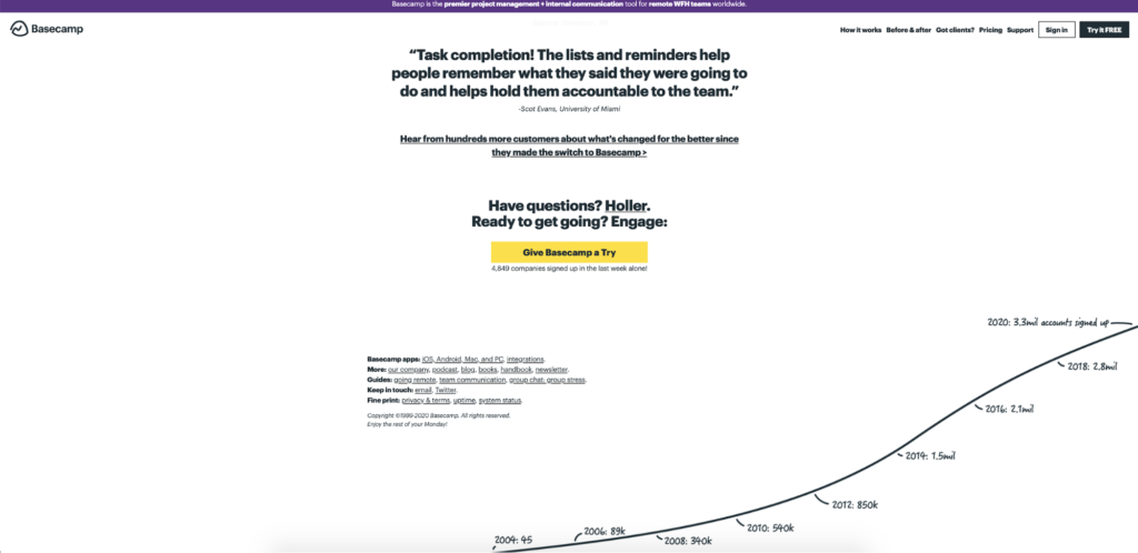
13. Basecamp
Basecamp’s landing page really impresses us with its distinctive font and minimal design. The header shows what the business is about and what value it can bring to the table. In the subheadline, there’re the benefits a user can get after using Basecamp. This is a smart way to demonstrate what can be missed out on without this tool.
A yellow CTA ‘Give Basecamp a Try’ is effective as right below it there’s data on the number of companies signed up. And at the bottom of this landing page there is a simple but helpful graph showing how Basecamp’s client base has evolved over the years. These tricks are inspiring and make more people join this community.
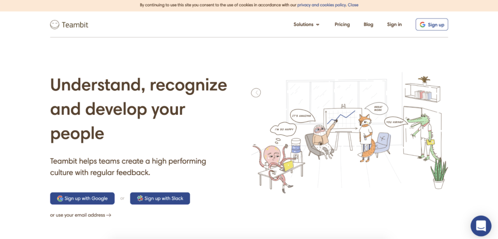
14. Teambit
Fancy is one of those words we come up with when landed on a Teambit’s landing page. This illustration-heavy page of HR software is both fun and informative. This company offers three options for signing up, with a Google Account, Slack, or an email, which allows users to be flexible and doesn’t limit them. It’s more comfortable for a person not to hand in every personal detail all at once.
An animal cartoon shows next to each informational section across the landing page keeping visitors interested and scrolling through to find out more. Teambit’s landing page is an ideal proof that you don’t have to be too conventional with your products or services to design a fun page.
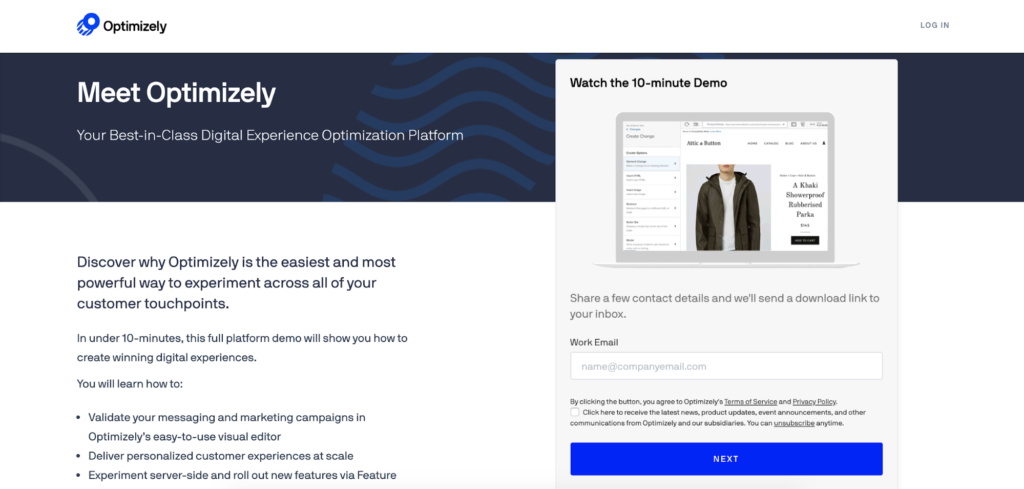
15. Optimizely
Optimizely is a platform for thriving businesses. This company helps marketing, product, engineering, and data teams optimize their products faster using advanced tools. When you first land on this landing page, you can’t but watch a demo from Optimizely. And that makes sense as they have designed this page perfectly.
Why does Optimizely’s landing page work? They use eye-catching visuals, bulleted copy, and social proof. So, if you want to spruce up your marketing strategy, consider adding them to your landing page. A video file, for instance, is better perceived than a cumbersome text. Plus, it can encourage your clients to stay on your page longer and provide more information about what your company deals with.
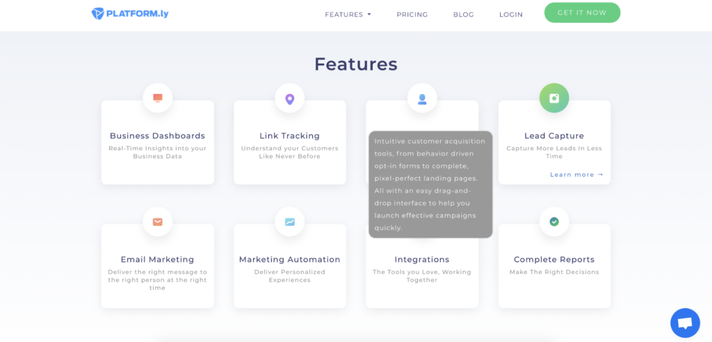
16. Platformly
Who doesn’t like animation? The first thing that catches our attention here is a round-robin vividly demonstrating all Platformly’s features. It’s a smart choice as a visitor don’t have to read bulks of information all at once and has an opportunity to actually see what Platformly has to offer and how it works.
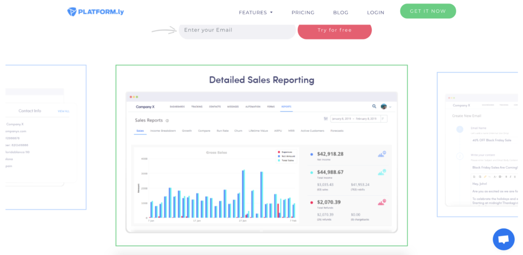
This landing page is designed in a minimalistic and convenient way. Plus, you can look through these features briefly just by mousing over to the section as you scroll through the page. Just click ‘Learn more’ and you’ll be transferred to a separate page explaining what this feature entails in detail.
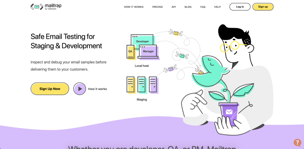
17. Mailtrap
This fresh Mailtrap landing page design is what many others have to adopt. Its colors are light, soft, and eye-appealing. The CTA button ‘How it works’ piques interest in the split second, so you can watch a quick video about Mailtrap’s main features.
Besides, Mailtrap heroes are all over the page which adds to the company’s individuality and distinction. Their aim is to show how Mailtrap can help with email inspection and debugging. Plus, small pieces of text next to each character are brief and to the point, which doesn’t make you get tunnel vision. You see, read, and sign up: it’s that simple.
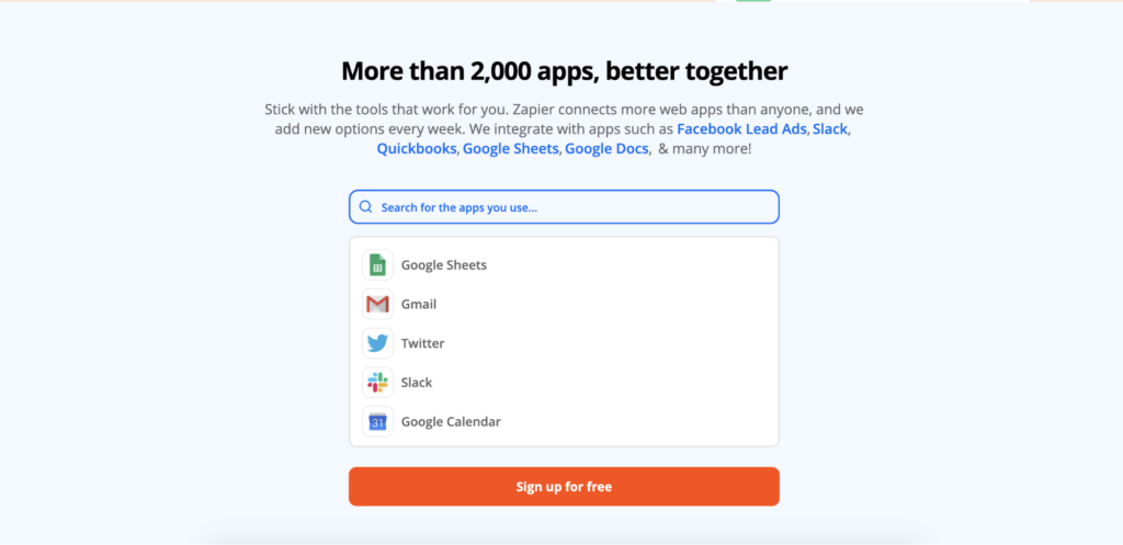
18. Zapier
Zapier helps users all over the globe integrate their web applications and automate the workflow. When we first landed on this well-thought-out landing page, we couldn’t help but notice that this company invites its potential coworkers to join and puts a small ‘Work remotely’ offer at the top right corner. Though it would be even more impactful if this sentence was in plain view.
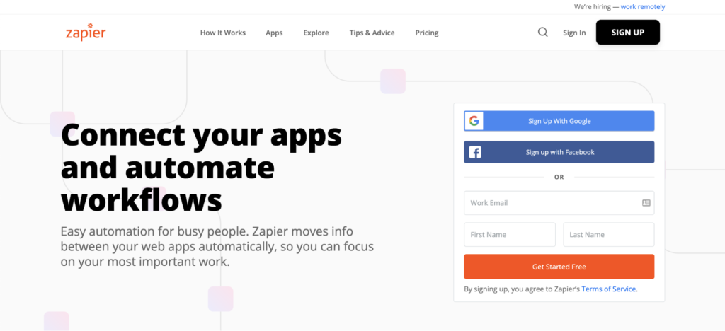
Apart from an easy-to-see contrasting headline and subheadline that gives you a brief overview of what Zapier has to offer, we also find the Integrations section really user-friendly.
A search box is a perfect way to draw user’s attention. You search for an app, see if Zapier is compatible with it, and click the CTA button to sign up for free. This way, a visitor stays on a page longer and won’t switch to a Zapier’s competitor.
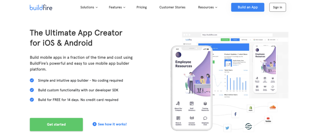
19. BuildFire
The BuildFire’s landing page is actually all about CTAs, which we don’t find over the top at all. While you scroll down, you see the CTAs ‘Get started’ or ‘Learn More’. Such a trick leaves a visitor with no choice: try BuildFire.
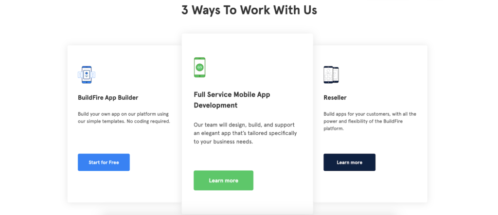
On the other hand, it’s great that BuildFire demonstrates three options to work with them. Each of these ways explains what benefits a user can get if they choose it. If you lack information, hit the CTAs. It’s more convenient than just reading cumbersome text at once.
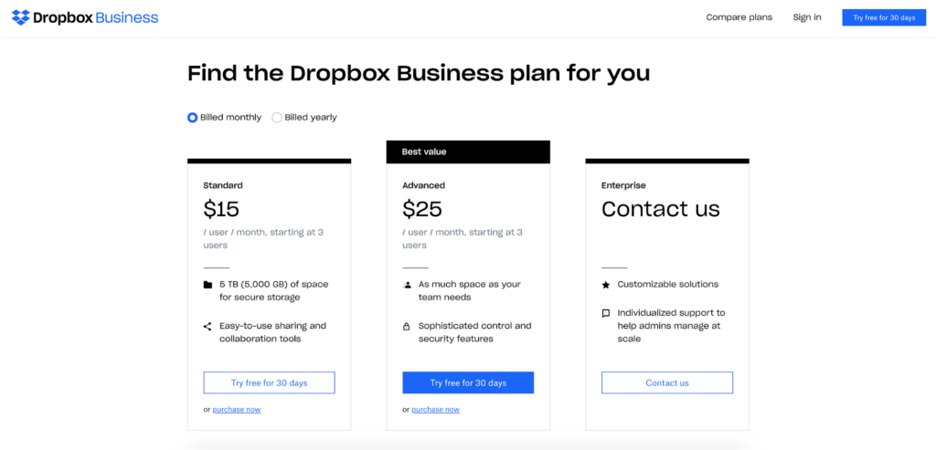
20. Dropbox
Simplicity can be beneficial. And this Dropbox landing page is as simple as it gets. They offer us to get right down to business and demonstrate perfectly written pricing plans which change depending on what option you click: billed monthly or yearly.
What we love about this section is that there are two options: to try this product for 30 days free or purchase now. No pushing, it’s a visitor who is a decision-maker. Plus, Dropbox anticipates that customers may have pricing-related questions, so the CTA ‘Contact us’ is right next to the prices.
Bonus: Landing Pages Tips & Best Practices
Have you ever scrolled on social media and clicked on a post that had an interesting offer like a course, a challenge, or a free gift?
Chances are, you were probably directed to a custom landing page that instructed you to do something (like register your email address) to participate or claim your gift.
And chances are if the landing page was set up properly, it worked.
Custom landing pages draw visitors in and encourage them to take inspired action — that’s why it’s crucial to use them to boost your marketing campaign conversions.
But how do you know if you set up your landing pages properly?
In our ultimate guide, we’ll cover everything you need to know about landing pages and share our secrets to landing pages that sell.
Ready? Let’s begin.
Landing Pages FAQ
Landing pages are to digital marketing what mosquito traps are to people in humid climates: they’re designed to lure a visitor in.
If you’re a business owner, marketer, advertiser, or agency, a landing page is a genius way to entice a potential customer to take a specific action you want them to take.
Landing pages are also great for lead capture and can be set up as part of your marketing automation system to convert visitors to customers while you sleep.
What’s the difference between a landing page and a website?
A landing page is a web page that’s laser-focused towards a specific segment of your audience who will most likely be interested in a special offer, while a website is a collection of web pages with information about your business.
Websites and homepages are meant for exploring while landing pages are customized to a specific marketing campaign to guide visitors to take some sort of specific action.
Note: while a homepage can act as a landing page it’s important to differentiate between the two to improve your conversion rate — especially since homepages have navigation bars (a big no-no with landing pages).
Can I have a landing page without a website?
If you’re just starting as a business owner, then the short answer is yes.
Landing pages are easier and quicker to set up than most websites making them a fast solution if you’re trying to get up and running immediately — but you’ll need to set up a professional website eventually if you want to present yourself as a real legitimate business.
How can landing pages help my business?
Landing pages are meant to introduce visitors to the top of your sales funnel — the awareness stage. An effective landing page introduces a visitor to your brand, helping them form first impressions about you and your business.
You can also use landing pages to carry your customer throughout multiple phases of your sales funnel. Read on to find out how.
Picture this:
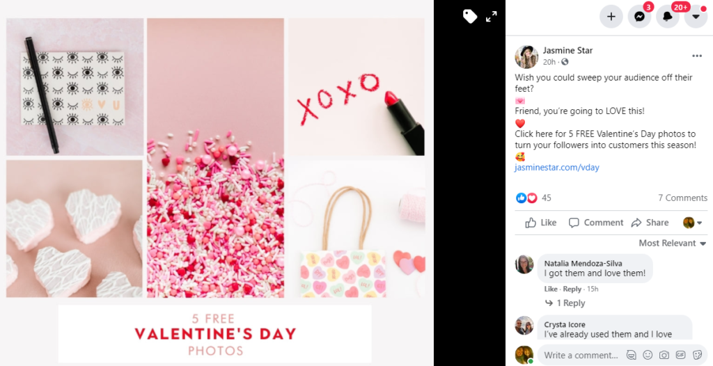
You’re a photographer and you want to create a Valentine’s Day promotion.
You decide your bait is giving away 5 free Valentine’s Day stock photos and your goal is to get customers to sign up for your monthly social media marketing subscription package.
After shooting and choosing your top 5 photos, you create the top of your sales funnel with a Facebook post announcing your free gift:
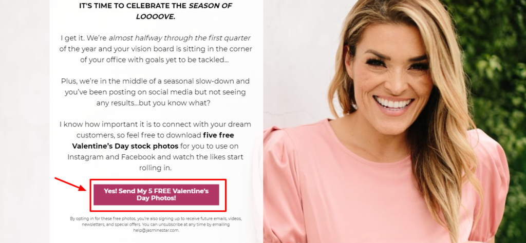
You also create a landing page connected to that Facebook post so viewers are directed properly when they click the link in the post:
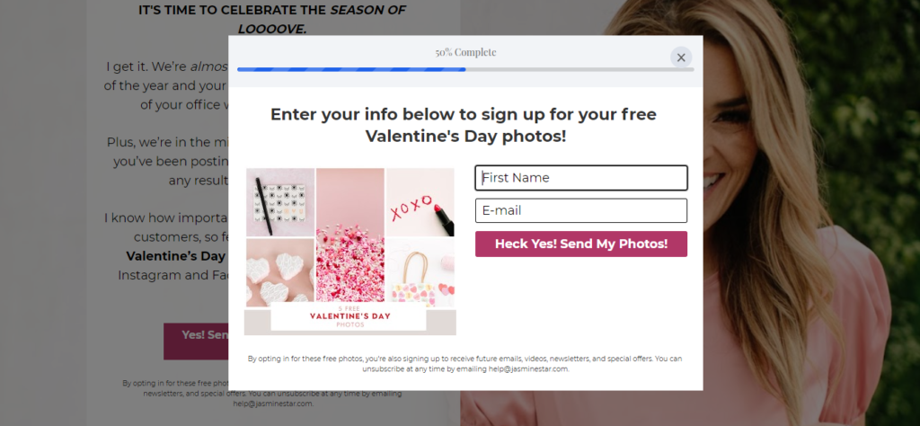
Next, you direct viewers to sign up to receive their free photos (they’re also opting-in to receive future emails and offers from you too):
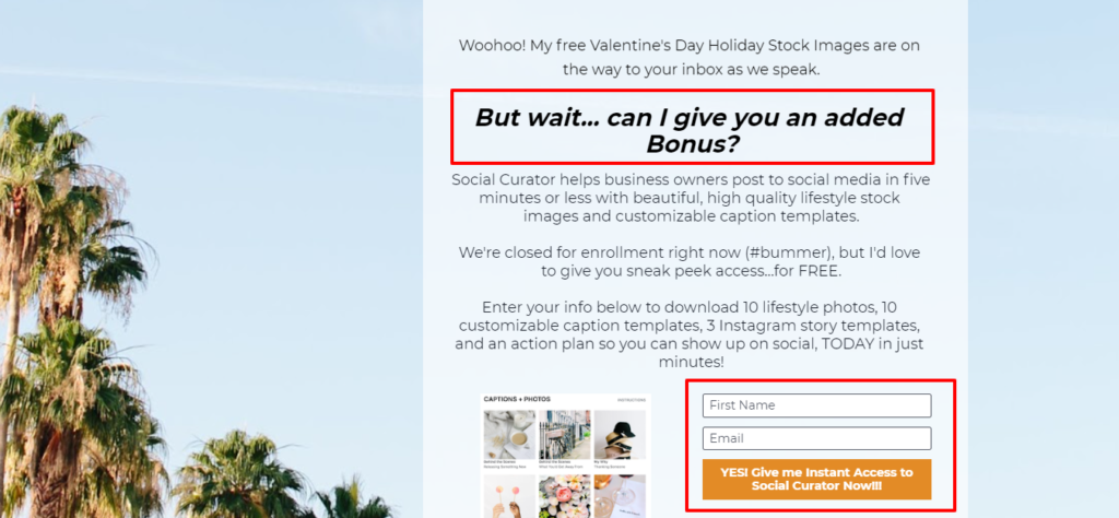
Afterward, viewers are led to another landing page connected to the sign-up page to promote a special bonus offer:
After signing up for the bonus offer, viewers are led to yet another landing page that explains your monthly social media marketing subscription:
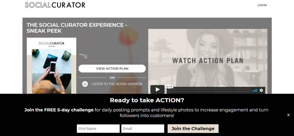
At this point, viewers have several options: they can join your free 5-day challenge by signing up at the bottom, they can view your action plan in video form, or they can listen to your action plan in audio form.
If they decide to not take action at all, you’ve still captured their email address with your lead capture button on the initial landing page.
As viewers move through your funnel, you’ve recorded their process (and can now understand what their clicking habits are and what they might be interested in).
You now have the grand opportunity to email them regularly regarding relevant offers based on the data you’ve collected.
You can also use this information to offer discounts, promotions, or to reveal new product launches and success stories.
Don’t underestimate the power of landing pages and sales funnels. Together they have the power to increase your engagement rate tenfold.
Landing pages build credibility, improve the effectiveness of dynamic content, grab attention, and strategically support marketing and business goals.
And with that, we present our top best practices and examples for creating landing pages that convert:
Use videos to convey your brand’s message
Adding a video is a great way to create a high converting landing page that presents who you are and what you’re doing.
Here’s an example from a medical alert system company:
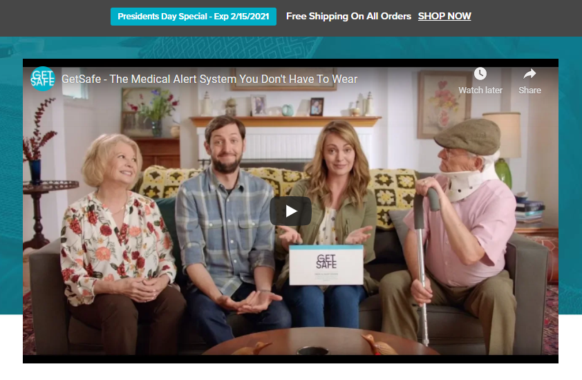
When you land on their page, you can immediately understand what they’re doing thanks to their presentation video.
Here are some tips for creating unique videos for your landing pages:
- Keep videos short and to the point
- Have a process for producing content
- Don’t’ bury the lead — emphasize the point upfront (within 8 seconds)
- Design around the video — the video should be the main focal point
- Draw viewers in with a story and killer headline
- Optimize your video for search and track analytics
- Give a lot of value and ask for action
- Bring emotion into the video when you can
- Feature happy customers and testimonials when appropriate
If a video isn’t working or isn’t meeting visitor goals, consider editing or re-shooting it to hit your goals.
In the end, not only will your customers know how you can bring value to their lives, but they’ll also trust you more and view you as an industry expert.
Note: To avoid a high bounce rate don’t autoplay the video.
Draw customers in with a clickable banner
Having a clickable banner that’s announcing a special sale, offer, or seasonal promotion is a great way to entice viewers to take inspired action on your landing page — especially for eCommerce businesses.
For example, AGiftPersonalized does this well with their Valentine’s Day banner:

Not all banners are created equal though. Make sure your banner is the right size and is designed well (check with your designer or use a pre-sized template that will fit on your landing page without looking awkward.)
Here are some other tips for creating clickable banners that convert:
- Add a value proposition like ‘limited stock available’ or ‘25% off’ for example
- Add a call to action button (CTA) like ‘shop now’ or ‘join today’
- Have a defined frame around your banner with graphics extended to the edges
- Consider adding a small gray border around your banner if it’s white
- Use different font sizes but don’t write more than 4 lines
- Don’t use fancy fonts, cursive fonts, super-thin fonts, or all uppercase copy
- Stay away from tiny font sizes (10 and under) unless it’s an important disclaimer
Feel free to test a variety of banners on different landing pages to see which ones work the best.
Showcase your customers’ reviews and testimonials
Helping visitors understand what kind of experience they’ll have with your product or service is crucial to convincing them to try you out — and that’s where testimonials come in.
Giving examples of real customers who love what you offer motivates visitors to trust you in ways nothing else can.
Here’s an example from Legacy Healing:
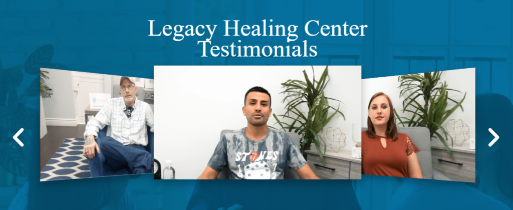
Legacy Healing uses a testimonial slider to feature 10+ powerful video testimonials of customers whose lives changed thanks to their services.
A slider like this an easy way for visitors to scroll through testimonials and using videos truly illustrates the efficacy of their service.
Here are our top tips on featuring testimonials on your landing pages:
- Use high-quality videos or photos (hire a crew if you need to)
- Arrange for professional hair, makeup, and wardrobe to help your clients look their best
- Ask your customers to provide as much detail as possible (use numbers and concrete examples when possible)
- Only feature the most powerful testimonials
- Make sure to check the testimonial text using a grammar checker like Grammarly
- Try different formats on a variety of landing pages to see which perform the best
- Provide templates and questions to help customers easily submit testimonials
- Provide filtering options whenever possible so potential customers can see testimonials relevant to them
As long as you make it easy for customers to provide testimonials, you’ll be on your way to having a full collection of testimonials to choose from and feature on your landing pages.
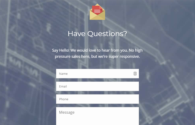
Make it easy for customers to reach you
Having a contact form or a ‘give us a call’ CTA button are great examples of providing easy ways for customers to reach you.
Check out this clean contact form from Excel Builders:
Other easy contact examples include:
- Live chat button
- Chatbot button
- Active social media buttons
- ‘Request a callback’ button
- ‘Submit a customer service request’ button
Making sure visitors have an easy way to contact you or leave a message is a crucial step to turning visitors into customers — but don’t forget to respond as soon as possible.
Add a search function
Adding an easy search function on your landing page is important if your website contains a lot of searchable content or if you offer a marketplace type of service.
For example, Preply offers a search function as part of their CTA for their online tutor marketplace:
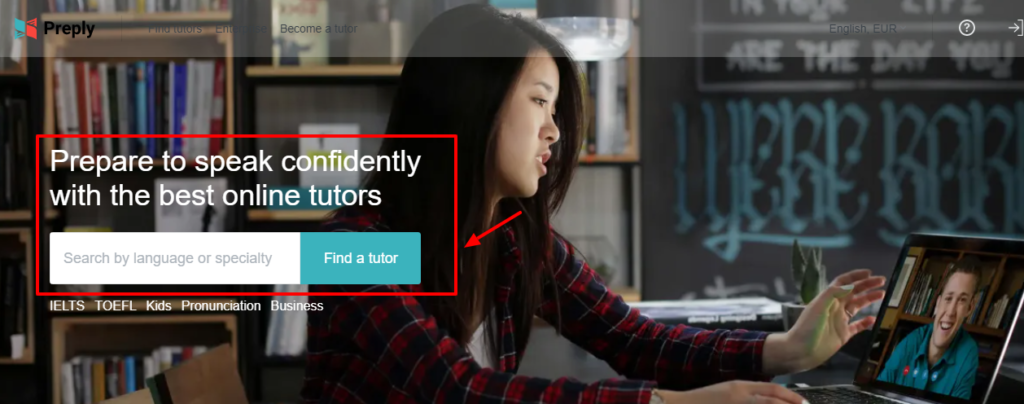
Here are some tips to help you add a successful search function on your landing page:
- Keep the search internal (don’t use an external search or visitors may leave your page)
- Provide filtering options so visitors can easily find what they’re looking for
- Only include relevant search material — don’t use a basic search feature
- When visitors find what they’re looking for, give plenty of examples and information so they understand how it works (i.e. when they find the Japanese tutor they’ve been looking for, show them what a Japanese class looks like)
- Include comparisons wherever possible so visitors can easily spot differences between products and services
If you have extensive products and services, consider adding a search function to your landing pages.
Keep your layout clean and include a CTA
Having a cluttered landing page is an easy way to lose viewers quickly.
Make sure your landing page layout is clean and not too cluttered — the graphics and words should be aligned properly, the color palette should be easy on the eyes, and the message should be short and to the point.
Take a look at this example from EarlyBird:
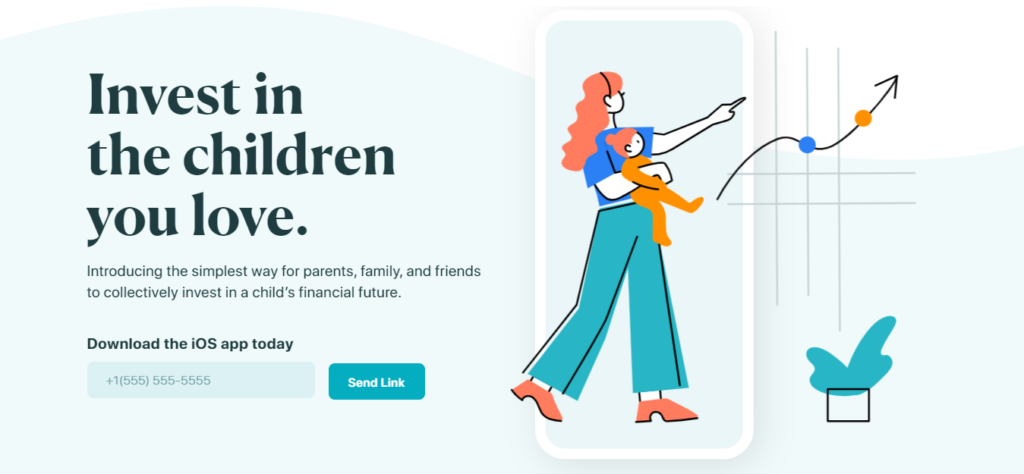
In this example, EarlyBird has plenty of white space, their graphics are properly placed, their message is direct, and they have a simple CTA button.
Here are some more design tips:
- Eliminate any points of stress (i.e. the tip of a crown shouldn’t touch the top of a line)
- Create a rule-of-thirds composition (important elements should be placed correctly)
- Hire a graphic designer when needed
- Save time with already done templates
- Optimize readability
- Balance contrast
- Use a visual editor
- Remove all navigation bars unless relevant
Let’s take a look at another example of clean design by Best Value Schools:
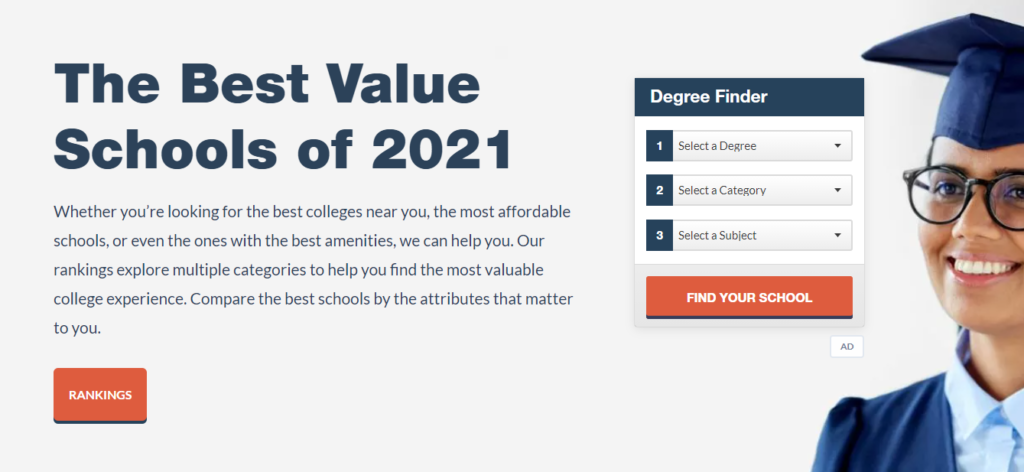
In this example, their page design features few and clear colors, one picture, clear text, and relevant CTA buttons.
Don’t overlook design when planning your landing pages.
Conclusion
There you have it: inspiring landing page examples are at your disposal. Creating a landing page sounds simpler than it is.
A good landing page requires thoughtful planning, impeccable design, a value proposition, and a CTA button so your visitors can take inspired action. Bear in mind that a landing page isn’t something that is somehow done and launched. It needs to be fully tweaked to strike the right note with your brand.
Make sure to optimize your landing pages and track analytics to see what’s working and what isn’t.
And there you have it! Our ultimate guide to landing pages. Take advantage of our examples and you’ll design a landing page that drives your business.
Need a landing page tool? Check out our super easy to use landing page builder to help you get started right away.