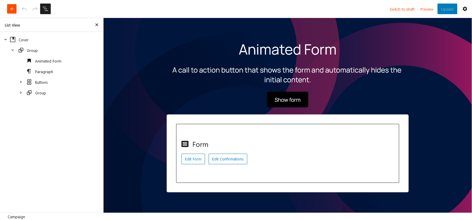
Woorise allows you to create landing pages with many different layouts. In this guide we will see how we can create a landing page with a call to action button that reveals a form and automatically hides the initial content.
- In this Animate Form example we will use the cover block to create a full screen background.
- Inside the cover block we will use the following blocks: a heading block, a paragraph block, a button block as our call to action and the form block.
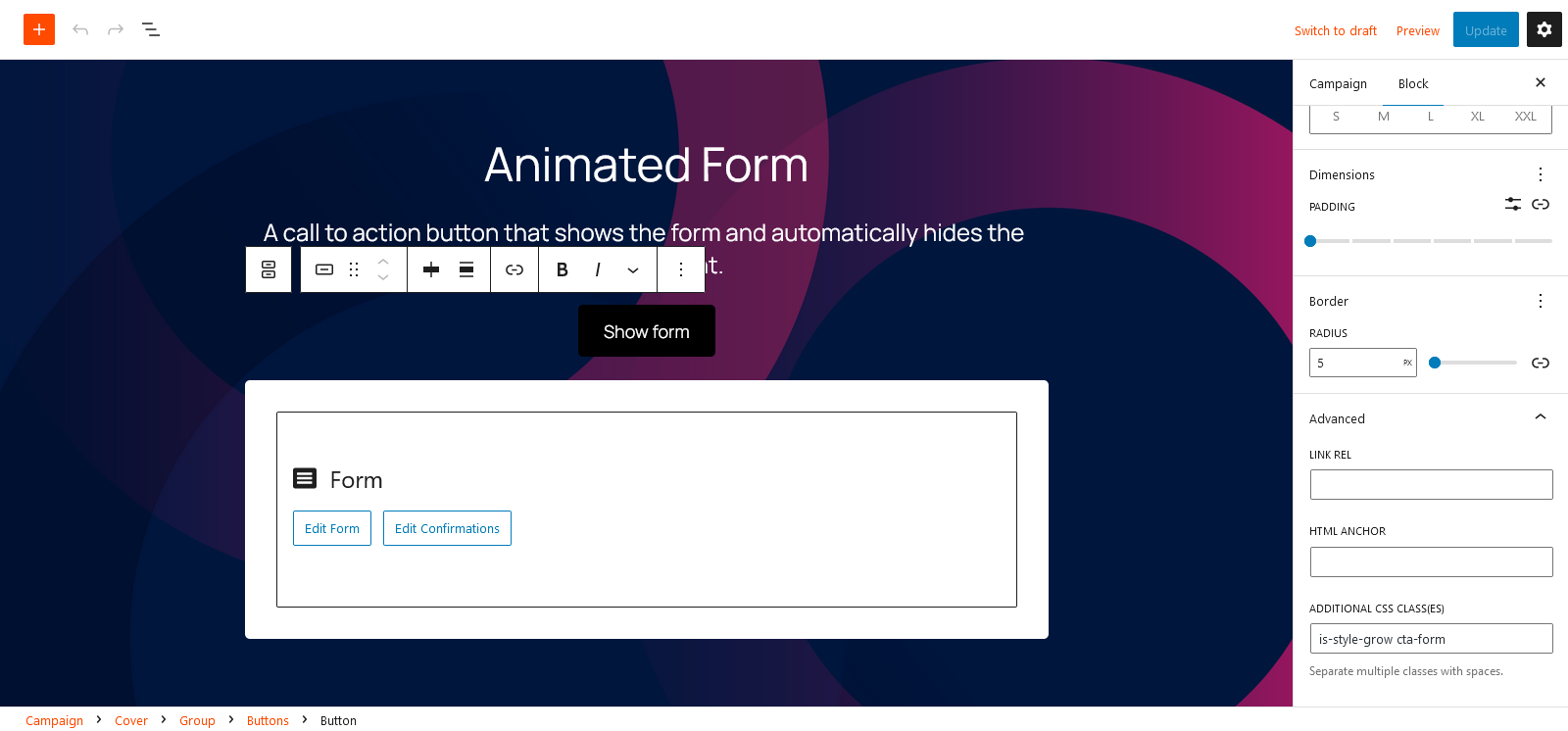
- An important step is to add the class
cta-formin our button in the Advanced tab > Additional CSS class(es). Doing this will hide the form and it will reveal it on click.
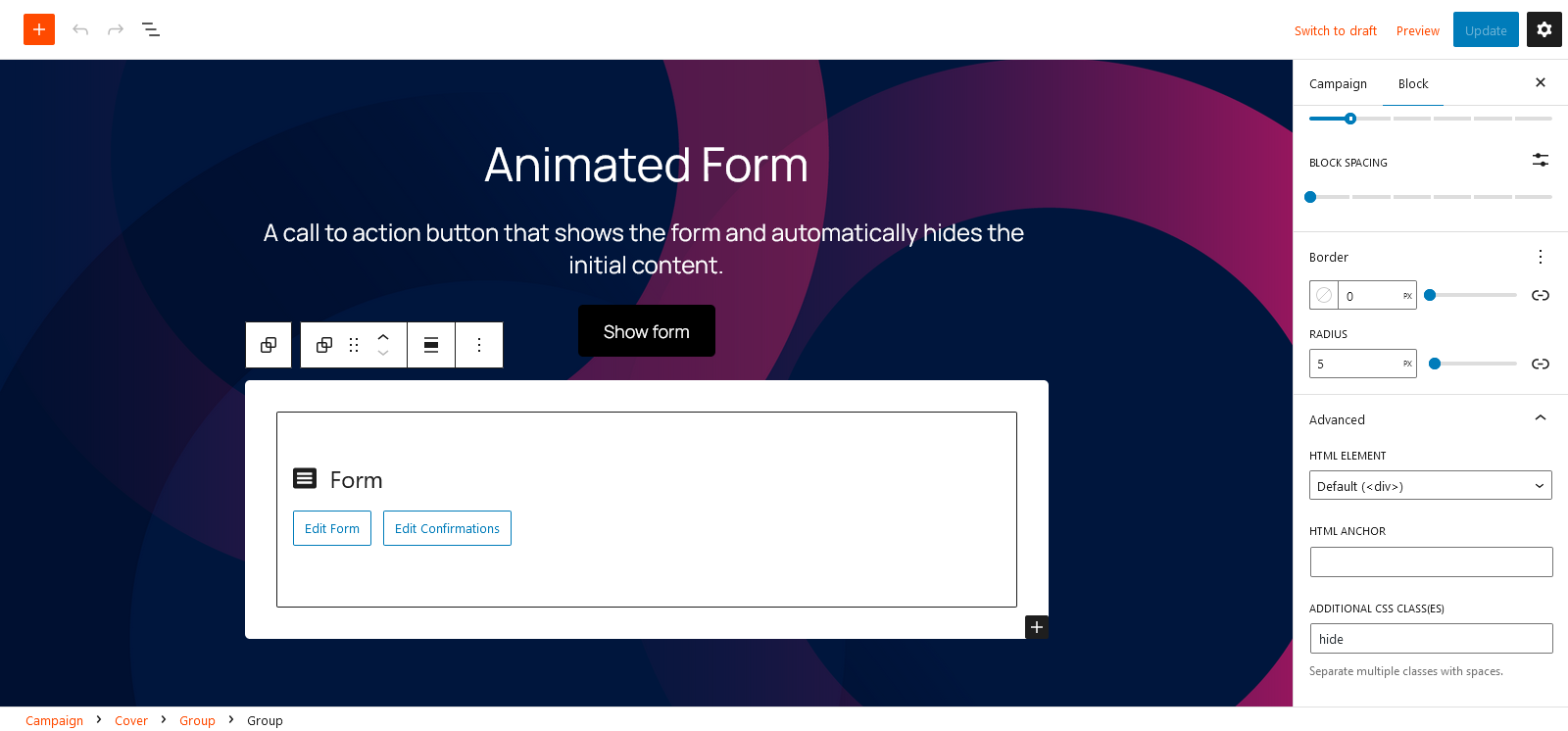
- Most of the content it will be hidden automatically. Some blocks such as the Group or the Columns will not hidden automatically. In that case you could use the class
hidein the Advanced tab > Additional CSS class(es). In our example we use the classhidein the Group block that contains the form block.
Note that this layout may work better with a small amount of blocks and form fields.