The popularity of virtual events has been at its peak since 2020. In fact, 25% of organizations are running on virtual-only event strategies to market their products.
When discussing virtual events, you can’t forget webinars. Top B2B brands use webinars to educate, nurture, and sell their products and services. Webinars are a great way to establish your brand as an authority and trigger word-of-mouth marketing for your product.
A successful webinar is promoted well. Otherwise, despite huge potential, your webinar will get lost in numerous mediocre webinars.
The first step is to create a webinar landing page to promote your webinar. It is the landing page where the visitors explore the event and decide whether to register.
This article has discussed some of the best ways to create webinar pages and examples from leading B2B brands. Let’s go!
In this article
Defining the Webinar Landing Page
Before diving into the details of creating a compelling webinar landing page, let’s first understand what exactly a landing page is and why it is essential for successful webinar marketing.
A webinar landing page is a dedicated web page designed to promote and provide essential information about an upcoming webinar event. It serves as a central hub where potential attendees learn about the webinar’s topic, date, time, and speakers and register for the event.
Below is an example of a webinar page from ClickUp:
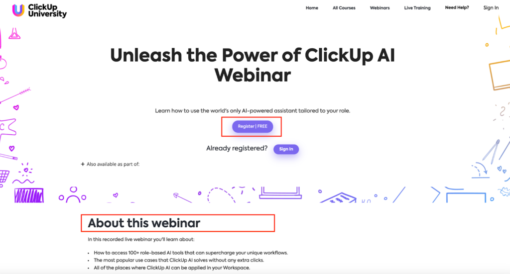
Some of the key aspects of this webinar landing page are:
- Title of the webinar
- What to expect from the webinar
- Registration CTA
The primary goal of this webinar landing page is to convert visitors into registered participants by showcasing the value and benefits of attending the webinar.
12 Webinar Landing Page Best Practices for B2B Brands
Now that you have a definitive idea of what is a webinar landing page and what is its purpose follow these best practices to create one:
Setting Clear Objectives
Before you start creating your webinar landing page, it is crucial to define clear objectives for your webinar. Ask yourself questions like:
- What do you hope to achieve with this webinar?
- Are you looking to generate leads, educate your audience, or promote a new product or service?
By setting specific goals, identifying your target audiences, and understanding their needs and pain points, tailor your webinar page to effectively communicate the value and benefits of attending the event. This will allow you to create targeted messaging and content that resonates with your audience and addresses their specific concerns.
For example, the CRM platform Pipedrive arranges webinars frequently. The objective of these webinars is to educate existing Pipedrive customers about the tool’s different features so they use it better.
Accordingly, the webinar landing pages include:
- Detailed description of which use cases and features will be described in the webinar
- Introduction to the hosts
- Registration CTA
Crafting an Attention-Grabbing Headline and Subheadline
A well-crafted headline should convey the value and benefits of attending the webinar concisely and compellingly. It should communicate what participants expect to learn or gain from the event.
For example, if you are hosting a webinar on social media marketing strategies, a strong headline could be: “Master the Art of Social Media Marketing: Boost Engagement and Drive Conversions.” This headline communicates the webinar’s topic and highlights the value and benefits of attending.
Subheadlines reinforce the messaging and provide additional details or highlights of the webinar. They address specific pain points or showcase the speakers’ expertise.
Let’s take the example of Hootsuite’s:
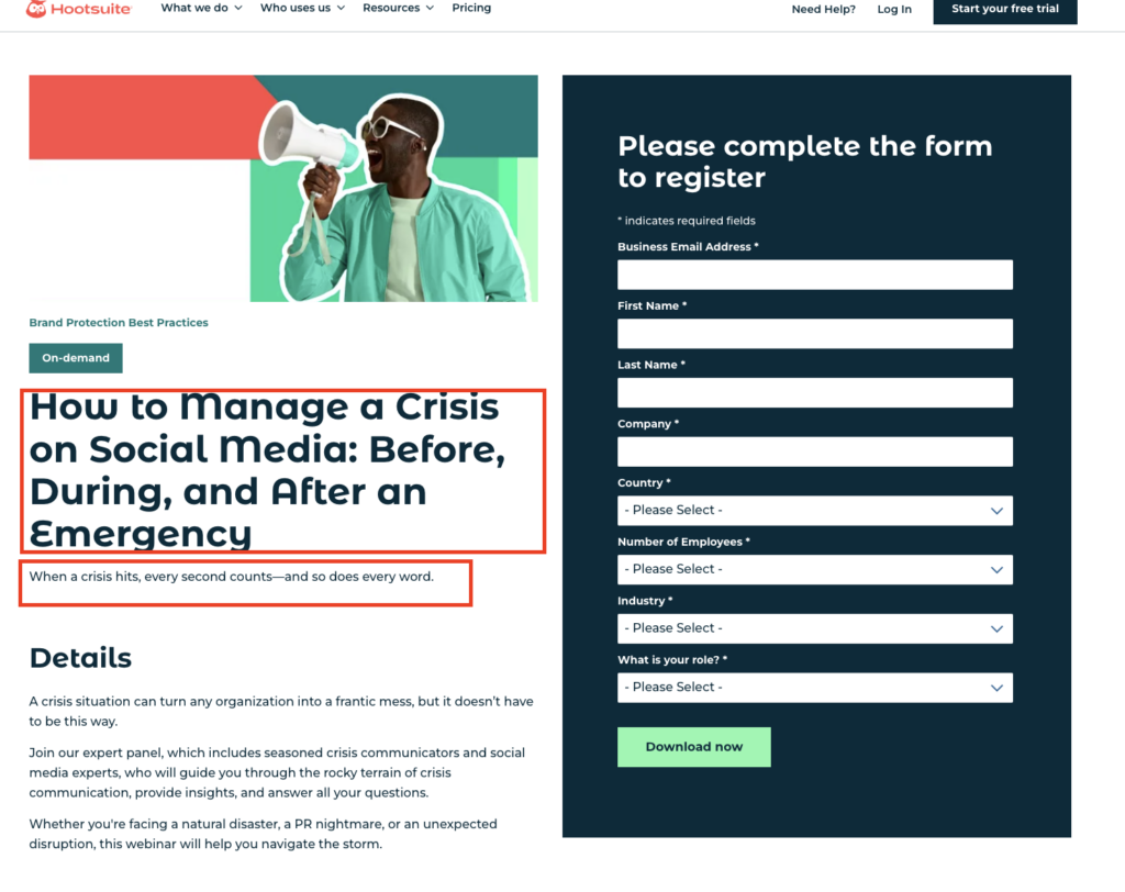
By analyzing the headline and sub-headline of the landing page, we can say that:
- The webinar is about handling social media urgency
- The webinar will cover tried and tested strategies to manage a brand’s social media before, during, and after an urgency
- The webinar will create awareness about different types of social media urgencies and the prevention strategies
Design and Layout Optimization
A clean and visually appealing design create a positive first impression and convey professionalism and credibility.
Here are some key design considerations for your webinar web page:
- Choose a neat design template: Avoid cluttered layouts and excessive use of colors or graphics. Opt for a clean, minimalist design highlighting critical information and calls to action.
- Focus on mobile responsiveness and cross-device compatibility: With 57.23% of Google Chrome browsers using mobile devices, ensuring that your webinar landing page is fully optimized for mobile. Test your landing page on different devices and screen sizes to ensure a seamless user experience.
- Use colors, fonts, and imagery strategically: Choose colors and fonts that align with your brand and create a visually cohesive and pleasing experience. Incorporate relevant imagery that enhances the message and captures the attention of your visitors.
Persuasive Copy and Content
The copy and content on your webinar web page persuade visitors to take action and register for your webinar.
Here are some key elements to consider when crafting persuasive copy and content:
- Highlight the value and key takeaways: Communicate the value and benefits that participants expect to gain from attending your webinar. Highlight the key takeaways, insights, or skills they will acquire and how these will help them overcome challenges or achieve their goals.
- Address potential concerns or objections: Anticipate any concerns or objections your target audience may have and address them in your copy. Provide reassurances or testimonials that demonstrate the credibility and effectiveness of your webinar.
- Keep it concise and engaging: Avoid long paragraphs of text and dense blocks of information. Break up the content into smaller sections, and use bullet points or subheadings to make it easy to read and scan. Use engaging and conversational language to captivate your audience.
Coming back to the same Hootsuite webinar landing page example,
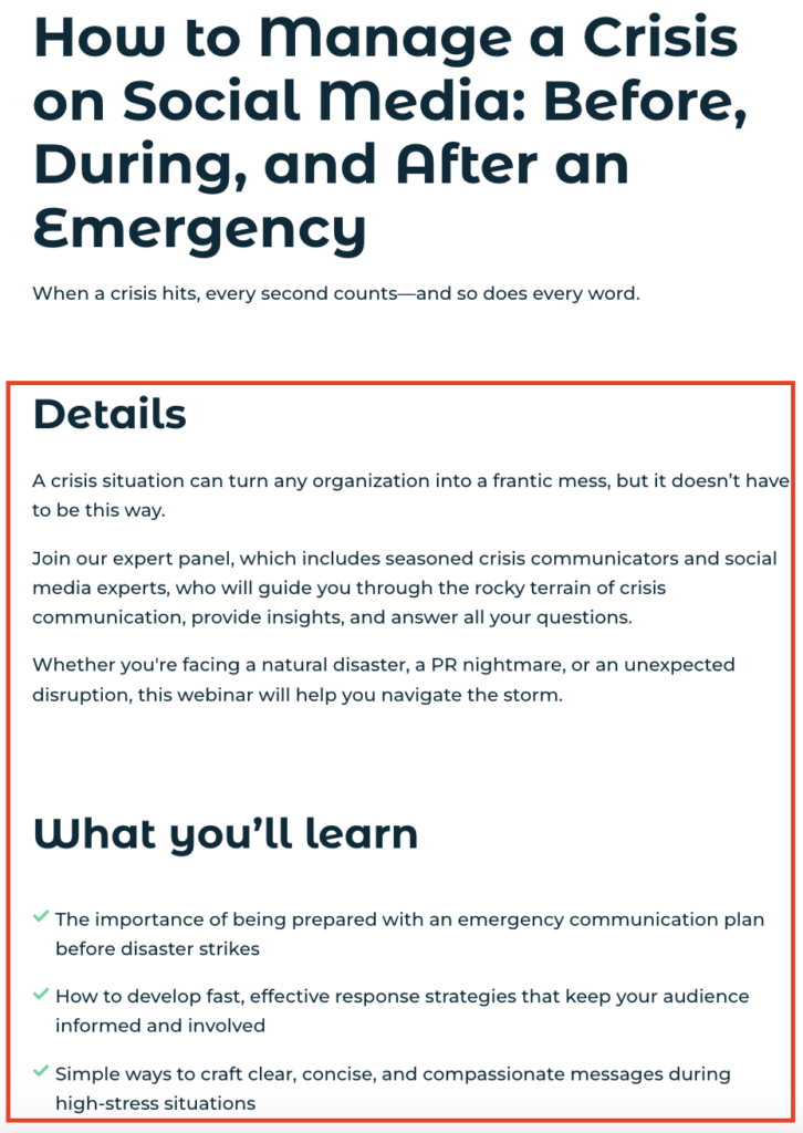
Note the how the landing page copy:
- Communicates the different types of social media urgencies and disruptions to expect
- Explains what to expect from this webinar in the most transparent way possible
- Doesn’t exaggerate and covers only what will be covered in the webinar
Captivating Call-to-Action (CTA) Buttons
The call-to-action (CTA) buttons on your webinar web page convert visitors into attendees. It is essential to use the correct set of CTAs that resonate with the intent of the webinar.
For example, if you want to create urgency and fill the seats faster, the suitable CTA can be – “Book my seat”. If you aim to educate the attendees, “Register now purely” can be an appropriate CTA.
Here are some tips for creating captivating and effective CTA buttons:
- Design eye-catching and action-oriented buttons: Understand color harmony and use contrasting colors, bold fonts, or compelling visuals to make your CTA buttons stand out and grab the attention of your visitors. Communicate the desired action, such as “Register Now” or “Save My Spot.”
- Place CTAs strategically: Position your CTA buttons at strategic points throughout your landing page to guide visitors and encourage them to take action. Place them above the fold and at the end of sections or key points in your content.
- Use urgency and scarcity tactics: Create a sense of urgency and scarcity by adding countdown timers or limited-time offers to your CTA buttons. This motivates visitors to take immediate action and register for your webinar.
Registration Form and Data Collection
The registration form on your webinar page is where visitors provide their information and sign up for your webinar.
Here are some considerations for creating an optimized registration form:
Create a user-friendly and streamlined form: Keep the registration form simple and easy to complete. Only ask for essential information that you need to follow up with participants. Minimize the number of required fields to reduce friction and increase form completion rates.
Collect essential information: While keeping the form simple, collect the necessary information to follow up with participants effectively. This may include their name, email address, job title, company, or other relevant details.
Provide reassurances and privacy statements: Assure visitors that their information will be kept secure and used only for the webinar. Communicate your privacy policy and any relevant terms and conditions.
Below is the registration form from one of the latest webinars of Sprout Social:
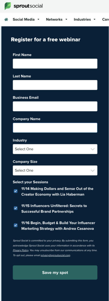
Observe how the brand has added only necessary and bare minimum fields to the form.
Social Proof and Trust Elements
Incorporating social proof and trust elements on your webinar web page boosts its credibility and persuades visitors to take action.
Here are some examples of social proof and trust elements to consider:
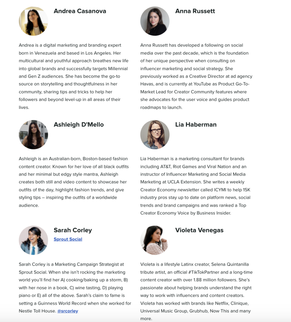
- Testimonials and reviews: Include testimonials from past webinar attendees or satisfied customers highlighting the value and benefits of attending your webinar. Include their name, photo, and any relevant credentials to increase credibility.
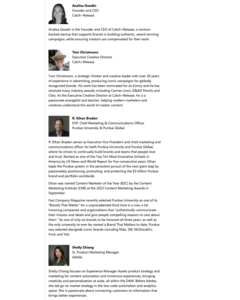
- Speaker credentials: Showcase the expertise and credentials of your webinar speakers or presenters. Highlight their experience, accomplishments, or relevant industry recognition to establish trust and credibility.
Note how Sprout Social describes the background of each speaker in detail to build attendees’ trust:
- Endorsements and partnerships: If your webinar has received endorsements from industry experts or has partnered with reputable organizations, include these on your landing page. This increases your credibility and attracts more registrations.
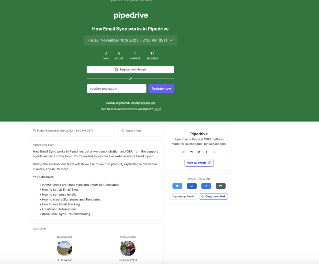
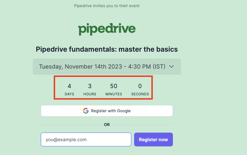
Countdown Timers and Urgency Tactics
Creating a sense of urgency and scarcity impacts the conversion rate of your webinar page. Here are some tactics to consider:
- Countdown timers: Add a countdown timer to your landing page to create a sense of urgency. This motivates visitors to register for your webinar before time runs out immediately.
Pipedrive adds countdown timers to each webinar landing page like in the below image:
- Limited-time offers: Offer limited-time discounts or bonuses for early registrations. Communicate the deadline or expiration date clearly to create a sense of urgency and encourage visitors to sign up.
Visuals and Media Integration
Using visuals and media on your webinar landing page improves the user experience. Here are some considerations for integrating visuals and media:
- Use images, videos, and infographics: Incorporate relevant and engaging visuals that support your webinar topic and message. Use pictures, videos, or infographics to explain concepts, showcase examples, or highlight the value of attending your webinar.
- Ensure fast loading times: Optimize the file sizes of your visuals and media elements to ensure fast loading times. Slow loading times negatively impact the user experience and lead to higher bounce rates.
Mobile-Friendly Landing Pages
With the increasing use of mobile devices for internet browsing, optimizing your webinar web page for mobile users is crucial. Here are some considerations for creating mobile-friendly landing pages:
- Adapt landing pages for mobile: Ensure your page is fully responsive and adapts seamlessly to different screen sizes. Test your landing page on various mobile devices to ensure a consistent and user-friendly experience.
- Mobile-specific design considerations: Consider the unique user experience and design considerations for mobile devices. Use larger fonts, clear and concise messaging, and optimized layouts for mobile screens.
- Cross-device compatibility: While optimizing for mobile, ensure your landing page is compatible with other devices, such as tablets or desktops. This will provide a seamless experience for all users, regardless of their device.
Case Studies and Examples
Real-life case studies and examples provide valuable insights and inspiration for creating effective webinar landing pages.
Here are some examples of successful webinar pages:
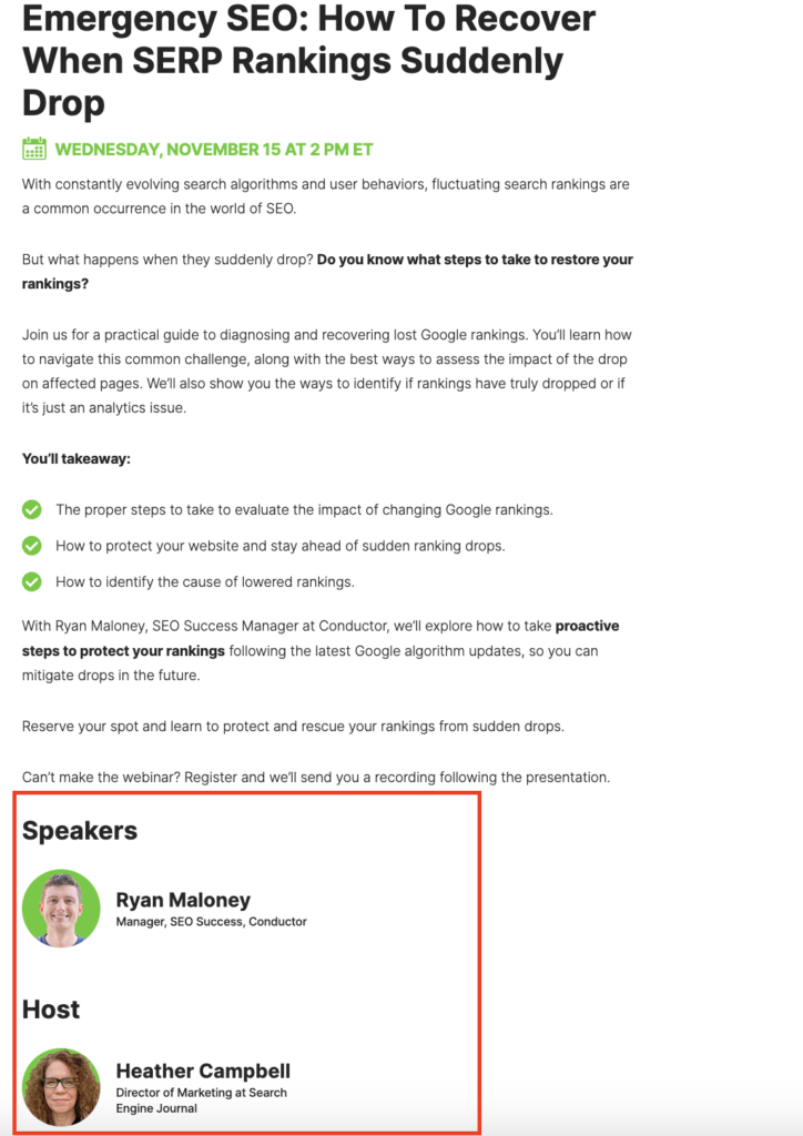
- Search Engine Journal: This webinar landing page uses a compelling headline and subheadlines to highlight the value and benefits of attending the webinar. It also features the speakers’ photos and informative bios.
- Content Marketing Institute: This landing page features a bold headline and subheadlines that communicate the purpose and value of the webinar. It also includes a logo that is not hyperlinked, keeping visitors on the landing page.
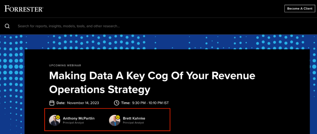
- Forrester: The headline on this landing page is thought-provoking and addresses a specific pain point. It also includes photos and titles of the webinar hosts.
- GetResponse: This landing page uses concise and engaging copy to highlight the value and key takeaways of the webinar. It also features an eye-catching call-to-action button and a short and sweet signup form.

Tools for Webinar Landing Pages
Various tools and resources are available to help you create effective webinar pages.
Here are some recommended tools and resources:
- Landing page builders: Platforms like Instapage, Unbounce, and Woorise offer intuitive and user-friendly landing page builders with pre-designed templates and customization options.
- Design tools: Tools like Canva and Adobe Spark allow you to create visually appealing graphics and images for your webinar landing pages.
- Best practices guide: Websites like Woorise and HubSpot provide comprehensive guides and resources on best practices for creating effective webinar web pages. You can also use ready-made webinar landing page templates to get started.
By leveraging these tools and resources, you can streamline the process of creating webinar pages and ensure that they are optimized for conversion and user experience.
Conclusion
Remember, creating effective webinar landing pages is an ongoing process. Test and refine your landing pages based on data and user feedback to ensure optimal performance and conversion rates. With the right strategies and a well-designed landing page, you can captivate your audience, drive registrations, and host successful webinars that deliver value to your attendees and achieve your business goals.