
Driving traffic is one of the most important goals you want to achieve when building a website. After all, getting your brand out there and introducing your business to as many people as possible can help you gain more customers and increase your revenue.
One of the most effective ways of achieving this is by optimizing your website for search engines. Achieving SEO success is a tedious but rewarding process that can help you generate more traffic and increase your brand awareness.
However, getting a lot of visitors to your website doesn’t mean anything more than having people view your website and browse your content. If you don’t exert effort into engaging with your website visitors and getting to know them better, you’re wasting your site’s potential and chance to turn them into customers.
But personally trying to chat with every visitor to get their information and engage with them will be unproductive, if not impossible. So, how do you learn more about your website visitors more efficiently? The answer is lead capture pages.
In this article
What is a Lead Capture Page?
A lead capture page, also known as a landing page or squeeze page, is a specialized web page for lead generation designed to capture valuable information about visitors, typically their contact details, such as email addresses, names, or phone numbers. Its primary purpose is to convert website traffic into leads for businesses or organizations.
These pages are often used in online marketing campaigns, such as email marketing or pay-per-click advertising, to entice visitors with a compelling offer, such as a free e-book, webinar, or discount, in exchange for their contact information. Finding the right balance between the “ask” and “reward” is key to a successful exchange. Asking for irrelevant information from users, such as sensitive personal information, can push them to abandon the form and leave the site.
The information collected from lead capture pages helps businesses nurture and engage with potential customers, guiding them through the sales funnel to ultimately convert them into paying customers. In turn, users are rewarded with an offering that can make them see the company as an industry leader and trustworthy brand.
Anatomy of a Lead Capture Page
A lead capture page has several important parts that work together to convince users to provide their information in exchange for an exclusive offer. Here are the parts your lead capture page should have:
Headline
The headline is the first thing visitors see when they land on your lead generation landing page. It serves as a powerful attention-grabber and must convey the primary benefit or value proposition of your offer succinctly. A compelling headline should be clear, concise, and emotionally resonant.
For example, if you’re offering a free e-book on personal finance tips, your headline might read: “Unlock Financial Freedom: Get Your Free Personal Finance E-Book Now!” This headline not only communicates the benefit of the offer (financial freedom) but also creates a sense of urgency and directs visitors toward the desired action.
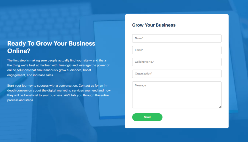
Lead Capture Form
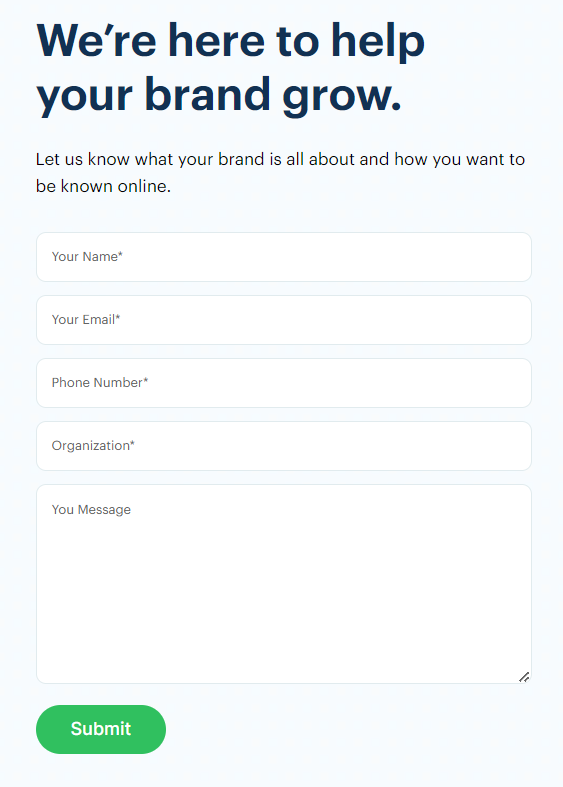
The lead capture form is the heart of your squeeze page. It’s where visitors input their information, typically including their name, email address, and sometimes additional details like phone numbers or company names. This form allows you to collect valuable data for future marketing efforts.
When designing your form, strike a balance between gathering enough information to qualify leads and making it feel quick and easy to complete. Long, intimidating forms can deter visitors, so ask for only what’s necessary at this stage. Labels and input fields should be clear, and error messages should be informative to prevent frustration.
Additionally, consider using a two-step opt-in process, where visitors click a button or checkbox to reveal the form. This can increase conversion rates as it reduces the perceived commitment to filling out the form.
Call to Action
The call to action (CTA) is a crucial element that guides visitors toward taking the desired action, such as submitting the lead capture form. It should be prominently displayed, typically as a button, and use action-oriented language that encourages immediate engagement.
Effective CTAs often incorporate verbs like “Get,” “Download,” “Subscribe,” or “Claim” to convey the action visitors should take. To create a sense of urgency, you can use phrases like “Limited Time Offer” or “Act Now.”
The design of the CTA button is equally important. It should contrast with the page’s background color and be large enough to catch the eye. A/B testing different CTA button colors, sizes, and text can help determine which version performs best.
Copy
The copy on your lead capture page plays a vital role in persuading visitors to take action. It should provide context for the offer, address potential objections, and highlight the benefits of your product or service. Clear and persuasive copywriting can significantly impact conversion rates.
Start with a brief introduction that reinforces the message conveyed in your headline. Make sure to use concise paragraphs and bullet points to break up the text and make it more scannable. You also need to emphasize how the offer solves a specific problem or fulfills a need for the visitor.
Additionally, it’s crucial to maintain a customer-centric approach in your copy. Focus on what the visitor will gain from the offer, rather than just listing features. Use relatable language and, if possible, create a sense of connection by speaking to the visitor’s pain points or desires.
Image
Visual elements, such as images or graphics, enhance the overall appeal and effectiveness of your landing page. The image you choose for your landing page should be relevant to your offer and complement the content. For instance, if you’re promoting a fitness product, an image of a person using the product can help visitors visualize its benefits.
The image should also convey emotions that resonate with your target audience. Whether it’s happiness, success, or relief from a problem, the image should reinforce the message you’re trying to convey.
To keep users engaged with your page, ensure that the image is of high quality, loads quickly, and doesn’t overshadow the primary content. Slow loading times and poor image quality can make your page look unprofessional and deter users from giving out their information.
Lastly, you need to remember that some visitors may have slow internet connections or use mobile devices. So, you need to make sure your images are optimized for different screen sizes and resolutions.
Privacy Policy
In today’s digital landscape, concerns about data privacy and security are paramount. Including a link to your privacy policy on your lead capture page demonstrates transparency and reassures visitors that their information will be handled responsibly.
The privacy policy should outline how you collect, use, and protect the data you gather through the lead capture form. It’s essential to make this link easily accessible, typically placed near the form or CTA button. You can use language like “We respect your privacy” to convey your commitment to data protection.
Optional: Social Proof
Social proof elements can bolster the credibility and trustworthiness of your squeeze page, encouraging users to take action with confidence. Here are some social proof elements you can include in your lead capture page:
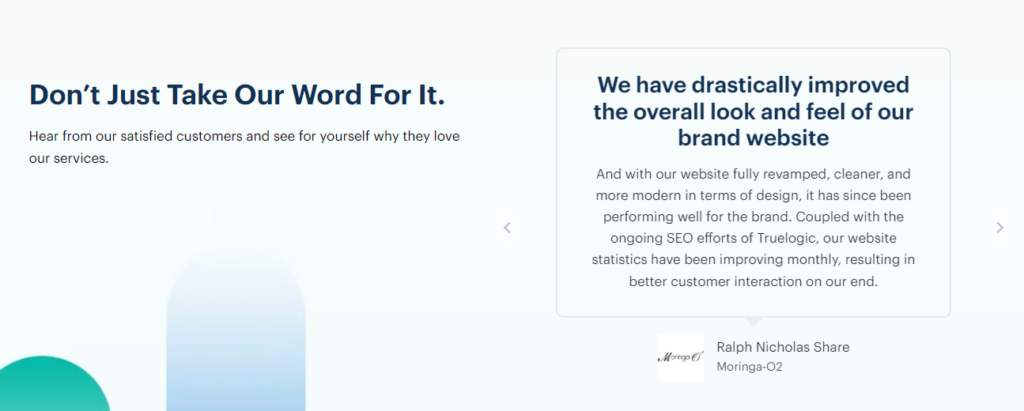
- Customer Testimonials: Including brief, positive testimonials from satisfied customers who have benefited from your offer can be highly persuasive. Testimonials should ideally highlight specific results or experiences.
- Customer Badges: If you’ve received industry awards or certifications, display these badges on your page to establish authority and trust. Badges like “Top Rated” or “Certified by [Authority]” can make a significant impact.
- Trust Seals: Security trust seals, such as SSL or payment security badges, indicate that your website is safe to use and that sensitive information is protected. These can alleviate concerns about data security.
When using social proof elements, ensure they are genuine and relevant to your offer. Overloading your page with too much social proof can be overwhelming, so strike a balance that maintains a clean and focused design.
Lead Capture Page Optimization
A well-designed lead capture page is a powerful tool for turning website visitors into valuable leads. To achieve maximum conversion rates, it’s essential to optimize various elements of your page, including the form position, form length, and Call to Action (CTA) button.
Form Position
The position of your lead capture form on the page significantly influences user engagement and conversion rates. A strategic placement can make the difference between a visitor filling out the form and leaving the page. Here are some considerations for optimizing form position:
- Above the Fold: Positioning the form above the fold means it’s visible without scrolling. This ensures that visitors see the form immediately upon landing on the page. This can be highly effective for capturing the attention of users who might not explore the entire page.
- Inline with Content: Integrating the form within the content can provide context and relevance. Place it where it logically fits within the narrative or when you introduce the offer’s benefits. This way, visitors understand why they should provide their information.
- Floating Forms: Floating or sticky forms remain visible as users scroll down the page. They can be less obtrusive than static forms and ensure that the form is always accessible, increasing the likelihood of conversions.
- Exit-Intent Pop-ups: These pop-ups appear when a user is about to leave the page, presenting a final opportunity to capture their information. While they can be effective, use them sparingly to avoid annoying visitors.
Ultimately, the best form position may vary depending on your specific audience and the nature of your offer. Testing different placements and monitoring their performance can help you make data-driven decisions.
Form Length
The length of your lead capture form directly impacts conversion rates. A longer form with more fields may provide valuable information but could deter potential leads. Conversely, a shorter form is less intimidating but may collect limited data. Balancing form length is crucial for optimization. Here’s how to find the right balance:
- Essential Information Only: Start by collecting only the essential information necessary for your marketing goals. In many cases, this includes a name and email address. As the relationship with the lead progresses, you can gather additional details.
- Progressive Profiling: Implement progressive profiling, a technique that gradually collects more information from leads over time. With each interaction, ask for different data, preventing an overwhelming initial form.
- Use Smart Fields: Some marketing automation platforms offer smart fields that automatically recognize returning visitors and pre-fill known information. This simplifies the process for returning leads and encourages them to complete the form.
- Clear Value Proposition: If you need to collect more data, ensure your value proposition is clear and compelling. Explain why providing additional information benefits the visitor and enhances their experience.
CTA Button
The CTA button is the gateway to conversions on your landing page. Its design, placement, and messaging are critical for optimizing conversions. Here are key considerations:
- Color and Contrast: Choose a CTA button color that contrasts with the background and grabs attention. Common choices include vibrant colors like orange or green.
- Size and Placement: Make the CTA button sufficiently large and prominently placed so that it’s easily clickable. Ensure it’s visible on both desktop and mobile devices. Placing it near the form and at the end of a persuasive copy can be effective.
- Action-Oriented Language: Use action-oriented, persuasive language on the button. Phrases like “Get Started,” “Download Now,” or “Claim Your Free Trial” convey a sense of urgency and encourage clicks.
- Whitespace and Design: Surround the CTA button with whitespace to isolate it from other page elements. This draws the visitor’s focus and reduces distractions. Design the button with rounded corners and shadows to make it appear more clickable.
- Mobile Optimization: Ensure that your CTA button is mobile-friendly. Mobile users should be able to tap the button easily without accidentally clicking nearby elements.
Create a Lead Capture Page That Works for Your Brand
No matter how many tips you read on optimizing your lead capture page, they will not always work as is. Because different brands have different audiences with unique needs, some tips may work well for some but not for others.
To create the best lead capture page that works for your brand, it’s best to do A/B testing. It is a method that allows you to assess the effectiveness of different variations of a page by creating two or more versions (A and B, or sometimes more) of the content with slight differences, then presenting these versions to different groups of users or visitors to determine which one performs better in terms of a specific goal or metric.
Here’s what you should consider testing within your lead capture form:
- Form Fields: Experiment with the number and types of form fields. Test whether a shorter form with minimal fields (e.g., just name and email) performs better than a longer form requesting more information (e.g., phone number, company name). Finding the right balance between collecting necessary data and user convenience is essential.
- Form Position: Test the placement of your lead capture form on the page. Evaluate whether positioning it above the fold (visible without scrolling) or within the content yields better results. You can also explore floating forms or exit-intent pop-ups to assess their impact on conversions.
- CTA Button: A/B test different aspects of your CTA button, such as its color, size, text, and placement. Determine which combination encourages more clicks and conversions. Use action-oriented language and experiment with urgency-inducing phrases to optimize your CTA.
- Copy Length: Vary the length of the copy around your lead capture form. Test shorter, concise messaging against longer, more detailed explanations of the offer. Striking the right balance between providing enough information to entice visitors and avoiding overwhelming them is key.
Through systematic A/B testing of these elements, you can gather data-driven insights to fine-tune your lead capture form, ultimately improving its effectiveness in converting visitors into valuable leads. Remember to track and analyze relevant metrics to make informed decisions about which variations perform best.
Final Thoughts
Mastering the basics of a lead capture page is essential for any business looking to thrive in the digital landscape. These specialized web pages are your gateway to transforming casual website visitors into potential leads and, eventually, loyal customers.
However, you need to remember that the journey doesn’t end here; continuous testing and refinement are the keys to achieving ever-improving conversion rates and building a robust customer base. Embrace the power of lead capture pages, and watch your online presence flourish.