You have just one chance of making an excellent first impression. The first thing your potential customers see is what they’ll remember about your brand.
In most cases, this is your landing page.
A great landing page has become a key component to acquiring leads, getting conversions, or selling products. A landing page aims to allow visitors to complete a particular task you want them to.
Truthfully, there are many things to keep in mind when creating a high-converting landing page. Continue reading to find out what a landing page should look like to succeed, including some examples to inspire you this year.
In this article
What is the purpose of a landing page?
A landing page can be best described as a single-page website. It has one goal—to inspire a visitor to take a specific action. Whatever the campaign’s objective is, a landing page has a clear message in the form of a headline, visuals to complement the copy, and a strong CTA.
Landing pages are more like sales pages because they’re used to sell products or capture leads. They carry more in-depth data about your service or product than your regular website and need to work flawlessly. Landing pages are a part of a marketing strategy, where potential clients “land” after clicking on paid advertisements such as Google ads or social media adverts.
To stand out, you should invest resources in quality design and exceptional UX tools. This is the only way to make visitors follow through on CTA. However, companies often miss out on usability testing or page responsiveness.
What do the best landing pages have in common?
Different elements work for various businesses, but a few are considered obligatory.
We’ve noticed these six components in the best landing page examples:
- A motivating copy that sticks to the point, with a friendly tone of voice
- A few-step explanation (often with visuals) of what the process looks like
- An explainer video that conveys a complex story, which further clarifies the offer and the value proposition
- Social proof, such as testimonial videos, that showcase your worth
- A compelling design with graphic visuals that complement the copy for an even better user experience
- Frequently asked questions that help visitors resolve confusion or a chatbot with a similar purpose
These traits are essential and should be a part of any landing page. But keep in mind that creating a powerful landing page with the rest of the website looking outdated or unappealing could push some visitors away.
Your website may need a complete makeover. Do you need to redesign the entire site? How much does it cost to develop a website? How much time will it take? These are some questions to ask before applying changes. Some features could be expensive.
These elements are frequent among the best landing pages, but still, companies do things differently. So, let’s continue and take a look at some examples.
1. Maze
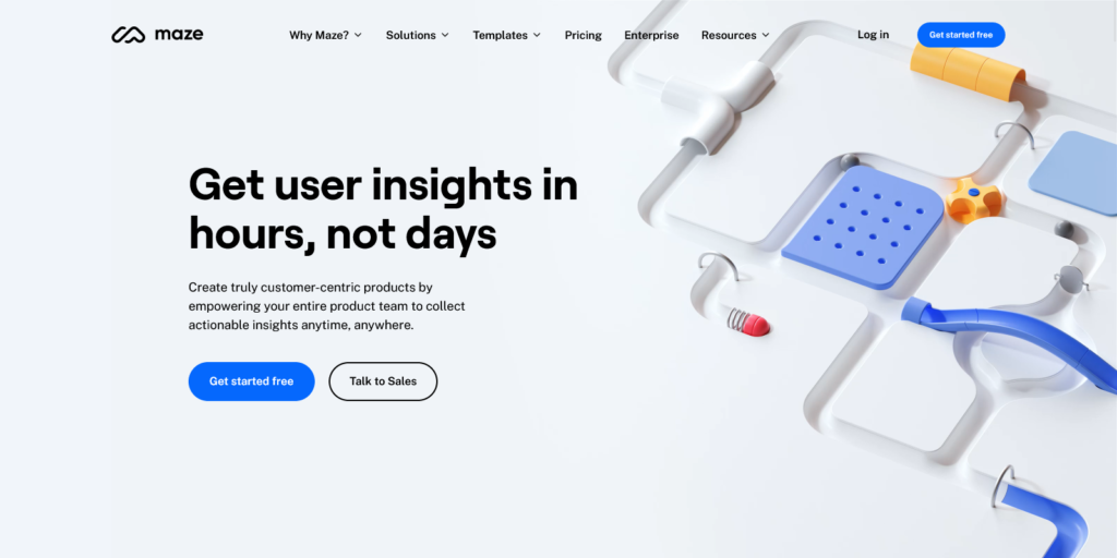
Maze helps build amazing products. This word game is a great way to capture people’s attention when they land on the website. The headline is very direct and motivates people to take action. It addresses some of the pain points product managers may have and provides a practical solution. Two CTA buttons are placed right below the copy and serve as a logical continuation of the message.
Another amazing aspect of the landing page is the animation. It feels integrated into the page without clear borders or lines. Although the elements move slowly, each has a different path that keeps people engaged long enough to consider the tool and, ideally, take action. The rest of the page is designed in the same style, with plenty of captivating animations and strong copy. Every element works together and naturally leads users step-by-step through the website.
2. Restream
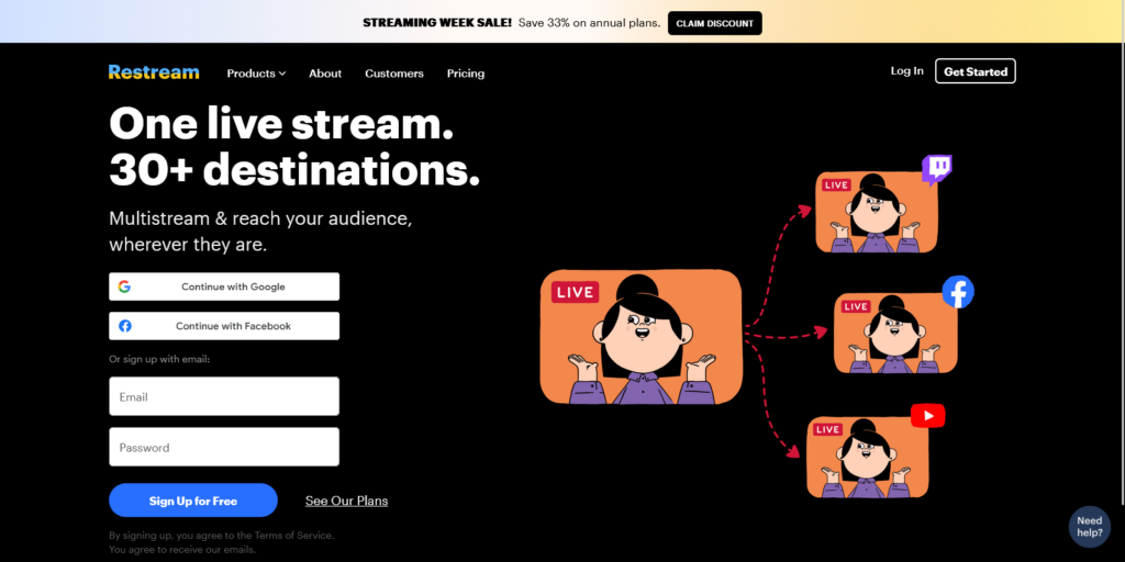
Restream has a very straightforward landing page that explains the purpose of the tool in a single sentence. There are no teasers or vague statements. The copy is clear and concise, followed by different Signup options. Users are immediately asked to follow through and try the software.
The illustrations are very cheerful and intended to show what the tool does. The elements are striking, thanks to the dark background combined with a bright palette. The dominant elements on this page are CTAs. The bottom right corner has the traditional “Get started” button. However, every “Sign up” option serves as a form of CTA. Wherever people look, they see an invitation to try the tool.
3. Zoom
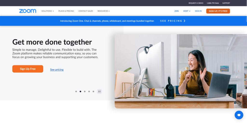
Zoom has been one of the most popular video conferencing tools for many years now. However, it has proven to be even more helpful in the new hybrid setting. The landing page focuses on this aspect very well. Instead of promoting Zoom as just a conference tool, it explains how it can be helpful in a specific setting. With the rise of hybrid workspaces, almost all communication has to be done online and Zoom is one of the best solutions. At least, this is the message that users get after landing on the website.
Zoom stays true to its well-known illustrations when it comes to visual identity. The brand has reached the point of being easily recognizable without any additional descriptions. This is why the landing page is quite simple and encourages people to sign up for the tool.
4. Snapchat
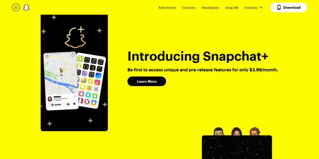
Snapchat is famous for its bright yellow color, used as a theme on its landing page. This is an excellent example of a company that stays true to its brand and visual identity without introducing too many novelties. Once people visit the page, they immediately associate the color with the brand, so there’s no need to explain much.
The left side of the screen is reserved for showcasing the experience with Snapchat, while the right side invites people to join the network. No lengthy descriptions and promotional copy. A simple CTA with a phone number field is enough to get people started.
It’s important to note that this type of landing page can work only if people are already quite familiar with a brand. Most of them don’t land on the website to learn more but to take some action. In that sense, such a minimalist landing page does a great job of attracting and keeping new customers.
5. Masterclass
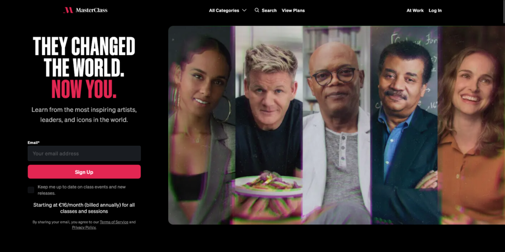
Everybody knows about Masterclass. Whether you are a chef, business owner, artist or scientist – Masterclass has a great course to offer. Their landing page shows all of the famous lecturers in a series. There is no need for complex design or illustrations. Showing the biggest asset of this program (in this case, people) helps attract new users.
It’s important to note that the copy sends a compelling message. It tells people they could be just like one of the world-known icons. The text is highly motivational and free of any fluff. Just a simple message to encourage individuals to get started with a course. Plus, it’s enough to enter an email address and join the MasterClass community.
The background is dark, which helps all colors stand out and the CTA button. A strong contrast boosts the message, making it impossible to ignore once you land on the website.
6. Salesforce
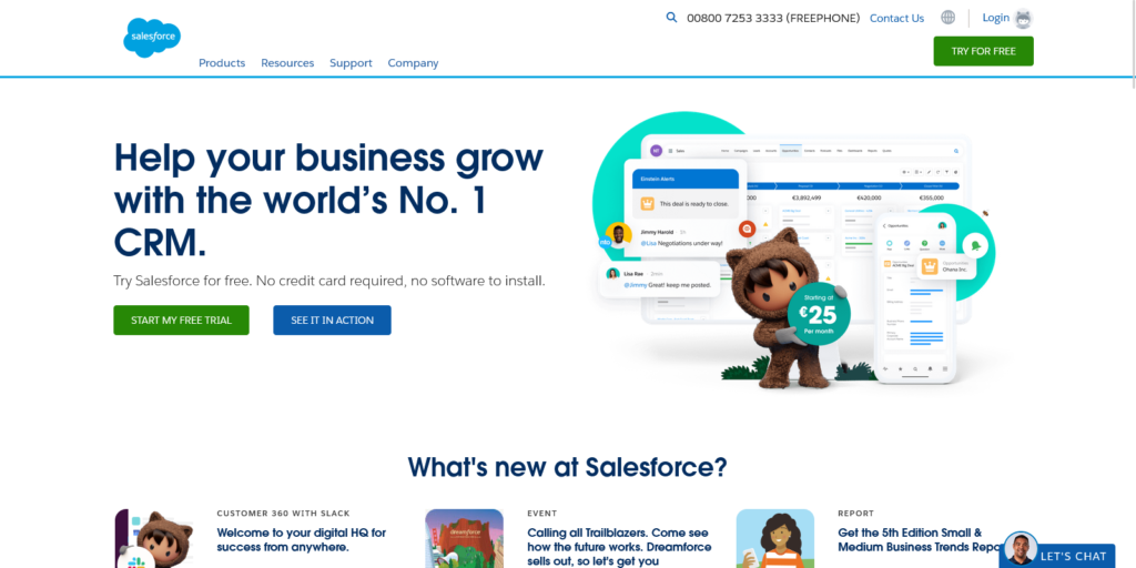
Salesforce is famous among marketers and salespeople. This comprehensive tool offers a customer relationship management service, analytical tools, marketing automation and various development and sales tools.
This can be hard to show on a single landing page. Salesforce does an excellent job at presenting every functionality as a separate icon. Looking at the main image, people can understand what to expect after using the tool.
Another way to capture people’s attention is to show results. It’s much easier to get started with the tool when a person reads that they could see a 300% increase in leads. For those still wondering how the process works, Salesforce offers plenty of demos that can improve the user experience.
7. TypeForm
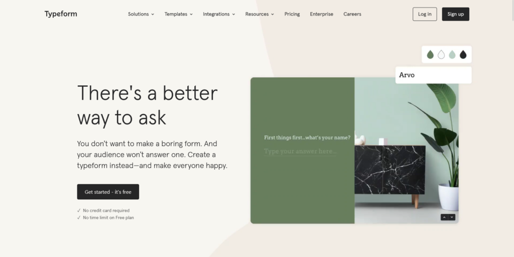
Asking questions is pretty simple and straightforward. Most people don’t experiment too much with it. This is exactly what TypeForm tries to challenge. Their landing page is an example of how copy can serve as a teaser and make people spend a few moments looking at the animations.
Instead of describing the tool with words, the landing page shows more than ten different ways of asking things. Starting from the traditional typewriter effect, images, colors, surveys, and animations can bring posing questions to another level. TypeForm landing page gives people just enough to spark interest and inspire people to get started with the tool.
8. Zenefits
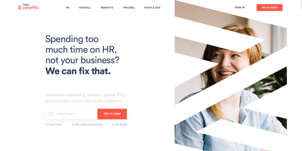
Zenefits is all about supporting businesses in the HR segment. This is one of the classic landing pages that works very well. The copy is presented in the problem-solution style. A lot of business owners struggle with the lack of time. Zenefits addresses this issue and provides a great solution.
To get started with Zenefits, people need to enter an email address. Some would say this is an extra step, but it has an essential function. It encourages interaction and helps Zenefits grow its contact list. The reason why it’s not perceived as boring is the lack of any other steps or requirements. The landing page emphasizes this, so users know there are no hidden surprises in the next phase.
9. Vectary
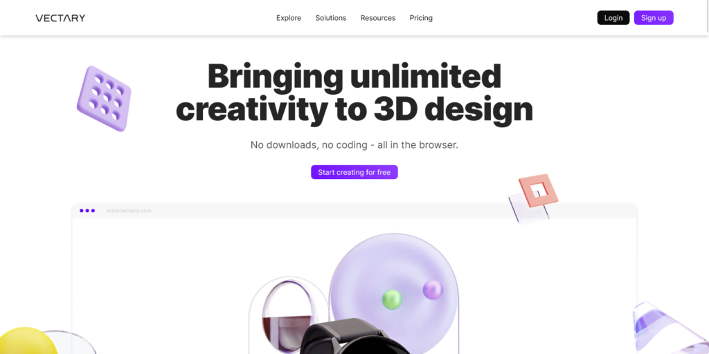
The best way to attract users to a design tool is to show what it can do. This landing page presents different animated elements made with the help of Vectary. Although it may seem that there is no connection between a watch, a spiral and a ball, users get the impression that all of those components belong together.
There are no lengthy texts on this website. The only message is encouraging users to get started with the tool. The entire focus is on showing people what the user experience is like instead of describing it with words. The more people scroll down, the more they learn about all functionalities that the tool offers.
10. Petal
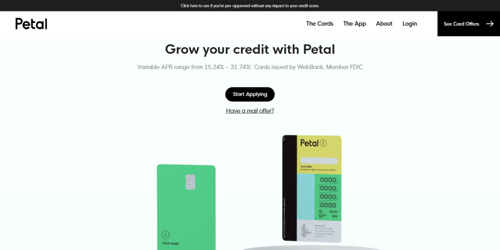
Credit card websites often look like one another and don’t spark interest in people. They are professional, serious and full of information. However, Petal takes this to another level. Their landing page is interactive and motivates users to scroll down and see what comes next. The animation is excellent and focuses on a single element – the credit card.
The copy is concise and appears to be in the second plan compared to the animation. However, CTA is very easy to find throughout the entire page so that people can get started very quickly. Minimalism is at the core of this landing page and it works very well. Those who have more questions are intrigued to look further. The page is easy to navigate and has a natural flow that keeps users hooked.
11. Helpscout
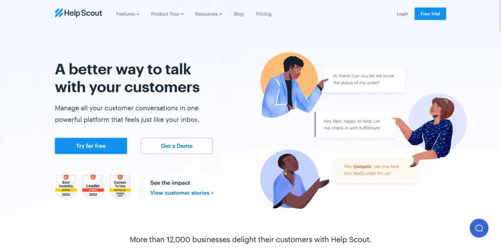
A great way to promote your tool is to show people how it works. HelpScout provides several examples of how their tool helps improve customer support. As a proof of expertise, the landing page includes three badges of recognition, thereby boosting the software’s credibility. These don’t take too much space, so people don’t get the feeling they’re too promotional.
HelpScout has an exciting combination of light colors and engaging illustrations. The copy is very concise and on-point, leaving no space for too much inference. Plus, both CTA buttons are indicative, which helps the users get started in just a couple of clicks.
12. Gong
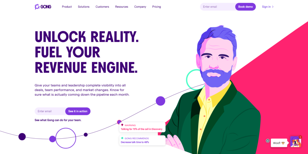
The first thing that catches the eye on this landing page is different elements that don’t all appear simultaneously. This keeps people engaged for a few seconds and helps them focus on one section at a time. The process doesn’t take too long as it could be perceived as frustrating. Instead, Gong achieves an excellent balance and makes visitors stick for a while.
Even after all of the elements appear, the page remains interactive and users can move different parts of the page. This kind of experience matches the company’s motto, which is “Unlock reality”. Gong is an excellent example of a landing page with all of its segments working together and creating a unique user experience. Every word, illustration and button are designed to showcase the software’s uniqueness.
13. BambooHR
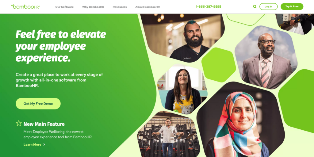
BambooHR is a well-known HR software designed to modernize hiring and improve employee experience in the process. This is precisely what the landing page emphasizes. The focus is on people, regardless of their age, sex, religion or ethnicity. BambooHR landing page showcases some of the company’s central values in just a few photos.
The selection of green colors shows the company’s visual identity very appealingly. The copy is quite simple and focuses on the most relevant keywords. Thanks to the page’s simplicity, it was easy to integrate a ‘New main feature’ section without it looking overly promotional.
Let’s wrap it up
The quality of your product is the first condition for success, but after that, it’s on you to find ways to promote it. Landing pages are considered a great tool to grow your business. We saw how they could help you present your offer and provide in-depth information.
The great thing about landing pages is that you can add various types of content to complement your offer. Explainer videos, engaging and motivating copy, bulleted lists, numerous design elements, social proof, background images and plenty of conversion opportunities.
These are some commonly used components for this year, but keep in mind that every business is different. What works for one brand might not work for the other. And what seems that it doesn’t suit your brand might prove to be a perfect addition to your landing page.
Use this list as inspiration and as a model for your landing pages. Specific landing page templates can also help you get started. Good luck!


