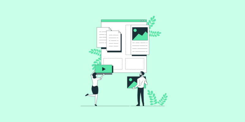
In the world of digital marketing, landing pages play an important role in gaining leads and sales. A landing page is a web page, distinct from a website’s home page, designed to bring traffic to the site. Landing pages can be found in several ways, including an organic search result, an ad or a link.
Digital marketers and designers create landing pages in such a way that it provides relevant and informative content to searches. In other words, landing pages are always focused on offering a solution to a searcher’s specific problem or questions. Essentially, it’s the next step in turning a visitor into a customer.
Considering this, not all landing pages are always successful. Many businesses don’t understand what makes a landing page work. For it to stand out, it should contain certain elements. Therefore, it is important to hire dedicated web developers or a design team to work on your landing page. A fully optimized and well-designed page can lead to significant benefits for your website.
In this article
- Why Well-designed Landing Pages Convert Better
- Examples of Strong Landing Pages
- 1. Uber
- 2. Patreon
- 3. Trello
- 4. Salesforce
- 5. GoToMeeting
- 6. Shopify
- 7. Moz Pro
- 8. Master Class
- 9. Slack
- 10. Asana
- Best Practices to Design an Effective Landing Page
- How to Apply Brand Marketing Principles to Your Landing Pages
- The Value of a Well-designed Landing Page
Why Well-designed Landing Pages Convert Better
If you are interested in attracting more leads, then your landing page design has to communicate your message well. A well-designed landing page keeps a visitor engaged and improves the chances of them clicking through to buy-in. Whether you want to boost a new product or simply want to improve sales, you have to design a landing page that conveys your brand through specific design elements. These elements typically include colors, fonts and graphics, bold call to actions (CTA), social media sharing buttons and professional, well-written copy.
But it is not enough to just mix these elements. It needs to work together to create a flow. The elements must be used in such a way that it persuades the visitor to take action. Examples of this include steps to sign up for a service or a bold CTA designed in a different color that instantly catches the eye. It is also important to keep the objective of your landing page in mind when designing it. Let’s consider ten top landing page examples designed by web developers for renowned brands:
Examples of Strong Landing Pages
Big brands typically set the standard in the world of digital marketing as they use tried and tested processes and design methods. They are usually at the forefront of marketing trends and understand the value of a landing page. Looking at a few strong landing pages can help you to understand how to design your own pages with the help of dedicated developers, by incorporating certain elements that are known to work.
1. Uber
Uber Technologies, Inc., commonly known as Uber, is one of the world’s biggest and most well-known transport and food delivery services. With their landing page design, their objective is to persuade people to sign up for their service on their popular mobile app.
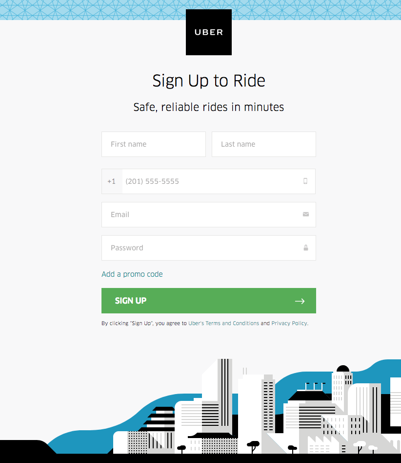
Uber Effective Elements
Uber makes use of minimalist copy, colors and graphics and a clean overall design to keep the focus on the lead capture form. A cluttered page can easily frustrate a visitor which will lead to them leaving the page.
Uber’s use of an easy-to-fill-in form allows visitors to click through efficiently, while the use of their logo at the top of the form gives visitors the comfort knowing they’re dealing directly with Uber. The CTA button is displayed in a different color than the rest of the page, making it stand out. In general, the page is easy to navigate and simple though striking. It will keep visitors engaged while prompting them to take action.
2. Patreon
Patreon has created a platform for creators and artists to easily make money by gaining fans. Anyone around the world can support their favorite illustrators, photographers, writers and more, by signing up for exclusive monthly rewards and perks offered by the creator. Patreon’s landing page is focused on signing up supporters.
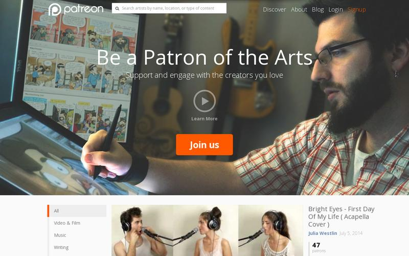
Patreon Effective Elements
When looking at Patreon’s landing page, you are instantly engaged. This is an important aspect regarding the company’s objective, as it will spur interest immediately and the visitor will want to learn more. Patreon makes use of minimal, though bold, clever copy using motivational language that engages the aim of the visitors’ search. They understand that asking for donations on the page can scare away visitors, therefore, they rather ask people to become a “Patron of the Arts.”
The large image of an artist immediately draws visitors in, as it tells the story of what the page is about. The use of a bright orange CTA button makes it stand out and helps to persuade the visitor to opt-in. There is also a second CTA which invites visitors to “learn more”. Because of the nature of the main CTA (To spend money), a second CTA is a clever way not to lose visitors immediately, but rather to ask them to get more information first.
3. Trello
Trello is a free collaborative list-making application focused on businesses to keep track of projects. The aim of their landing page is to get visitors to sign up for the platform.
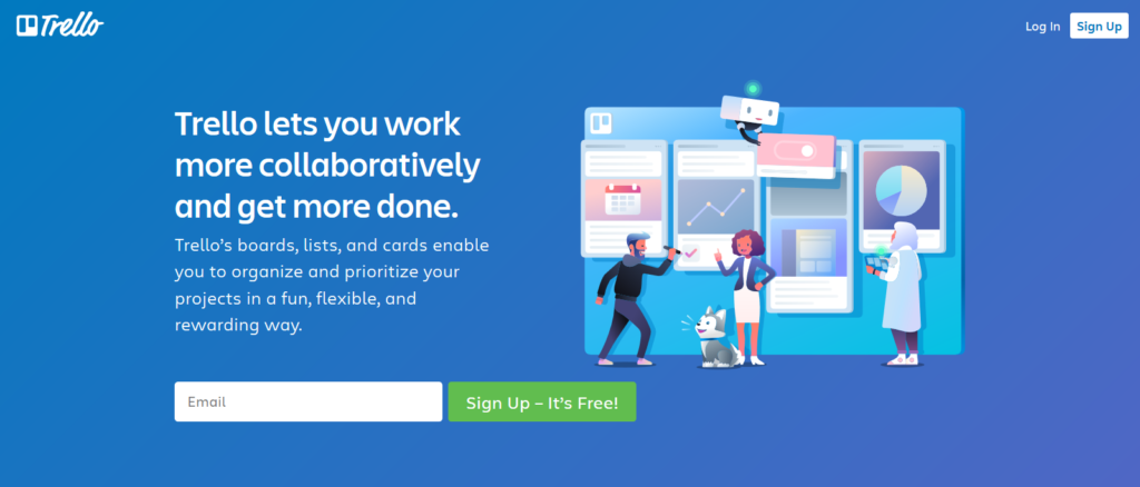
Trello Effective Elements
Trello’s landing page makes use of bold fonts and colors to keep visitors engaged and interested from the start. The headline gets straight to the point, explaining exactly what the application is about, while the subheadline offers information around the project management feature and sub-features.
By using a large, colorful illustration on the one side of the page gives it an interesting element and perfectly balances out the design. The green CTA button stands out against the blue background, placing the focus on the aim of the page – to sign up to Trello.
4. Salesforce
Salesforce is a cloud-based software company specializing in customer relationship management services and a complementary suite of business applications. Their landing page is focused on getting visitors to sign up for a Salesforce reporting application.
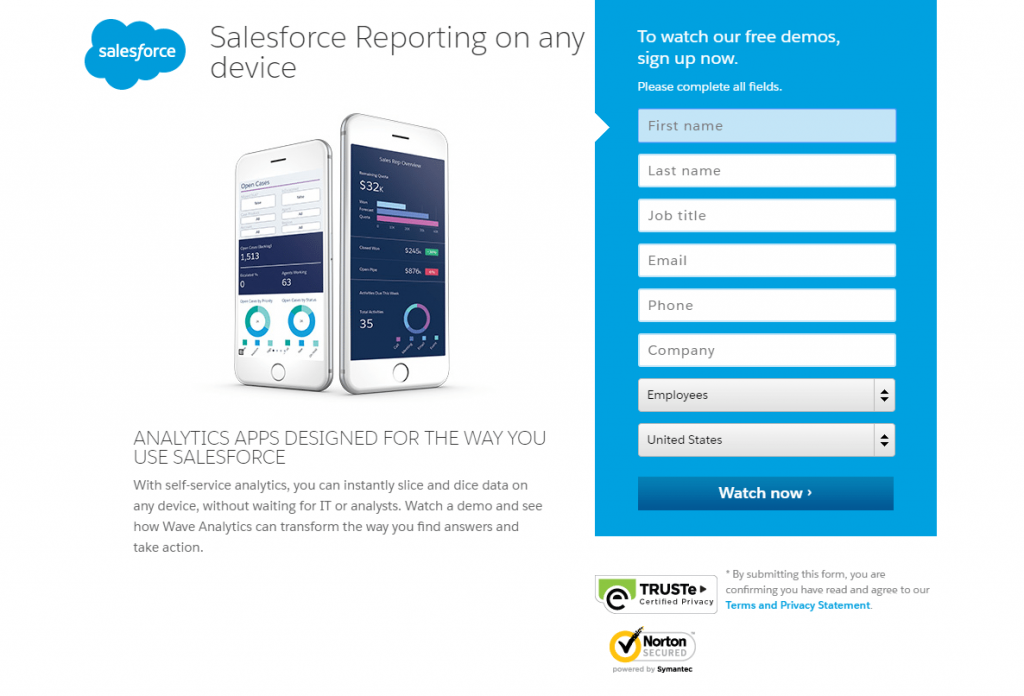
Salesforce Effective Elements
Salesforce makes use of brand-focused copy, images and a convenient leads form on their landing page. The headlines are compelling as they immediately provide a solution. It also describes what the page and product are about and as a result, will lead to more targeted leads.
The blue color used for the form makes it stand out against the white background, guiding visitors’ eyes to it, while the form itself has eight easy-to-fill-out fields. It’s not overwhelming and can be completed in just a few minutes.
The use of trust badges and a privacy policy help increase confidence in signing up with Salesforce. Trust is important for businesses and because they are B2B focused, these elements are highly effective.
5. GoToMeeting
GoToMeeting is an online meeting, and video conferencing platform focused on businesses with remote teams. Their landing page is designed with the objective to sign visitors up for a free trial.
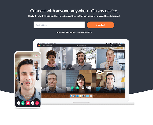
GoToMeeting Effective Elements
GoToMeeting keeps things concise with simple but effective elements. The headline states what the platform is all about, while the image complements the text showing how the platform is used. The bright orange CTA stands out and is placed right at the top of the page, ensuring the most important part is seen first by anyone who lands on the page.
6. Shopify
Shopify offers ‘n commerce platform to anyone who wants to sell online. Their landing page is focused on getting visitors to sign up and sell on Shopify.
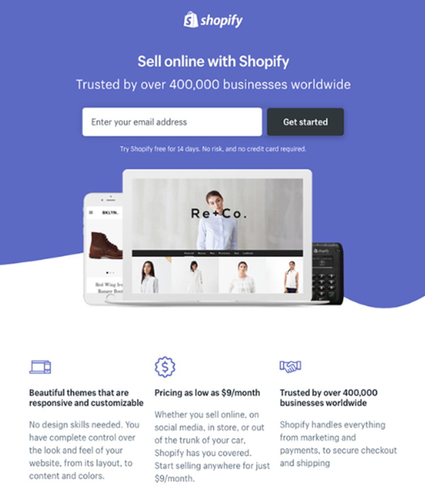
Shopify Effective Elements
Shopify makes use of straightforward design for their trial landing page. The design is sleek without too much text or images. Shopify has decided to go for a traditional downward-scroll page that is easy to navigate and well-balanced.
The page relies on a short headline and a few bullets to communicate the Shopify trial’s details. The headline “Sell online with Shopify” tells the visitor exactly what the page is about, while the text “Trusted by over 400000 businesses worldwide” boosts Shopify’s credibility. A single image of a Shopify website serves as an example of what can be designed with the app, while the CTA is used right at the top, making it very easy for the visitor to quickly enter their email address.
7. Moz Pro
Moz Pro is an all-in-one SEO software suite offering tools designed to improve search engine rankings. Their aim with their landing page is to sign people up to try the suite.
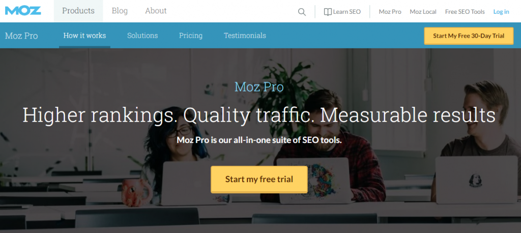
Moz Pro Effective Elements
Moz Pro makes it easy to understand exactly what their landing page is about through the use of a bold heading. Visitors can expect higher rankings, quality traffic and measurable results. The CTA is in a bright shade of yellow, making it stand out against the faded image. This is a great design tactic to guide visitors’ eyes to the most important part of the page: To sign up for a trail. The faded image shows three people working on their laptops, which further boosts what the page is about and may also enhance interest.
8. Master Class
Master Class offers online classes for students, teached by some of the most experienced professionals in the world. Their landing page’s objective is to sign students up.
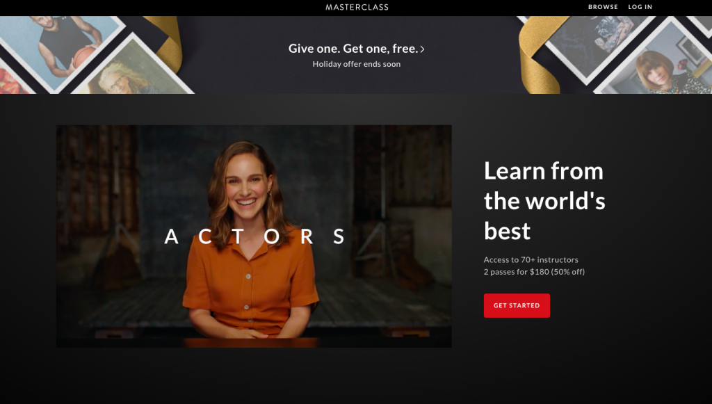
Master Class Effective Elements
Master Class’ landing page is very informative, but the text does not take up too much space. This is due to using a video as the main type of media. Videos are highly effective to use on landing pages, as people are more drawn to visual elements compared to text.
The white headline in contrast with the darker background makes it stand out and catches the eye immediately, while the copy itself is bold and interesting. Finally, the red button brings colour to the page and catches the eye immediately.
9. Slack
Slack is a communication platform used by thousands of businesses around the world. With Slack’s landing page, they aim to get visitors to try their application.
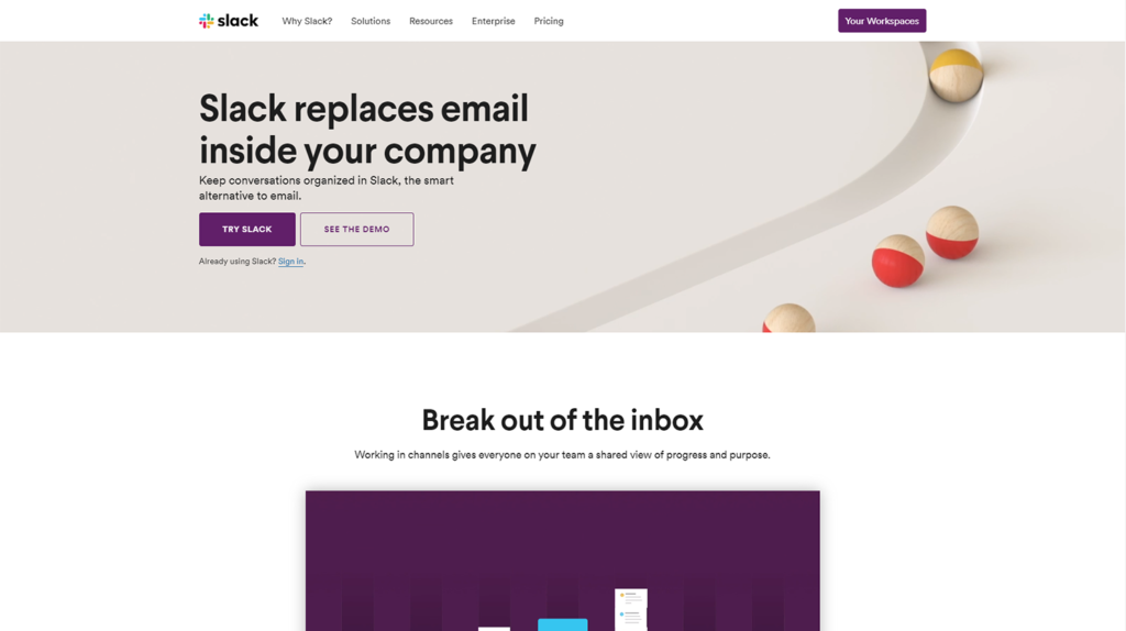
Slack Effective Elements
Slack has designed a simple, though effective landing page to persuade people to try the app. They’ve opted for a simple layout, in line with the brand, with shades of purple and an image in the header which makes it more engaging. This page features a unique scrolling style allowing the most important content to be displayed at all times, making it easier for visitors to access information when needed.
The most prominent elements on the page are the lead generation form and the CTA buttons which makes it convenient for visitors to sign up. The most important button “Try Slack” is designed in a darker shade, which makes it stand out, while the other button “See The Demo” offers visitors a choice to get more information before they make a choice. Slack has opted to use “Try Slack” instead of “Sign Up”, as trying a new product out first is often more appealing.
10. Asana
Asana is a free application designed to help teams organize and manage their projects. Their landing page’s focus is to get visitors to try it out.
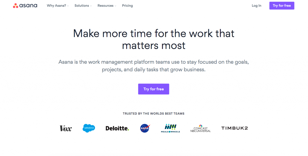
Asana Effective Elements
Asana has made use of very simplistic design to place the focus on the CTA. They’ve used clever copy that mentions a major benefit for working professionals: To save time. The CTA is the only colorful element on the page, which makes it stand out immediately. To boost trust and credibility, they’ve added the logos of popular companies they have worked with in the past.
Best Practices to Design an Effective Landing Page
Consider the following scenario for a second:
You search for dog beds on Google search, and here are the options you get to see:
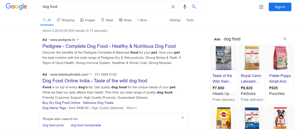
So you click on the first link…:
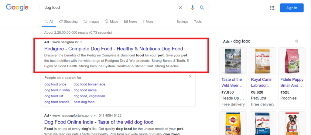
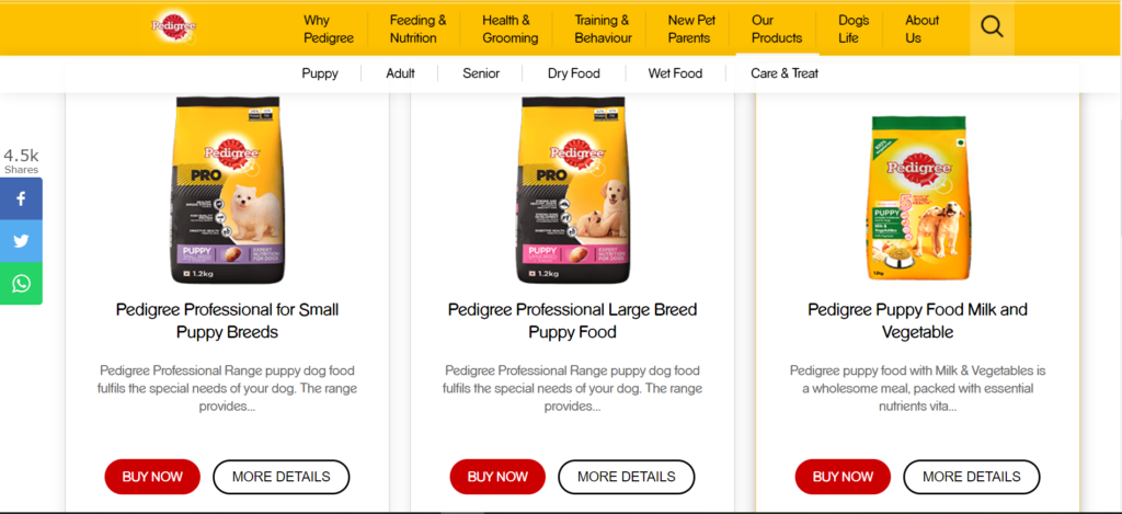
…which redirects you to Pedigree’s landing page…:
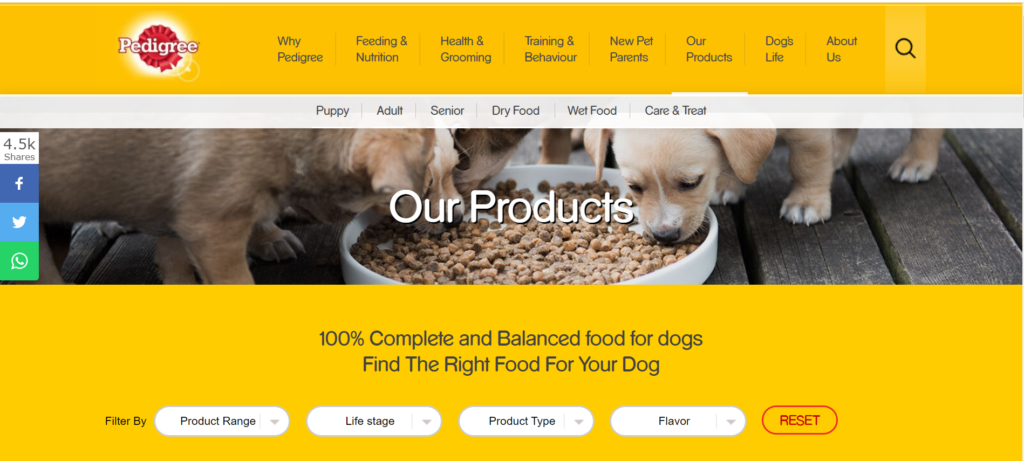
…where you can browse for a host of dog food options and complete the purchase:
Sounds simple enough, right? But the catch is this: There is a lot of effort that goes into ensuring that your brand emerges on top of the Google search list. In fact, most brands with the best landing pages don’t use their “Homepage” or “About Us” page as the landing page.
They strategically design a ‘separate’ page to create conversions by eliminating any and all kinds of distractions (read: competing links, navigation, alternate options, etc.). In the end, the idea is to capture the user’s complete, undivided attention.
In technical terms, we call this ‘effort’ landing page optimization. So why should you optimize your landing page? Here is what the data tells us:
- When targeted correctly, a landing page can boost conversion by up to 300%.
- Around 48% of top landing pages are ranked in Google Maps and organic search query results.
Long story short, your ‘landing’ page is an integral piece of the marketing puzzle. At this point, you might be wondering about what a landing page entails. Simply put, a landing page is characterized by two key elements:
A. It can be any website page that has a specific purpose–primarily, to convert website visitors into qualified leads and boost conversion rates.
B. It typically comprises of two types of pages:
- Lead generation: It captures the visitor’s contact information (think: name, email ID, phone number, etc.) using a lead form in exchange for offers such as free eBook, webinar access, etc.
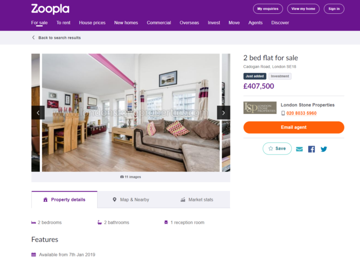
- Click-through: It throws light on the brand’s product/service/offers and tries to convince the onlooker to make a purchase using a CTA button (in the following example, the CTA button would be the ‘orange’ button, “Email Agent):”
Now that you have a fair understanding of what a landing page is, let’s look at some time-tested, expert-approved landing page best practices. Keep reading.
Keep All Headlines And CTAs ‘Above The Fold’
First off, let’s breakdown what we mean by ‘above the fold.’ Basically, you need to ensure that your Call-To-Action buttons, headlines, and all the other important sections are visible as soon as someone lands on your landing page. Why?
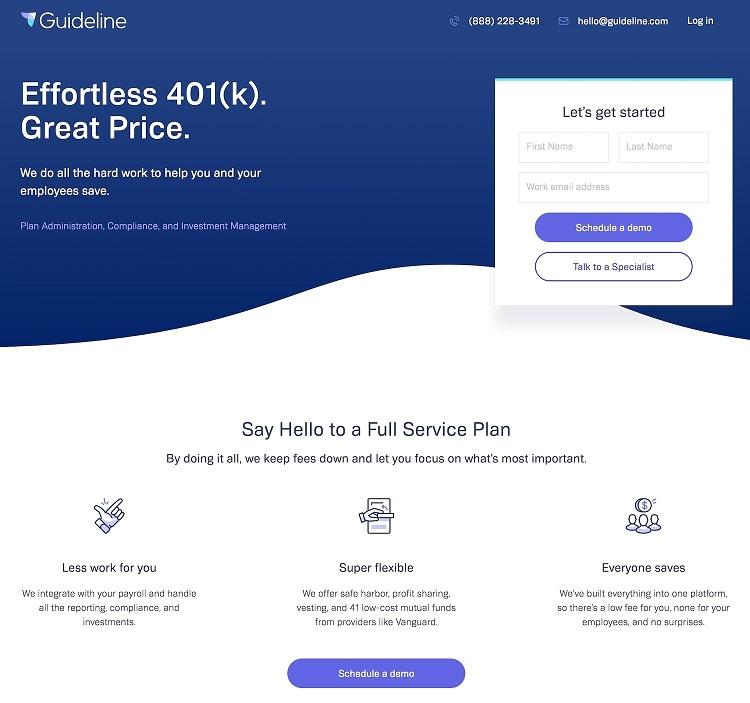
The logic is simple. If you are going to expect the user to scroll through and search for meaningful information, you might as well say goodbye to them. People need to understand “What’s in it for them” from the get-go instead of mindlessly browsing a page that may leave them confused, overwhelmed, and frustrated. Here’s an excellent example of a landing page that highlights the important CTAs (Schedule a demo and Talk to a Specialist), the brand USP, the contact information, etc. above the fold:
Design And Make It Compatible Multi-Device Optimized, Starting With Mobile
Get this: There will be over 3.8 billion smartphone users in the world by 2021. Goes without saying that not designing your landing page and making it compatible across devices and screen-sizes–especially the mobile–will be a ‘missed opportunity’ of gigantic proportions. That said, the customers today are increasingly going omnichannel in the way they browse and shop online–they may start with the buying experience on their desktop, move onto their mobile while on-the-go, and end up on their tablets. According to Google Research, an overwhelming 98% of Americans switch between devices on the same day.
All in all, as a brand, you should strive to convert leads through your landing page no matter which device your visitor is using to connect with your product/service. To that end, here are the top-5 tips to follow when it comes to multi-device landing page optimization:
Design a different, standalone page for every device for an optimal viewing experience (as shown below). A standard design across all pages will not fit the bill:
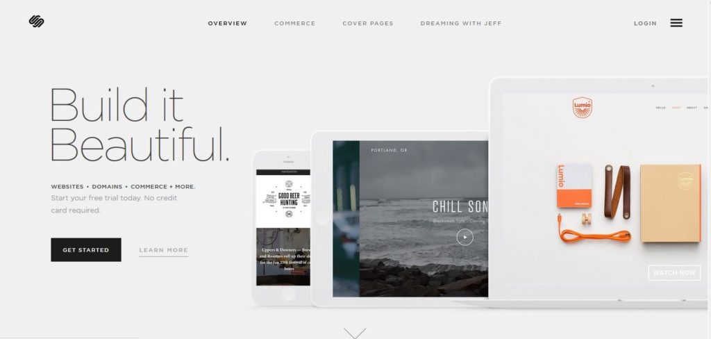
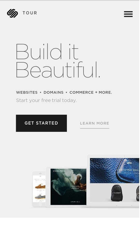
Make sure to factor in key design elements such as screen sizes, resolutions, and formats for all device types. Keep the design neat, clean, and simple as SquareSpace does across its landing page and mobile designs:
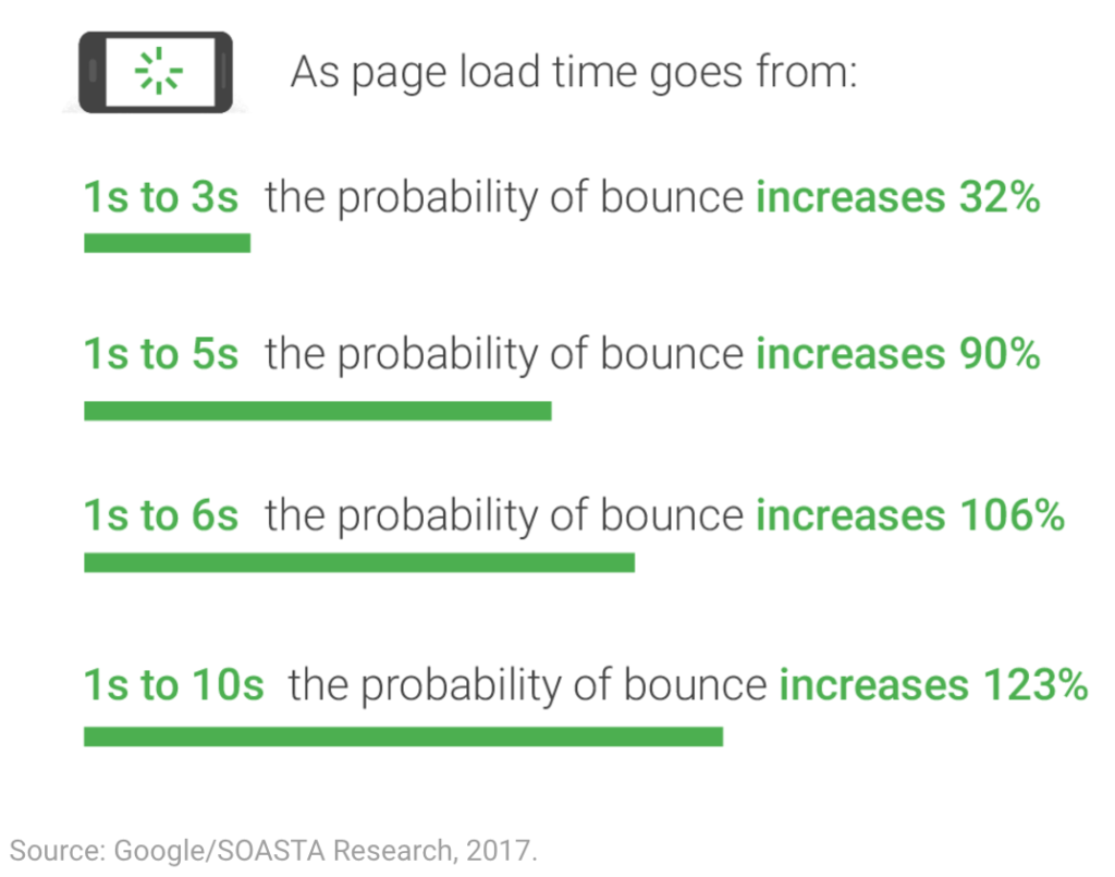
Ensure that the content is short and the headlines are pithy. Keep in mind that the page loading time across every device is fast, no matter the type of content, or you will risk losing customers:
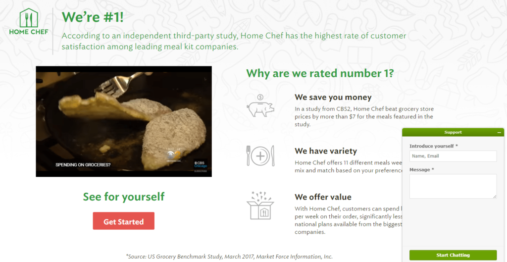
Leverage The Live Chat Widget For Real-Time Support And Reduced Bounce Rate
If your visitor has made an effort to click on an ad and land on your landing page, they should be equipped with the best kind of customer service possible. And one sure-shot way of delivering an exceptional customer experience is by making use of intuitive live chat software.
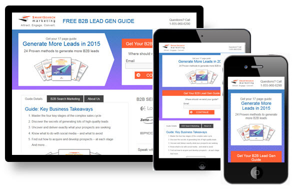
With customers already pretty used to Facebook and Instagram live chats, they have come to expect speaking to a customer agent in real-time–be it for getting their queries addressed or simply getting more information about the products/services available. This allows you to capture leads and connect with people instantly, more personally, and in real-time. Here’s an example of a great live chat post-click landing page that makes use of a catchy headline, informative video, and eye-grabbing CTA button:
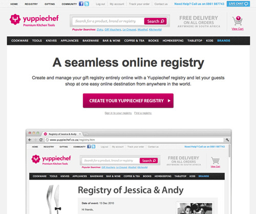
Keep The Navigation Simple
The power of simplified navigation cannot be stated enough. All users want today is a simplified, minimalistic navigation style. In fact, many brands do away with the navigation bar altogether, allowing the reader to singularly focus on the information at hand or engaging in a specific action, without any unnecessary distractions:
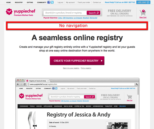
Unsurprisingly, the second variation (with no navigation) led to an increase in the conversion rate by 100%.
Ensure That The PPC Ad Headlines Match With The Content On The Landing Page
Imagine if you’re running an ad on social media about running shoes. Your user clicks on the landing page and suddenly is greeted with information about athleisure clothes. No points for guessing that your users will be left confused, bound to leave the page and never come back again.
In contrast, look at the following example where the Facebook ad and the landing page design are in sync with respect to the messaging, the overall aesthetics, and the design.
The point we are driving home is this: You need to align the goal of your ad campaigns with your landing page content, design, and messaging in order for it to be effective.
Update The Landing Page Regularly
This one’s a rather obvious suggestion, but it needs to be said in print: Your landing page should always be updated. In other words, presenting outdated information can be off-putting for your customers. When we say ‘updating,’ we mean you can play around with the background colors, font style, imagery, CTA buttons, etc. The idea is to remain fresh and prevent fatigue in the user’s mind.
Make It SEO-Optimized
SEO optimization for your landing page is an absolute must if you wish to remain on good terms with powerful search engines such as Google. To that end, here are a few best practices to keep in mind when drafting an SEO-optimized landing page:
- Make sure that your landing page’s URL is unique and uses the right keywords based on your target audience.
- Keep changing your “Title” tag (which is different from the Header tag) using SEO-optimized keywords.
- Use your landing page headline (in a more concise manner) as the content for the header tag.
- Create a stellar copy for the meta description that can help readers understand exactly what the page entails.
- Name your images using relevant keywords that explain the purpose of using said image/graphic.
- Make sure to backlink your published page across your website/blog/other third-party vendors so that Google can authenticate its veracity.
A/B Test Different Versions Of Your Landing Pages
Whether it is the content of your page, the images, the layout, or the CTA, A/B testing your landing pages is vital to understanding how well your page is performing and converting users. Perhaps your headline isn’t up to the mark. Or maybe, users can’t understand where your CTA button is. The more you test, the better you’ll understand what’s working and not working when it comes to your landing page.
Making informed decisions based on data and numbers can provide real results. Moreover, you can use heat maps to understand how your users are interacting with the landing page, which sections they are visiting, how long they’re staying on a particular page, etc.
It’s time to move onto some of the best performing landing pages and understand what they’re doing right. Let’s jump right in.
To wrap up, building a solid landing page is the cornerstone of effective marketing. Most brands spend added time, effort, and money into creating a landing page that converts. They also keep it updated and keep the user’s interests at heart.
So if you are looking for an interesting and foolproof way to capture more leads, make sure to follow the following 8 landing page best-practices:
- Keep all the important information such as headlines, CTAs, etc., above the fold.
- Make sure that your landing page design is compatible with varying devices and screens.
- Leverage an intuitive live chat widget on the landing page for real-time support and reduced bounce rate.
- Keep the navigation simple, or, depending on your needs, remove it altogether.
- Align your PPC ad campaign’s goals and designs with the content of your landing page.
- Always keep your landing page updated and fresh in the user’s mind.
- Make your landing page SEO-optimized.
- Make informed decisions by A/B testing different versions of your landing pages to see what’s sticking (and what’s not).
Think we’ve left out on any best practices that have helped you along your conversion rate journey? Share your thoughts in the comments below.
How to Apply Brand Marketing Principles to Your Landing Pages
It’s no secret that good landing pages can be a major asset to your company. They provide a chance for customers to interact with your brand and are a simple way to turn leads into returning customers, thereby driving brand engagement. A great landing page will also help to support the branding strategy your company is employing.
The question, then, isn’t whether to perfect your landing pages, but how to go about doing that.
One of the most important things you’ll want to work on to make those landing pages as attractive as possible is content. That’s why we’ll be looking into exactly how to optimize them to draw out their full potential.
The Importance of Branding
So why exactly is it necessary to double and triple-check that your branding comes across clearly on any landing pages? The short answer is consistency.
The long answer is that strong and consistent branding is the very lifeblood of a brand. For example, consider how the following image immediately brings to mind the name of an iconic brand in the coffee industry.
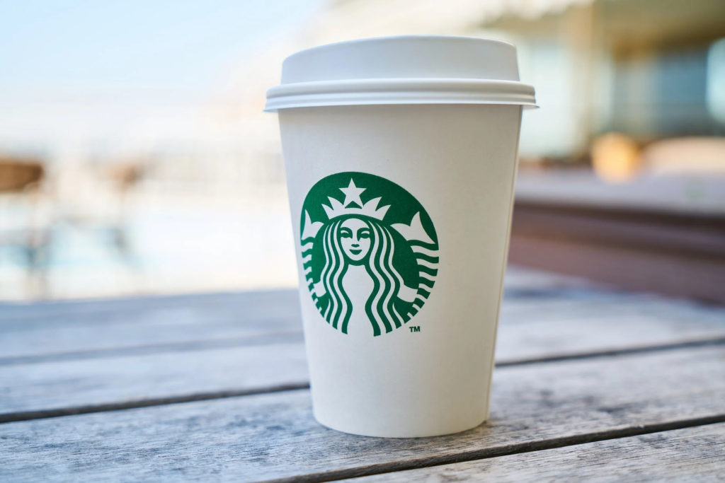
Source: Pexels
With nothing more than a white lidded coffee cup and its famous green-and-white logo, Starbucks has created an image that instantly brings its brand to mind. Your mind might even jump to the kind of order you’d place if you were at a Starbucks right now, just from seeing their iconic logo. This cup serves as both a drink container and, more importantly, an advert that immediately makes onlookers think of the brand.
This is exactly what branding should do. Truly great branding is a marketing strategy in and of itself, which is why a company should incorporate its unique branding into all of its content. Landing page content is no exception.
In general, there are two major factors to keep in mind when considering the branding of the content on your landing page. These are as follows.
Consistency
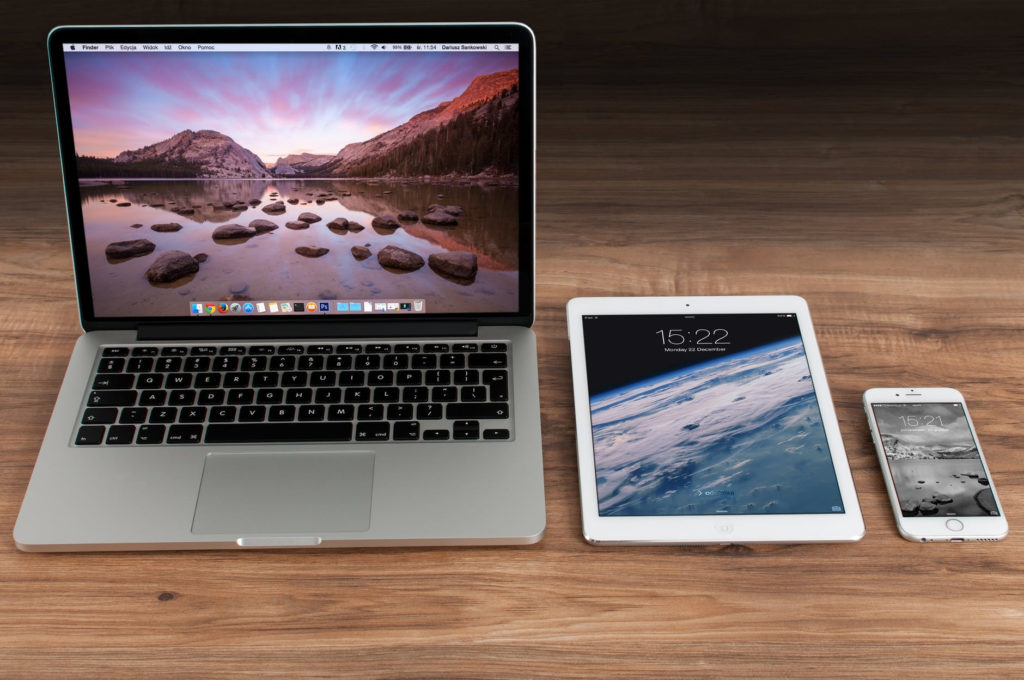
Consider the above image. Each of these products is fundamentally different from the others, and yet all three are recognizably made by Apple. Every aspect of their design has been considered carefully to make sure it’s part of the overall brand aesthetic, rather than just existing on its own.
That’s a perfect example of consistency done well. The more consistent your overall branding is, the more recognizable your brand becomes – and the more memorable it will be to any potential customers.
In terms of landing pages, the branding found on them should be consistent and congruent with the rest of your marketing strategy. The branding should, in other words, gel. The more smoothly you can make the landing page content’s branding align with all your other branding, the more your landing pages will feel like organic extensions of your brand.
We’ll come back to this point later to consider it in greater detail. More specifically, we’ll be looking into how to create that sense of consistency; for now, what counts is that consistency as a concept is crucial.
Message
Your branding should be focused on sending a singular, clear, and concise message. This message should be incorporated into, and align perfectly with, your mission statement. However, unlike your more detailed mission statement, it should be short and simple enough to fit into a single screenshot if it’s written out.
Here’s a helpful example of an article that conveys a clear message.
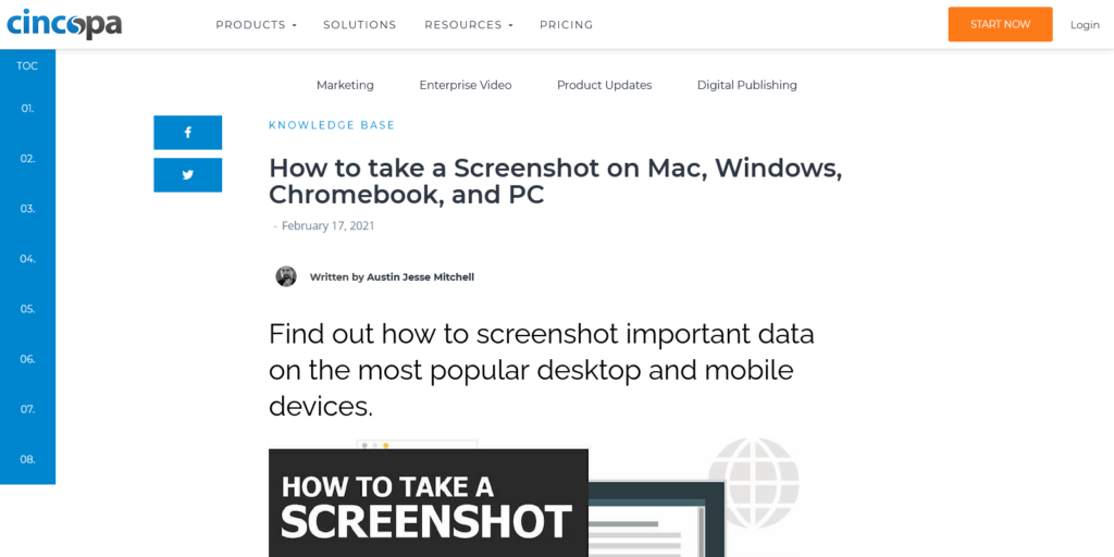
The title and first heading immediately let you know what you’re in for once you click onto the website. This page’s mission is to help you take screenshots, and their message is that they’re going to show users of the most common devices how to do that. The page tells any onlooker this within seconds of landing on it.
That’s the same thing your landing page content should be achieving: the clearer your overall message is, the less time customers will have to spend trying to figure out what they’re signing up for. That frees up time for them to spend browsing your products once they’ve provided you with their information on the landing page they were directed to.
Branding and Landing Pages
Now we’ve seen how branding is all about sending a clear message that your company should direct to consumers and/or clients. The next step is taking that knowledge and applying it very directly to the creation of your landing pages.
Branding should shape everything about your landing pages, from their content to their URL. To that end, we’re going to return to a previous topic.
Crafting a consistent image
Consistency is key when you’re in the process of creating a landing page, as we’ve discussed in this article. That consistency should be present throughout all aspects of your company’s branding, including but not limited to the following.
Fonts
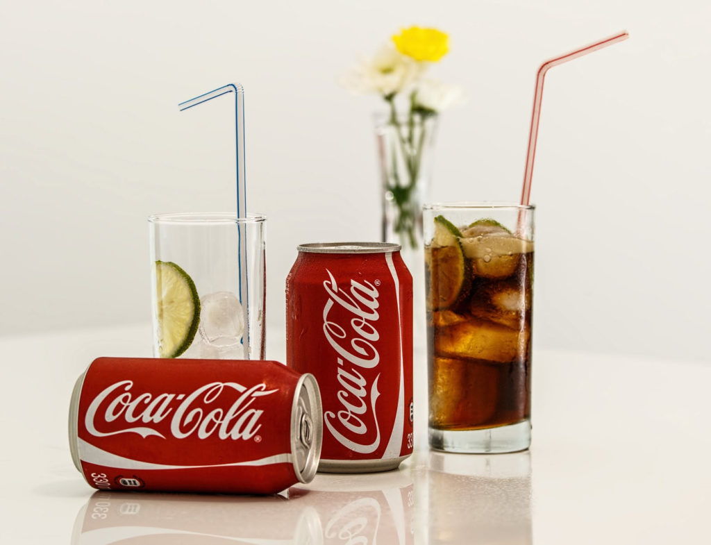
Fonts are a significant – yet often overlooked – aspect of brand identity. Just look at the image above. Would those cans be as instantly recognizable if a simple font like Arial had been used to write “Coca-Cola” on them? Of course not, because the brand’s specific font choice is iconic enough to be known no matter what context it’s placed in.
If your landing page uses fonts that don’t appear throughout the rest of your branding, then that landing page will seem incongruent with your company. Just by making sure all your headings and body texts consistently use the same fonts across your products, outlets, and other forms of content, you can strengthen your brand identity and help your company stand out. That’s why it’s important to strive for consistency.
Colour schemes
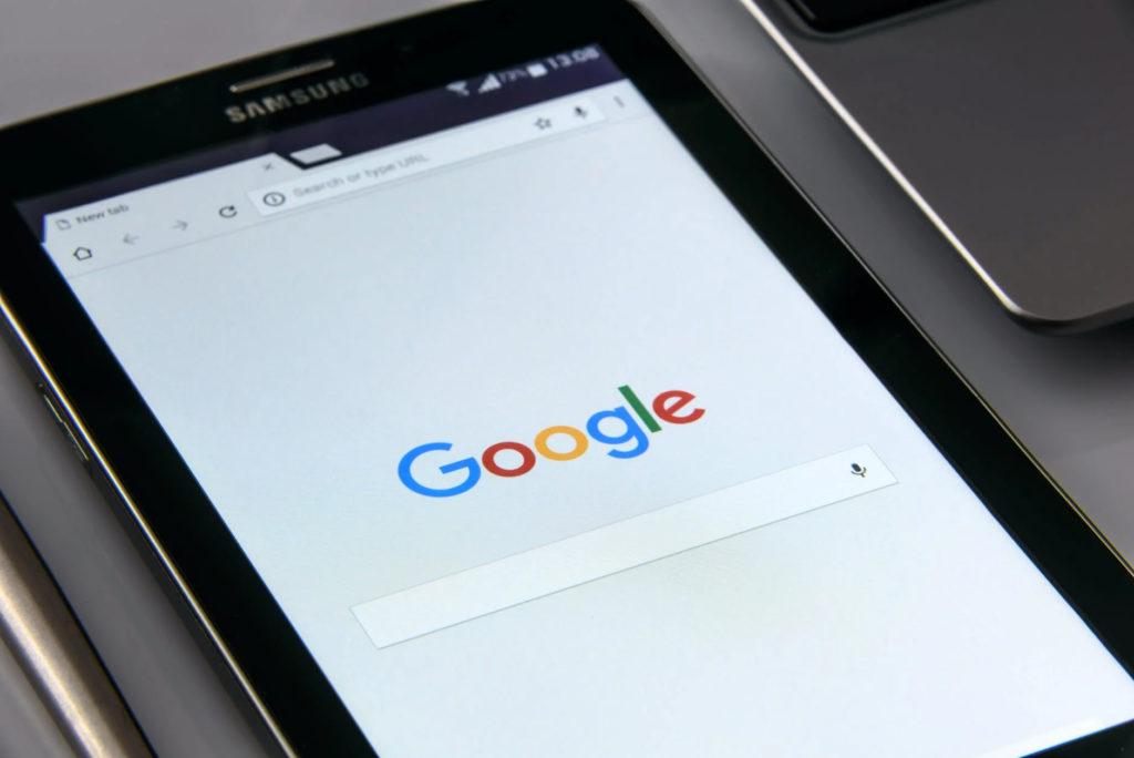
Though Google’s font has changed over the years, its color scheme has always remained perfectly consistent. When you see those six letters in that specific color sequence, your brain makes the immediate connection and tells you this is Google’s homepage that you’re looking at.
Of course, color schemes should be consistent across more than just your brand’s logo design. All websites, apps, and any web app associated with your company should use the same color scheme. Your landing pages should be doubly careful about following that pattern.
A landing page that deliberately uses the same colors in the same way as the rest of your branding (for example, a specific shade of dark blue as an accent color) will look like it belongs with the rest of your content. That’s why your landing page content must be rendered in the right color scheme to make it fit with your brand identity.
Logos and images
Few logos are as iconic as McDonald’s’ golden arches. Your brand’s logo should strive for a similar effect, providing an instant reminder of exactly what your brand represents.
The kinds of photos that can be found on your digital platforms should be consistent throughout, including but not limited to your logo iconography. That way, whenever they have a good experience, they’ll associate that positive feeling with your brand.
Landing pages are no exception to this rule. It’s important to ensure that your landing pages contain at least one tactically placed logo, as well as photographs. These photographs should match the color scheme, layout type, and overall style your brand employs. That way, customers who end up on one of those pages will instantly recognize your brand based on your landing page content.
Cross-platform consistency
A separate but equally important aspect of creating a strong brand identity lies in your brand’s consistency across different platforms.
Digital apps and social media are becoming increasingly popular ways to connect with customers. With this rise in multi-platform marketing, there’s been an increase in the importance of ensuring those platforms link together to create a bigger picture – so much so that around 63% of people list brand consistency as a factor in choosing where they’re going to spend their money.
Any given landing page doesn’t exist in isolation. It necessarily interacts and engages with your other platforms, especially your social media outlets, which will often be the medium through which your consumers land on those pages. This is what makes it crucial to ensure your consistency extends across platforms.
To that end, it can be helpful to look into an integration platform as a service. These exist to connect disjointed bits of software and deliver a unified solution to customers. This can help you create a more unified brand image across platforms.
Once your brand image is consistent throughout those platforms, and once your landing page is consistent with that branding, you will be able to project a stronger sense of identity to your customers.
This makes your brand more memorable. That’s especially important because landing pages should be one part of your brand journey, and they’ll only become more effective as the rest of that journey increases in quality.
Connecting with customers
Now we’ve established the importance of creating and pushing a consistent brand image across platforms, including landing pages, it’s time to look at another aspect of crafting the ideal landing page content. This is the page’s ability to connect directly with customers.
Landing pages are designed to create conversions, or in other words, to transform potential leads into repeat customers. They’re supposed to encourage customers to take action and trade their details for special deals, promotions, or other types of offers.
One way they can do this is by creating an opportunity for the brand to connect directly with its consumers. Fortunately, there is marketing automation available that allows landing page visitors to fill in forms that will automatically get routed to your CRM software.
The Value of a Well-designed Landing Page
The thing to keep in mind as you craft your landing pages is that they’re fundamentally different, and yet closely connected to, your main website.
A company’s website should have lots of information available – more than anyone looking for just one promotion or deal would need right away. The whole website should provide information on the brand itself, the company’s mission, individual products or services, and so on.
A landing page, on the other hand, exists for the specific purpose of encouraging customers to take action and provide their details in exchange for a promotion or deal.
In other words, landing page content is more specifically targeted than the content you’d find on the website as a whole. Landing pages should show the value of your brand but not provide its entire story or ethos in one place.
With that said, a landing page and its content should still fit into the brand image as a whole. It should still incorporate the brand’s overall message and adhere to all aspects of the brand’s established style, thereby creating textual and visual consistency.
A truly great landing page does more than just call customers to action, although it should do this as well. What sets excellent examples of landing pages apart from their competition is their ability to linger in a customer’s mind and to be an organic part of the brand journey.