Coming up with a landing page design that hits your conversion goal isn’t easy. There are simply too many factors to consider. The call-to-action button, landing page copy, value proposition, and colors are just a few page elements you’ll need to consider.
So what are some landing page best practices that’ll get users to take the action that you want?
Let’s talk about the landing page strategies that have worked for other online marketers, agencies, and businesses. Using these best practices will help you convert visitors into leads more efficiently.
In this article
- Building Landing Pages
- Have Simpler Form Fields
- Use a Scrolling CTA
- Do A/B Testing
- Have Social Proof
- Use Contrasting Colors on CTA Buttons
- Optimize Your Landing Page for Speed
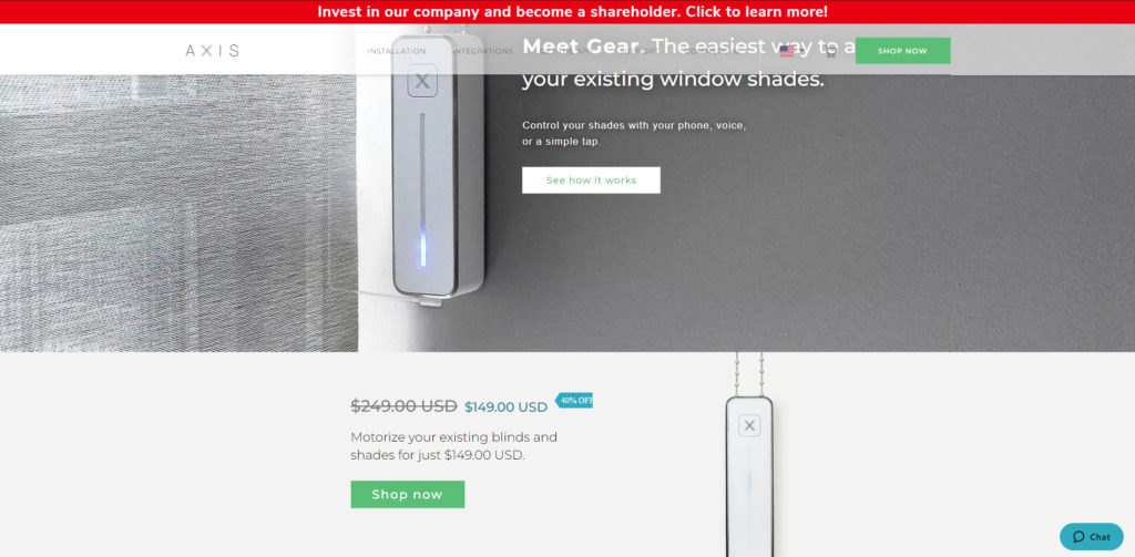
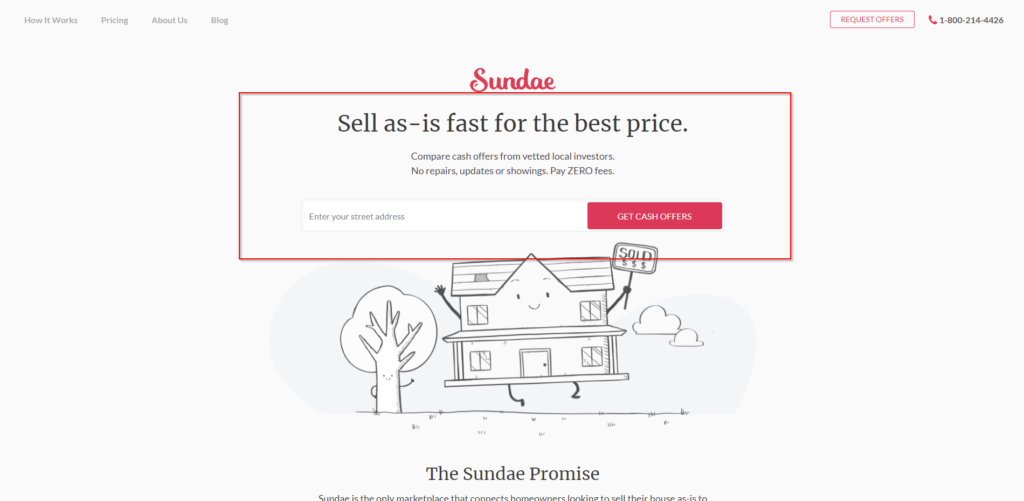
- Place Important Copy Above the Fold
- Add a Thank You Page
- Keep SEO in Mind
- Support Your CTA with Copy
- Have a Landing Page That’s Relatable
- Say No to Distracting Copy and Images
Building Landing Pages
None of these landing page optimization best practices would work if you don’t have the means to build landing pages in the first place.
Here’s the good news:
You don’t need to hire a web designer to create a landing page for you. You don’t even need to know how to code using HTML or CSS either. There are products and services that empower you to make custom landing pages on your own.
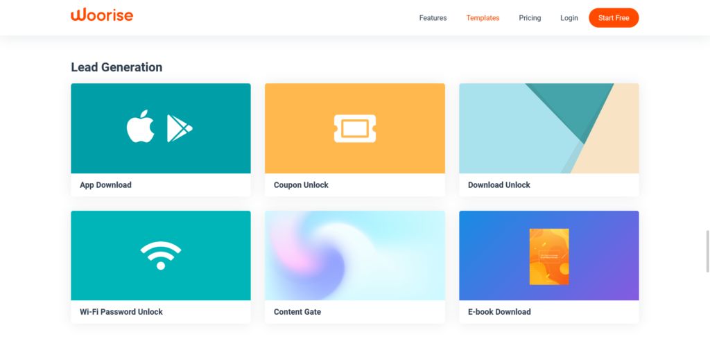
If you’re using Woorise, there are plenty of landing page templates for a quick start. Woorise is perfect for building custom landing pages with content block elements. The Free plan gives you access to hundreds of mobile-friendly pre-designed templates that are conversion-optimized to help you generate leads for your business.
Trust us — once you learn how to create a landing page on your own, you’ll be able to attract your target audience and increase your conversion rates.
If you want to have more website visitors, then it’s important for you to pay attention to every design element on your landing page. Here are a few best practices to make your landing pages much more powerful.
Have Simpler Form Fields
As a rule of thumb, you want to simplify your lead capture form by only asking for important information. Your call to action (CTA) shouldn’t discourage customers from abandoning your sign-up process.
Visitors don’t like filling out a form. But if you have something great to offer in return, they’ll put up with it.
However, you don’t want to push your visitors to their limit. You should make your calls to action straightforward. This is the key to having a good conversion rate.
How can you make your landing page simpler and more accessible?
- Have fewer fields to fill out. Most forms only require the visitor’s name, email, and phone number. But it all depends on what kind of data you need. So pick which details are the most important to you.
- Make mobile-friendly designs. Most users access landing pages on their phones or tablets. So when you build your sales pages and forms, make sure they load properly on mobile devices.
- Use drop-down menus. A drop-down menu can help customers sign up faster. So add them in your form when applicable. However, you only want to use them sparingly. Too many options can turn off a potential customer.
- Leave out personal questions. Nothing scares a customer more than being asked for their personal information. Set the boundary. While having more data can help you sell more goods, resist the temptation to ask for important personal details that you wouldn’t give yourself.
Use a Scrolling CTA
Where you place your CTA is also an important element. It’s one of the things that marketers struggle with. Do you place your CTA on top or the bottom of a landing page?
This is no longer an issue since you can now use scrolling CTA buttons. Regardless of where a customer is on the landing page, the CTA will remain visible. Users can click on it right away at any point.
It’s a gentle nudge, reminding your customers that they can take action anytime. It also makes it more convenient for users since they no longer have to scroll back up or down the landing page. This little change helps your conversions to go higher.
Do A/B Testing
A/B testing, in simpler terms, is copying a landing page and making small adjustments to see which version gets more conversions. For example, one page could have a blue CTA button while the other one has red.
The goal is to find out which landing page has less bounce rate and use it moving forward.
There’s plenty of design elements that you could test through this method. Another example would be using a countdown timer. You could see if this improves conversions or not. You can see what happens if you remove navigation and replace background colors.
It’s also vital for improving your copy. The right kind of content will encourage users to click through. It gives users directional cues as to what they should do next. If your current content isn’t working for you, then making copy changes and testing them will let you realize if that is indeed the problem.
Have Social Proof
Social proof gives visitors a reason to trust you. This doesn’t just refer to your social media profiles — although having a strong presence on different platforms certainly helps.
When we talk about social proof, it refers to having awesome online reviews and recommendations. You should have a good number of people buying your products. Getting influencers in your field rave about your brand is another example of having proof.
It’s anything that lets a customer know that you’re a legitimate operation.

Display your proof on your landing pages. Insert elements like ratings, number of satisfied customers, and popular clients. This will give your visitors the peace of mind they’re looking for.
If enough customers prove that you can be trusted, then potential leads would have no issue filling up your forms. Your goal should be to make them as comfortable as possible by providing evidence of your trustworthiness.
Use Contrasting Colors on CTA Buttons
You have to make your CTA button stand out from the landing page background.
You’ll have better results if your design highlights the action that you want users to make. Using CTA colors that pop from the page helps draw the user’s attention.
Using a contrasting color, button copy, font and button size, as well as making the right offer will work together to increase conversions.
Optimize Your Landing Page for Speed
Every second that your visitors have to wait for a page to load is an opportunity for them to click away. So if you want to hit your conversion goal, then you’ll have to find ways for you to decrease your page load time.
There are different ways to do it.
- Reduce your image size. When you use high-resolution images, they tend to have large image sizes. And the larger the size, the more time it’ll take to load. There are apps, plugins, and services that let you reduce image size for free. Try using any one of them to help pages load faster.
- Get a reliable web hosting solution. You’ll experience slow load times if you go with a terrible web host for your landing page. So do your research and find a provider with reliable uptime.
- Clean up your code. If you’re not familiar with HTML, CSS, and Javascript, then you might need to find someone who can help you. Have someone minify and combine your files. These are processes that can help reduce your website’s file size which in turn improves your load times.
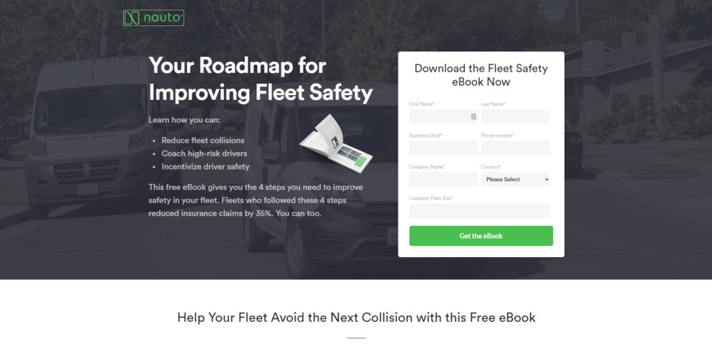
Place Important Copy Above the Fold
The most valuable space in a landing page is the top because it’s the first section that website visitors will see after the page loads. So naturally, this is where you want to put your most important copy including your CTA button.
You should make it clear right from the start what you want your users to do and what they will get in return.
The rest of the landing page could be reserved for your testimonials, product images and descriptions, case studies, and other supporting information.
Landing page design best practices include leaving the top of your page uncluttered. As much as possible, you should only state your offer and a contact form where visitors can leave their details.
Add a Thank You Page
Thank you pages are not just for showing gratitude. A thank you page can also serve as visual confirmation that you’ve received your visitor’s information. And you can also use this to inform your lead what they should expect from you.
You can also use it to point the user to other sections of your website where they can find details about your brand and services.
Keep SEO in Mind
We can’t talk about landing page best practices without discussing search engine optimization (SEO). You’ll have far better conversion rates if you optimize your landing pages for search engines.
Here’s a list of what you can do to improve your SEO performance.
- Customize your URL. Landing pages can have custom URLs. Instead of ending your URL with a random string of characters, edit it so that it includes your target keyword.
- Improve your metadata. You can also edit your title and description to include relevant keywords. Not only will this improve your chances of ranking higher on search engines, but it also helps visitors to see what your page is all about which leads to more clicks.
- Use descriptive image file names. What you name your image files has an impact on how they’re seen by search engine crawlers. You can also insert keywords here. If you’re familiar with image alt tags, you can add keywords there too.
- Get backlinks. Having people link back to a blog post or article helps it rank better on search engines. It’s the same with a landing page. The more people link to any page, the better its chances of ranking.
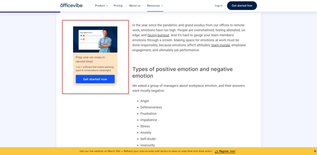
Support Your CTA with Copy
You can also try inserting additional copy before or after your CTA. This helps drive your point home.
As mentioned earlier, most users access landing pages on their mobile devices. That means they can only read copy in chunks. They’d have to scroll up and down your landing page to catch all the details.
So when you introduce a CTA, it’s better if you try and recap all the important points. Remind visitors why they’d benefit from signing your forms. This is one of the landing page best practices that could differentiate you from your competition.
Make your mobile landing pages better by adding supporting copy beside your CTA.
Have a Landing Page That’s Relatable
People won’t sign forms if they can’t relate to you and your business. Think about your target market and design your landing page after them.
In short: Have a landing page that people can relate to.
If you’re targeting younger people, then select a color that speaks to that generation. The same concept applies to business professionals or seniors.
Your content’s tone should also match the age, sex, location, and education of your prospects. You must make them feel that you are one of them. You need to lead by example through landing page copy.
Another strategy is to use testimonials that make your product or service relatable. Show them how your other customers benefited from what you have to offer.
Say No to Distracting Copy and Images
It’s so easy to find yourself inserting more ad copy and images than necessary. But while you might think that all of these are useful, there’s a good chance that trying to say too much might turn off your readers instead.
Conversion is all about sticking to one idea and selling readers on that idea.
Saying more than you should will only distract people. So don’t have multiple call-to-actions. And don’t insert more images than needed. Say more with less.
You should also stay away from visual effects, background videos, GIFs, and animations.
A simple landing page with one clear call-to-action is all you need.
If you think you’d greatly benefit from having a video, don’t make it part of your background. And don’t have it play automatically. Leave it to your users to click play if they want to. That way, it won’t distract them from the call-to-action.