These days, it’s almost a necessity for businesses to have some form of an online presence. In the age of digital marketing, companies that wish to grow have to adapt.
The quintessential online platform is, of course, the website. This is despite the availability of numerous social media platforms. You can pin this down to the fact that websites offer a lot more freedom for the business.
The thing is, having a website is not the end-all-be-all that many think it is. Just because you’ve got something pretty online doesn’t mean your conversions will be any better.
In this article
What is a landing page?
A landing page is a place that your visitors arrive after clicking a link from another email or webpage.
Landing pages have a specific purpose and intention. They provide just enough information to keep the prospect interested, while enticing them to take more action.
At the end stages of a sales funnel, this action can include placing an order.
However, in earlier stages it could include generating leads by making a request for an email address or by using a lead generation quiz, which can also help to increase engagement.
Landing pages are standalone web pages that have a clearly defined purpose.
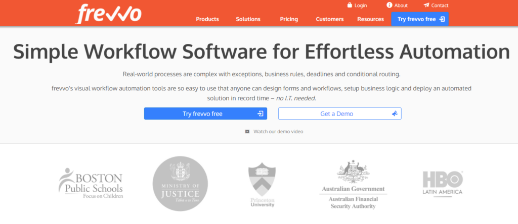
A great example of this is the Frevvo website. This organization provides simple workflow automation and has a very clearly defined landing page.
As soon as a visitor arrives, they understand what Frevvo does and who their customers are.
They even promote the fact that their solution requires no IT skills and prospects can get a free trial to see if it’s suitable.
All possible questions are quickly answered helping drive further engagement.
Can your landing page be your home page?
A company’s homepage is designed to offer visitors a simple overview of the organization. It is a means of showcasing your products and services in a detailed, yet attractive manner.
A landing page is different.
With a landing page, you’re looking to accomplish a specific goal.
Landing pages need to be targeted to an appropriate audience through the information they contain.
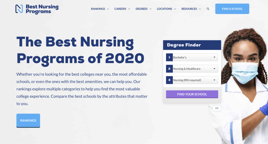
They also need to have a clear Call To Action (CTA) that leads prospects onwards. Like the example below from Best Nursing Programs, you have three CTAs that help their site visitors to directly find the information they are looking for.
Why is a landing page important?
A landing page is an excellent tool for converting prospects into customers.
With a landing page, you’re giving shoppers a clearly defined goal and asking them to take a very specific action.
For a landing page, anything that takes away from this intention is removed. That means features like menus or links should not be included.
You can see this in action on the Joy Organics website.
Here, a very simple landing page promotes a special offer at the top and provides shoppers with purchase options while giving them access to a chatbot for any questions they might have.
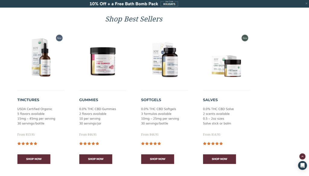
This is a great example of how an ecommerce website should look.
However, remember that landing pages are not replacements for your website or online store.
Rather they are tools that can be used by marketing teams to increase conversion rates when promoting specific products or services.
The right landing page helps introduce shoppers to your company and transforms them into leads that you can feed through your sales funnel.
A good landing page is an excellent investment for any business.
The Next Step
The assumption that leads many websites to stagnate is that people find the website the same way every time. Site owners forget that some people will find their site through ads, search queries, or even shared content.
What does this mean? Well, all these people might be expecting to find something different, depending on their point of origin.
Let’s say I’m scrolling through Facebook and I see something that your business shared. I’m interested, but maybe I want to learn more about the business. So I click the link that you’ve included.
To my surprise, I find myself on your product page. To me, that might seem a little too aggressive. This is why a lot of successful businesses make use of landing pages.
A landing page, ideally, welcomes and introduces you to the business. Once you have their interest, your new challenge will be how to retain them.
Some websites have gotten away with making their homepage their landing page as well. A better way would be to dedicate a specific page that ties in with the link that brought the visitor there.
So what makes a good landing page? Well, as in many cases, it’s hard to pin it down to one thing. That’s why we’ve compiled a list of best practices (with examples) to guide you along your way.
Note: The examples presented in each point excel in more than just one attribute. You will notice that there will be commonalities between each one.
1. Know Your Audience
A proper welcome means knowing what your audience prefers. The question is, who is your audience?
Defining and analyzing your target audience will allow you to strategize efficiently here. Do you know the niche with which you’re trying to communicate? If so, do you know what they’re preferences are?
There are a couple of different ways to go about this. A few easy ways:
- Surveys
- Competition research
- Consulting firms
- Community research
These are just a few examples of how you can address the situation. The fact of the matter is, you need to know how you’re going to package your message.
With a more personalized touch, the customer will feel that this page was designed just for people like them.
You can imagine what kind of effect this will have on your conversion rate.
Landing page example
Let’s take Bills.com as an example. For those who don’t know, Bills.com is a financial consultancy that helps customers manage their debts and such.
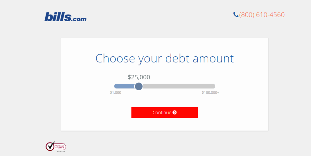
Off the bat, they ask the site visitor for the estimated debt amount. Hitting “Continue” will bring you to the next question (“Are you behind on your payments?”. This is a great example of how landing pages don’t have to be static things.
Instead, Bills.com opted to have a landing page that adapts to the customer. This way, they will know your situation and how to help you. The page itself gathers data from the customers (albeit in a secure manner).
Debt is a commonly understood issue and Bills.com is able to get straight to the point with this one. Get creative with your landing page and you can find new ways of bringing people in.
2. Define Your Brand
Another factor for the end product is your branding. What kind of brand are you? Knowing your brand will help you with the construction of the message on your landing page.
Why? Well, because your landing page will have to reflect your brand. Remember that the landing page is where people will end up after following an ad or promotional link.
With that said, you’ll want to make sure that they’re greeted appropriately. It’s important to ensure that whatever is on your landing page is consistent with your brand message.
Some things to watch out for:
- Page layout
- Language or speech pattern
- Brand goals
Keep in mind that these are just a few of the things that affect your branding. The point is that your landing page just might be the first page from your site that people will see.
You want people to know what they can expect from you and your business.
Landing page example
Let’s use Khan Academy as an example. They have provided a great example of how a website can use its homepage as a landing page.
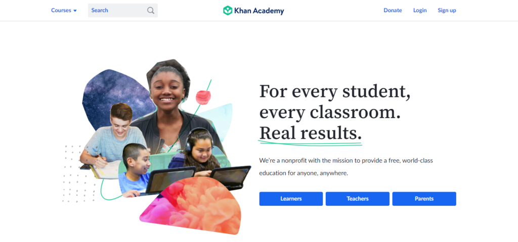
It’s not hard to see why this one is effective. The message is clear and direct with no chance of getting things mixed up.
The branding of Khan Academy is immediately apparent. From the layout to the images, all the way to the phrasing. You can already tell that quality education is the priority here.
It should help that they state their status as a non-profit educational website. With that, site visitors will know right away what to expect. Take a look at how each phrase is typed out.
What helps as well is that they immediately direct traffic depending on who the visitor represents.
3. Keep Things Simple
It might be tempting to flood your landing page with loads of information to entice your site visitors, but it can be easy to overwhelm them.
That’s the last thing you want to happen. You’re trying to get these people to subscribe, register, or what have you. Overcomplicating things will just make them click “back” on their browser.
With landing pages, you’re basically channeling visitors toward you. With this in mind, craft your landing page in such a way that it leads people.
It’s about making things simple for them. That way, they know exactly why they’re there. This is why a lot of sites use multiple landing pages. Each landing page will target a specific branch of the audience.
Landing page example
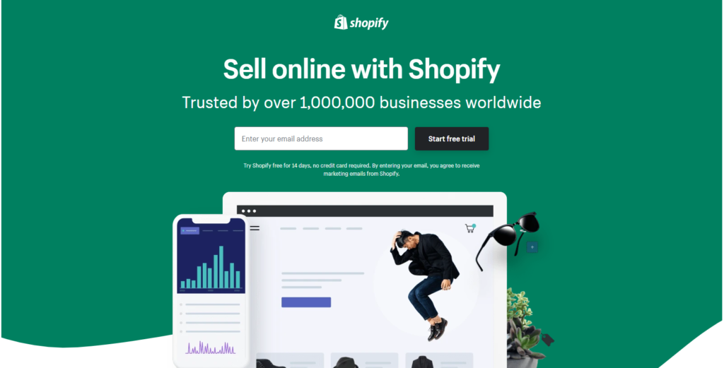
Take a look at this landing page from Shopify. It doesn’t take a genius to figure out who this one is targeting.
This is what we mean by keeping things simple. Have a few graphical designs over an aesthetic background. Other than that, only the necessary information should be on the page.
Shopify does this well by:
- A clear message at the top, “Sell online with Shopify”
- Followed by a form of social proof, “Trusted by over 1,000,000…”
- Clear CTA button beside the single entry field, “Start free trial”
It shouldn’t be hard for you and neither should it be hard for the audience. Oftentimes, simplicity is key with landing pages.
A simple tip here is to put yourself in your target audience’s shoes. This is why prior market research is important as well. With a proper understanding of their needs and wants, a proper strategy can be put in place.
4. Keep The Layout Clean
Similar to the previous point, you don’t want to leave your landing page looking like a big mess. Having a clean landing page will benefit you in that it forces the customer to look at what counts.
This means leaving only the necessary details on the page. You might be tempted to use the page to advertise all your products and services. That won’t do. For landing page best practices, you’ll want to keep things organized.
It helps when you know what to offer. That way, you can direct your focus toward what’s important.
Landing page example
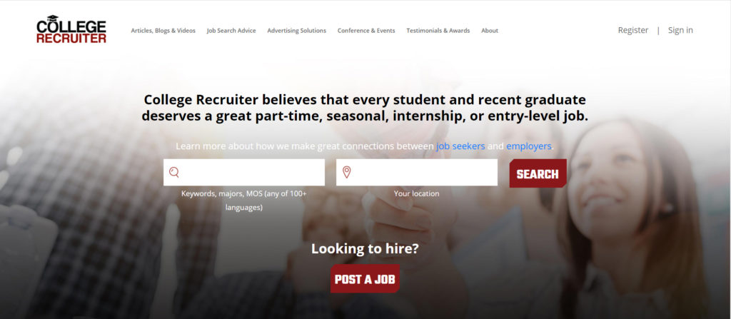
Here we have the product of outsourcing. CollegeRecruiter chose to limit their risks by hiring a website design company to create a homepage/landing page combination. In this case, it was executed perfectly.
Keep in mind that this is the site homepage. Normally, homepages would have all manner of advertorial and informational content.
CollegeRecruiter, on the other hand, prioritizes their service above-the-fold on their site. All the other content was pushed to the lower half. This is a perfect example of outsourcing done right.
CollegeRecruiter chose a firm that understood their vision and their needs. Additionally, being a WordPress website, College Recruiter outsourced to a firm that can work with WordPress website design.
Remember, it’s about what your site needs.
5. Don’t Stick to Text
If a salesperson came at you with a flyer with walls of text, you’d probably be bored with it right away. The same goes for landing pages.
Landing pages are meant to entice potential customers. Boring them won’t be the best way to do that. Instead, don’t rely on pure text. Yes, the goal is for them to be informed but too much is too much.
Get creative! Use a couple of photos or graphic images. Videos won’t hurt, but they increase loading times. The best is to know what’s most applicable in your situation.
Landing page example
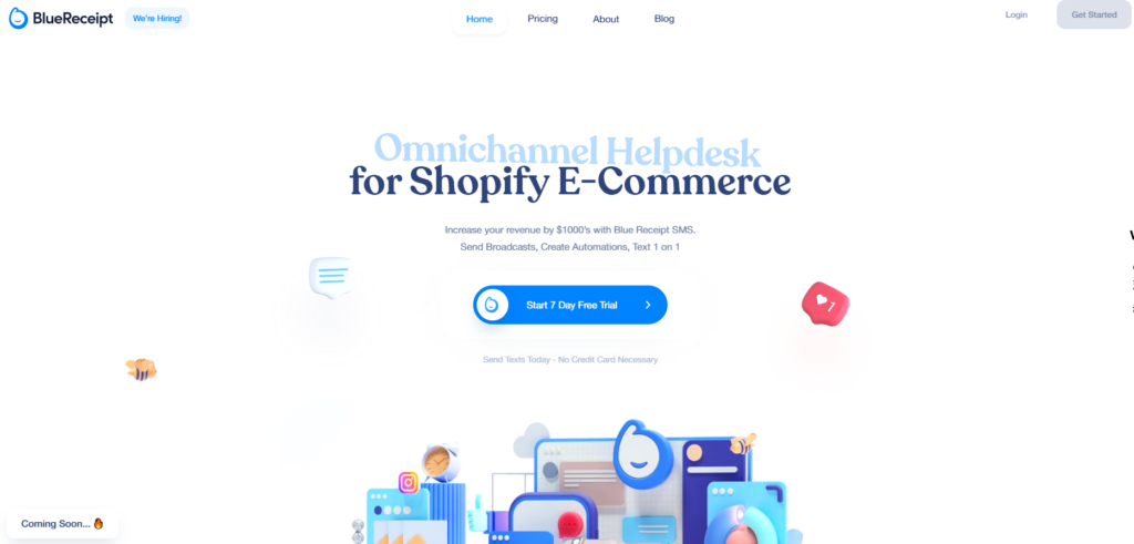
BlueReceipt is a Software-as-a-Service (SaaS) that aims to help e-commerce businesses. It would be so easy for them to overwhelm their audience with information about each possible connection.
Instead, BlueReceipt summarizes the service and uses the resulting negative space for some simple graphics. As you can see it’s nothing complicated but it helps balance the layout of their page.
Again, graphic images can be as simple as seen above. There are online tools to help you create simple graphics like the one above.
A few examples are:
- Canva
- Easil
- Picmonkey
- Pablo
These are just a few examples. If none of the above strike your fancy, it won’t be hard to find alternatives.
6. Show Them Who Trusts You
Kind of like having votes of confidence or referrals, having quotes from satisfied customers can help convince potential customers to listen to you.
You wouldn’t hire someone without knowing the person’s credentials, right? The same goes for your business. How does the audience know if you really deliver on your promises?
Make sure you keep a record of customer feedback. It’s a helpful way for you to advertise your business without having to spend. This time, the adverts are coming from the customers themselves.
Established clients will have the option to let you use their logo design as badges as well. It’s a nonverbal way of saying, “Hey, we’ve worked with these guys and they liked us”.
Landing page example
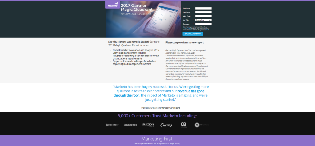
Take Marketo’s landing page as an example. For context, Marketo is a Service-as-a-Platform automated marketing platform. Above, you can see the overall layout of the page.
The middle to the top half of the page is pretty normal. You have the form, and the services offered by the business. What gives them the advantage here is the supporting info towards the bottom of the page.

By the time the reader gets toward the bottom of the page, they’re assessing the credibility and authority of the site. They know what you offer but may have doubts about whether to trust you. So Marketo addresses this by first using a quote highlighted in blue.
To top it off, they include a row filled with badges of businesses they’ve done business with in the past. You can easily see how they support their page just by including a few small badges.
7. Make Things Clear
What do you want people to do when they get to your landing page? Register an account, buy a product, or simply look around?
You’ll want to make sure you are very clear about this on your landing page. People lead busy lives and don’t want to spend more time on something than they need to.
It’s best practice to make the call-to-action very clear. That’s the button that sites highlight through bright or outstanding colors.
Landing page example
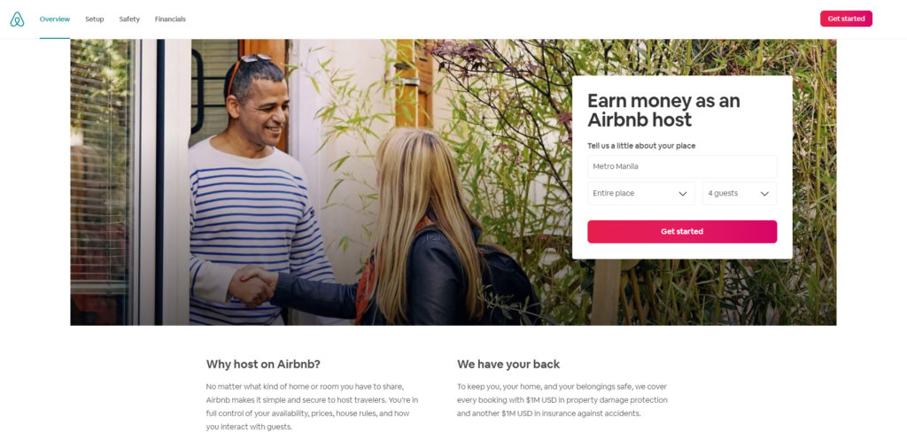
Airbnb is a great example. The minute you take a look at the page layout, two things jump at you. Their “Get Started” button on the top right and the main panel as well.
It’s simple and it’s direct. Everything else on the page just supports the call-to-action. This is what we mean by making things clear.
8. Entice With Freebies
This one is a little more simple and straightforward than the rest. Give your site visitors a little something extra. Think of free samples but with a little more “oomph”. It’s easy but may be expensive.
Admittedly, this implies investing some money or time. The great thing about using freebies is that you give your audience an added incentive just to consider your business.
Offer bonuses for registering or referrals. Free trials can be a great way for you to introduce them to the business. You can even package this as a contest for that competitive push. You’ll find that promoting these won’t be a problem.
In either case, the idea is that potential customers have more reason to avail themselves of your services. That’s because freebies always catch people’s attention.
Landing page example
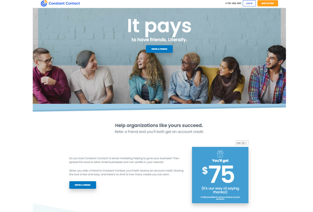
Constant Contact is a great example of this. The first thing you notice on the page is the freebie that they offer for referrals, right? It doesn’t hurt that it’s on a much larger, colorful panel in a much larger font.
Just by referring the site to your friend, the two of you can immediately take advantage of a $75 credit on the site. And $75 is nothing to laugh at in any case. It’s not hard to see why this would be an effective strategy, right?
See, it doesn’t have to be hard cash. You can offer a trial run or a sampler of your services. The point is to give them something, anything, for minimal effort on their part.
You can even develop this further. Use this as a way to outreach your services. Given certain conditions, certain small businesses or individuals can try a free product or service. It’s a way to give back to the community while improving on your company image.
9. State The Benefits
Let people know what they stand to gain. You’d think it was obvious but that’s because you’re involved in the business. Sometimes, you have to say it loud and clear.
All it takes is more attention to detail. Are you just listing down your products and services? That won’t do. Tell your audience how this can help them. It’s not even going to cost you anything.
What’s the reason for this? Well, not everyone will have the same understanding of your product information. You have to consider the fact that not everyone on the internet is coming from the same place unless you’re targeting a specific locale.
Even then, you might be limiting yourself. The best way to be sure of a high impact landing page is to state the benefits clearly.
Again, put yourself in the customers’ shoes. Try to imagine you’re seeing your business online for the first time. What are the things that would matter to you?
Answering that will help you plan for this. Give them the reasons why they should choose you.
Landing page example
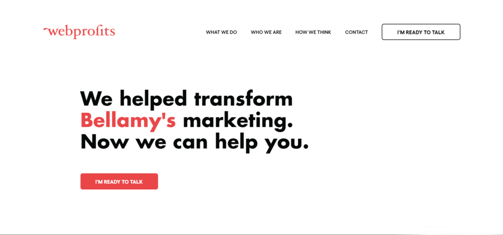
Take this landing page from WebProfits as an example. What they’ve done is a combination of social proof with the benefit of stating what they can do.
It’s not apparent from a still photo, but the highlighted word in the statement scrolls through a couple of different brand names.
You can think of this as an inexpensive way of optimizing your marketing. Imagine, just by rephrasing your message you can immediately change how your message comes across.
It’s simple and it’s effective. Try it out and see how big the differences are. We guarantee its effectiveness.
10. Offer a Solution
Sometimes, the implications of your offerings aren’t so obvious. It’s similar to the previous point but this one is factoring in the problem and how it can be solved. Go for a problem-solution formula.
The thing is, some people don’t know they have a problem. They might be thinking that whatever issues they’ve been having are normal. That, or they think there’s no solution to it.
This is where you come in. By stating the problem, you acknowledge the existence of it. Follow that up with the solution. This way, they understand their situation better and they know how they can address it now.
It gives you a professional and knowledgeable image as well. This works especially well when the problem at hand is not so apparent to the general public.
Landing page example
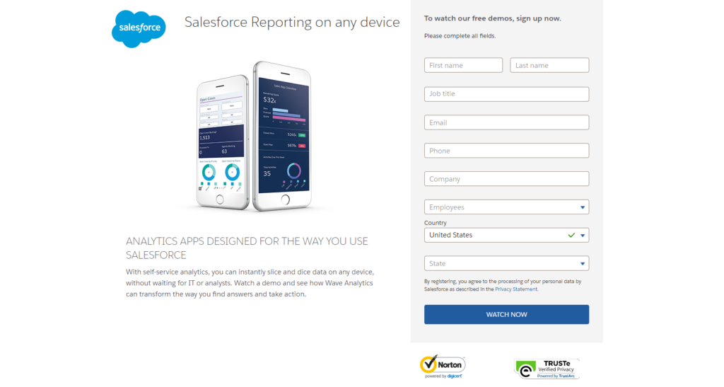
This one is a great example of presenting a common issue. Analytics have been an important aspect of sales and for the most part, people have been dependent on their PCs.
Salesforce instantly addresses that by presenting a solution offered via a common tool.
See, it doesn’t have to be a very complicated problem. SalesForce presented that problem but followed it up with a unique solution. Taken together, their solution’s impact is more apparent.
Bonus: Landing Page Design Tips You Should Follow Today
For today’s businesses, there is one absolute essential they all have in common — a website.
Companies today absolutely need a website as a way of promoting their services online if they want to find new customers and grow.
Regardless of the product being offered, potential customers almost invariably turn to the web to find information on prices, performance, reviews, and ratings.
If your company doesn’t have a website, those clients are going to go elsewhere.
However, for those companies aiming to accelerate their growth, a website alone is not enough. They need to invest in targeted landing pages to better service customers.
What makes a good landing page design?
When considering landing page design, there are a couple of different tips and tricks that you should keep in mind.
Remember, a landing page is a tool to educate shoppers.
It is often the first thing potential prospects see after clicking an ad. As such, it’s imperative that you get it right, as it is a representation of your company and you only get one chance to make a good first impression.
Define your goal
Before you get too far into the weeds on landing page design, you need to define your goal.
What exactly are you trying to achieve and how will your landing page help?
Are you looking to obtain leads, or are you more interested in sales?
Also, try to understand your audience and market.
Who is going to be coming to your landing page?
Each customer is different, so you might want to have various landing pages based on what you know about the target audience. That ensures you can give each customer a unique experience based on their wants and needs.
If you’ve defined your customers and created unique goals that are attainable, even difficult conversions become simpler.
For example, selling products in a niche like empty capsules can be hard. With the right landing page that explains the product in detail, targeted to the right audience, it becomes significantly easier.
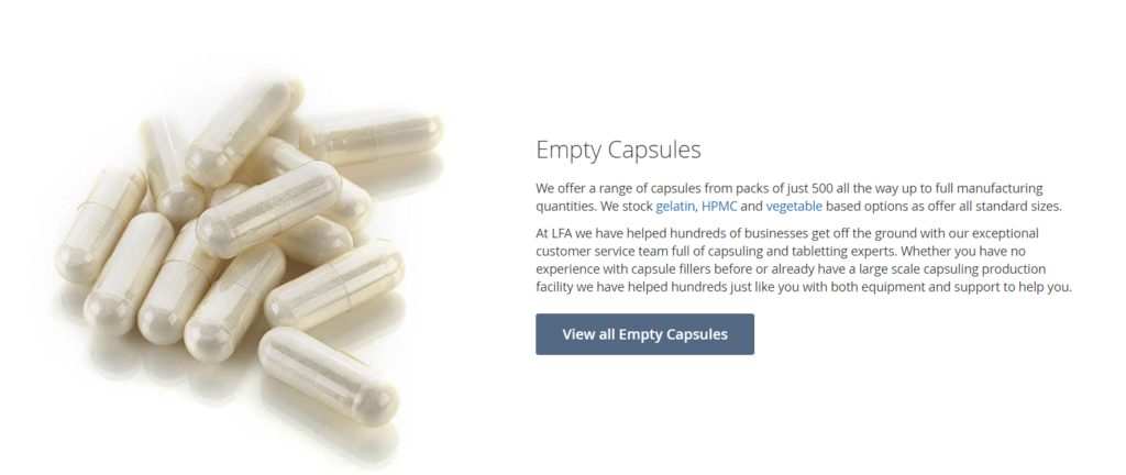
The team at LFA Capsule Fillers understands that it’s in a very niche market. They’ve optimized their landing pages with copy and calls to action that speak directly to their specific audience, instead of trying to cast a wide net.
Make it easy to find information
Your website and landing page need to be properly formatted with a simple and organized design.
If you are only just beginning to set up your online presence, consider tools like WordPress.
With simple and easy to use templates, WordPress helps give millions of companies around the world a professional look and feel.
If you do not know which template to use, check out this post by Freshbooks. They’ve listed 19 excellent WordPress templates that could help you get started.
When using WordPress or any other Content Management System (CMS) to build a landing page, always keep in mind that the goal is making things easy for prospects to convert.
To that end, all of these different elements need to be aligned with this goal in mind.
Provide useful information
If you expect a landing page to convert, you need to make sure that it provides useful information to your audience.
Email campaigns and any other marketing campaign will require a landing page that has concise and on-brand information.
A good example of this is EarlyBird. On their landing page, you can see that they do not try to overwhelm prospects with too much information.
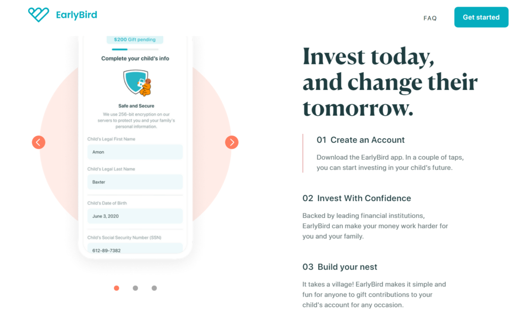
Instead, their landing page provides relevant and useful information in simple, easy to understand language.
On the landing page consider the following elements:
- Headlines and Headings: Headlines need to be eye-catching and attention grabbing. You have very little time to get a reader’s attention. If your headline misses the mark, you’re going to lose them. Use action specific words in your headlines to draw your readers in, then build an argument around the pain points you’re trying to resolve.
- Useful Information: The body of your landing page should be full of useful information. Try to use bullet points and paragraph breaks to make it easier to read. If you’re selling something, try to let your reader know that it is urgent they act now. Alternatively, if your intention is to collect information like email addresses, explain why and what they can expect in the future.
- Footer: Provide your landing page with a footer which should include your contact details. This way, your future customers know how best to get in touch if they have any questions or confusion.
- An actionable CTA: Make sure your CTA is clearly defined and there is no confusion about what action you want your prospect to take.
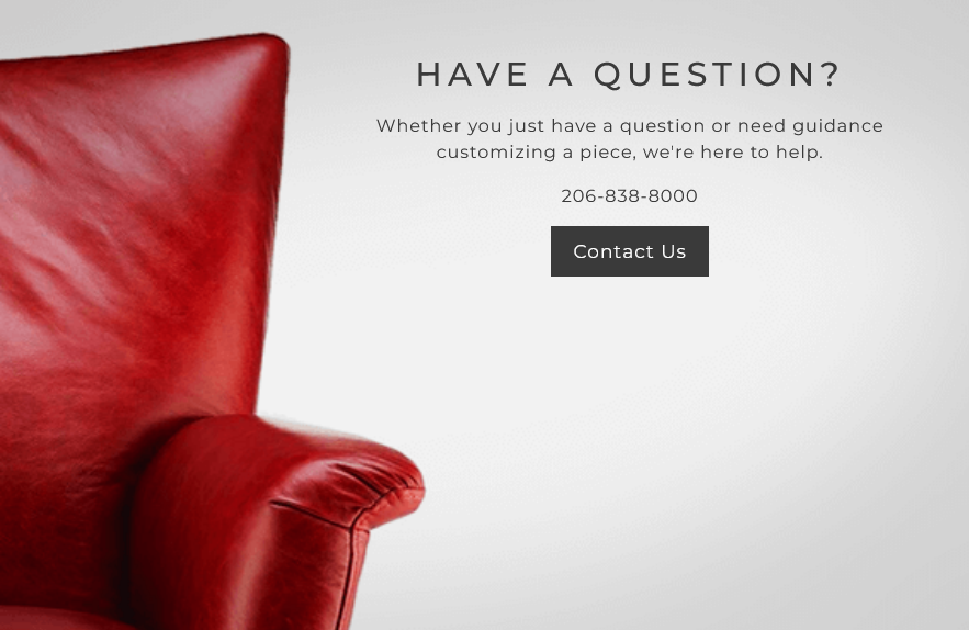
Here is a call to action (CTA) example by Kasala (a company that sells furniture) which is clearly defined what action users have to take.
Consider Color
While landing pages should have the same branding as the rest of a company’s sites, they can also have splashes of color that will help entice people.
Using different colors throughout a page can impact readers in different ways.
Blues, for example, can help readers feel more serene while reds can help build a sense of urgency.
You could also consider changing the background.
By pairing a bold color with a different font, you can emphasize details in a different way.
Images
The adage of “a picture is worth a 1,000 words” is right, but only partially so.
While an image provides a lot of information, even to a casual scroller, it needs to be the right image.
On the web, your prospects can’t touch or feel the product, so a picture becomes very useful.
Images and photos are often the only method of influencing a purchaser, so the quality of your images is of key importance.
Consider using multiple images on a page with different angles, so shoppers can visualize the item. Try to incorporate images in the real world with real people, so that shoppers can put themselves into the picture.
But be careful, having too many images can impact page load speeds. That can seriously hurt your SEO chances, so make sure they are optimized and placed correctly without overdoing it.
Use Video
High quality product videos, even more than pictures, are an excellent sales tool and method of promotion.
In fact, in some instances it is even better than text. With a video, you can demonstrate the benefits or a product instead of just listing them in words.
You can even combine the two together by detailing key points with text and using the video as a means of explaining information in more detail.
Consider Mobile Devices
Building a landing page that only works on desktops and laptops is nothing less than criminal.
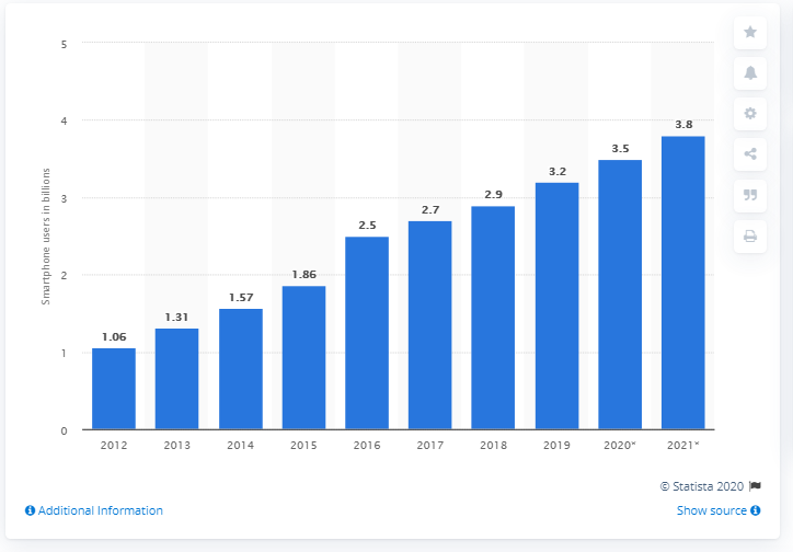
With the number of smartphone users rising every year, landing pages absolutely need to be mobile friendly.
Mobile friendly landing pages should still present the same content, but images and videos need to be resized and the overall layout adjusted for ease of use and navigation.
Reviews and Testimonials
Carefully curated reviews from customers and advocates are a great method for driving new business.
Shoppers always look for reviews from peers with similar issues and problems before buying.
By featuring these directly on your landing page, you’re helping them find information that they need before deciding.
Depending on the product, you can expand this further by adding links to case studies and other testimonials. This helps demonstrate your trustworthiness.
Consider using more subtle endorsements also like +1s and “likes” as a means of demonstrating trust. You can combine this with social media plans to further develop relationships with shoppers.
Use FAQs
Clients have questions, but by being up front and honest with your responses you can help alleviate them quickly and easily.
A FAQ or Frequently Asked Questions page on a website might start small, but over time it should grow as new questions are raised.
Often, shoppers do not want to call for help or assistance. A FAQ can provide the answers your prospects need without having to wait on a phone call. This helps improve conversions and loyalty at the same time.
Landing Pages — You Need to Have Them
A landing page is an absolute must for every organization. It is one of the most effective ways to sell a product or service.
An effective landing page is almost by itself a recipe for success. It’s where all of your efforts come to life. It’s the location where your prospects become customers and you earn revenue.
Building a landing page combines insights from psychology and marketing to build motivation for action within the prospect.
To succeed with a landing page, every detail matters. Well structured content helps drive conversion, but it also has to look and feel good too.
Follow the tips in this guide to build a landing page that converts so you can generate more leads and increase sales.