
Driving traffic to landing pages and convincing your web visitors to take action is hard — your copy, design, and CTAs determine whether or not your visitors will convert..
Your copy needs to match their intent, the design of your page needs to be easy on their eyes to guide them through your page, and your CTA needs to be simple, yet effective.
For effective CTAs, you need to think about the design and copy. Unfortunately, there is a tendency to lean heavily on “best practices,” such as button color which doesn’t always lead to more conversions.
Effective CTAs are both an art and a science, and the one that converts best for someone else might not be what you need. Understanding the principles behind effective CTAs and conducting A/B tests will guide you on what elements to include in your CTAs.
Daniel Kahneman, in his book; Thinking, Fast and Slow, talks about the Law of Least effort, our tendency as human beings to look for the simplest way to get things done.
In the context of CTAs, you want to make sure that your design and copy provide the simplest path towards solving their problems or getting what they’re looking for.
This means they should be as simple as possible such that your web visitors immediately understand what’s in it for them and what you want them to do.
Luckily, you have a bit more creative freedom than writing email CTAs, which rely almost exclusively on persuasive copy as readers are constrained to the email format.
To show you what this looks like, I’ve compiled seven examples of simple CTAs explaining the principles behind their effectiveness. Hint: It’s not limited to the button copy, placement, or color.
In this article
- 1. Woorise: Use Contrast to Make your CTA stand out
- 2. Omniscient Digital: Make your CTA the next logical step
- 3. Aprimo: Reduce the risk of time commitment
- 4. GatherContent: Reduce the risk of financial commitment
- 5. Order: Bring the CTA to life
- 6. Shipyard: Address objections
- 7. Simon Data: Use trigger words
- Simple, yet effective CTAs always drive conversions
1. Woorise: Use Contrast to Make your CTA stand out
A web visitor landing on your homepage or landing page means one of the following:
- They searched for you on Google using your brand name
- They’ve landed on your pages from an external link
- You appeared on top SERP results in the keywords they used
In each of these scenarios, some of your visitors will have a higher intent to take action. Others need more information before they’re convinced that you’re the best solution they can have.
For web visitors with a higher intent to take action after landing on your homepage, i.e., visitors who are looking to sign up for your product, make it easy for them to find your CTA.
One of the simplest ways to do that is by using contrast to make your CTA button stand out. But don’t put any color on your CTA buttons instead, use high contrast colors that appeal to the eye and make the CTA button stand out.
Similarly, there’s no best color to use on your CTA button, but you want to make sure your colors evoke relevant emotions that resonate with the action you want them to take, just like Woorise does here:
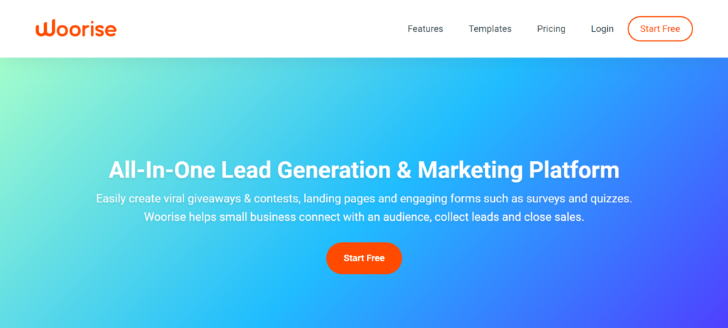
Orange is a vibrant color and denotes optimism, while blue denotes trust and honesty.
Looking at the homepage above, both colors appear tactfully where blue is the background and orange pops out as the CTA, making it stand out naturally.
When using contrast, there are no hard and fast rules. What you need to keep in mind are the emotions you want to evoke and make sure that you align the colors you use with your brand. As you will see in other examples, some brands use black as the color of their CTAs, where black evokes feelings of elegance and power, and these CTAs are still effective.
2. Omniscient Digital: Make your CTA the next logical step
Having your CTA button carry the full weight of converting your web visitors means you might end up spending an inordinate amount of time optimizing on colors and placement of the button.
It also leaves you vulnerable because if these elements don’t work, you’ll lose out on potential leads and customers.
To make your CTA more effective, go for low hanging fruits such as your copy that make it far easier for your web visitors to click on the CTA.
Your copy needs to make your visitors view the CTA as the next logical step, either through using anticipation or through interrupting their thought patterns.
Take a look at how Omniscient Digital uses a pattern interrupt in the headline of their copy, making their CTA come across as the next logical step:
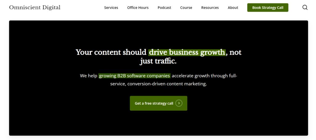
Most marketers use content as a channel to drive traffic and few take the time to link content to business objectives.
However, that is changing, given that 32% of CMOs are shifting their priorities to make content a key driver of great customer experiences and improve conversions.
For marketers, they not only have a role to prove that content will drive traffic but also, prove that content will deliver better buying experiences that have an impact on business objectives.
From there, the copy goes ahead and talks about what the agency does, and the CTA below, “Get a free strategy call’’ feels natural and makes the web visitor view it as the next logical step to take.
If your CTA isn’t getting the conversions you’re looking for, could it be because you haven’t made it the next logical step, after reading your copy?
If so, what stories are your customers telling themselves that could be false? What’s about to change and how is your product positioned to help them adapt and succeed?
Can you use the copy on your landing page as a wakeup call and make it easier for them to click on your CTA?
3. Aprimo: Reduce the risk of time commitment
We’ve already talked about the thorny subject of getting your visitors on your site and having them pay attention and take action on your CTA..
Once you’ve spent enough time creating a great CTA, crafting relevant copy, the last thing you want is half of your visitors walking away from your pages.
Most visitors viewing your content aren’t always ready to commit to you in any way by taking action on your CTA.
Commitment comes in two forms: Time and Money. When you’re using content for lead generation, then you’re asking your web visitors to commit to you through their time to consume your content.
Your content will be competing with other content they also need to consume, and to avoid losing them, provide options that reduce the risk of them feeling overwhelmed by the amount of content they need to consume. .
In this example from Aprimo, they provide a simpler option by asking subscribers to read a press release.
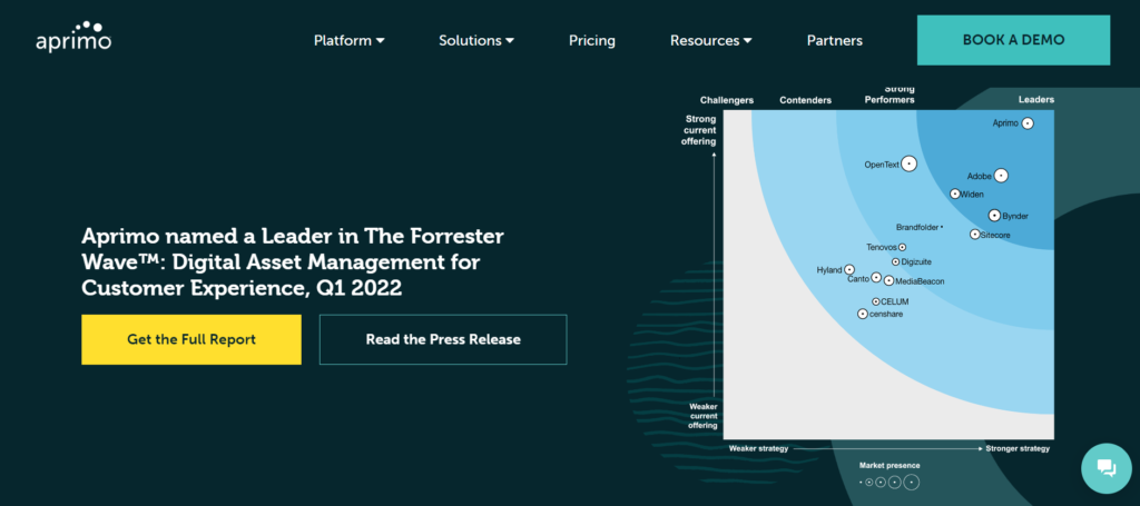
Visitors who want to read the full report are also free to do so. However, reading the press release takes less time than downloading a report to read later. When a visitor self-selects, they read a press release which also offers options to read the full report..
This is better than losing half of the subscribers who would rather not go through the trouble of providing their details to sign up and get the report.
Depending on the level of commitment you want from your web visitors, provide options, which reduces their risk. A side benefit is that these options help you filter out potential leads who are not a great fit for you.
4. GatherContent: Reduce the risk of financial commitment
Still on commitment, when your web visitors are already familiar with your brand and have spent time interacting with your content, you need to reduce the financial risks that come with buying from you.
The last thing you want is to deal with buyer’s remorse and unflattering reviews about why a customer switched over to your competitors after they didn’t have their expectations met.
That said, there’s always some hesitance to take action. At this point, you don’t want to have CTAs that push them to spend more time with you, rather, options that allow them to feel safe about spending money on your product.
For GatherContent, most visitors coming to this page below are at the bottom of the funnel,and one way to reduce the risk is by asking them to experience the product first before taking the leap.
So they provide them with two options: schedule a demo or start a free trial.
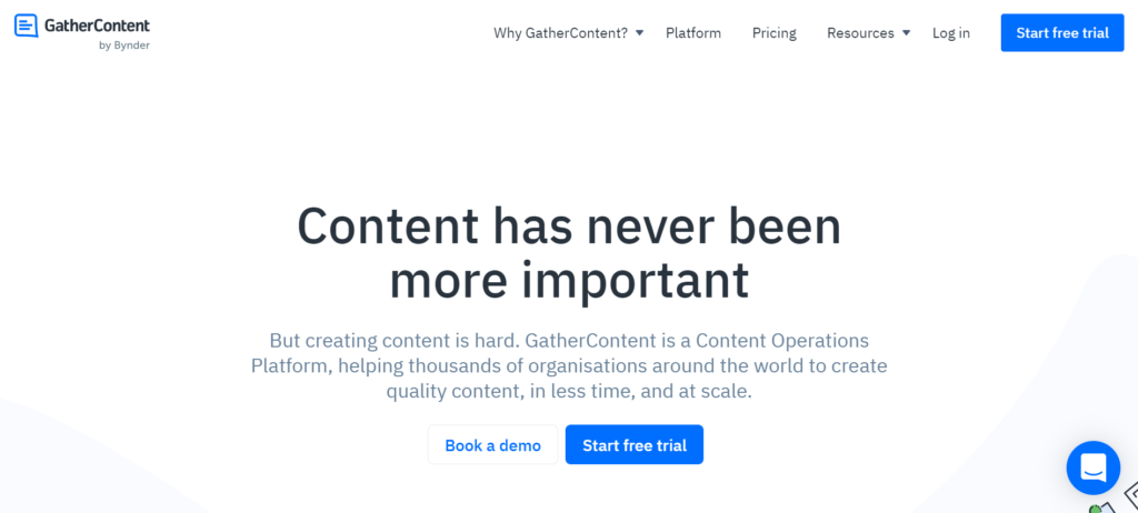
You’ll also notice the blue color on the CTA against a white background, which nudges the lead to click on it. As we said earlier, blue represents trust, honesty and in this case, safety. There’s still room for those who need a bit of hand holding, and they can schedule a demo if they want to.
5. Order: Bring the CTA to life
A simple but effective design element in CTAs is changing its color the moment a cursor hovers on it. And Order pulls it off, relying on two approaches: visitor behavior on the webpage and visual hierarchy.
These approaches drive attention to the CTA button, which comes to life by turning black once the cursor hovers on it, making it stand out.
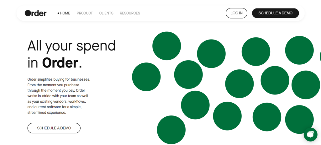
Let’s break this down further to see how it works:
Eye Tracking studies conducted by the Neilsen Norman group reveal that most web visitors interact with content on web pages in F pattern. The study revealed a couple implications for these behavior.
One is that users will skim through content looking for what they need, meaning that the copy needs to be brief and to the point, containing the most important information the reader needs.
When you look at the copy on the Orders page, it’s a total of 41 words including the headline.
To take full advantage of eye tracking movement behavior, Order has designed visual elements by filling the white space on the right with green circles.
These push the reader to look at the content on the left, which positions the CTA strategically, and comes to life the moment a cursor lands on it.
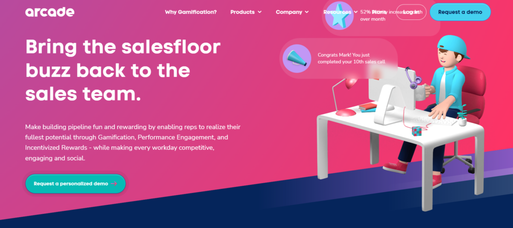
Take things a step further by using colorful illustrations that represent your target audience, just like Arcade does:
When the cursor hovers on the CTA, the arrow moves slightly to indicate forward movement.
6. Shipyard: Address objections
Before taking action on your web pages, visitors have to overcome two types of doubt: self-doubt (am I making a mistake / is this the right solution?) and doubt in your brand (are they telling the truth? Has anyone tried them out? ).
These doubts come up in the form of objections, and you need to address them in your CTA, either in your copy, or add some copy below that addresses them to make your CTA effective.
Shipyard knows that they need to do more than tell their web visitors to enter their email and get started with building workflows:

From the surface we might deduce a couple of doubts both in the product and in the prospect: Will using this tool to build workflows take up all the time I have? Do I have to start from scratch? How much do I need to spend to build a workflow?
And given that they have addressed these potential objections in the copy just below the CTA, the visitor is confident that they won’t regret signing up and using Shipyard to build their workflows.
7. Simon Data: Use trigger words
Your web visitors have a way that they use to describe the problems they have and the solutions they’re looking for.
And when it comes to improving your button copy, what works often is mirroring back the language that they use when asking them to take action.
Recent research reveals that when lawyers use linguistic mirroring, they’re more convincing and tend to win cases that are laden with facts. When two opposing sides are competing on logic, the one who can connect with the judge emotionally carries the day.
Why does this work?
When you mirror back the language that your audience uses to describe a problem and their solutions, you earn their trust. You come across as someone who deeply understands what they’re dealing with.
They also feel understood and are drawn towards liking you because you feel and sound familiar. Let’s take a cue from Simon Data a customer data company that walks the talk:
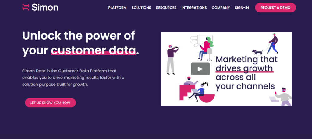
Before you decide to include words such as submit, read more, learn more, or sign up, conduct a survey and hear out your audience first to understand how they speak. Once you do this, find ways to mirror back that language to them in your button copy.
Simple, yet effective CTAs always drive conversions
We’ve talked about seven examples of CTAs that get their copy and design right, ranging from reducing risk, bringing the CTA to life, visual hierarchy, contrast, addressing objections, and more.
Each of these elements have a role to play in boosting your conversions, and the CTA you use for inspiration will depend on what you’re already doing and the outcomes you’re looking for.
Consider using a combination of each of these elements to improve conversions. For example, if you’re already using contrast on your landing pages, then you may want to make your CTA the next logical step.
Success in high-converting CTAs lies in testing different approaches to identify what works for you and then doubling down on that.