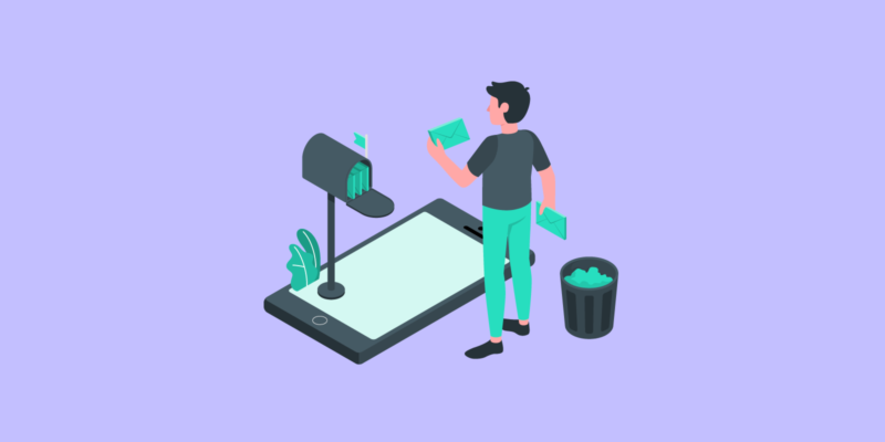
In the era of social media, emails remain a stand-tall tool for generating leads– especially for B2B companies. Today, as many as 69% of B2B businesses still use email as one of their communication channels.
The thing about email marketing is that it needs a breath of fresh air. Those bulky, text-heavy ones are no longer effective in convincing prospects to read, let alone taking action. You need to take the email to new heights by spending more effort on the design.
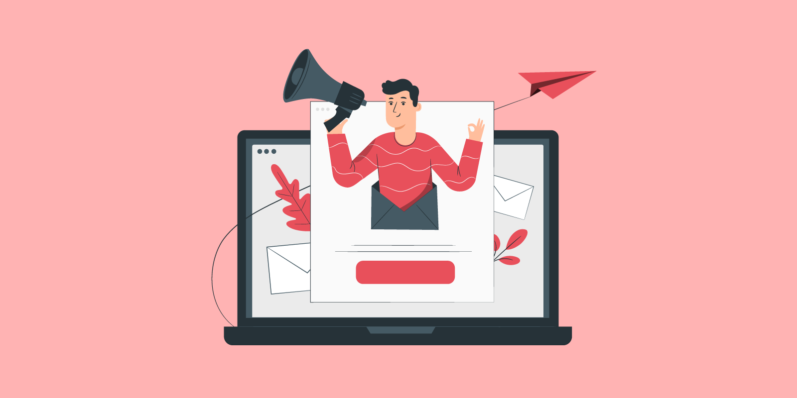
When we talk about email newsletter design, it doesn’t have to be overdone visuals that can dilute the core message or distract the readers. A great design can be as simple as a clean layout, well-organized content, and a consistent color scheme that complements the brand’s identity.
We’ll break down eye-catching, effective email newsletter ideas from other brands to inspire your next email marketing strategies.
In this article
The Key Design Elements of an Effective Newsletter
Before we get into the nitty gritty details of email newsletter ideas, let’s brush up on the basics first. So, what makes an email newsletter design great so that it hooks subscribers?
Eye-catching Header
The header is one of the first things your subscribers read after opening your email. That’s why it needs to be well thought out.
A visually appealing header grabs the reader’s attention and sets the tone for the newsletter. It should include the brand logo, a compelling title, and possibly a relevant image to make a strong first impression.
Clear and Readable Typography
The use of clear and readable typography ensures that the email content is easily digestible. Choose fonts that are legible on both desktop and mobile devices, and use a hierarchy of font sizes to guide readers through the newsletter.
Avoid larch blocks of text. A well-designed email newsletter should include article titles and a one-sentence description for each piece of content you choose to include.
Visual Hierarchy and Scannability
A well-structured visual hierarchy guides readers through the newsletter, making it easy for them to scan and locate important information. Use headings, subheadings, bullet points, and whitespace to break up content and create visual cues.
Consider putting your email content in blocks, just like newspapers. Other layout options like inverted pyramids and zig-zag layouts can also be used to keep the reader’s eyes moving in a given direction.
Engaging Visual Content
Incorporate relevant and engaging visual content, such as high-quality images, infographics, or videos, to enhance the newsletter’s appeal. Visuals can help reinforce the message, evoke emotions, and make the email content more memorable.
Mobile-Friendly Design
With the increasing use of mobile devices for email consumption, it’s essential to optimize your email newsletter design for mobile responsiveness.
Ensure that your design adapts seamlessly to different screen sizes, with fonts and images that are legible and buttons that are easy to tap. Pay attention to the layout and formatting to provide a smooth and enjoyable experience for mobile users.
Call-to-Action (CTA) Buttons
Include clear and prominent CTA buttons that encourage readers to take action. Design the buttons to stand out from the rest of the content, using contrasting colors, appropriate sizing, and persuasive copy to prompt subscribers to click and engage further.
Design Ideas for Captivating Newsletters
Now that we know what makes an email newsletter design great, let’s move on to the brands that nail their email newsletter campaign. You can use their design as inspiration and ideas to create your own successful email newsletter campaigns.
1. Animoto
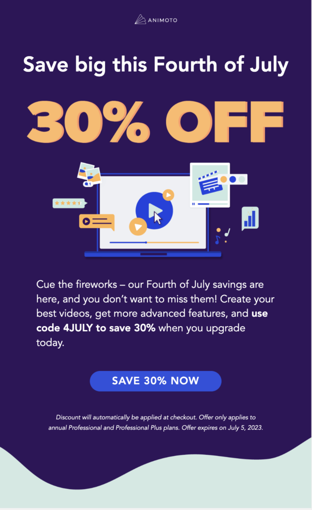
Animoto opted for a simple yet convincing design by promoting their special offer at a special event. They tried to help their subscribers focus only on the core message, so they provided a snackable, reader-friendly paragraph.
This can be such a good idea if you only have one message to deliver to your subscribers. They know right from the start that their special offer is the main highlight of the email, allowing subscribers to quickly grasp the value and take action.
By keeping the design and content concise, Animoto ensures that subscribers can easily understand and act upon the core message without any distractions or unnecessary information.
2. PandaDoc
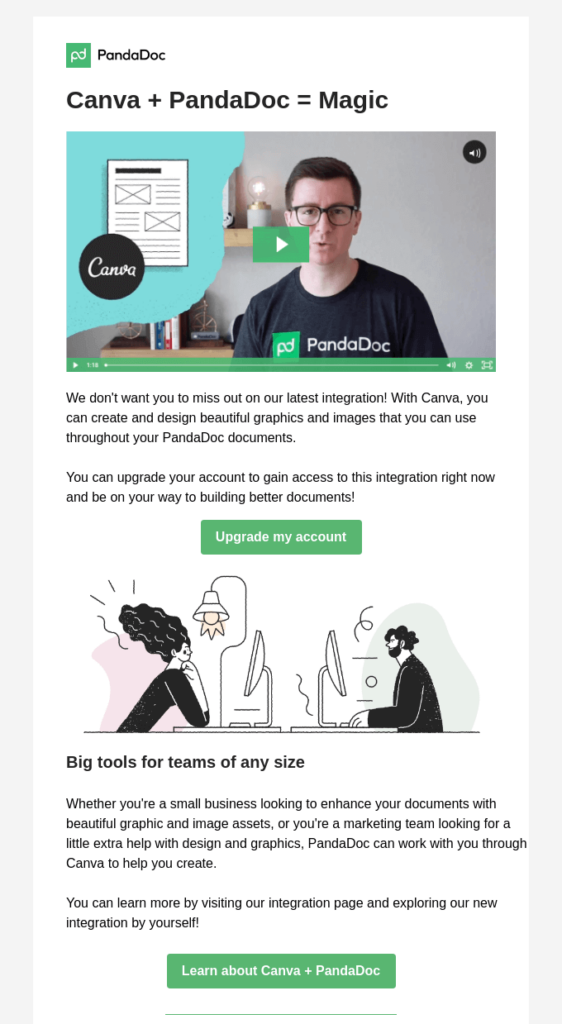
PandaDoc uses its email newsletters to announce integration options with Canva. The use of a short marketing video comes in handy to break down complex explanations.
PandaDoc effectively avoids overwhelming subscribers with lengthy explanations, ensuring that the core message is easily understood and encourages subscribers to explore the integration further.
They keep the design minimalistic, using only green and white colors to maintain a cohesive and branded look. The simplicity of the design allows the integration announcement to take center stage, while the use of video provides an engaging and visual way to demonstrate the benefits and functionalities of the Canva integration.
3. Wistia
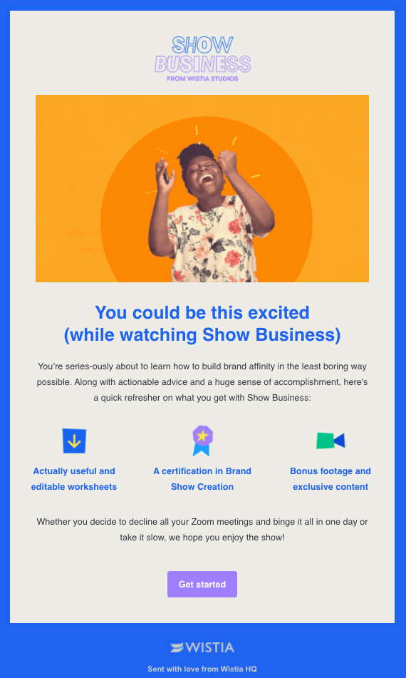
Wistia adds some fun, playful touch by leveraging a GIF in their email newsletter design. By incorporating a GIF, they bring motion and visual interest to their message, capturing subscribers’ attention and creating a dynamic experience.
They only write a simple, understandable paragraph that describes their new show. With colorful illustrations, they give subscribers a sneak peek into the show’s themes and what they can expect from it.
The combination of the playful GIF, colorful illustration, and clear paragraph piques subscribers’ curiosity and entices them to learn more or watch the show.
4. Mintel
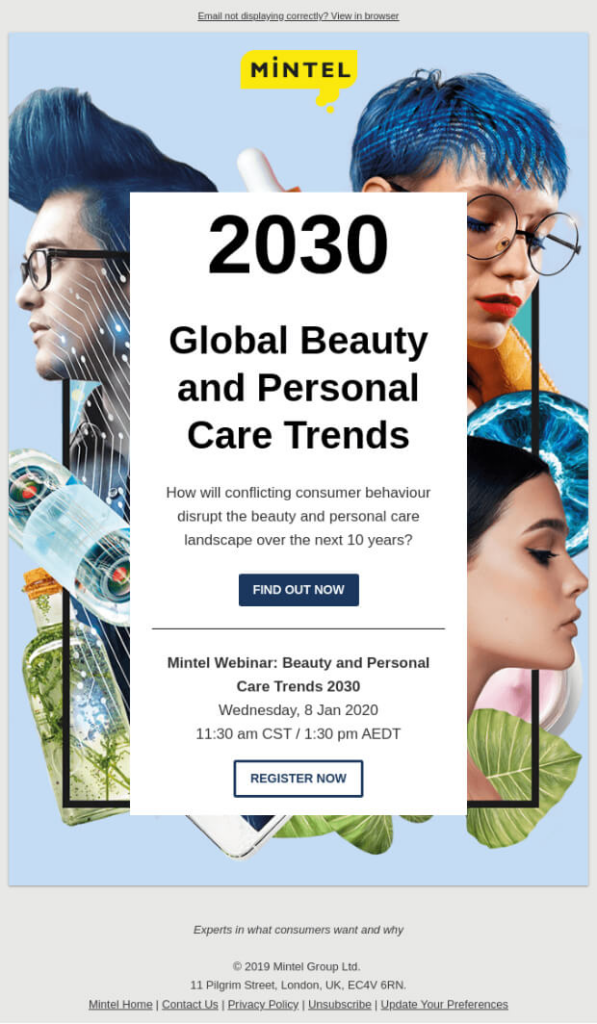
An email newsletter that promotes a webinar typically looks plain, featuring only the speaker, and the rest is just the details about the event in plain text.
Instead of a plain and minimalistic design, Mintel incorporates visually appealing elements such as graphics, icons, and images related to the webinar topic. The collage art is thoughtfully composed, incorporating various visual components that represent different aspects of the event or the subject matter being discussed.
This creative approach adds a touch of uniqueness and visual interest to the newsletter, making it stand out from the typical plain text designs. The collage art not only captures subscribers’ attention but also provides a glimpse into the content and theme of the webinar.
5. Headspace
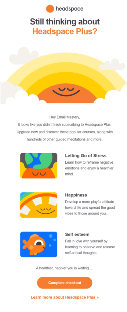
Headspace sends you an email to remind you of the benefits of signing up. Using vibrant, on-brand colors and illustrations, it creates an inviting and visually appealing email newsletter design. The colors used align with Headspace’s branding, creating a sense of familiarity and consistency for subscribers.
The illustrations incorporated in the email are not only visually appealing but also purposeful. They are carefully chosen to depict the benefits of signing up for Headspace, such as improved mindfulness, reduced stress, or enhanced focus.
These fun illustrations help convey the core message in a visually engaging and easily understandable way, making it more compelling for subscribers to take action.
6. Asana
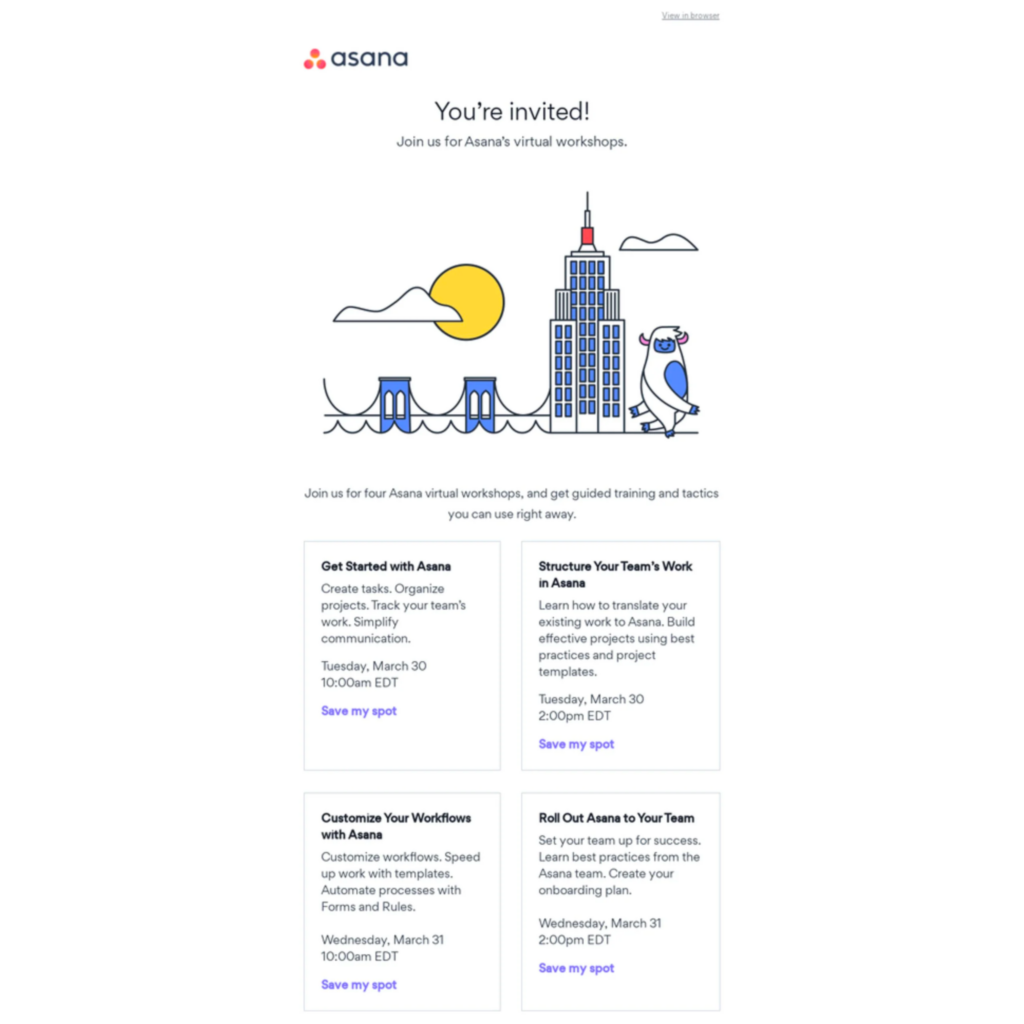
If you prefer a minimalist design without too many colors other than white, you can take an inspiration from this Asana newsletter. Using a white background as a dominant element, the design creates a clean and modern aesthetic. The simplicity of the design allows the content to shine and makes it easy for subscribers to focus on the key message.
In this minimalist approach, Asana may use strategic pops of blur color sparingly to draw attention to important elements such as CTA buttons. These color accents could be in line with their brand colors to maintain consistency and recognition.
The use of ample white space in the design not only contributes to the minimalist look but also enhances readability and gives the newsletter a sense of elegance and sophistication. Asana’s choice to keep the design clean and uncluttered allows the content to be easily scannable and digestible for subscribers.
7. Spotify
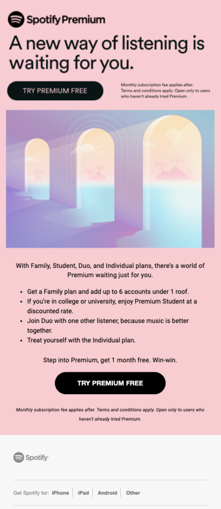
Spotify often uses pastel colors in its email newsletters, creating a visually appealing and vibrant design. Pastel colors are known for their soft and gentle hues, adding a touch of elegance and playfulness to the overall aesthetic.
By incorporating pastel colors, Spotify’s email newsletters create a sense of harmony and balance. These colors can evoke positive emotions and a sense of calmness, which aligns with Spotify’s mission of providing enjoyable and relaxing music experiences.
The pastel color palette can be applied to various elements of the newsletter, including background colors, headings, buttons, or even illustrations. It adds a visually pleasing contrast while maintaining a cohesive and consistent brand identity.
8. Lush
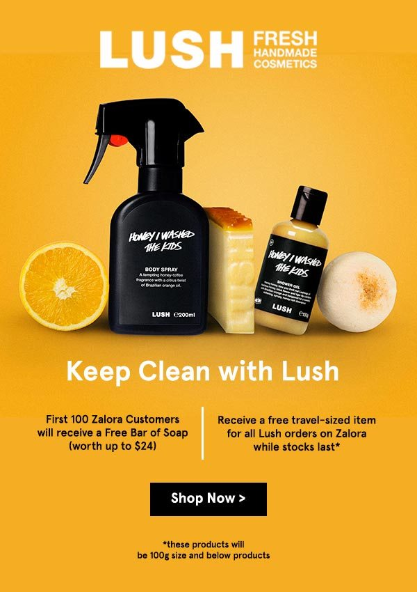
If you’re promoting cosmetics or skincare products, the best thing is to display the product and make it the best thing is to display the product and make it the focal point of your email newsletter design. That’s what Lush did.
Lush’s email newsletter design often features vibrant and eye-catching product images with a focus on the textures, colors, and unique shapes of their cosmetics or skincare items. They showcase their product in a visually appealing and enticing way to capture the attention of subscribers.
By using visuals that evoke a sense of freshness and natural ingredients, Lush effectively communicates the essence of their products and captures the interest of subscribers.
9. PetSmart
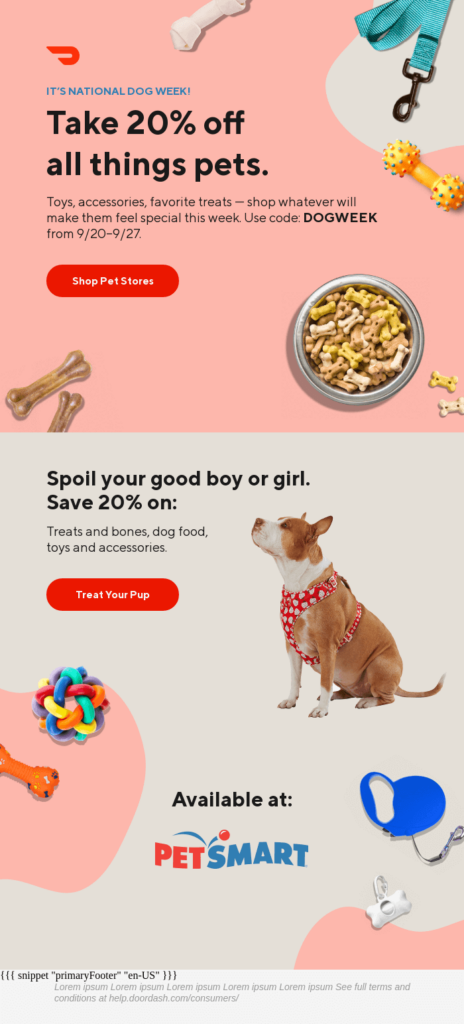
Since PetSmart focuses on animal products and services, they can create email newsletters that showcase adorable and happy pets to resonate with their subscribers. Featuring dog imagery (dog, more specifically) evokes positive emotions and creates a connection with pet owners.
Showcasing pets that are well-groomed, healthy, and enjoying their time can inspire subscribers to consider products or services for their own pets. Not only that, PetSmart incorporates vibrant and playful colors that align with its brand identity.
It also integrates playful design elements such as paw prints, toys, or pet-related illustrations to add visual interest and reinforce the pet-centric theme.
10. Starbucks
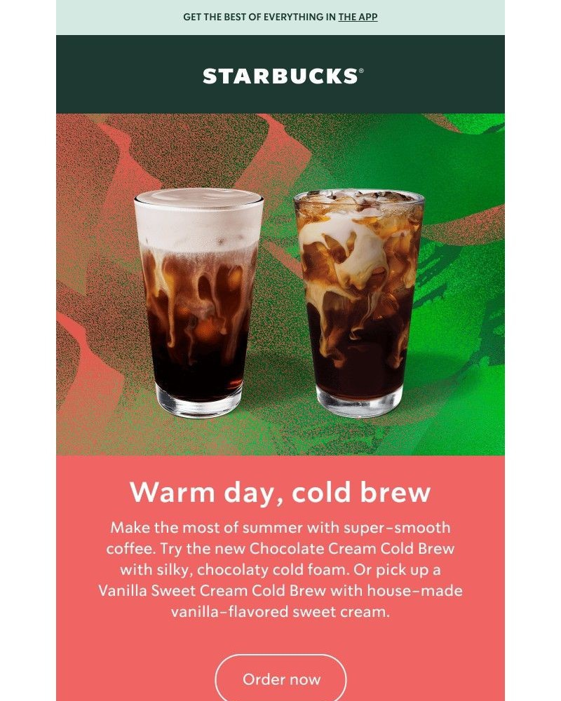
For its email newsletter design, Starbucks focuses on creating a visually appealing and enticing experience that aligns with its brand identity. It showcases its beverages, food items, and merchandise through high-quality images.
The visuals are carefully crafted to highlight the appeal and quality of their products, enticing subscribers with delicious-looking drinks and enticing food options. It also describes the taste using enticing and evocative language to stimulate subscribers’ senses
11. TunnelBear
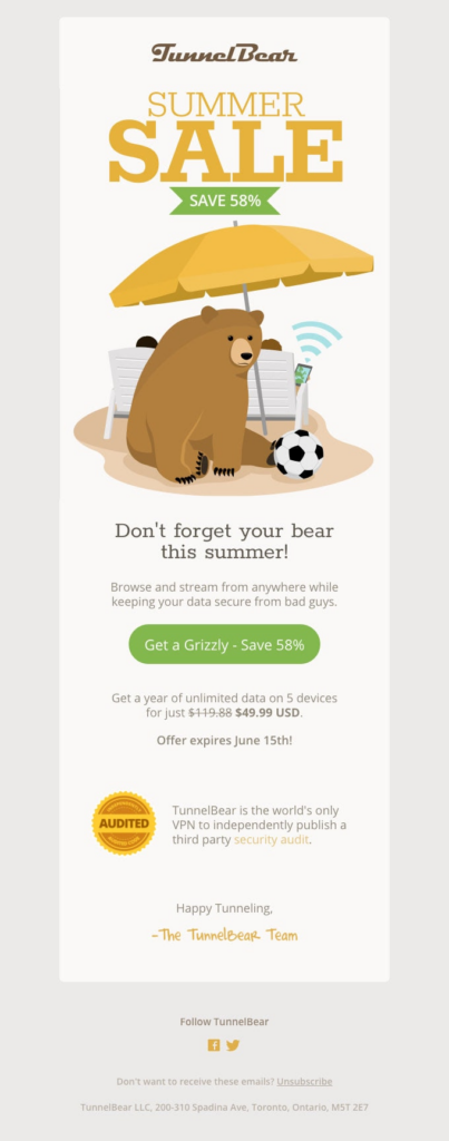
The best thing about having an animated mascot is that you can incorporate it into your email newsletter design, as TunnelBear did.
The animated mascot design maintains consistency with TunnelBear’s branding, ensuring that subscribers can easily recognize and associate it with the company. This visual consistency builds familiarity and strengthens brand identity.
Besides the bear mascot, TunnelBear also maintains consistency with its branding elements, such as color scheme, logo placement, and typography. This helps subscribers quickly associate the email newsletter with TunnelBear’s brand, fostering trust and recognition.
12. TacoBell

People love games. In a Christmas newsletter, Tacobell incorporates an interactive game, “How Fast Can You Meet Your Friends” to engage subscribers and add a fun element to the holiday season.
The Christmas newsletter design incorporates festive colors, seasonal elements, and playful graphics to create a holiday atmosphere. This sets the tone for the interactive game and enhances the overall festive experience.
The game also makes the newsletter shareable. It allows players to share their results or invite friends to join the fun. This facilitates organic word-of-mouth promotion and expands the reach of the newsletter campaign.
13. eMeals
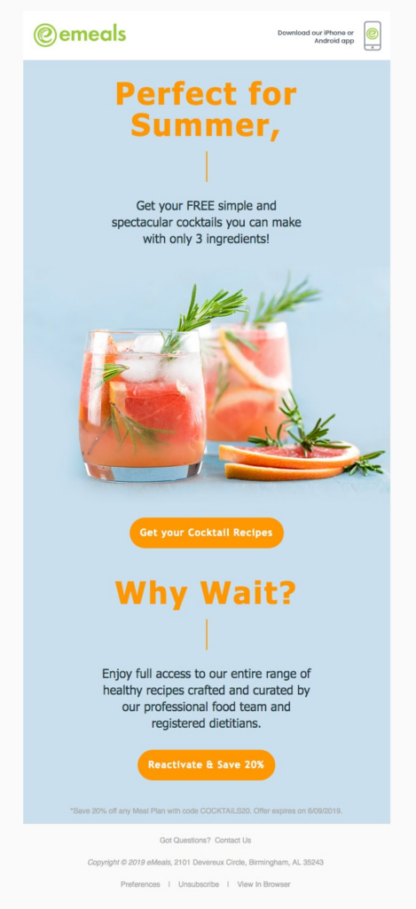
Who does not like exotic drinks on a hot summer evening? eMeals summer newsletter revolves around a theme that brings to mind summer within seconds: cocktails.
The email newsletter design also features a vibrant color palette, including bright blues, sunny yellows, and refreshing greens. These colors mimic the hues of summer and contribute to a lively and energetic atmosphere, capturing the attention of subscribers.
The vibrant colors, mouth-watering imagery, and seasonal messaging create an email newsletter design that is both visually appealing and enticing to subscribers during the summer season.
Wrapping Up
Email newsletter designs are one of the most powerful tools for engaging subscribers and delivering compelling content. With strategic design choices, captivating visuals, and well-crafted messaging, you can create email newsletters that leave a lasting impression on your audience.
Remember to stay true to your brand identity, keep the design clean and organized, and focus on delivering value to your subscribers.
By continuously refining your email newsletter designs and adapting them to your audience’s preferences, you can build strong connections, drive conversions, and achieve your marketing goals.