When connecting with potential customers online, you only get one shot to make a good impression. You have to project competence and trustworthiness while also positioning your brand as the best choice to deliver the specific benefits your potential customer is seeking.
When someone clicks a link and winds up on your landing page, they’ve shown at least some interest in what you’re offering. However, you only have a brief window to truly capture their attention. Every aspect of your landing page design should drive them forward towards taking a specific action and moving forward towards a conversion.
Don’t worry if you’re new to creating landing pages, and aren’t sure where to start, because our complete guide includes everything you need to know. With just a few simple techniques, you can convert customers more effectively than ever before!
In this article
What is a Landing Page?
Let’s start with the basics.
A landing page is a static webpage designed to encourage users to take a specific action. It’s different from a home page, which presents a broad array of info on the entire site.
Landing pages play a key role in expanding your customer base and taking your business to new heights. However, in order to be effective, they require specific UX deliverables, word choice, and more.
Instead, a landing page has a singular focus, such as:
- Purchasing a specific item
- Signing up for a free trial, newsletter, contest, etc.
- Encouraging a donation
By limiting the page to a single idea, landing pages create a clear value proposition along with an immediate call to action. Everyone who lands on the page immediately understands what’s being offered and how to get it.
8 Ways to Drastically Boost the Effectiveness of Your Landing Page
Get the best bang for your buck by using these tips that combine simplicity with effectiveness. Use all of them together (or as many as are relevant to your site) to maximize the conversion rate of your landing pages.
1. Create Clear Headlines
Headlines are important throughout your website but especially so on a landing page, where people expect immediate information on whatever led them there.
Keep the headline clear and direct. For example, you have a landing page focused on a contest to win a Playstation 5. Make sure the headline tells the reader this page is where they enter.
- Ineffective Headline: Do You Want a Playstation 5?
- Effective Headline: Enter Today to Win a PlayStation 5!
Also, notice how it’s immediately clear what you could win. While that’s natural for a contest, make sure you’re also applying it to other types of landing pages. For example, say you’re trying to build an email list by creating a daily newsletter about stocks.
- Avoid: Sign Up for Our Newsletter
- Use: Sign Up for a Daily Stock Tip Sheet Delivered Right to Your Inbox
Uber’s headlines on this landing page for would-be drivers illustrates this point:
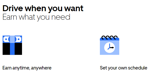
They don’t spend time confirming the page is for those interested in driving, because the marketing funnel that brought them here has already filtered them as such. Instead, Uber immediately pushes the idea of flexibility and the ability to earn as much (or as little) as you want.
2. Write Relevant, Clear, and Strong Copy
Maybe you’ve heard of solution-selling. Until quite recently, it’s been the backbone of advertising copy. With solution-selling, you attempt to understand what the customer is trying to accomplish and present reasons why your product is superior to the competition.
However, this approach doesn’t apply to today’s consumers. Harvard researchers discovered that solution selling is no longer effective. People have access to all the information they need to learn about the solution your type of product provides.
Instead, potential customers want to learn about the benefits of whatever you’re pitching. Tell them the specifics of how your product works, and they’ll decide on their own if it meets their needs.
For example, check out this landing page from Jaybird Headphones:
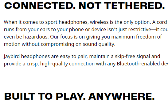
They make headphones for enthusiasts of outdoor sports. While they touch upon why you want certain features in outdoor headphones, they mainly trust that’s the info you already know. So, they dive right in by detailing its wireless capabilities, weather-resistance, and other factors the audience already knows to look for.
3. Remove Distractions
First, identify the clear goal of your landing page. Do you want customers to download an ebook? Do you want them to buy a holiday-themed product? Stick to the point of your landing page, and don’t deviate from it.
This tip can feel counterintuitive. After all, the person on the landing page is already interested in one item or service you offer. Doesn’t it make sense to showcase what else your brand has to offer?
Actually, it can feel misleading. People wound up on your landing page for a specific reason, and anything besides that can feel like a bait and switch.
Check out the simplicity of Pocket, an information storage platform:
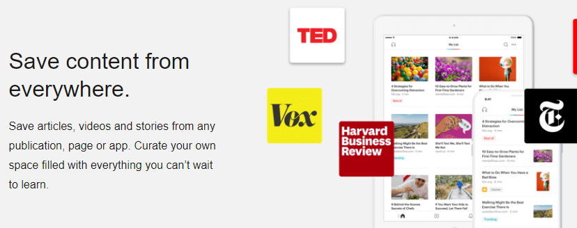
The moment you land here, you’re instantly told what the site is and how it works. Plus, the still video image next to the text features the logos of prominent companies, quickly implying endorsement and prestige.
4. Maintain Brand Alignment
Even if your landing page is about a specific event, make sure all design elements reflect your brand’s look. Use the same fonts and style as your existing pages. You don’t have to use the exact same colors, but they should be close.
For example, check out this Valentine’s Day page from Target:

As a standalone image, you might not necessarily know it’s a Target page. However, imagine you clicked on a link in an email you received from the retailer. If you’re expecting Target, the logo makes a lot more sense, and the red in the letters becomes more apparent.
The purple tones further establish that the person has landed where they intended. Of course, the title says “Valentine’s Gift Ideas,” but the addition of purple tells us that this is a special event because it’s deviating slightly from the traditional Target color scheme.
When brand alignment is done well, it’s not something most people notice. Instead, they quickly, perhaps even subconscious, confirm they’re in the right place. However, imagine clicking on a link to a Target site only to land on a page loaded with blue and yellow. You’d probably think you landed on something related to Wal-Mart!
5. Use Visual Images, Videos, and Graphics
While the words on the page help drive the reader towards an action, images capture a visitor’s attention first. The human brain processes the basics of an image in as little as 13 milliseconds. Your landing page should have an image that instantly conveys two ideas:
- The brand
- The specific focus of the page
Zales has an excellent example of image use:

The rotating slideshow shows bright, clear images of different rings. Plus, the slideshow effect helps emphasize how these rings are customizable. Each high-resolution image presents different features that you can mix-and-match to build your own unique ring. It’s an excellent, well, marriage between a type of visual (rotating slideshow) and the information it’s meant to convey (you can select any of the features shown).
Additionally, images provide an opportunity for SEO benefits. Give each image a descriptive title and alt tag. For instance, avoid titles like IMG_123.jpg. Instead, go with Zales_Pink_Diamond.jpg.
The average visitor might occasionally see these titles, if they hover over the image, but real people aren’t the target audience here. Instead, adding descriptive titles to images helps improve your site’s placement in search engine results. Search engine spiders consider all of the text when ranking a page, including titles and alt tags.
6. Include Social Proof
Social proof can have a tremendous effect on your business, both positive and negative. People look for trust signals when evaluating a business, and the presence of people using a business (or lack thereof) is highly influential.
Personal referrals still play an important role, but most social proof is internet-based. It takes several forms:
Customer Reviews
Even if you do everything right, you’ll likely still have to deal with at least some negative reviews on sites you can’t control, such as Yelp and Google Maps. The best strategy is to engage with negative reviews head-on.
Politely apologize, offer to provide solutions, and then guide the person towards direct messages. Even if you can’t solve the situation to that person’s satisfaction, future customers will read your replies and appreciate your commitment to problem-solving.
Testimonials
Place short quotes from happy customers throughout your website. Make them relevant to the content. For example, place a quote praising your company’s excellent customer service on your Customer Service page.
Get proactive by eliciting testimonials from customers. If you’ve delivered great service to a client, ask if they’ll write up your praises. In return, offer them a discount on a future order.
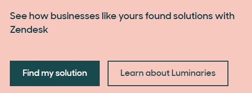
Zendesk, a widely-used customer service management platform, offers a robust and engaging testimonials section on their site. You can search by industry, so you can find people who have used the platform in the way you plan to.
Case Studies
Case studies are a more elaborate type of testimonial with detailed specifics on the customer’s experience. They’re often ideal for more complicated services that aren’t necessarily easy to see. For instance, if you create marketing campaigns for websites, a case study helps illustrate the tactics you use to increase brand awareness for your clients.
7. Optimize Your Lead Generation Form
Do you have forms on your page? Every detail matters.
First, always remember the customer’s POV. People will only fill out forms if they’re clearly getting something in return. Place the benefits of signup in a headline directly above the form.
- Don’t Use: Join PokerPlayers Today!
- Use: Get Free Poker Tips Daily!
Reiterate this information on the button. Instead of “Sign-Up,” use more descriptive language such as “Sign-Up for Your Free Daily Tips.” Even better, instead of buttons, use clickable images (along with descriptive text).
Do you have a fairly extensive signup process? Consider multi-step forms. They present one question at a time, which must be answered to move forward to the next. It helps prevent an intimidating wall of queries that many users will balk at. When using a multi-step form, make sure to include a progress bar along the bottom.
Kickstarter does form design at a superstar level. Setting up a Kickstarter project seems complicated and time-consuming, but their signup forms let you hit the ground running.
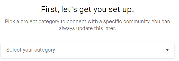
You select a basic project category, write a 135-word description of what you want, select your country, and attach some payment information. A three-step form is all it takes to turn someone from a landing page visitor to an account holder.
8. Create a Clear Call to Action
No matter where in the conversion funnel this visitor is, the Call to Action (CTA) button is where they take the next step, whether that’s making a purchase, signing up for a newsletter, or otherwise connecting more with your brand.
Make the CTA button stand out. While it shouldn’t overwhelm the page, make it large, colorful, and clear. Also, use exciting and dynamic language – and include a verb. For example:
- Try for Free
- Start My Free Trial Now
- Send Me More Info STAT
As far as placement goes, the rules have changed. Place the CTA at the bottom of the page – that classic placement will never go out of style. But you also want the CTA immediately visible when someone first lands on the page. Many designers put the CTA along the side of the page, too, so it’s always at the ready.
Finally, limit your CTA to a single idea. For example, a visitor shouldn’t have the option to sign up for a newsletter and order a free ebook.
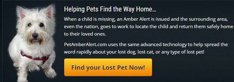
PetAmberAlert is a service that broadcasts an emergency missing pet notification throughout a targeted area. As you can see, their CTA is quite compelling. It uses active, emotional language that clearly states the benefit. Plus, the bright yellow box stands out immediately from the black background.
Final Thoughts
Landing pages boost your online presence and help target people interested in the product or service you provide. The tips above are easy to implement and will help take your site to new levels of success!