
Online forms may appear at pretty much every step of a customer journey. More often than not, customers may not know that they are filling out yet another form.
It makes sense, considering how beneficial online forms are. You do not have to spend money on typography, and then spend hours putting all the answers together and analyzing the data. You can easily get back in touch with form fillers by sending a follow-up email and asking for answers globally.
However, online forms have been overused. We fill out forms for newsletters, account registration, sales contact, ordering and paying, and giving feedback. Not only during buying something we have to fill out numerous fields but on the work as well. Thus, everyone dreads answering the questions and entering data over and over again.
So how can you help the customers or colleagues to go through the process? Can online forms be less dreadful and boring? How do you know what to change in your form?
In this article, you will be able to find out answers to all of the questions. Read and get to know how to optimize online forms for better open and complete rates.
In this article
- 1. Come Up With Benefits
- 2. Experiment With Form Lengths and Other Factors
- 3. Create a Multi-Step Form
- 4. Use Different Question Formats
- 5. Consider Autofill
- 6. Consider Adding A Progress Bar
- 7. Use Customer-Customized Forms
- 8. Become Mobile-Friendly
- 9. Avoid Placeholder Text
- 10. Use Forms Analytics To Improve
- Bonus: 12 Contact Forms Design Examples
- Conclusion
1. Come Up With Benefits
We are all overly busy. With so many tasks and deadlines, you can hardly imagine that someone will fill out an online form just for fun. So you have to basically sell your form to a customer. How?
Let them know what they will get out of this. Scaring them with what they will lose if they do not fill out the form will not work. Throwing imperatives like “Check out our survey”, “Answer these 5 easy questions” will not do the trick either.
Offer a discount, a promo code, a gift card, or use lead magnets (checklists, reports, video tutorials, etc.) to attract their attention.
2. Experiment With Form Lengths and Other Factors
An average person’s attention span of an average person is 8 seconds, while goldfish can live without distractions for 9 seconds. With instant gratification, messaging, shopping, we lose our patience quickly and we want quick results.
Therefore, the main strategy in online forms (or any forms, really) was to keep them as short as possible. It makes perfect sense: customers will fill out the form with 2-5 questions to get their benefit but 10+ questions are already too much and they will drop it midway.
Yet, can we call it a golden rule? Doubtfully.
In some cases, it did help to increase conversions by shortening the form: Quicksprout managed to get a 50% increase, and Marketingexperiments got a 3,4% boost and cost per lead reduction.
Yet, Michael Aagaard found out that, after shortening the form to 3 questions, he got a 14% drop in conversion. Why so? As he says, he left boring questions. All that can be actually exciting about the form was gone.
This brings us to the point: it is not only the form length that matters. Consider this:
Form type
Is it newsletter signup or feedback form? It is evident that people will just want to enter their names and emails – no dates of birth, locations, zodiac signs. However, they would like to elaborate more on their positive or negative experience in the feedback form.
Benefit
If the benefit is good enough and conveyed in a clear way, people will take the form no matter how long it is (do not go all crazy with 100 questions though).
Kind of information you ask for
People do not like to share very personal information due to data breaches and poor cybersecurity. Try to not intrude in their lives too much.
Types of Questions
If you ask too many open questions or repeat the same strongly agreed to strongly disagree, people will lose their interest immediately.
Question length
Do not put three-lines questions, people will be too lazy to actually read. Try to do more questions but reduce the length of single questions.
There are many other things to consider as well. For example, ask yourself what kind of information do you need? Will 3 questions be enough to get a deep insight into the problem? If not, go for a longer form. Otherwise, there will be no sense in making the survey at all.
So try different lengths out and find a perfect fit for your aim and industry.
If you decided to go for a long-form, try our next tip.
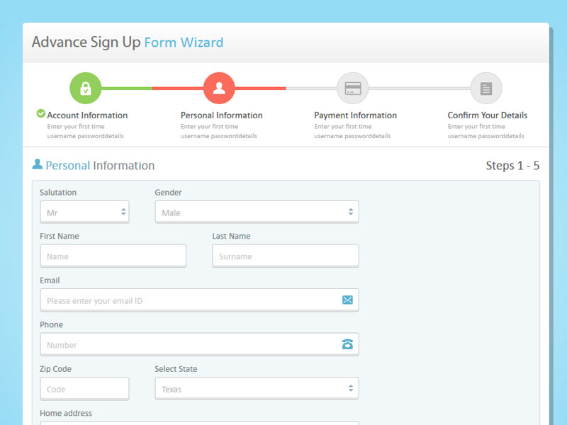
3. Create a Multi-Step Form
A multi-step form breaks down long forms in several pieces, often shown on different pages.
Usually, visitors get overwhelmed when they see dozens of questions on one page and close the form before answering a single question. With a multi-step form, they see 5 questions on a page. It is not hard, right? The next page has 5 questions too, and it is still not hard to answer just 5 questions.
It works like what you do when you have big projects. You can not imagine that you can complete this big task, you have no motivation and procrastinate. So you break it down into small tasks and start doing small steps towards a bigger goal.
For instance, BrokerNotes was able to increase their conversion rates by 35% overnight! Multi-step forms also have a 14% higher completion rate.
Multi-step forms have other benefits, such as:
- variety of data that you can collect
- better quality of data
- better user experience
However, keep in mind that multi-step forms are good when you actually need to get a lot of data and you have many questions to ask. When users know that for this form basic information is enough, they will quit after they see more than 5 questions.
4. Use Different Question Formats
If users see 10 questions with the same multiple-choice of agreeing/disagree/does not apply to me, they will be bored.
There are two possible outcomes: they will continue filling out the form because the benefit was too good (they will remember the bad experience anyway) or they will quit.
In order to avoid such scenarios, spice up your form with different question types:
Multiple choice
It is the classic of online forms: it is easy to just choose an answer and click the button.
Open questions
A customer gets to type a lot. Some often type a “-” just to get the form creators off their backs. However, some may share deep individual insights that are harder to analyze but provide you with top-quality data. Try to not use too many of these.
Drop-down menus
It is quite similar to multiple-choice but mixes them in the form and you will deliver some liveliness and variety in a form.
Ranking
The ranking is perfect for finding out the priorities and preferences of your customers, colleagues, or employees.
Star or smile rating
Star rating helps you to gather feedback.
You may choose question types according to your goals and form type.
5. Consider Autofill
There are forms where the information is too basic to type fully. For example, your location: people will be more delighted when they type three letters and have a list of places starting with them so a user can choose.
It is not only less annoying for users but it also eliminates errors: for example, a person may make a typo and not notice. Where will their purchase go? To a non-existing place?
Autofill is great for both parties.
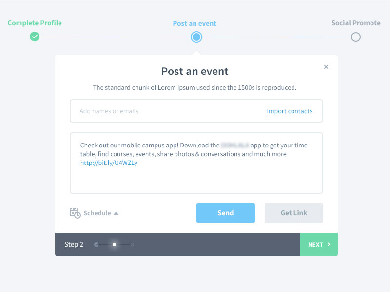
6. Consider Adding A Progress Bar
A progress bar that shows how far you have come is pretty motivating. Users will see that they have already done so much and their benefit is just around the corner: there is no sense to give up now.
However, there are some additional tips to optimize online forms.
According to SurveyMonkey, it is better to place your progress bar at the bottom and it is better to not indicate how many pages or percent are left. If a customer sees on the first steps that there are 60 questions or 5 pages of a survey to complete, they may get overwhelmed and close the tab of a survey.
7. Use Customer-Customized Forms
Online form creators do everything possible to make the process of filling out quicker, easier, more enjoyable, and less stressful. One of the tactics that are commonly used is conditional logic.
Have you ever filled out the form where you had to click “does not apply to me” in the whole section? You can not skip it because they were the required questions.
It is annoying. Moreover, it makes the form longer unnecessarily.
With customer-customized forms, the next question will depend on the answer to the previous question. If a user says that it does not apply to them, the section will not be shown to them.
8. Become Mobile-Friendly
There are 3,5 billion smartphone users worldwide who account for 50,81% of web traffic.
Many businesses know how important the mobile version of the site is, however, they do not consider mobile versions while creating online forms.
You can improve the experience of filling out the form from a mobile device by:
- right formatting
- suggesting numeric keyboard for such fields as phone number, date, time, etc.
- use collapsible menus and dropdown lists
- reduce the loading time by deleting unnecessary elements
9. Avoid Placeholder Text
Placeholder text is a text within the enter field that might give you an example of what the answer should look like or what kind of information you have to fill in. The text disappears as soon as you start to type: a user does not have to delete anything.
Placeholder text might seem like a good idea: people like getting hints, especially if the form is serious.
The problem is: it disappears after you start typing. By adding placeholder text, you rely on the short-term memory of a customer. If they were not attentive enough or can not keep in mind how many lower and upper cases a password should contain, they will have to delete their answer to look at the hint again. It is annoying and unmotivating.
Moreover, it makes empty fields go unnoticed. It may seem like you have completed the form, and you have to put additional effort into searching for that one empty field. But what about not optional questions? A user will never know that they did not answer the questions and you will probably lose deep insights.
10. Use Forms Analytics To Improve
In order to make experiments with form and question types, lengths more accurate and effective, use form analytics. It will provide you with real-time data. You can use the following metrics:
- total visits (how many times people saw your forms)
- unique visits (how many individuals saw your forms)
- abandonment rate (how many people did not complete the form)
- conversion rate (how many people did complete the form)
- user location
- top devices (desktop, tablets, or smartphones)
You can make better decisions if you analyze the data you receive.
For example, high visits and low conversions mean that the form is too lengthy: consider cutting off some questions or go for a multi-step form.
Low unique visits and high conversion rate mean you have an excellent form but either the placement is wrong or you do not tell everyone about it. You can place your forms in a sidebar, about page, contact page, at the beginning or bottom of any page, or you can send it by email.
Bonus: 12 Contact Forms Design Examples
Designing a great online form begins with finding inspiration in examples that already work well. Check out a few websites with simple or advanced contact forms and read about why they’re effective models.
1. Media Proper
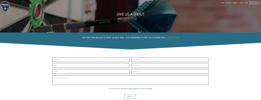
Consumers who don’t feel comfortable submitting too much personal information will enjoy simple contact forms like Media Proper’s. It only requires a visitor’s first and last names and email address. Everything else is optional.
The message field is also the largest on the screen, emphasizing the importance of customers’ feedback or inquiry beyond their information. It’s a subtle way to contrast a powerful message that holds more weight in a world where people prefer websites not to track their data.
2. Pixpa
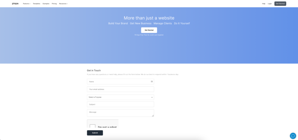
Pixpa’s contact form is straightforward. There aren’t any plugins or additional links to distract whoever needs to get in touch. There’s also a call to action just above the first form field, which encourages people to submit their messages.
It’s also an excellent way to clarify when a team member will get back to them. Pixpa promises 24-hour responses, but other companies might take longer. Some consumers may prefer to make a phone call if that’s the case.
3. VisionGauge
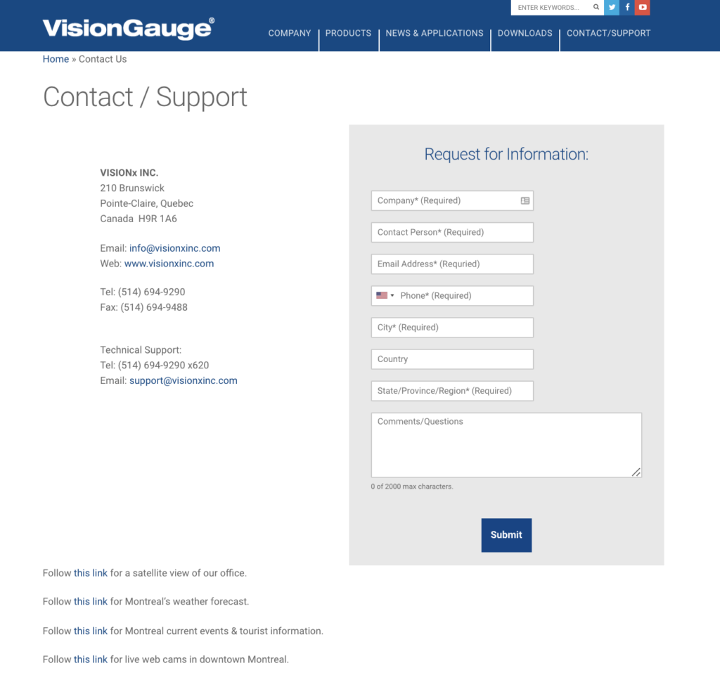
The VisionGauge website directs visitors to its contact form through a simplified link in the sidebar. It only uses eight form fields and lists direct contact information beside them. It’s a single-step process with limited fill-ins that’s quick to use and easy to understand.
4. Weifield Group Contracting
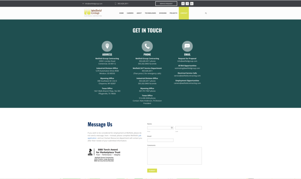
There are a few reasons why the Weifield Group Contracting page works so well. Its simplicity directs users in two ways. It features a link for employment inquiries first to clarify how best to contact their hiring team. It also uses only three form fields to speed up the process.
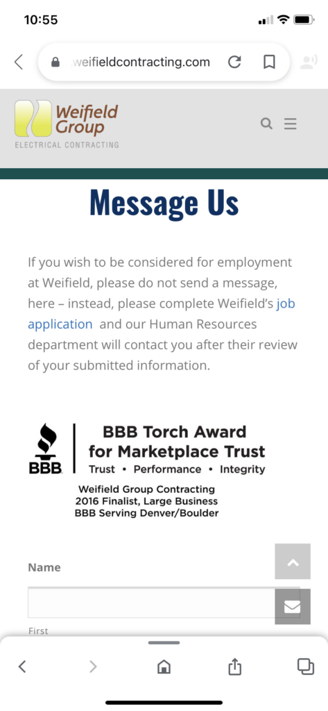
The page works well on mobile devices. When reached through a smartphone, the boxes are large and the text is readable. Visitors won’t have to wiggle the page around or zoom in to contact the company as quickly as they would on a computer.
5. Glossier
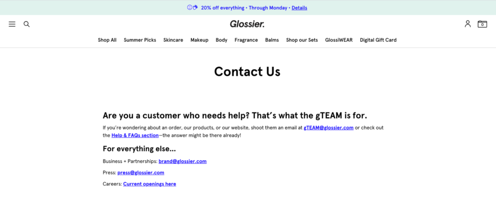
Glossier’s contact page changes how websites can approach simplicity. It’s opted out of boxes and required text. Instead, it provides four helpful links and clarifies who should use which one. The company prefers email as its primary form of communication, so it doesn’t offer boxes and phone numbers. It guarantees a better response time and takes away any potential guessing games for people who need help.
6. Zendesk
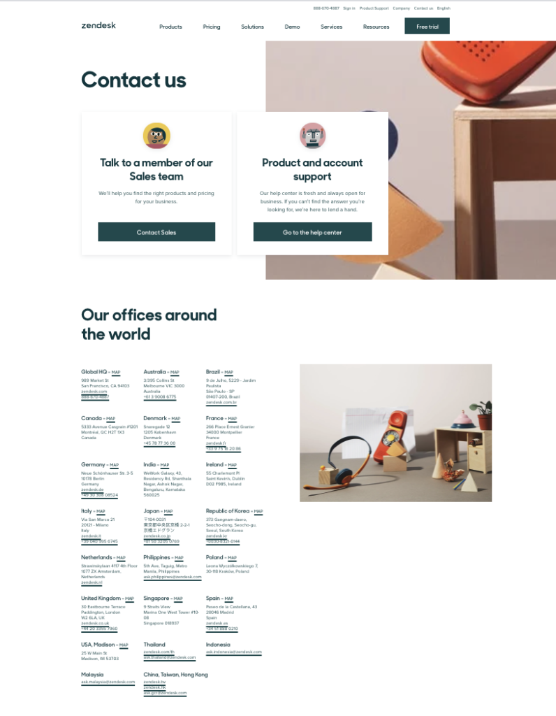
International brands often struggle with consumer outreach because there are so many languages and locations at play. Zendesk lists every global office address and phone number so they’re easy to find. The webpage also utilizes two links for contacting the sales team or help center, which minimizes the chance of people sending a message that gets lost in a busy inbox but otherwise would be easy to address.
7. Yeti
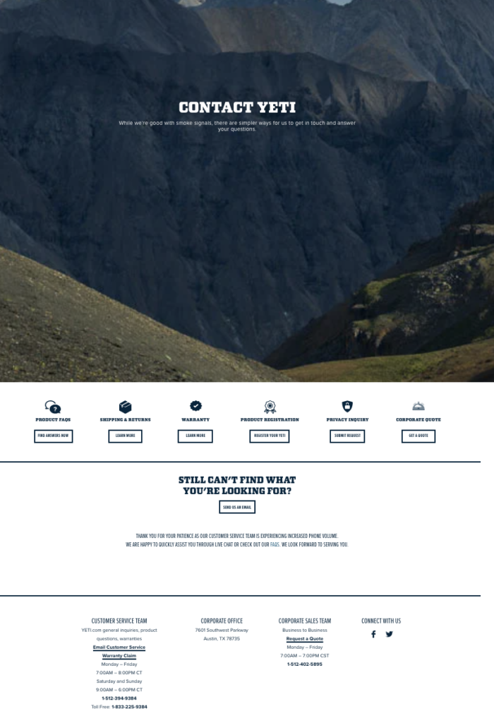
Anyone who needs to reach the team behind Yeti will find seven separate sections within the contact form page. Colorful buttons guide visitors to each topic, while horizontal lines divide the page into three categories. A link to the company’s email address is just below the subsection buttons, and the final category contains addresses and phone numbers.
The page displays many different kinds of information without cluttering anything. It’s an effective way to organize contact details without creating confusion.
8. Accenture
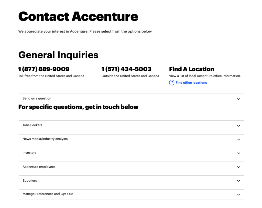
Accenture customers could live in over 120 countries. If each service location had a phone number, the contact page would quickly become too complicated to navigate. Instead, the brand uses an advanced contact form with expandable sections.
The page has clear organization and labels. The primary resource for general inquiries holds the most prominent text size and sits at the top of the page, directing visitors before they ever start clicking around.
9. Atlassian
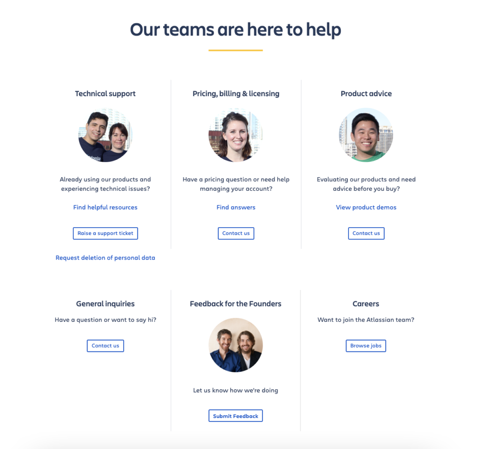
When you picture a contact form, you may only visualize lines of words and numbers. Atlassian flips that construct on its head by using headshots for each team. The faces and smiles make them more approachable for consumers who may feel hesitant or embarrassed to ask for assistance.
The six sections use minimal wording to get their point across. It’s clean and inviting, which removes any nerves people may feel when sending a message to a faceless brand.
10. BrokerNotes
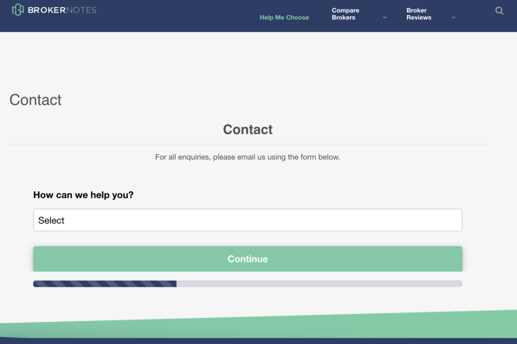
Anyone who needs to contact BrokerNotes will find a multistep advance contact form on its website. Users must select the reason for their message before clicking through to the field with the message box. The multiple steps make this version a bit more advanced, but there is a simple “Other” category for people who aren’t sure where they fall within the list of reasons.
11. PeopleMetrics
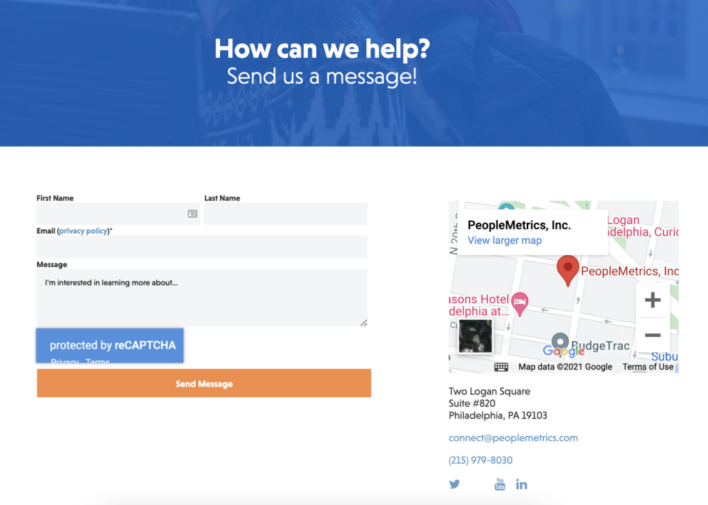
At first glance, the PeopleMetrics contact form is simple to use. There are four fields to fill out before sending a message, but the company also embedded a CAPTCHA check to verify human access. It’s a great way to prevent spam messages, but it is an additional step in the page creation process.
12. Scribd
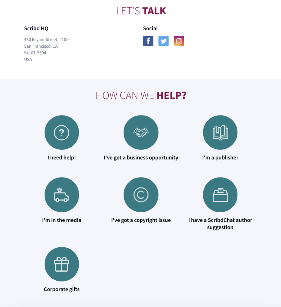
Scribd produces multiple digital publications, so there are numerous reasons for consumers to need them. The contact form has seven categories simplified into single icons, and people will find specific instructions within each one. It saves web visitors the hassle of reading through pages of text or guessing at phone numbers for their desired department.
Conclusion
Creating an online form is not as easy as it seems. First of all, you have to make your form attractive by providing benefits, then you have to experiment a lot with forms and question types to keep things interesting.
In order to optimize online forms and make them as simple as possible, you have to consider progress bars, autofill, mobile-friendly design, customer-customized forms, and avoiding placeholder text.
After you have created your perfect online form, you still have to check up on analytics to find room for improvement to keep users engaged.
It might be a bit overwhelming to keep track of all the 10 steps. However, start small and implement tips one by one. At the end of a journey, your conversion rates will skyrocket!