A landing page is a real catch for merchants and business owners who want to create powerful and actionable strategies to promote their products/services, improve sales, and, subsequently, increase their total revenue. As far as the only purpose of a landing page is to engage visitors and convert them into leads, every part of it: from copy and images to a CTA button should be customized to achieve the goal.
No matter how good your product is and how much money you invest in the marketing campaigns, your prospects won’t convert if your landing page doesn’t guide your target audience farther down the sales pipeline.
Did you know that the average conversion rate of landing pages is 2.35%? It is far from being impressive, isn’t it? When it comes to building high-converting landing pages, some workable practices that can be adopted from the world’s leading brands can be implemented – something that worth mimicking.
So, let’s take a closer look at the best practices from businesses across various industries to help you find a way to turn your prospects into leads.
In this article
- 1. Use the Right Tool
- 2. Make it Simple
- 3. Personalize your Landing Page
- 4. Remove Navigation Bars
- 5. Use an Obvious CTA Button
- 6. Do Not Use Too Many Fields to Fill In
- 7. Limit Yourself to One Call to Action Idea per Page
- 8. Use Social Proof and Expertise to Increase Trust
- 9. Compress the Amount of Text
- 10. Use Visuals to Show your Product in Action
1. Use the Right Tool
Creating a powerful landing page for a website is often more challenging than it seems. This step can be not only time-consuming but expensive, especially if you decide to work on a custom page with a designer. Undoubtedly, custom designs can bring fantastic results, but it is not the only option available.
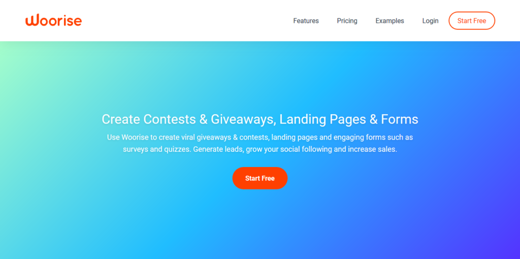
The choice of landing page builder depends on your business needs. Some tools are more efficient than others. For instance, for high converting and promotional landing pages, Woorise application would be a great option. The app provides the marketing tools to increase social engagement and generate sales whether it is a giveaway, contest, poll, survey or landing page.
Woorise integrates with popular marketing platforms like Mailchimp, Aweber, ActiveCampaign, Hubspot, Google Analytics, Bitly, Zapier, PayPal, Stripe and many more.
Woorise platform includes social actions for any social platform such as Facebook, Instagram, Twitter, YouTube, share buttons to encourage social engagement, referral rewards, drag & drop builder, pre-made templates, email notifications, conditional actions, 1-click pick winners, export data to CSV, analytics, fraud detection and a lot more.
2. Make it Simple
One of the best practices which retains its relevance and significance for years is simple, uncluttered design. A page overwhelmed with text and graphic content, colorful elements, images, media, call to action buttons can be so frustrating. Sometimes it is hard for the visitors to see what the page is intended for, what it is trying to offer, quite apart from the fact that it can be difficult even to find a CTA button covered by heaps of the stuff.
If you make your landing page too complicated, there is a huge probability that you will confuse your potential customers rather than convince them to action.
Look at this awesome landing page made by Codeacademy, one of the leaders in online education:
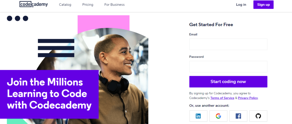
They decided to go with a simple, clear design to invite their visitors to make the best of their system for learning to code. While using the colorful elements which add creativity to the design, Codeacademy keeps the focus on visual clarity, minimalism, and straightforwardness to highlight how the product they offer is easy to use.
3. Personalize your Landing Page
Personalization is a big deal when it comes to doing business. People love to feel unique as if they were your one and only customers, so they really appreciate the features that deliver them a truly tailored experience. Your customers want personalization in every aspect of their lives, so you may give them what they want.
Look at what Airbnb has done. As far as persuading homeowners to open their doors to strangers is challenging, they found a way to convince them – showing the homeowners just how much they could earn by doing it.
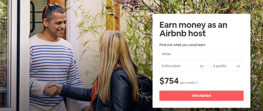
The calculator that displays the earning potential of your home is an exclusive feature that benefits from people’s desire for monetary gain. The total price is based on:
- The type of apartment you can offer as a host.
- How many quests you can accept.
- The area you live in.
4. Remove Navigation Bars
Unlike any other page on a website, a landing page serves only one purpose – it converts visitors into leads. So, it should neither look like a homepage nor act like one. As far as a homepage is concerned, navigation links provide website hierarchy and help visitors move from one section of a site to another, as they want to get to know a brand better. On landing pages, on the contrary, navigation links take visitors away from the conversion goal serving as exit links, so that you can not be sure whether the visitor comes back to your page or not.
As far as visitors have a limited attention span (the attention span of the average person is about 8 seconds), business owners need to engage them on their landing page right from the start and ensure everything is going well from there on out. Just think about it: every link on your page is an additional opportunity for visitors to leave.
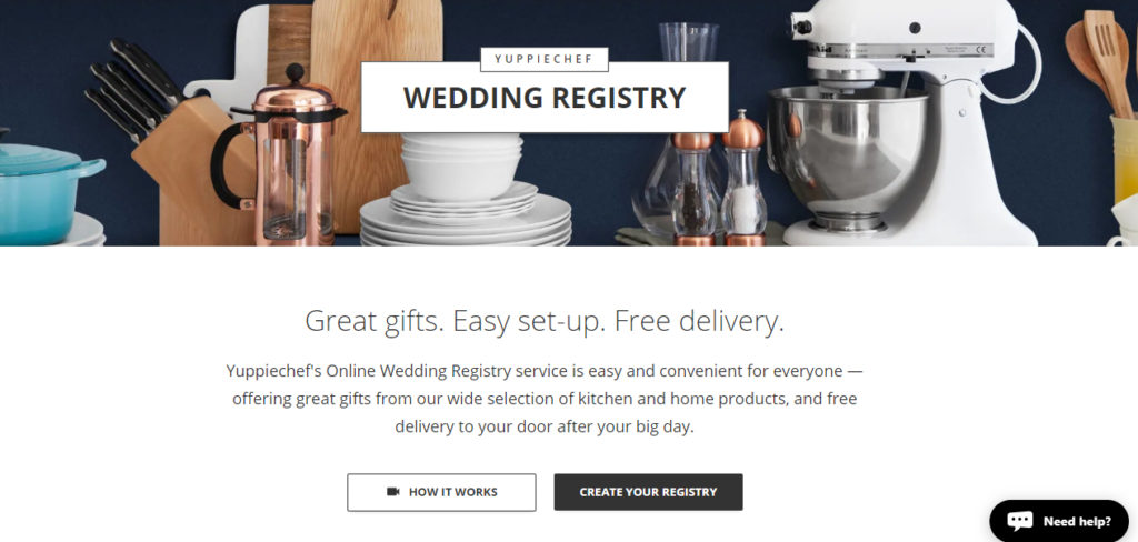
Just take a look at this Yuppiechef landing page. Yuppiechef is one of the leading South-African stores specializing in premium kitchen tools. They wanted their visitors not to be distracted by the navigation links and focus on the conversion purpose. The main goal was to get the visitors to sign up for their online wedding registry service. The new landing page without a floating navigation bar increased their conversion rate by 100%. Astonishing!
5. Use an Obvious CTA Button
A CTA button is a direct path to conversion. As such, it should be impossible for those who visit your landing page to miss it. As far as individual elements are concerned, a page with a strong CTA button generates more leads than a page with the weak one.
Here are the rules to follow to create a perfect call-to-action button:
- Use a color that helps the button stand out.
- Keep your CTA design laconic (additional images, arrows, CSS effects are redundant).
- Make the button’s size that makes sense.
- Mention your offer on a CTA.
- Make it the next obvious action.
- Make your CTA look clickable.
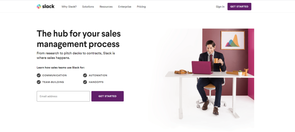
Thus, for instance, let’s take a look at the landing page of Slack collaboration hub. The CTA button is perfect here: visitors can immediately get the message the moment they visit the page. Due to super-simple design, the users can easily see the leverages of using the hub for sales and how to get started with it. Moreover, the purple color of the main CTA button is harmonized with the logo design and image but is slightly different to make the button stand out.
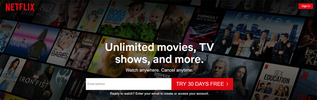
To make it clear, let’s take a look at another great example of a CTA button. Here is the landing page of Netflix, an internationally famous streaming service. The copy of the Netflix call-to-action button is based on the promising offer. As far as one of the people’s major fears which often a sticking point for signing up for something is the necessity to pay for the subscription, Netflix offers a 30-days trial right from the start. Moreover, you can see that the red color of the main and secondary CTA buttons perfectly matches Netflix’s logo.
6. Do Not Use Too Many Fields to Fill In
The main goal of landing pages is to convert visitors into customers and collecting information from them is essential for achieving the goal. Naturally, both sales representatives and marketers want to ask for as much information from visitors as possible. The users at their end do not want to spend their time filling out an innumerable number of fields to get access to the offer they are trying to get.
Is there a general number of fields where visitors will likely be turned off? When does frustration with a lot of required fields begin? Most commonly, the number of required fields is a balancing act between business needs and user experience.
According to Hubspot research, there is a correlation between the number of fields and landing page conversion, so it is a good practice to use as few form fields as you can. Moreover, you should be wary with sophisticated text areas as they have a powerful depression effect on conversion rates.
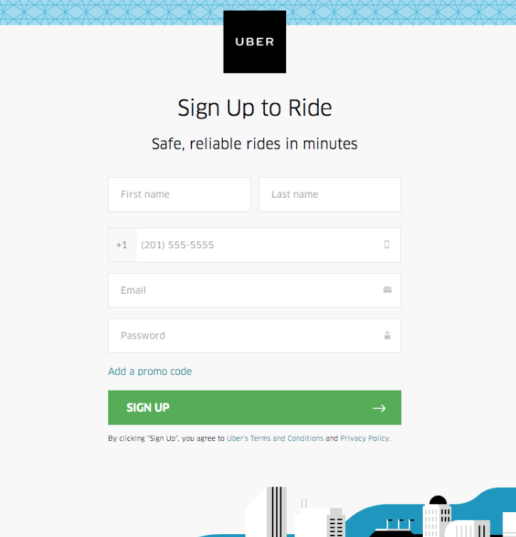
Now, look at this awesome Uber landing page convincing users to sign up to ride. What is good about the page? It provides only 5 form fields to fill in. It is an appropriate number for a signing up page. Moreover, they do not ask for personal information which is likely to make prospects suspicious. The promo code on the page is smart and it does not appear until the user clicks on it. This approach allows them to scale back the number of required fields keeping it limited to 5 ones.
7. Limit Yourself to One Call to Action Idea per Page
The major goal of having a CTA on a landing page is to give potential leads only one action to take. It is essential to reduce the noise which may distract visitors’ attention from the main purpose, providing them with a single path to follow toward conversion. One of the biggest mistakes here is inserting several competing ideas and multiple visual styles into one landing page, so it may just confuse users.
This applies to every element of a page design including copies, colors, font. But what if your company sells two types of products/services? There are two options here:
- Create separate landing pages for Product A and Product B.
- Pitch two types of products on the same page (this must be done with caution).
Just have a look at how a famous PR platform Muck Rack implemented the idea.
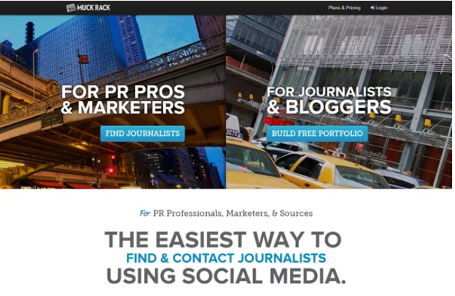
This page is not only fully interactive and visually appealing but has an intuitive design. But the coolest thing about it is that they segmented the target audience within one page by dividing it into two parts. The first one appeals to PR professionals and the second part is devoted to journalists. Muck Rack was succeeded in featuring both their services side-by-side but this does not confuse visitors as long as each of the parts has its own CTA.
8. Use Social Proof and Expertise to Increase Trust
Put the case that you came to the hospital for a check-up. After a while, two men approached you and recommended you to take the pills. Provided that, the first man is dressed in a t-shirt and pool shoes, as far as the second one has a stethoscope and is wearing a doctor’s coat. Whose advice are you more likely to follow? Of course, the second men have more credibility due to his uniform.
This is how authority works. Recommendations by a recognized expert are likely to carry more weight than ones by an ordinary person. The big brands often benefit from the practice in their landing pages.
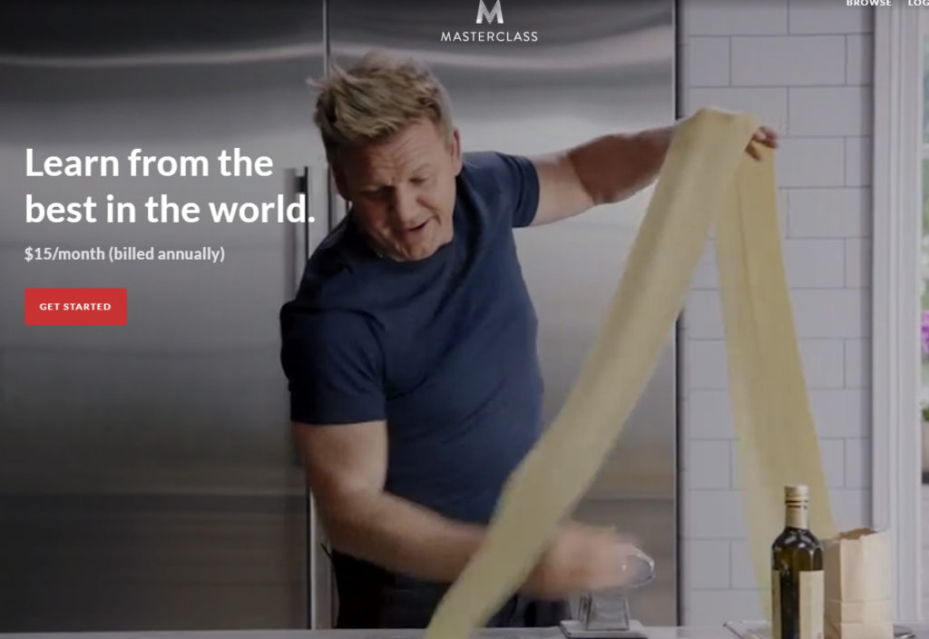
For instance, an American online education platform Masterclass.com uses its famous teachers to convince potential students to get tutorials and lectures pre-recorded by experts in different fields from cooking to singing. Thus, the platform uses the promo with Gordon Ramsay, a British chef and celebrity of world-wide reputation.
However, using authoritative figures is not the only way to increase trust. A simple and well-optimized design that adheres to high-standard quality is a good way to achieve the goal. All it takes is to look at landing pages of big brands to see that their design is impeccable.
Social proof aimed at helping to show that your product/service is recommended by experts, other companies, customers. Here are the stats: 63% of consumers are likely to purchase from a website if it includes product review or rating. However, social proof can come in various forms such as logos of your current customers, reviews, quotes, ratings, and more.
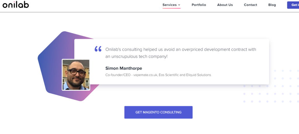
Here is an example of the quote with the fragment of the customer’s testimonial on the website of Onlilab company, which provides eCommerce Magento consulting services.
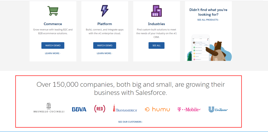
Salesforce, a leading CRM system for sales and marketing specialists, is a good example of how social proof on a landing page can look like.
9. Compress the Amount of Text
If you do not want your landing page to seem like an endless wall of text and lose visitors before conversion, don’t overwhelm the page with text information which makes it impossible to focus on the message you are trying to deliver. According to the Nextweb research, you have only 5 seconds to convince visitors to stay on your page. Otherwise, they will likely end up on the landing page of your competitor.
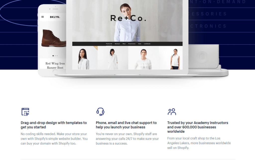
Using bullet points and visuals instead of tons of text information is a common practice big brands follow. Look at this Shopify academy landing page! They use visual elements and minimum text to convince people to join their training and business courses.
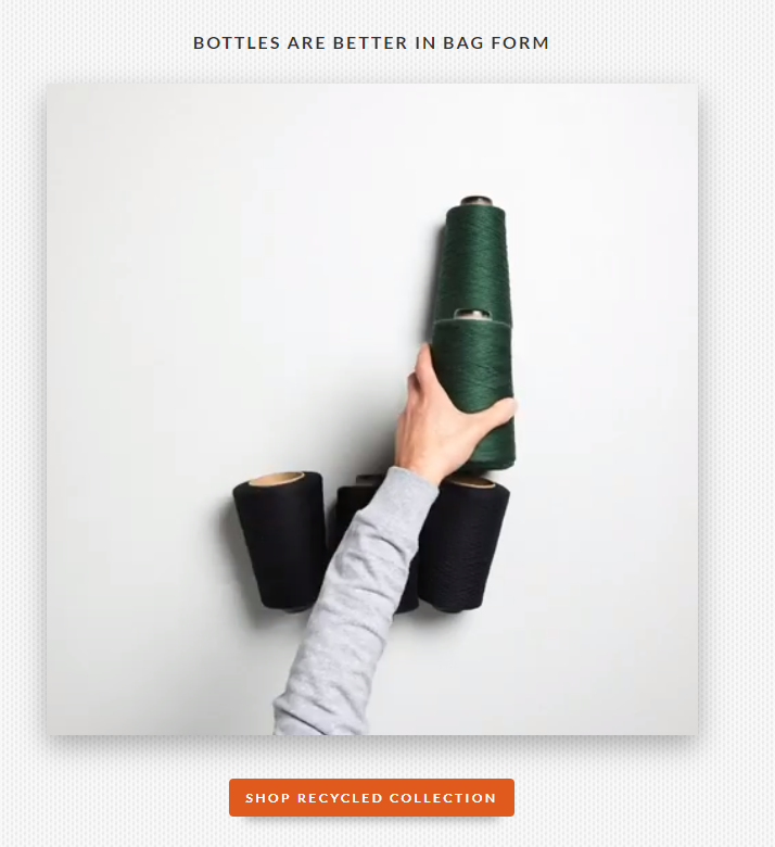
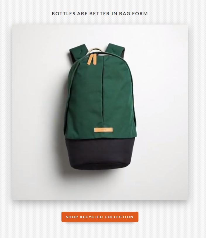
10. Use Visuals to Show your Product in Action
Showing a service or product in a real-life context helps visitors envisage themselves as owners of the product. Moreover, it is an awesome way to show how a product or service works. Animation, video, step-by-step photographs, demos are effective tools for capturing visitors’ attention.
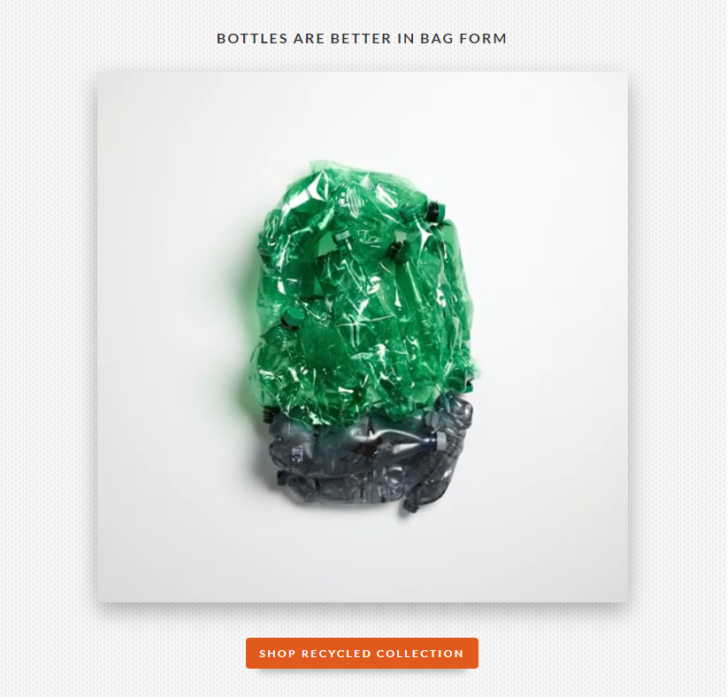
Now, let’s take a look at the more interactive landing page example. Bellroy is an Australian accessories brand, making bags, pouches, folios, wallets, phone cases and other accessories.
The company adds some fun and allows visitors to see how plastic bottles are turning into a brand bag with the help of animation. It is a smart solution to capture users’ attention and let them discover why Bellroy’s bags are an excellent choice.
There you have it – 10 simple tips to create better landing pages. Follow our recommendations, look out for trends, and do not forget to A/B test various options.