Building a website that converts is not an easy task. Yet knowing how important landing page design is in ensuring conversions, it’s safe to say that getting the best end result possible is worth the effort.
So, whether your landing page conversion rates fall between the acceptable 2% and 5% or whether they outperform averages (and your competition) with two, five, or ten times better results, it’s not a bad idea to become familiar with the top landing page design trends. And once you have a solid idea of what appeals to consumers right now, you can confidently make changes to the existing assets on your website to drive the success of your business.
This guide gives you a variety of well-designed and high-performing examples of landing pages that convert. You can look to for inspiration, along with some much-needed explanations as to why the examples work and tips on how you can apply the same strategies to your website.
Let’s get inspired.
In this article
- 1. Timeless (Minimalist) Design: Feather
- 2. Layout-First Design: Sigma, Apple, HubSpot, Pocketed
- 3. Illustration: Scott's Cheap Flights
- 4. GIFs & Micro Animation: Slack
- 5. Video: Optimal Workshop
- 6. Live Demo Embedding: Quetext
- 7. Emotional Appeal: Mindmesh
- 8. Social Proof: Monday, HelpScout, Voices, Evernote
- 9. CTA Click Triggers: Bay Alarm Medical
- 10. Readability & Low Word Count: Shopify
- Final Thoughts
1. Timeless (Minimalist) Design: Feather
While aesthetics may seem insignificant in the grand scheme of things — especially when trying to get your web visitors to convert — science shows that there’s good reason to pay attention to aesthetics when designing landing pages.
- First and foremost, there’s the fact that web visitors form a first impression about a website in less than 0.2 seconds. And they do it based on visual factors.
- Secondly, research shows that people prefer to interact will well-designed web pages. In a survey from Adobe, it was found that 59% of people would choose to consume content that was beautifully designed rather than something plain and simple.
- Thirdly, several studies have proven that aesthetics positively impact brand trust, customer experience, and (perhaps most importantly) consumers’ repurchase intention.
Of course, beautiful web design is a vague term. So how can you ensure that your landing pages look spectacular and deliver results?
Well, one possible direction would be to play around with the idea of minimal web design.
A study from Google discovered that web visitors tend to perceive websites with low visual complexity and high prototypicality as highly appealing, which shows that you don’t need to go over the top to secure conversions.
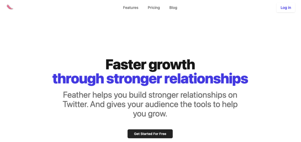
An excellent example of a brand that ingeniously utilizes minimalist design on its landing pages comes from Feather. Check out how the page below includes a ton of negative space, how it employs sans-serif typography and high contrast to deliver the unique sales proposition, and how well the CTA stands out thanks to a classic black and white color scheme. The best part? This look is something you can easily recreate, whether you have a design team to make the changes or prefer to design your landing pages yourself.
2. Layout-First Design: Sigma, Apple, HubSpot, Pocketed
When designing landing pages meant to appeal to your audience (and convert), you must understand how web users behave online. And the best way to get tested, actionable data is to look at existing eye-tracking and UX studies.
For example, the Nielsen Norman Group has followed online reading patterns for the past two decades. And the results of the agency’s findings show that some layouts naturally lend themselves to higher conversion rates.
In 2022, the split-screen design trend is particularly beneficial for brands trying to get landing page visitors to consume information. This is true because research shows that, right now, many web users utilize the zigzag and lawnmower patterns when reading online.
For inspiration on how to employ these layouts in your online assets, check out the example below from Sigma.
As you can see, the page alternates between text and images, encouraging readers to spend more time reading about the product features while including aesthetically-pleasing visuals that break up the text for readability and offer illustrated depictions of the solution’s main benefits.
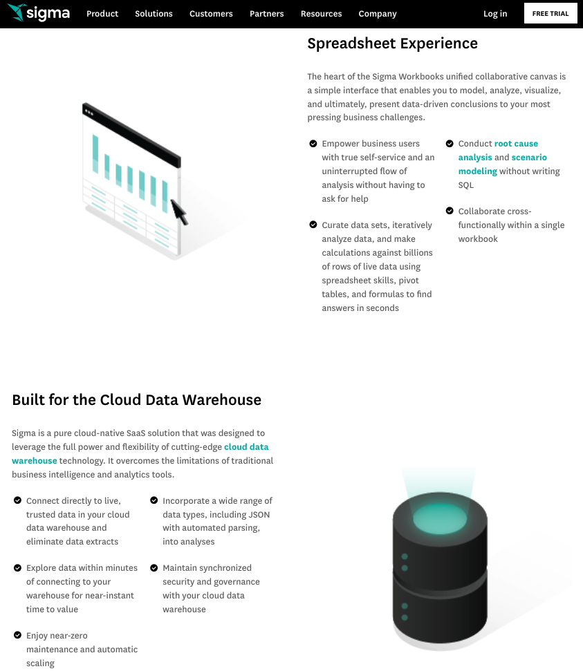
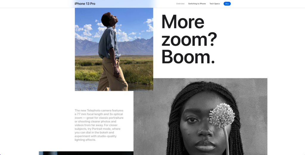
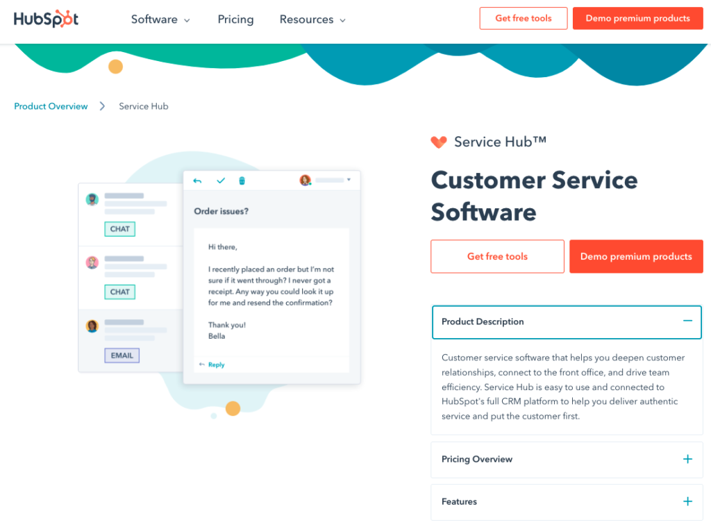
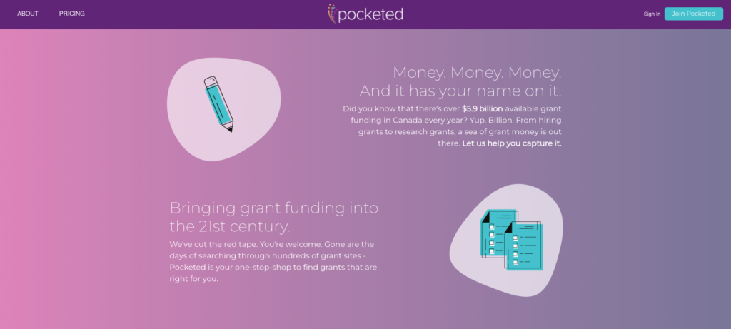
Other brands that use this type of layout pattern include Apple, Hubspot, and Pocketed. All add their own unique touch to the layout. But, on all these pages, the result is the same: an easy flow between textual and visual depictions of information and an overall web browsing experience that informs without becoming overwhelming.
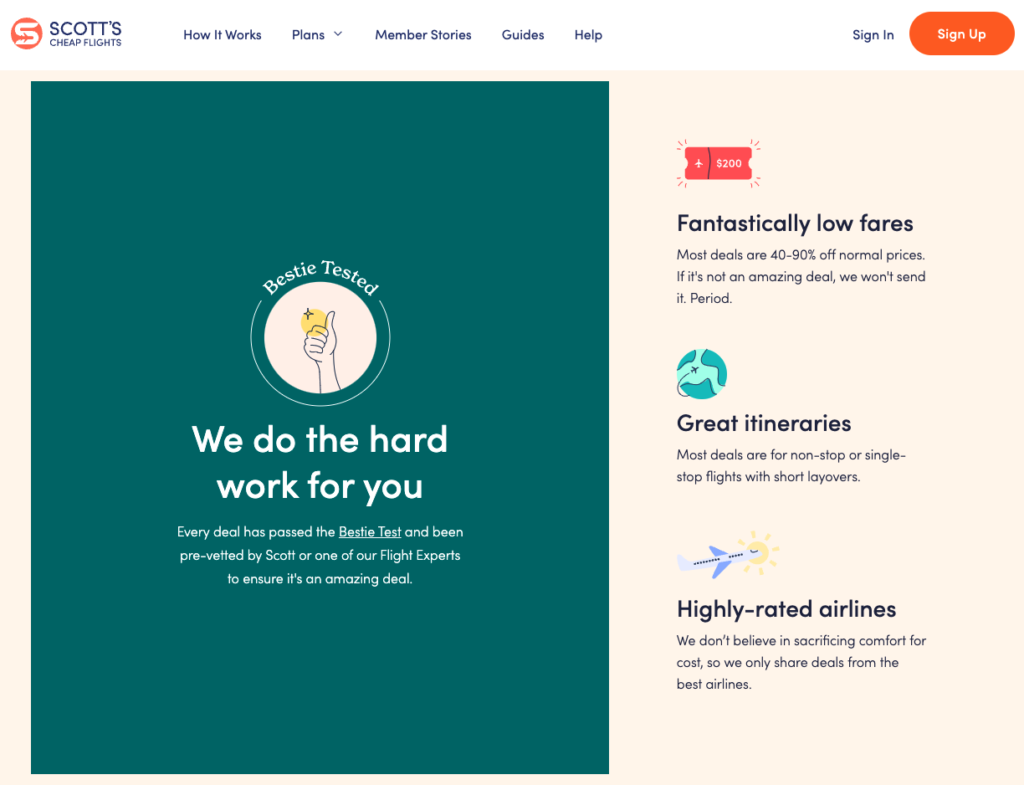
3. Illustration: Scott’s Cheap Flights
Most landing pages typically include imagery in the hero section. And it’s not a secret why this practice has become the norm. Essentially, visuals attract user attention. And by doing so, they allow high-value elements to stand out, consequently driving user action and inspiring conversions.
However, while photography reigned supreme during the past decade (with plenty of brands choosing to go with stock photography for their hero images), the last few years have seen an uptick in the use of illustration for website visuals.
The reasons for this shift are pretty straightforward. Illustrations are simpler and more successful at depicting complex ideas and situations. On top of that, they can boost web visitors’ motivation to consume the presented content and aid information recall. Moreover, illustrations effectively capture and retain user attention and allow brands to focus on a single message, target emotion, or desired outcome.
For an excellent example of a brand that chose to go with an illustrated landing page instead of one rich with photography, check out Scott’s Cheap Flights.
As you can see, it adheres to minimalist design rules to ensure it appeals to the brand’s audience. It also substitutes photos for illustrations, guaranteeing that web visitors notice and engage with the visuals, understand their meaning, and remember the benefits offered by the brand’s solution long after they leave the site.
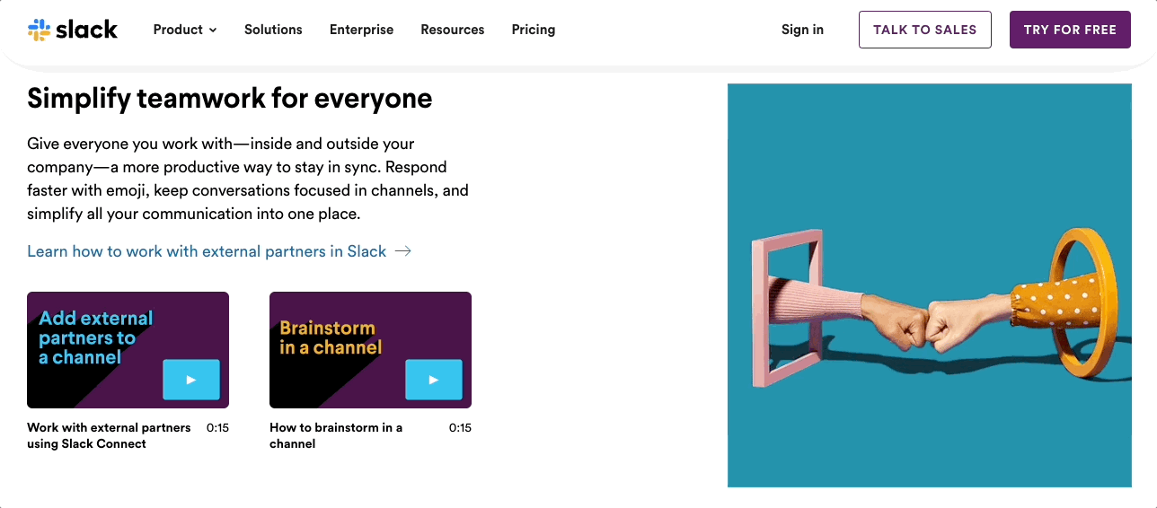
4. GIFs & Micro Animation: Slack
If you wish to take your visuals to the next level, it might not be a bad idea to start experimenting with GIFs & micro animation.
According to science, GIFs have become as popular as they are for several reasons:
- They are polysemic, meaning that they can carry more than one meaning.
- Using GIFs in communication drives empathy, seeing that the format allows the communication of emotional states that would otherwise be uncommunicable through words alone.
- The repetitive nature of GIFs allows these visuals to highlight details, establish layers of significance, and further engage viewers by making it (almost) impossible to depict where the loop starts and where it ends.
Nowadays, many brands utilize GIFs on their landing pages. But, perhaps none does it as seamlessly as Slack.
The way this brand chooses visuals for its homepage testifies to its global vision. Note how each GIF used on the homepage utilizes everyday objects to depict pain points universal to business teams. Yes, it could have been entirely possible to say that excellent communication drives successful teamwork. However, the truth is, showing a fist bump does it so much better than words ever could.
5. Video: Optimal Workshop
If you’re looking for landing page design tricks that will secure results in 2022 and beyond, you should definitely give the video a try (if you haven’t already).
First and foremost, video is an excellent format for introducing web visitors to your product. A survey from Wyzowl discovered that as many as 73% of consumers said watching a short video was their favorite method for learning about new products.
Secondly, recent data shows that videos aren’t just growing in popularity. They are becoming increasingly efficient at driving conversions as well. Vidyard’s State of Video Report for 2022 claims that as many as 93% of marketers say video converts the same or better than alternative formats.
Finally, don’t forget that video isn’t just efficient at securing a high ROI. It’s also exciting, engaging, and helps your web visitors understand your unique sales propositions in as little time as possible (with little to no effort).
For inspiration on how you could add a video to your landing pages, check out Optimal Workshop, whose strategy is to add an animated explainer to the hero section of its homepage.
This is an excellent example of doing video right — and not just because it looks good. Perhaps more importantly, the format allows the brand to describe its complex product without overwhelming awareness-stage buyers with too many details or industry-specific jargon.
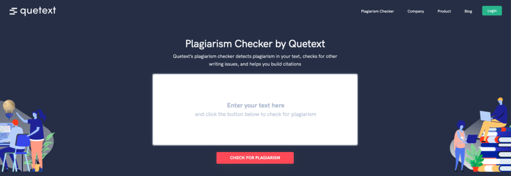
6. Live Demo Embedding: Quetext
Today’s consumers tend to be self-sufficient when conducting product research prior to their purchases.
They don’t just appreciate explainer videos and in-depth how-it works landing pages. They also look for landing page elements that give them the information they require to effectively evaluate solutions and decide whether they’re the best fit for their needs.
Considering this, product demos are a definite must-have when trying to convert customers. Especially for SaaS brands looking to break into competitive markets.
But, the truth is, the state of product demos isn’t at its highest. According to Navattic, it takes 3-5 business days on average for prospects to receive their requested product demos, which gives them plenty of time to explore alternative options (and even convert with one of your competitors).
However, there’s an easy way you can solve this issue on your landing pages: employing embedded live demos.
For inspiration on how to do this effectively, you can check out the Quetext website, where potential customers are allowed to try and use the brand’s solution.
Yes, prospects have to sign up for a (free) account before seeing their results. However, the entire process takes minutes and gives Quetext’s potential clients an instant, personalized illustration of what they can expect from the software, reducing the time it takes between people finding out about Quetext and becoming the brand’s paying customers.
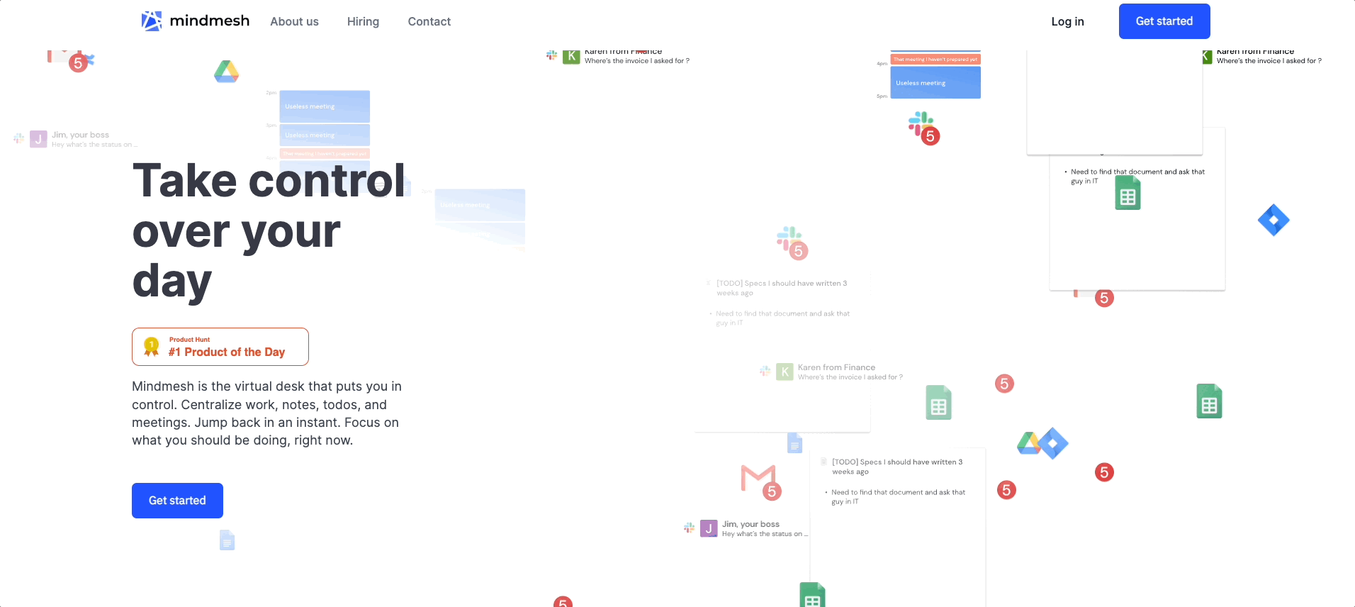
7. Emotional Appeal: Mindmesh
Emotional marketing techniques are always a solid choice when striving for success.
First and foremost, emotional imagery on websites (positive or negative) encourages people to buy more. On top of that, it:
- offers a unique opportunity to build relationships with your audience
- helps encourage web visitors to take action
- drives long-term loyalty
So, if you’re looking for that secret ingredient that will take your landing pages from good to great, it’s not a bad idea to play around with your audience’s emotions.
For inspiration on how you could do this, check out Mindmesh, a SaaS brand that uses animation to call attention to its target audience’s pain points. See how the notification badges, message previews, and calendar snippets point out the feeling of overwhelm that comes with doing business in 2022.
Essentially, the brand chose this direction, hoping that the negative feelings would encourage people to finally start solving their pain points, ideally by choosing Mindmesh’s software solution. And, if your products also aim to solve common consumer frustrations, taking inspiration from Mindmesh’s approach might just be the best design direction for you.
8. Social Proof: Monday, HelpScout, Voices, Evernote
When it comes to marketing strategies that drive landing page conversions, very few tactics work as effectively as social proof.
According to survey data from Statista:
- 94% of buyers say positive reviews make them more likely to use a business.
- 92% of users say negative reviews discourage them from using a brand’s services.
- 79% of people trust online reviews as much as personal recommendations from friends and family.
With this in mind, it’s safe to say that, when designing landing pages, adding social proof makes for an excellent way to present products in a positive light, boost conversions, and build credibility and trust for your brand.
There are several effective ways you can add social proof to your website. So let’s look at some great examples of social proof on landing pages you can replicate on your own website.
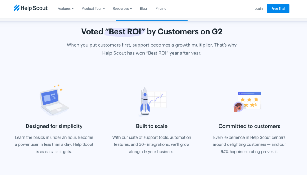
User stats, like the ones used by HelpScout, are a basic-but-effective solution because they support your claims by numbers.
As you can see in the example below, the stats work to convince potential subscribers that the software is the right choice for them. They promise a quick and easy onboarding experience. Plus, they also point out that the product offers more than 50 integrations and that the brand enjoys an impressive 94% customer happiness rating.
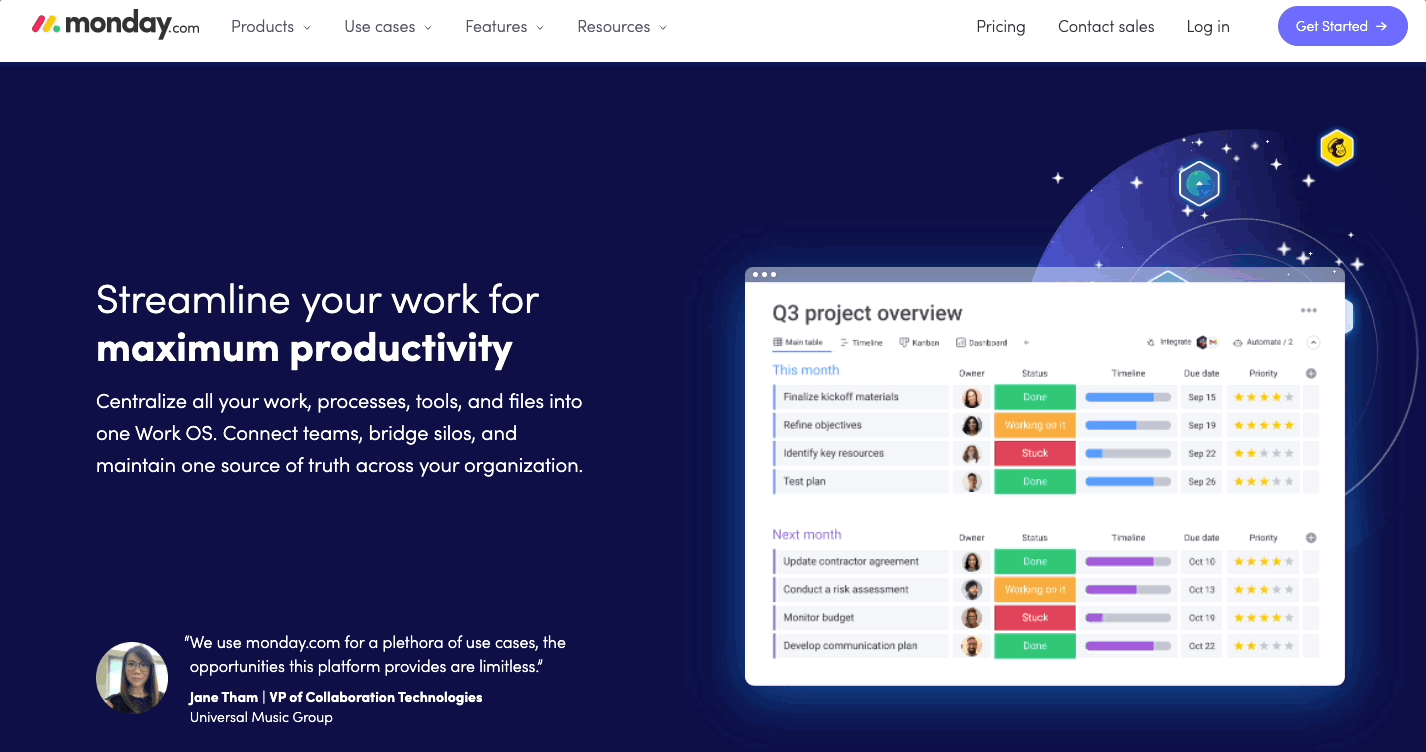
For a more personal touch, you could draw inspiration from Monday’s use of testimonial cards.
The brand connects each presented benefit with an instance of user feedback. This approach accomplishes two things. On the one hand, it proves that Monday can deliver on its promises. On the other hand, it shows off different use cases for the software, proving that the SaaS product is worth the investment.
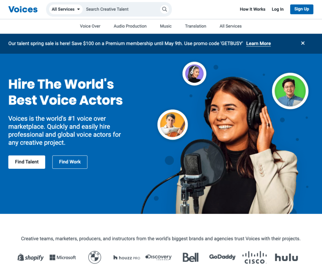
If your product or service is meant to help your audience achieve results, you might want to do something like Voices.
This company shows off customer logos on its landing pages, knowing that listing brands like Shopify, Microsoft, and BMW as its clients will impress potential new customers. Furthermore, by associating itself with these brands, Voices also shows potential clients that it can help them achieve the same level of success, as it delivers exceptional service and quality.
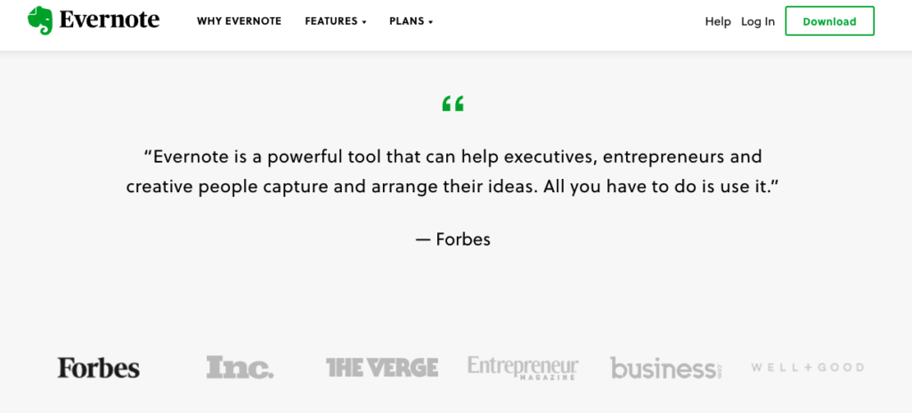
Finally, if your brand has been around for a while, it’s also not a bad idea to display social proof in the form of media mentions or third-party badges.
This is what Evernote does, relying on the authority of publications like Forbes, Inc., The Verge, and Entrepreneur to encourage web visitors to trust its claims and sign up for a free trial.
9. CTA Click Triggers: Bay Alarm Medical
Sometimes, the best way to improve the landing pages on your website is to enrich them with brand new content. But other times, you can get results that are just as good by making incremental changes to existing elements.
Focusing your attention on one of the highest-value parts of any landing page — the CTA button — can allow you to communicate your value proposition more effectively and inspire your web visitors to convert.
Sure, you might choose to play around with color schemes, size, and positioning. But one of the easiest ways to improve performance is to focus your attention on the copy.
By employing click triggers (pieces of copy that make converting seem less risky to your prospects), like Bay Alarm Medical’s “Get Started, Risk-Free” you can successfully encourage your web visitors to take action.
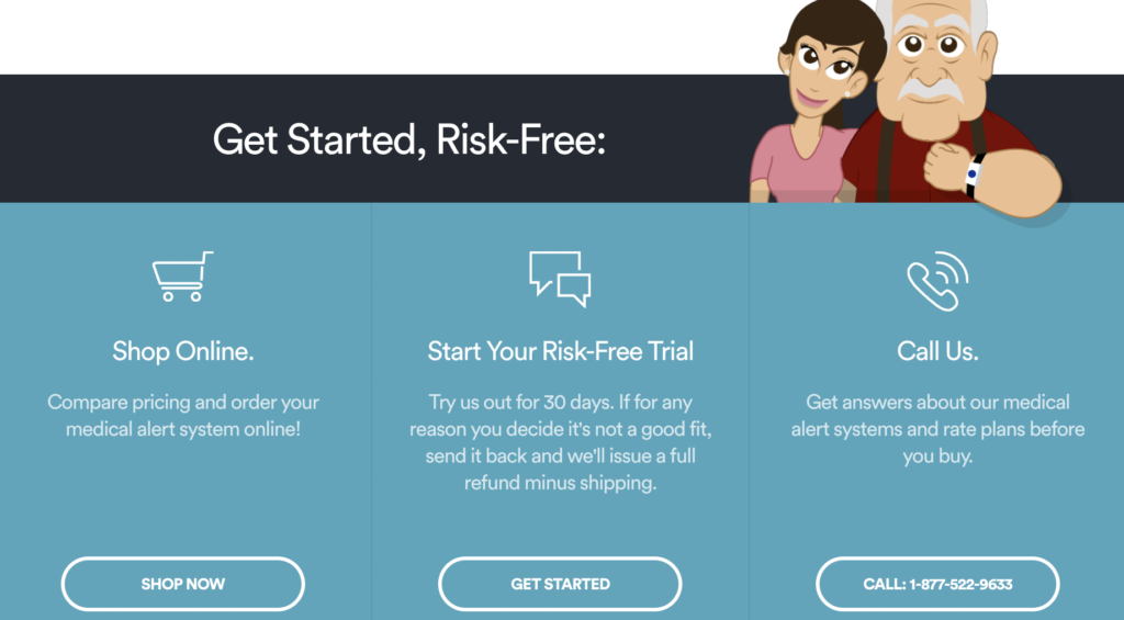
Offering a free trial is not the only way to employ click triggers. You could also experiment with instances of social proof, guarantees, secure messaging, etc. What matters is that you draw inspiration from examples of CTA click triggers that work and that you use analytics to test whether the changes you’ve made on your landing pages deliver the results you’re after.
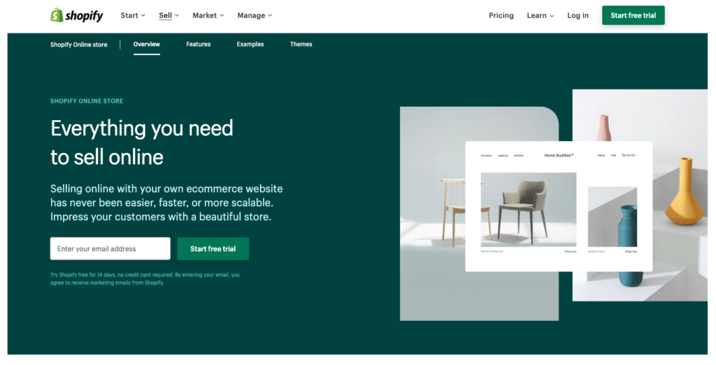
10. Readability & Low Word Count: Shopify
Lastly, as you explore inspiring landing pages that will help your brand achieve better results in 2022 and beyond, do your best not to adopt solutions that are too complex.
Yes, taking the extra effort to communicate your message, prove your brand’s trustworthiness, and convince your audience to convert is necessary for above-average results. But, data shows that simpler approaches tend to deliver higher performance than their complex counterparts.
In fact, a recent report from Unbounce discovered that both readability and word count significantly impacted landing page effectiveness, with the highest performers being those that kept the copy short and easy to understand.
So, why not look up to Shopify? This brand manages to present its offer in approximately 500 words. Plus, it receives a Grade 5 readability score, making the text understandable to absolutely anyone (even non-native English speakers).
Final Thoughts
There you have it, a generous list of landing page examples that you can look to for inspiration this year.
Whether you choose to employ a single conversion-boosting element from this list or more is entirely up to you. Just don’t forget to test its performance in the real world and keep an eye on the performance of your website to ensure you’re getting as many leads as absolutely possible.