Landing pages are a crucial part of converting your website visitors into customers. Without them, you’ll struggle to move people down the sales funnel until they make a purchase. Landing pages help you do this by prompting your visitors into taking your desired action:
Since landing pages are so important, you have to know exactly how to create and optimize them. In this article, we’ll look at best practices and some landing page examples to inspire you.
In this article
What Is a Landing Page?
A landing page is a standalone web page that is created for a specific advertising or a marketing campaign. It is where visitors land when they click on a link in a marketing email, a pay-per-click ad, or a social media post.
Why not just direct them to the homepage? Because you want to avoid a psychological phenomenon known as “choice overload”. Simply put, when people are faced with too many options, they are more likely to end up not taking any action at all.
A landing page is designed with one goal in mind: to guide website visitors to take a desired action. That desired action might be signing up for your webinar, giving their contact details, registering for a free trial of your product, or even making an immediate purchase.
You can build your landing pages on your own with the use of landing page software, if you wish. Alternatively, you can always hire a web design agency to help you.
Types of Landing Pages
There are different types of landing pages you can use. Which one you choose will depend on the action you’d like your website visitor to take.
Let’s take a look at some of the different types you can consider:
Squeeze Page
If your goal is to capture your website visitors’ email addresses, this is the type of landing page you want. By gathering their contact information, you can bring them into your digital marketing funnel and start building a relationship.
Squeeze pages offer something of value to website visitors in exchange for their email address. You might offer bonus content such as an ebook, white paper, or report. You could also offer access to an online course, training video, or even a free trial of your product. This is called a lead magnet.
At Lform Design, we’ve learned that using a double opt-in leads to a higher quality of email list. In a double opt-in, your visitor inputs their email address on your landing page, then receives an email asking them to confirm their subscription. This ensures a high quality email list, since only those who are truly interested will end up receiving your mailings.
Splash Page
The splash page is an intermediary page that appears usually when someone clicks on a content link, such as on a social media post. The primary goal of this type of page is not always lead capture. It can also be used to share an announcement or update, or to present an advertisement.
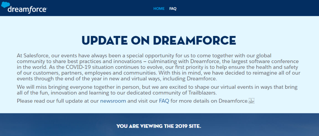
The example above is from Dreamforce. The landing page is used to inform website visitors that the company’s event is cancelled.
Lead Capture Landing Page
Lead capture landing pages are similar to squeeze pages. With lead capture landing pages, however, you try to get more information from your website visitor. So instead of just asking for their email address, you might also seek to get information about their work, interests, or geographical location.
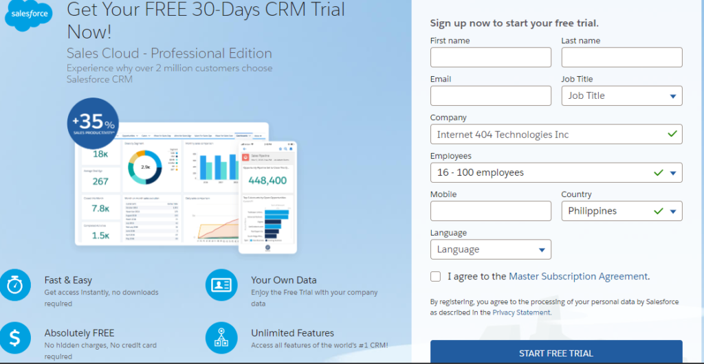
For that reason, you wouldn’t usually use a lead capture page for first-time website visitors who are just entering your sales funnel. This type of landing page is for those who have already expressed an interest in your product. In the above example, this type of page is used for those who have expressed interest in a free trial of Salesforce.
This form is quick and easy to fill in, but gives us enough information about our prospective customer that the right member of the team can get in touch with tailored communications.
The primary purpose of lead capture landing pages is to collect leads. You can generate more sales-qualified leads with pay-per-click, paid, and display advertising, which you can incorporate into your landing pages. These lead-generation strategies bring immediate gains, especially for pay-per-click ads per dollar spent.
Image-based ads must include your brand logo to boost brand awareness. You may promote ads across your digital channels and email marketing for existing newsletter subscribers to spread the word, and monitor metrics, such as open and click-through rates.
In addition, Google Ads Management can help generate new visitors to grow your business and see more than a 500% return on your investment. Placing your ads on your landing pages, social media pages, and website partners can attract new, more diverse leads and customers.
Coming Soon Page
If you’re launching a new product or redesigned website, or have something else exciting in the works, then you should send your visitors to a Coming Soon landing page. This page aims to inform and to create excitement surrounding the upcoming release or event.
You can also use this type of landing page to capture contact information. For example, you might ask for an email address so that you can notify the visitor when the new product is released.
Make your Coming Soon page attractive by launching a timer similar to those used in holiday countdowns. If you’re in retail or e-Commerce, such a countdown timer can excite consumers as they wait for your biggest promotions of the year. Note that this timer should accompany your announcements across your social media pages and other online platforms.
You can expect more prospects with this landing page strategy combined with a massive digital promotion that amps up the excitement about forthcoming deals.
404 Landing Page
When something goes wrong on your website and a page is not available for some reason, you can direct your visitors to a 404 landing page. But this page can do much more than just inform them that the page is broken. A 404 landing page can also work as a lead generation tool.
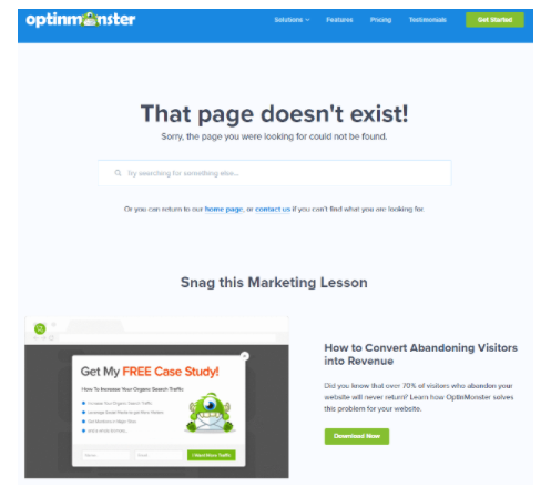
Check out Optinmonster’s 404 landing page, above. This page takes the opportunity to offer website visitors a free case study in exchange for their contact information.
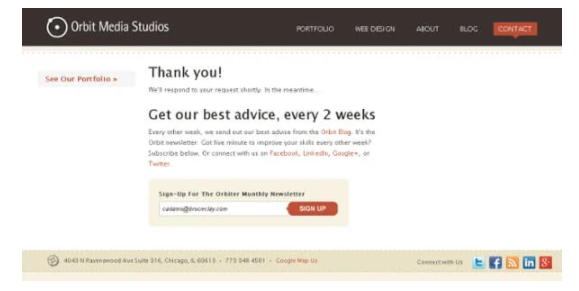
Thank You Landing Page
If your website visitors complete any of your desired actions, such as filling out a contact form, you can direct them to a landing page that thanks them for that action. You can also use this page to generate leads. The page pictured above from Orbit Media, for example, tries to entice website visitors to sign up for its monthly newsletter while they’re on the site.
Now that you know some of the types of landing pages you can use, let’s discuss some landing page best practices.
Landing Pages Best Practices and Examples
For your landing page to be effective, you need to be familiar with best practices and implement them. In this section, let’s discuss some of those best practices and look at some examples.
1. Create a Headline That Offers Value
The headline is the first thing your website visitors will see. If it doesn’t speak to them, they won’t even bother to read the rest of your landing page. That means you can say goodbye to them taking your desired action.
Therefore, your headline must be snappy and eye catching. It should also make the benefit to the reader clear. In other words, why should they care?
This one from Starry is a great example:
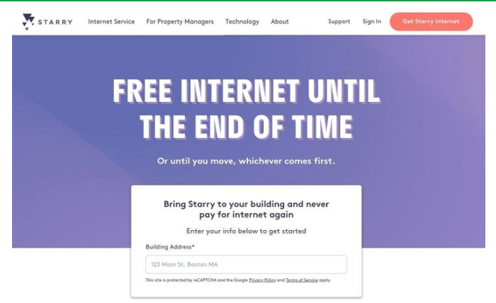
Starry’s goal with this landing page is to get visitors to make a purchase. The landing page easily catches people’s attention because the headline summarizes a very enticing benefit. Who doesn’t want “free internet until the end of time”, after all?
2. Include Visual or Video Content
Pictures are one way to catch the attention of your website visitors. Choose an image that is aligned with the offer and the page’s copy.
Here’s an example. When you click on Sendinblue’s paid ad on Google, you are directed to this landing page:
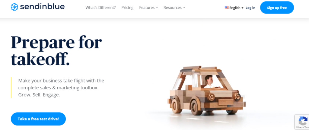
The goal of the landing page is to persuade visitors to try out Sendinblue’s suite of sales and marketing tools. The call to action reads, “Take a free test drive”. The image is actually animated and as you watch, the car transforms into a flying vehicle and takes off. This is aligned with the headline of the landing page, “Prepare for takeoff”.
Images are essential if you want to hold people’s attention, and video content is even better. Make sure you include compelling visual content on your landing page, no matter what its purpose.
3. Craft Compelling Copy
If the rest of your copy is dull, it wouldn’t matter if your headline catches your visitors’ eye – they still won’t stick around. Your copy needs to support your headline and align with your brand voice.
Keep it short and concise. If your copy is too long, the reader will get bored and leave. Check out this landing page from Mailchimp:
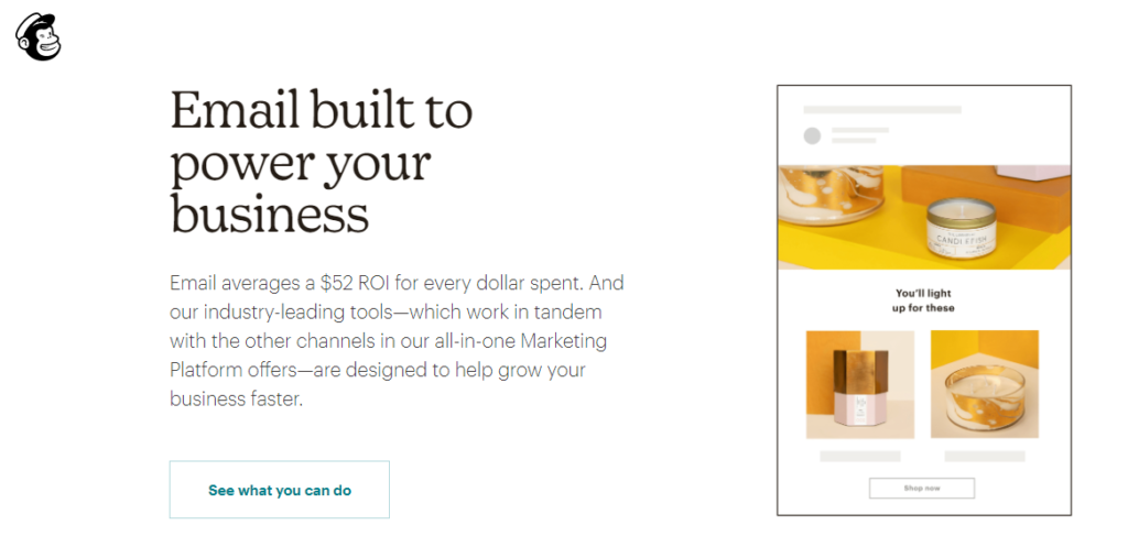
The copy is located directly underneath the headline, and it expands upon that headline. In one short paragraph, it makes a compelling case for why website visitors should give Mailchimp a try.
4. Make Your CTA Stand Out
Your call to action (CTA) is your final instruction to your website visitors, telling them what you’d like them to do. You need to make sure your CTA stands out on the landing page. You might locate it centrally, use a larger font size, or use a different color of text.
Make sure your CTA is clear, simple, and easily actionable. Instructions like “sign up now” or “check it out” make for great CTAs.
This landing page from Freshworks is a great example. The CTA, “Get started”, is presented as a blue button that stands out on the white background. When you look at the page, your eyes are automatically drawn to the CTA.
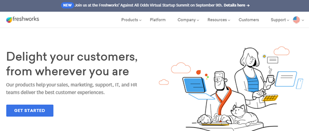
The CTA is clear and concise. Website visitors know that if they click on the CTA, they can get to know more about Freshworks. There is no room for ambiguity in your CTA.
5. Put Lead Form Above the Fold
Your lead form is one of the most important elements on your landing page. If visitors can’t find it, they might leave without taking any action.
Don’t make your visitors scroll down your landing page to find the lead form. Instead, always place it above the fold.
Here’s an example from Instapage:
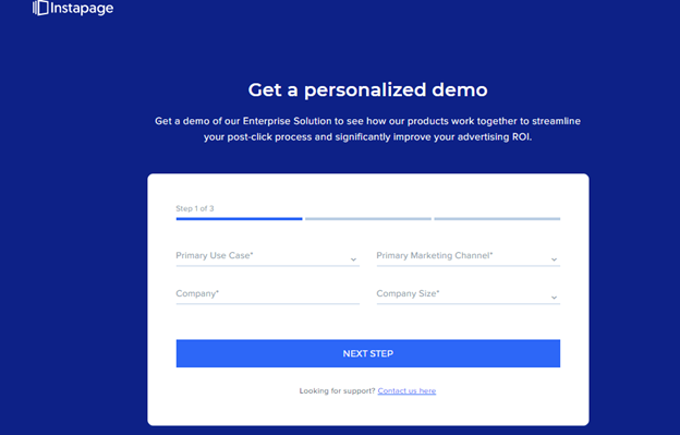
Those who want to take up the offer of a demo don’t need to scroll all the way to the bottom to provide their details. The form is above the fold, and prominently placed in the center of the page.
Want a different way to capture leads without putting the form in the middle of your landing page? Why not use a live chat plugin to capture their details? These are becoming increasingly popular and can even reduce bounce rate according to Mesh Agency.
6. Give Away Something Relevant
Your website visitors must understand what’s in it for them if they take your desired action. Therefore, you’re much more likely to get them to act if you give them something they want.
Try offering bonus content, a free trial, or another relevant freebie to encourage visitors to do what you want them to do. Make sure your offer is relevant to your product or service. Ultimately, you want your visitor to purchase what you’re selling.
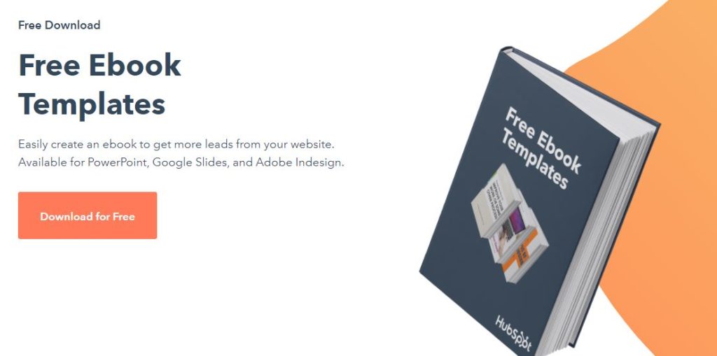
Here’s a good example from Unbounce:
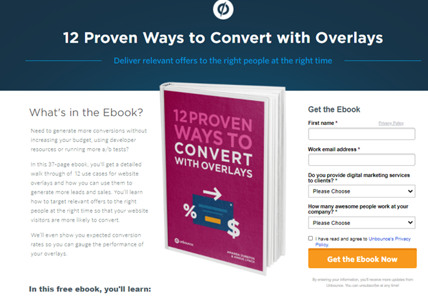
In exchange for website visitors’ contact details and other information, Unbounce offers a free ebook on a relevant topic.
7. Don’t Ask For Too Much
To start building a relationship with a website visitor, you need their email address and possibly name, but that’s all. Don’t commit the mistake of asking for too many personal details if your visitors are still at the top of the funnel. If you ask for too much information at this stage, they’ll likely leave and not come back.
Here’s a landing page from Active Campaign that asks for only an email address:
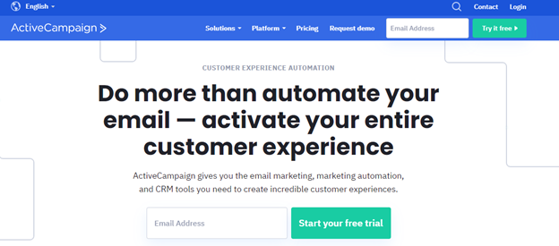
Active Campaign assumes that those who click on its paid ad on Google are just being introduced to the company for the first time. Therefore, it asks for nothing but their email address. Follow this example if you want to maximize the number of people who will give you that first, all-important bit of information.
8. Remove Competing Links
Since you want visitors to take a desired action on your landing page, you need to remove anything that may prevent them from doing so. That includes distractions such as competing links. If there are other links apart from your CTA on your landing page, there’s a chance your visitors will click on one of those links rather than on your CTA.
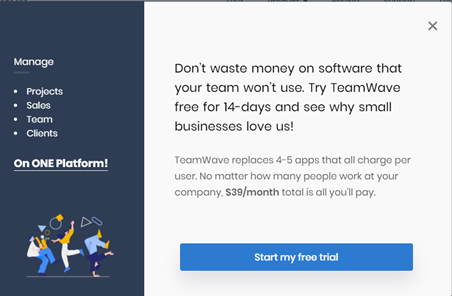
The above landing page from Teamwave only has one CTA and no other links. Those who get to this landing page have no other options but to click on the “Start my free trial” button or leave the page.
Remember: keep it simple. Don’t give your page visitors too many choices. One clear CTA and one link to click is the way to do it.
9. Make Your Landing Page Responsive
Fewer and fewer people are doing most of their internet browsing on desktop machines. According to the Hosting Tribunal, desktop web browsing has shrunk to 48.7% of total traffic, with mobile devices such as tablets and smartphones becoming more and more powerful. According to the World Advertising Research Center, 72.6% of Internet users will access the web using only their smartphones by 2025.
Therefore, you need to make sure your landing page provides a great user experience to all visitors, no matter what device they’re using. If the relevant elements on your landing page fall off when the page is viewed from these smaller devices, you will only end up losing many opportunities to convert. This is where responsive page design comes in.
Check out this landing page from Woorise:
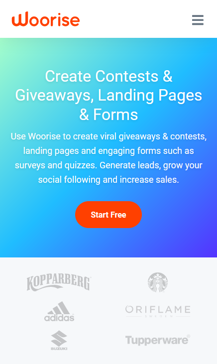
Even if you access it using a smartphone, you can easily see all the content, including the CTA above the fold. All the essential elements such as the headline, supporting copy, and images also remain intact.
Run robust responsiveness tests on all the sites you build and check for proper formatting including text, imagery, and breakpoint widths, across a number of browsers and devices. This is because responsive page design is not a nice-to-have; it is an essential.
10. Optimize For Search Results
Imagine you have created an amazing landing page with all the important elements: great copy, compelling images, the perfect CTA, and so on. All of this is no good at all if people can’t find it.
The top 3 results take 75.1% of total clicks in an average Google search. Therefore, you need to ensure your page ranks highly for the relevant keywords so people can find it through organic Google searches.
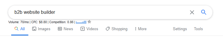
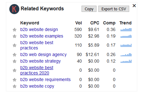
Take the time to undertake some keyword research to make sure you’re targeting the right keywords. Ideally, you want to aim for those that see a high search volume but have minimal competition. The Keywords Everywhere plugin can help you. For example, when I type in “b2b website builder”, I can see that the term has a modest search volume and is highly competitive (0.86 on a 0-1 scale). I might use the suggested alternatives to find a higher-volume and less competitive term instead:
Once you’ve chosen your keywords, make sure they appear on your landing page. Here’s an example: I searched the term “affiliate tracker software” and one of the top results let me to Post Affiliate Pro’s landing page:
This landing page is clearly optimized for those keywords.
Don’t forget to optimize any images using alt tags, too. Alt tags are short snippets of text that describe the purpose of the image. If your alt tag contains your target keyword, Google uses this as a ranking metric.
11. Ensure Your Landing Page Loads Quickly
Many people forget or underestimate the importance of page speed, or how fast a page loads. But it is a metric you cannot afford to ignore.
Page speed is measured in time to first byte (TTFB), which refers to how long it takes between the browser receiving a request (such as a user clicking a link) and receiving the first byte of data. TTFB is measured in milliseconds and a tiny improvement can make a big difference. According to Just Add Content, slow page speeds can lose a small business up to $125,000 per year! That’s because 40% of users will leave if a site takes more than three seconds to load.
Here are five quick ways to boost your landing page loading speed:
- Use the right format for images. In general, complex images such as photographs should be in JPEG format, while simpler images with only a few colors (e.g. logos) should be in PNG format.
- Compress your images by using a plugin such as WP-smush.
- Remove extra plugins, themes, and widgets. Everything you download is taking up space and slowing your site down. If you’re not using it, get rid of it. Streamline your site and only use the plugins you really need.
- Upgrade your hosting plan. If you’ve done everything you can to improve your page speed but your landing page is still slow, your hosting package may no longer be adequate for your needs. SEO-friendly hosting might seem more expensive, but it’ll pay off in the long run.
If everything else on your landing page is optimized but you’re still not seeing the conversion rates you’d like, page speed might be the problem. Test your page speed using Google PageSpeed Insights and take steps to improve it. Aim for a loading time of under 200ms.
12. Include Social Proof
If someone has only just heard of you, your company, or your product, why should they trust you? If you want your website visitors to try out your product or service, you need to know them you’re trustworthy. That’s where social proof comes in. Social proof is most commonly found in the form of reviews and testimonials.
Social Proof theory states that a person will look to others and imitate their behavior in a given situation. Applied to marketing, using reviews and testimonials shows the new site visitor that others have purchased your product or used your service and loved it. This makes it more likely they will do the same.
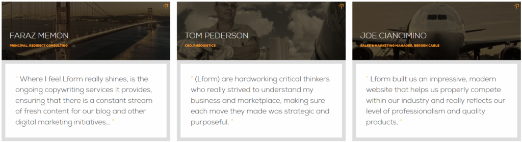
The testimonials are from senior team members at well-known and respected businesses. This proves to our website visitors that we can deliver on the service and expertise we promise.
Position your testimonials strategically so they support the goal of your landing page. Ideally, they should be located near the CTA. Additionally, use the photograph and full name of the person giving the testimonial if possible. This lends additional credibility and shows that the testimonial is genuine.
Using Landing Pages the Right Way
A great landing page can help you achieve your marketing and business goals. Whether it’s getting someone to sign up for your free trial, give you their email address, or hit that “buy now” button, landing pages can help nudge your site visitors into action.
But you need to be strategic in order to create a landing page that helps you meet your goals. Determine your goal, understand your audience, and then follow these tips to create better landing pages. You’ll soon start to see the benefits in the form of reduced bounce rates, higher conversions, and more quality leads for your business.