The fact that consumer purchasing behavior depends on emotional processes is nothing new.
Several research studies have shown that people make buying decisions based on anticipated emotions and spend more time shopping when they feel sad. Moreover, functional MRI imaging has revealed that consumers rely on personal feelings rather than information when evaluating brands. All this exposes the crucial function of emotions in mapping out marketing strategies.
But while employing emotional marketing techniques to raise interest and engage target audiences makes for an excellent strategy, there’s one thing that can turn feelings into an even more powerful weapon in any marketer’s arsenal: visuals.
Using emotional imagery – particularly on landing pages – holds the potential of:
- Conveying concepts more successfully than through words
- Communicating information more quickly
- Leaving a more positive first impression on web visitors
- Positively impacting conversion rates
If these benefits sound like something that your brand could use more of, the good news is that it’s easy to make images work for you and your business goals. So, without further ado, this is how you can use emotional imagery to create high-converting landing pages.
In this article
How Emotional Imagery Works
The first step you need to take when deciding to use emotional imagery on your landing pages is to precisely determine the types of emotions you want to evoke among your web visitors.
Do you want to make them experience in-the-moment happiness? Do you want to show them how great purchasing a product could help them feel? Perhaps you want to evoke negative emotions to inspire action?
There are a lot of ways people react to emotionally charged images.
Positive Emotions Make People Consume More
A research team led by prof. Winkielman discovered that images that evoked positive emotions directly influenced consumption.
In a study conducted in 2005, they found that thirsty people drank more after seeing pictures of happy faces. In 2018, the professor’s team discovered that the same effect on consumption could be achieved by showing images of positive objects (cute dogs, for example).
But, what’s fascinating about the second study are the following two things:
- The team found that positively rated emotive words had no swaying power over people’s consumption. This proves the significance of including emotionally charged visuals on your landing pages.
- The effects of the pictures on people’s behavior were noticeable almost instantaneously. The duration of the emotional cue proved irrelevant when influencing consumption. Practically speaking, the team found that an exposure of 200 milliseconds was just as efficient at driving consumption as that of 10 milliseconds.
Negative Emotions Can Also Make People Buy More
So, you might be thinking that all you have to do to make people convert on your landing pages is take note from happiness-inducing marketing tactics like the (genius) Coca-Cola “Hug Me” campaign.
But, the thing is, happiness is not the whole picture.
According to psychologist Ian Zimmerman, negative emotions like stress, anxiety, and unhappiness make people buy more. That is, such feelings can inspire impulsive shopping behavior in people by stimulating pleasure. The pleasure in question stems from the very fact that a person can acquire a product immediately.
How to Apply This Knowledge When Choosing Emotional Landing Page Imagery
As you can see, when employing emotional imagery on your landing pages for the sake of boosting conversions, you have two available approaches:
- You can aim to make people happy and likely to consume more simply by showing them pictures of positively-rated images. This is what Skillcrush does on its homepage, combining smiling faces with empowering messages and a ton of social proof.

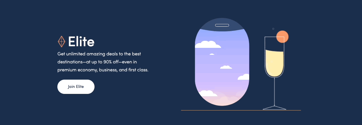
- You can make use of people’s negative emotions that drive conversions. Not by making people feel bad, but instead by appealing to their need to change the circumstances in their lives. Take, for example, Scott’s Cheap Flights. This website uses minimalistic animation on its Elite membership to illustrate the lavish lifestyle web visitors could be enjoying if they signed up for the program. Compared to the idea of cramming into an economy seat for a transatlantic flight, this type of visual works rather well to encourage people to spend more than they originally planned.
How to Drive Conversions With Emotional Images
So, you’ve figured out what types of images you want to use on your landing pages – that is, what sort of emotional effect you want to achieve. Now it’s time to ensure that your photos/illustrations of choice do the absolute best job of driving conversions.
You see, the thing is, a photo can do a fantastic job of inspiring action. But if it doesn’t play well with the rest of the elements on your landing pages, then it’s a waste of space and might even harm your conversions.
So, how can you ensure that the imagery on your site actually drives conversions? Well, a good start would be to consider the following two factors.
Subject Positioning
In photography, subject positioning plays a crucial role in determining the effect of a photo. Moreover, it can direct the viewer’s attention or even drive a particular emotional response, which is something that you definitely want to make use of on your landing pages.
One photography rule you have most probably heard of is the rule of thirds. While it has been in use for millennia, it was only recently that researchers ventured to figure out the effects of positioning a photo subject off-center.
In 2021, a team led by Michael Koliska found that the rule of thirds served as a “geometric guiding structure that directs [the viewer’s] vision.” According to the team’s findings, applying this principle:
- Made it easier for viewers to process images
- Informed viewers about the main subject of a picture
- Helped people gain a better understanding of a picture’s intended message
To see the rule of thirds in action, check out this landing page for the Strava app. A quick glance shows that the hero section implements the grid guideline by leaving the center of the feature image blank.
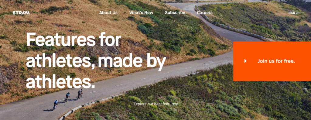
On the left-hand side of the grid, web visitors are presented with two elements: a trio of cyclists and a prominent unique value proposition stating that the app offers “Features for athletes, made by athletes.” On the right-hand side, the single present element is a loud call to action, inviting web visitors to join the app for free. Using a large button size, a contrasting color, and simple text, this CTA steals the show on Strava’s landing page. It works perfectly in harmony with the action-inspiring image and the convincing value proposition, contributing to the app’s
Of course, there are other ways to use subject positioning to achieve an emotional effect – yes, even with product photography.
In this hero image on the Transparent Labs homepage, the advertised product takes center stage while being surrounded with illustrations of its benefits. There’s the number of ingredients used, the removal of harmful additives, and the all-natural formula.
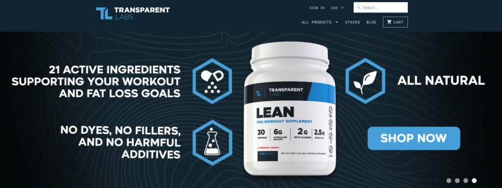
In this case, although the photo’s composition doesn’t tell a story or describe an emotional journey, it does paint a complete picture by visually depicting the pain points consumers deal with when shopping for clean supplements. As a result, web visitors see the product surrounded by all the needs it solves. This instantly creates an emotional connection that is likely to turn them from mere web visitors into leads.
Web Visitor Browsing Behavior
Another great way to maximize the impact of emotional imagery on your landing pages is to use eye-tracking data when planning your site’s layout.
For example, research from 2018 shows that people spend most of their time on a page viewing content located above the fold. Sure, they scroll more than they used to a decade ago (thanks to mobile devices). But that still doesn’t give you enough reason to sacrifice the conversion-driving potential of your visuals by hiding them away somewhere they’re unlikely to be seen.
For an outstanding example of how to make a stellar first impression with emotional content placed above the fold, check out the CampMinder homepage. This SaaS company understood that positive emotions and human connection had to be at the core of its branding strategy, so the design team decided to use a custom video as the main visual on the brand’s homepage.
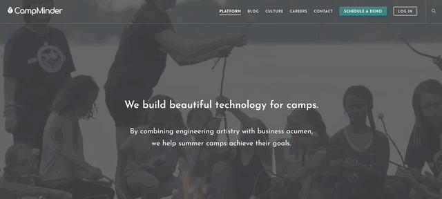
But what makes this approach work so well is that the emotional impact of the hero section is not where the positive feelings end. Scroll down, and you’ll see that every single visual used on the page features children smiling, having fun, and learning. Such powerful emotional imagery works to inform all website visitors that CampMinder is a brand fully dedicated to delivering the results it promises – making summer camps an unforgettable experience for kids.
Using Landing Page Layout to Get the Most out of Emotional Imagery
If the results you need from your landing pages can’t be achieved with a single visual (or by emphasizing one value proposition), you can still boost conversions by paying attention to how you place your selected images.
Several UX studies have shown that people tend to consume online content according to three common patterns, which can provide an excellent guideline for placing emotionally impactful images.
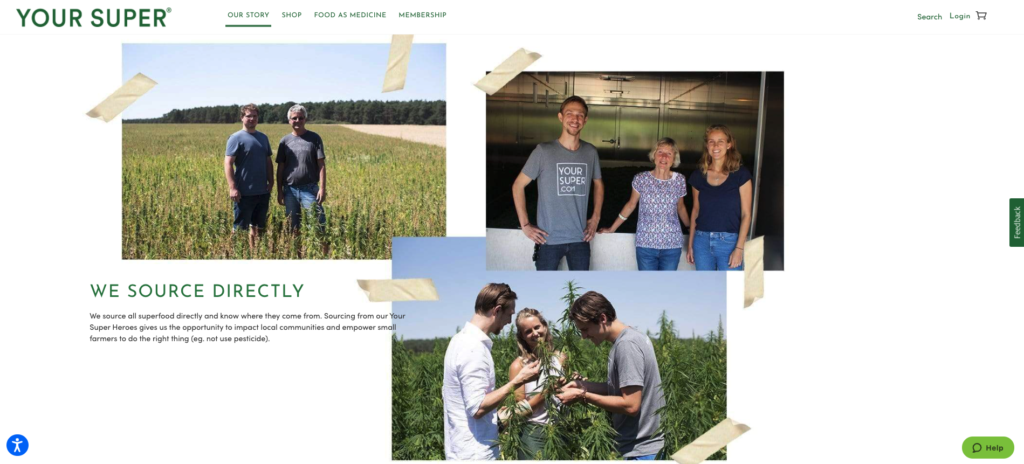
The ingredients landing page on the Your Super website, for example, follows the Gutenberg diagram, placing positive feeling-evoking photos in the three positions that are most likely to draw web visitors’ attention.
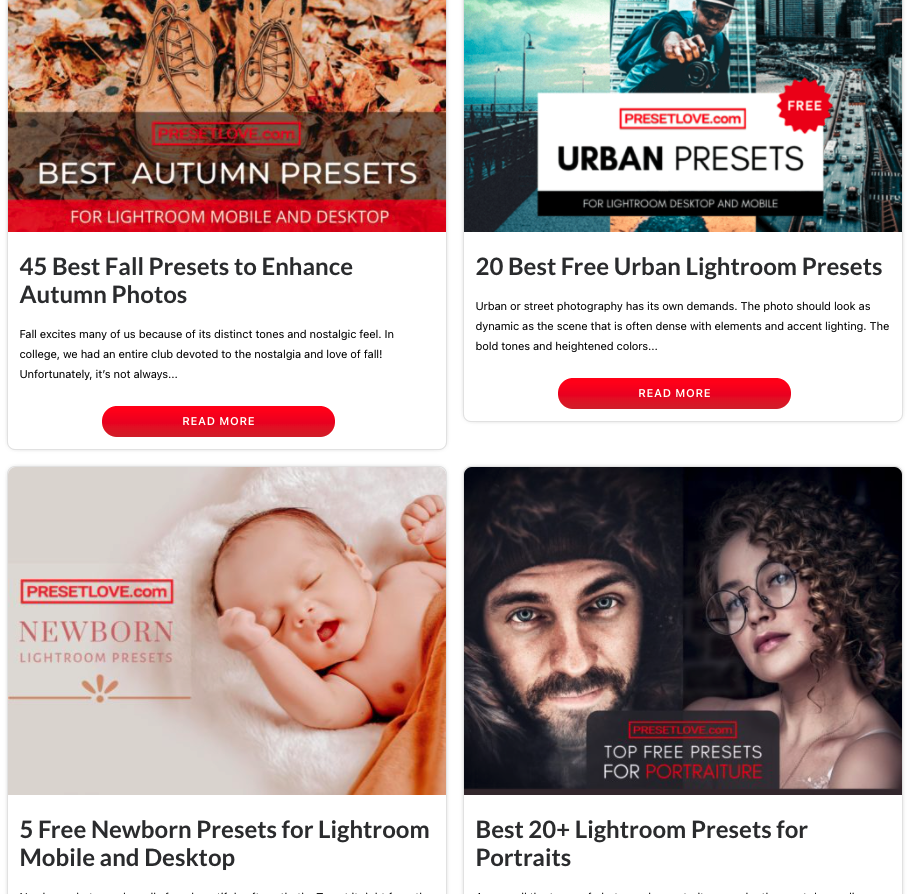
The Preset Love homepage, on the other hand, uses visually stunning pictures to encourage visitors to consume the web content according to the Z-pattern. This viewing pattern means that web visitors still move from left to right when looking at the page (following the shape of the letter Z), but thanks to the strategic placement of the page elements, it ensures that no page section is skipped by users.
To maximize the attention your high-value elements (like CTAs, value propositions, and lead capture elements) get, don’t forget to combine them with:
- Sufficient negative space
- An aesthetically pleasing color palette
- A touch of your brand’s irresistible personality
And, of course, make sure that your copy (and UX text) is perfectly polished and optimized to inspire action.
Implement Personalization Where Possible
Finally, if you’re ready to go all out on driving landing page conversions with emotional imagery, consider adding a personal touch to the visuals you use.
In a study conducted in 2014, a group of scientists set out to discover how personalization in ecommerce affected purchasing behavior. They found that:
- There is a direct link between personalization and purchase intention.
- Personalization can evoke positive emotions in shoppers.
So, if using hyper-relevant imagery on landing pages drives conversions by evoking a positive emotional reaction, it’s definitely a strategy you should consider for your website.
One super-simple way to implement personalization is to create dedicated landing pages for various traffic sources. For example, if you’re running PPC ad campaigns, you can direct that traffic towards relevant (personalized) landing pages that will reflect the text of your ads.
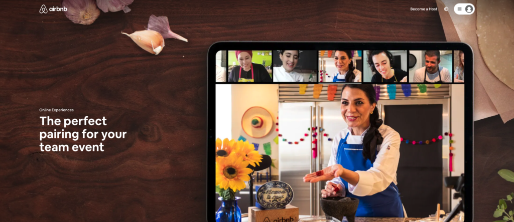
This is what Airbnb does when bidding for the “team building experiences” search term. Knowing that the people coming to its site looking for team-building activities want search results relevant to businesses, the brand created a dedicated landing page that focuses specifically on this type of user need.
Personalizing your landing pages based on traffic source is not the only strategy you should consider. You can also implement personalization for different use-cases of your products, as done by The Black Tux.
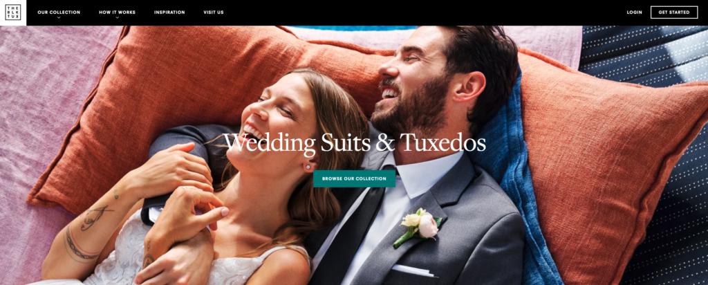
For its Wedding Suits & Tuxedos landing page, this brand chose highly specific emotional imagery that is most likely to elicit a reaction among couples planning their wedding. They use images of smiling couples, happy wedding parties, and groomsmen getting ready, wearing their perfectly fitted suits.
Going Beyond Emotional Imagery to Secure Landing Page Conversions
As you consider different marketing strategies to get the most out of your landing pages, you have to understand that emotional imagery, on its own, won’t be enough to deliver superb results.
Yes, a photo or illustration that elicits a reaction or drives web visitors to action is the perfect addition to a high-value landing page. However, it won’t work without show-stopping website copy, exceptional UX, high technical performance, and a layout that allows your CTAs to shine.
So, as you assess the imagery on your landing pages, don’t forget to take one last holistic look before they go live. Ask for feedback or employ A/B tests to check if the landing page works as a whole. Make sure that you’re directing user attention towards the correct page elements. And don’t forget to look at the page from several different devices to ensure it performs great for all of your potential customers.
Remember: you can always make your landing pages look and perform better with time. So don’t underestimate the power of analytics, and always use data (if available) to ensure you’re making the right design and marketing decisions.