The landing page of your business is a necessary part of any marketing campaign. It is the place where most of your visitors turn into converted customers.
Companies with 31-40 landing pages score get seven times more leads than companies with 5 or fewer.
There are a lot of factors that affect the success of your landing page in terms of getting conversions. These factors range from the quality of writing and graphical quality to the images you use to represent yourself.
Every pixel of your landing page represents your business, and every pixel of it matters.
If you can grasp what makes a landing page successful, you can dramatically increase the conversion rate of your marketing campaigns.
This guide will take you through everything you need to know in order to make an enviable landing page and start increasing conversions today. We’ll also guide you through examples of how other companies have made their landing page speak for them.
In this article
What Is A Landing Page?
A landing page is where your prospective users arrive when they take an interest in your business through an advertisement. Landing pages usually come in at the 3rd step of a sales pipeline. They are designed to be specialized pages to turn that click into a successful conversion.
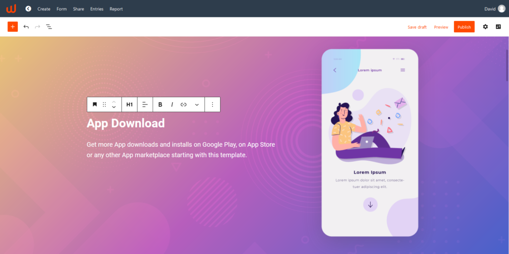
What Goes Into A Landing Page?
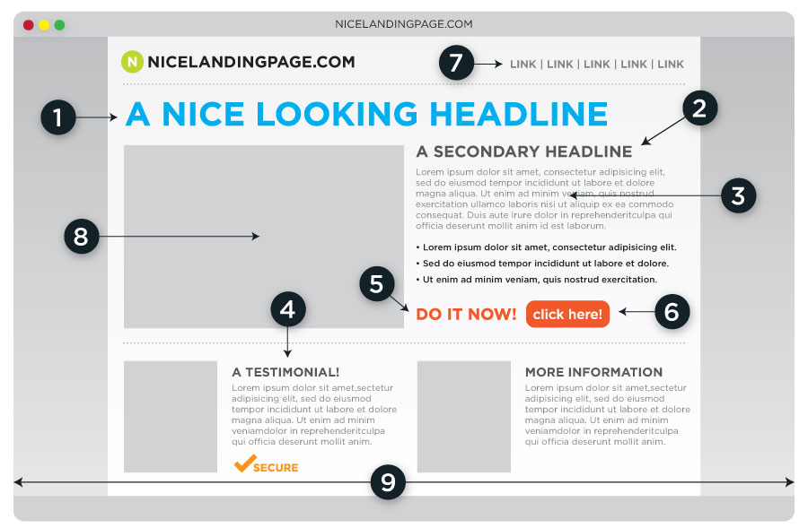
The above image shows you everything that a landing page needs to have, let’s go through its elements one by one:
- Eye-Catching Headline: You want your customer’s eyes to immediately go towards your title. It should be immediately relevant to them and connected to the advertisement that brought them here. An AI writing tool can help you with eye-catching titles.
- Secondary Headline: The secondary headline is there to offer a more specific look at what the primary headline describes. It should contain SEO optimized keywords, as you want the first words your user sees to be in line with what they’re expecting. It would be helpful to use APIs to build a keyword database enriched with high-quality keywords that bring in nothing but qualified leads.
- Body Text: This text is there to give a detailed look at what you provide, and why your company is ideal for the customer. Using a short bulleted list to present key points is advisable.
- Customer Testimonial: Did a client or customer have something good to say about your service? Put it here!
- Actionable Text: You want to have a short phrase as a centerpiece of the page, guiding your reader to the “Buy,” “Download,” or “Join” button.
- Button Letting Them Go Further: You want an eye-catching button that pops out and lets your customer take the next step in the conversion process.
- Navigation Links: These should be out of the way, but if a user wants to visit your “Home,” “About Us,” or “Contact” pages, they should be able to do so quickly.
- Related Image or video: What image or video you choose to feature in your landing page can make or break your user’s first impression. Make sure it’s a high-quality piece of content related to your subject. If you’re using images, finding a quality stock photo and using a good photo editor to give it some flair is a good way of doing this.
- Nothing Below The Fold: Make sure that all of the information you want to present
Now, not all successful landing pages have all of these, however, it is useful to keep this image in mind as a reference. For example, many modern landing pages feature videos instead of images, as they have been found to perform better.
The video below further elaborates on these points and offers some useful hacks for making your landing page more effective:
Why Do I Need A Landing Page?
To the uninitiated, a landing page might seem like an unnecessary expense. After all, why spend extra funding on a page your users will reach after clicking on an ad when you’ve got a perfectly functioning homepage?
Your homepage should contain all of the information any prospective customer might want to know about your business. On the other hand, a landing page is personalized to a smaller subset of users. It doesn’t take a genius to figure out which one drives more conversions.
Landing pages boast a 9.7% conversion rate, with 90% of visitors reading your CTA.
So, let’s look at an example.

Trendy Butler is an AI-based clothing subscription service. An AI is tasked with picking out your ideal wardrobe.
The first thing we see is the big “50% OFF FIRST MONTH” message. This immediately gives the new user information about the deal they clicked on, with the lower paragraph going a bit more in-depth on the offer.
The blue treetop along with the way the text is distributed guides our eyes to the “GET STARTED” button. The attached image is that of a trendily dressed man- perfectly appropriate for a fashion website.
Compare this to their homepage: https://trendybutler.com/
While it is still simple, it doesn’t immediately pull the user with text, and there’s a lot to scroll through if you want to find out everything.
A company like this, focusing on eCommerce sees almost all crucial metrics going up with the use of quality landing pages.
Best Landing Page Practices for Higher Conversions
Catch Your Viewer’s Eyes With Images And Video
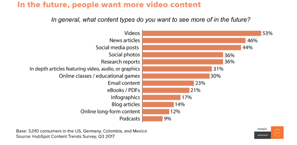
Your user’s first impression is 94% visual content. This is why any good landing page will feature relevant images and videos.
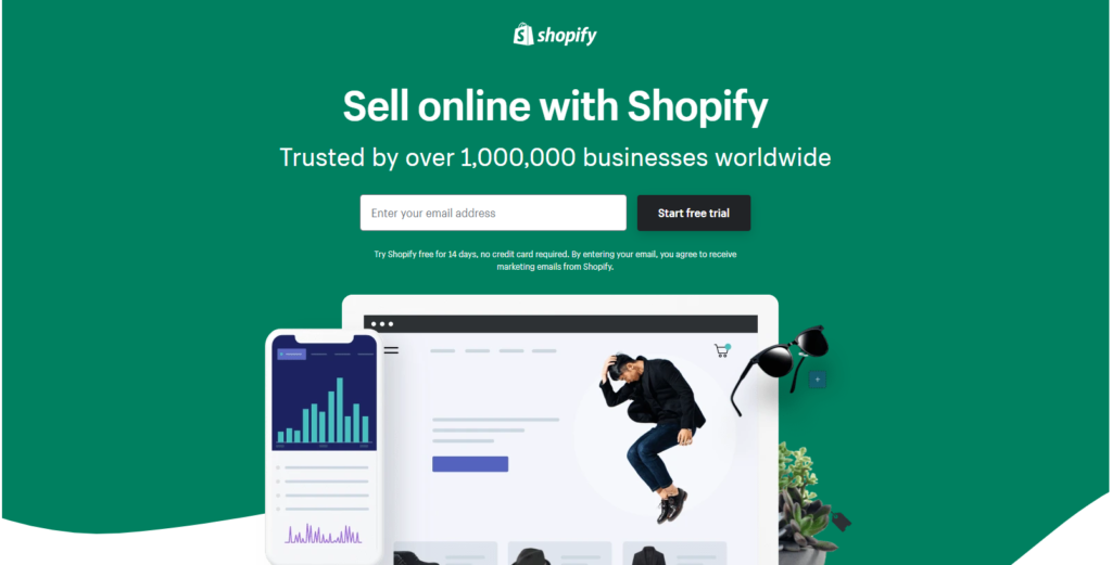
Take a look at Shopify’s example above. Although the images don’t show anything specific, you can clearly tell that this is a company that deals with commerce by the charts on the left, and their versatility is signified by the well-dressed man, alongside sunglasses and a plant.
Today, more and more landing pages are using videos to represent their businesses. In the past, it might’ve been difficult to create this kind of content. The abundance of video presentation software and camera quality means there’s no excuse for not having any video content available.
There are multiple reasons why your business could benefit from a video on its landing page:
- 62% of all internet users watch videos more thoroughly than other forms of content.
- 92% of mobile users share videos with other people.
- 95% of video watchers absorb the video’s message.
Remove Navigation
Although it’s generally advisable to have a navigation bar on your landing page, recently experts in the field have started removing them altogether.
This is because your landing page should be focused only on converting visitors. The only thing your landing page needs to do is keep the user on it until they take action. It’s unlike pages on your website where you want them to visit as many as possible.
For example, let’s say you’re running a business selling books on Amazon. If a viewer clicks on an ad to one of your books, chances are, they aren’t interested in anything else you’re selling.
Every link that doesn’t lead to an immediate conversion is another chance for your users to leave without buying anything.
Exit Popup
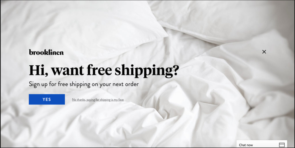
An exit popup is a message that’ll appear on your visitor’s screen if they try to leave the page. It’s your final chance to make a conversion.
These are much less annoying than popups that appear on your visitor’s screen as soon as they open the landing page.
We advise using an additional incentive to prevent the user from going away. Offer them a special discount or another offer.
Take a look at this video if you’re in need of inspiration on how to make exit popups that increase conversion rates by up to 4.9%:
Use The Right Builder
Finding the best landing page builder for your business is a crucial component of crafting a successful landing page.
The first factor you’ll want to consider is your budget and the expertise of your team. The same way a solo project’s website will be hosted on a cheaper platform, if you’re a new, one-man team, a simple WordPress plugin like Elementor Page Builder might be enough.
On the other hand, if you’ve got a high-quality team of trained professionals, raw coding or a more advanced tool like Woorise might suit your fancy. This will give you the ability to conduct A/B testing, dynamic text replacement, and many more advanced features.
A/B Testing
A/B testing is the act of running 2 landing pages simultaneously to see which one performs better. These two landing pages should be similar to each other, with only 1 element changing in between the versions.
Then, you see which one has a higher conversion rate. You test 1 element every time because you want to isolate the factor causing an increase or decrease in conversion rates.
You should be constantly A/B testing different versions of your landing pages. Take note of every change you make in Trello or an alternative, and see how well it did within a few weeks.
If you’re still uncertain about the benefits of A/B testing, former US president, Barack Obama, used it to garner an additional $60 million.
The video in this article goes into more detail on A/B testing and how you can use it to your advantage:
Optimize Loading Speeds
If your landing page takes more than 3 seconds to load, data shows 40% of your visitors will bounce off of it immediately.
In fact, a delay of 1 second can mean a decrease of 16% in user satisfaction. Because of this, it is crucial that your landing page loads extremely quickly. Make sure you’ve chosen the right hosting for you.
For a smaller company, a shared hosting might work just fine. However, a larger company is going to need highly professional hosting capable of withstanding hundreds of thousands of customers at once. A hosting service with an auto-scaling server is a good option for handling traffic spikes.
You should be taking all measures you can to speed up your landing page’s load times. For example, you could try resizing and compressing your images. This is part of why a quality landing page is simple- simple sites load faster.
Examples of Landing Pages and What You Can Learn From Them
Muzzle
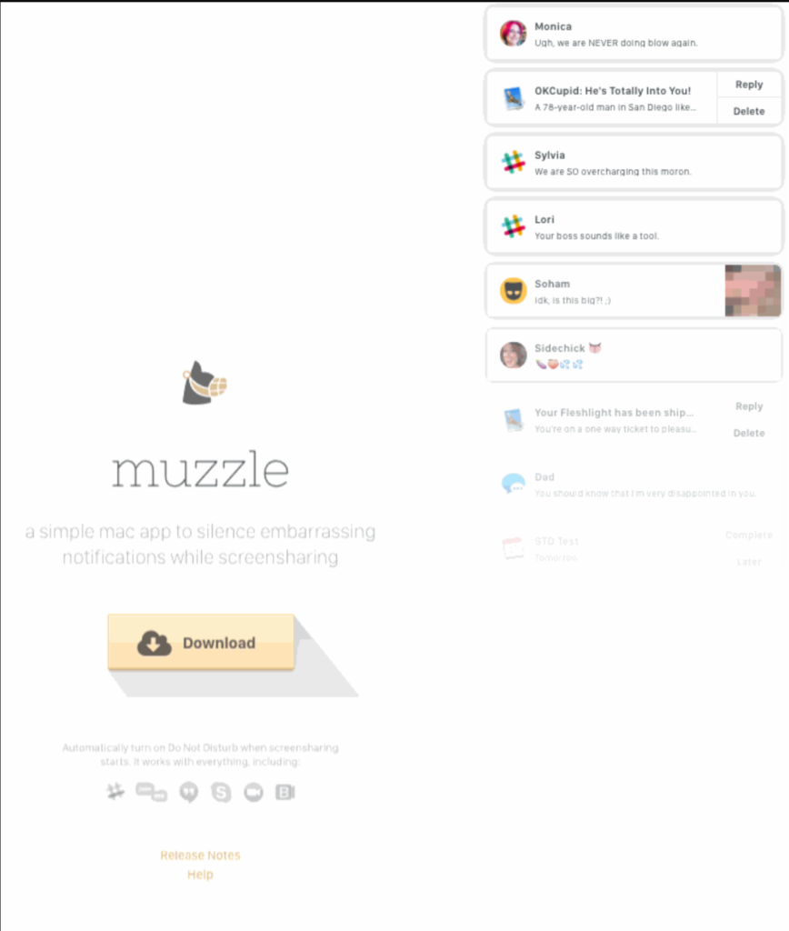
Muzzle takes a creative approach to their landing page. The first thing you see when you open their landing page is a bunch of notifications to your right. It loads in a flash, with notifications pouring soon after.
Muzzle is an app used to silence on-screen notifications on macOS devices. This is a genius way of both demonstrating the issue your customer has as well as how you can solve it.
If you are working on an app in a similar niche, taking this “show don’t tell” approach to your landing page might be just what you need.
The rest of the landing page is great, but pretty much standard. They use their logo(an image of a muzzled dog) as well as the text to guide our eyes to the contrasting download button. Below that we find what notifications it blocks, as well as a bit of navigation.
AirBnB
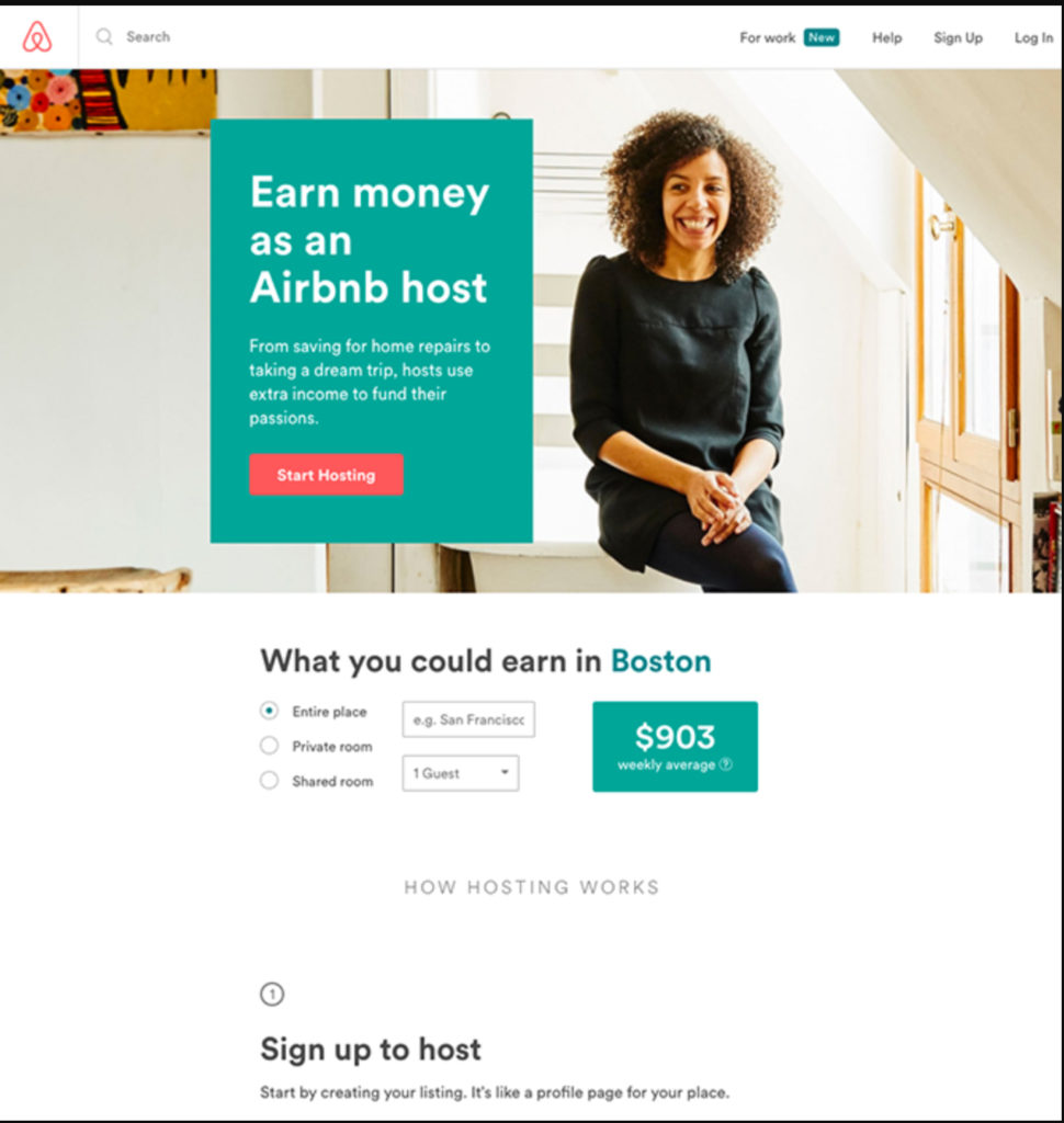
This Airbnb landing page is a great example showing that you don’t need to reinvent the wheel in order for your landing page to convert.
It has a navigation bar on top of the screen, with an attractive title “Earn money as an Airbnb host.” Below that it tells the user how much they could be earning, and immediately drives them to the, again, high contrast “Start Hosting” button.
The page is also personalized, giving the user average monthly earnings from their city. In addition to this, the website asks you if you’re sure you’d like to leave the moment you go out of it.
Teambit
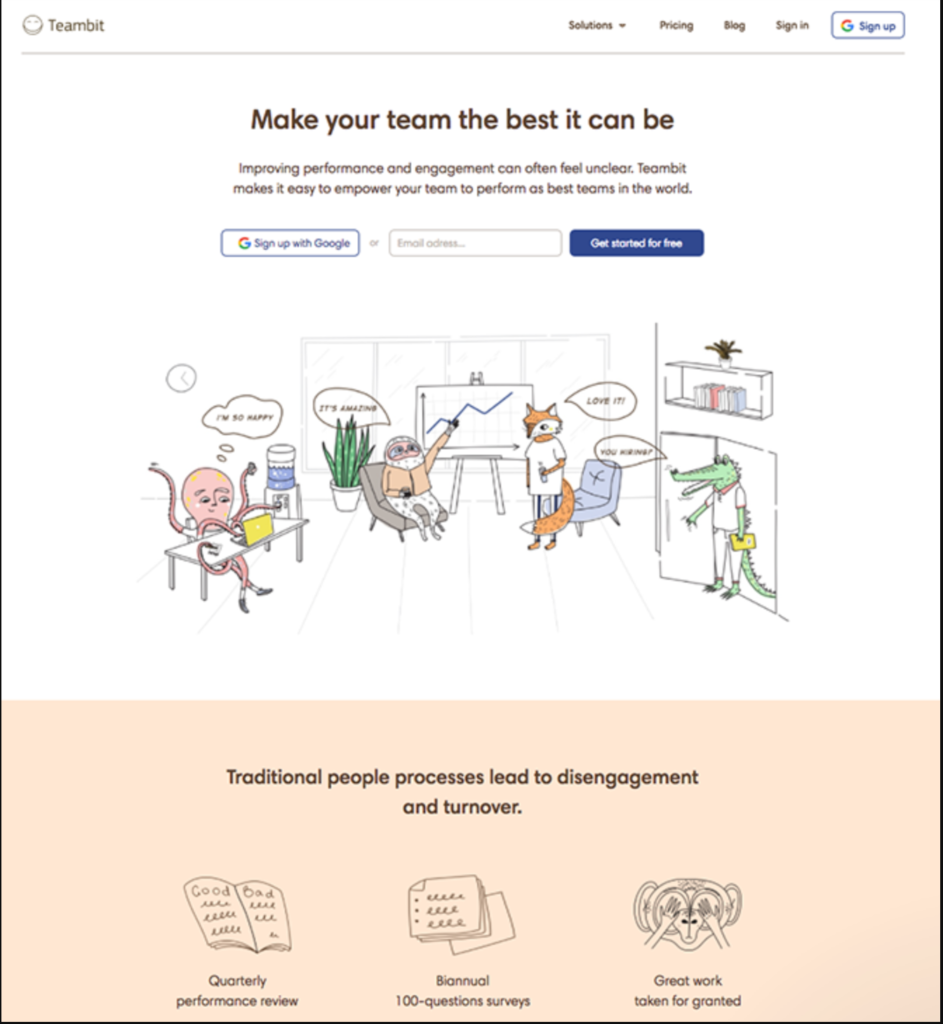
Teambit takes a more fun and cheerful approach to landing pages. This cheerful HR software allows you to digitally interact with your employees as you see fit.
It’s a simple landing page with just 1 form, giving the user the option to scroll down if they want to learn more about the product. No doubt the result of a lot of A/B testing,
Industrial Strength Marketing
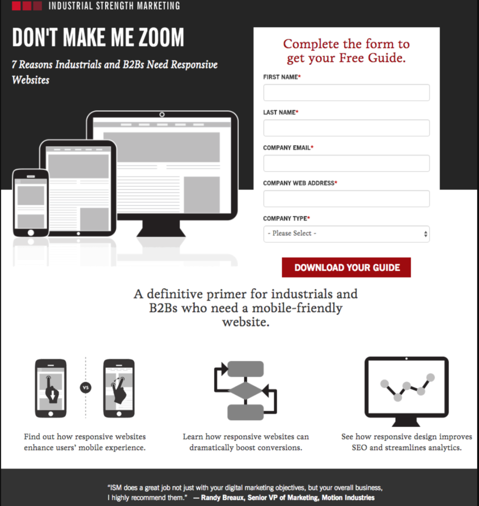
This landing page incorporates some of the latest landing page trends such as being longer, mobile-friendly and containing a reasonable amount of content. It follows a color scheme fitting to its industry.
While sometimes, standing apart from your niche’s image can be a good thing, Industrial Strength Machining shows off the power of a simple, yet quality landing page. It immediately grabs our eyes with the “DON’T MAKE ME ZOOM” atop the screen. Following it up with a clever subheading.
On the right is a form for those who have been convinced to go for it, while down below people can educate themselves further. At the bottom of the screen, they use the opportunity to show off a changing series of quality reviews. Furthermore, as the tool is geared towards businesses, the reviews aren’t from just anyone, but rather from notable people in the industry.
All in all, it’s just an incredibly solid landing page.
Uber
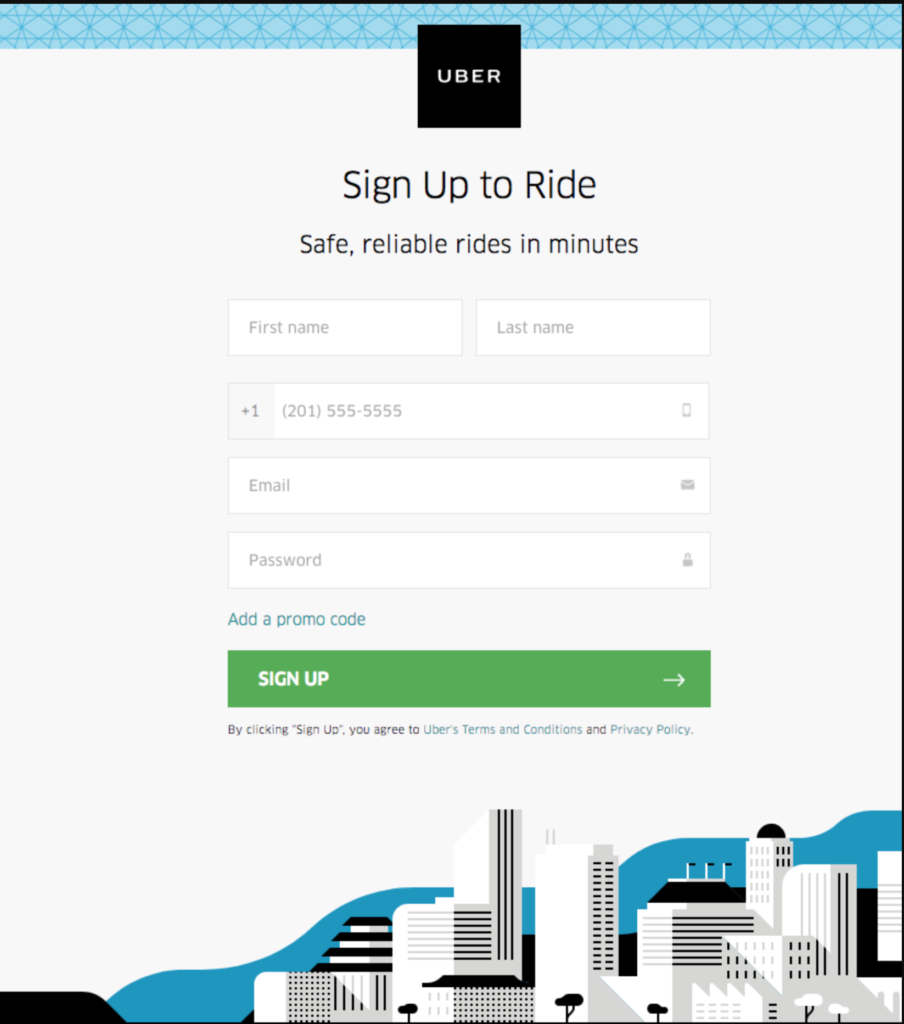
Uber’s landing page steps away from a lot of the most common landing page practices and instead strips away everything but the bare essentials. The post is only Uber’s logo, two lines of text, and a registration form.
We wouldn’t suggest taking this approach for a new business, as it can leave your visitors unsure and confused. However, once you’ve grasped a foothold in the industry, a landing page like this exudes confidence and boldness.
CrazyEgg
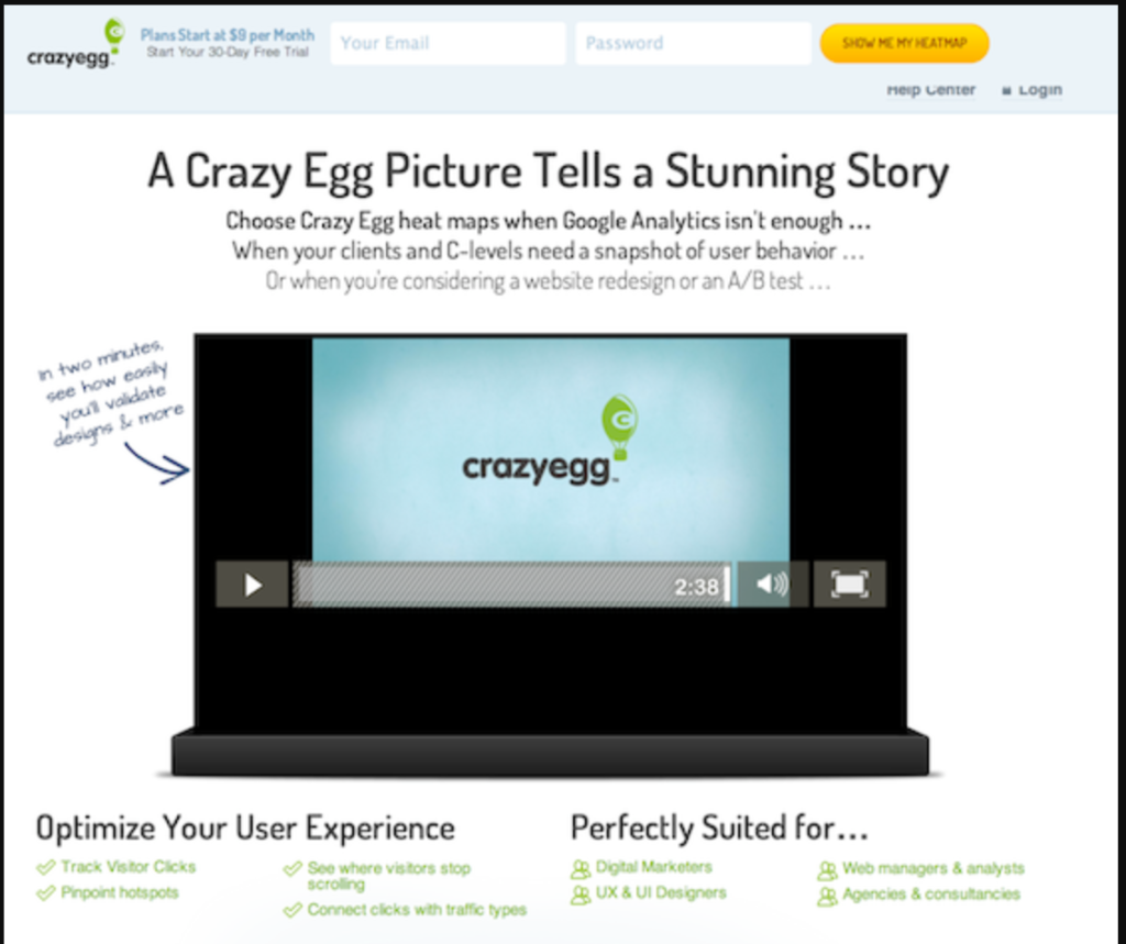
This is a great example of a landing page that incorporates video as its centerpiece.
The video- made by Demo Duck, quickly explains why a small business needs more than just access to Google Analytics to boost their conversions. This is where a heatmapping software like CrazyEgg comes in.
While this landing page isn’t perfect, for example, it’s missing a CTA button, it is still very effective. We believe a flawed landing page like this is the best way to show the power of having a high-quality video on your landing page.
Wrap Up
A landing page is one of the most important elements of any marketing campaign. It is only natural for the place where most of your new leads will be gathering to be the centerpiece of your attention.
There’s a staggering number of tweaks that you can implement into your landing page. It can be difficult to decide what to do and what to focus on. We hope that this guide has helped you with that. There’s no reason why you couldn’t have an expertly made landing page that converts.
If you follow the tips outlined in this article, your conversion rates will increase in no time!