
If you’ve been browsing different websites recently, you’ve probably noticed many of them have contact forms. As short-based forms published on a website, contact forms come with many benefits. However, their fundamental function stays unchanged, even if they can implement various designs.
From talking about the purpose of contact forms to tackling their main benefits, you can learn everything you need to know about them in this post. Furthermore, we’ll guide you through the process of creating a contact form in seven easy steps.
If that is something you’d like to know more about, keep reading!
In this article
The purpose of a contact form
Before we head into the main benefits of contact forms and how to create them, it’s essential to say something about their purpose. Namely, contact forms are dedicated pages on different websites that allow website visitors to get in touch with site owners and their customer support team.
Since there are so many different customer service tools for contacting businesses and site owners, what is unique about contact forms?
They are probably some of the best solutions both for clients and businesses.
On the one hand, clients can contact site owners anytime and anywhere. Contact forms are easy to fill out and convenient to use. Visitors only need to insert their name, email address, and comment. After that’s done, the client’s message is instantly sent over to the business.
On the other hand, businesses don’t have to reveal their emails to the public but can still be there for clients and offer them much-needed support. So, it’s a win-win situation for both sides.
Contact form benefits
Using contact forms equips companies with countless benefits. Although we already mentioned some above, now we’re going to focus more on specific advantages website owners can count on after implementing contact forms.
Make it easy for website visitors to contact you
Clients are always looking for ways to communicate with website owners. They usually want to ask a question, report a malfunction, or praise a particular product. Whatever the case may be, supplying customers with a convenient and easy-to-use communication tool is a must.
There are many clients and product users who don’t feel comfortable asking specific questions or explaining particular problems over the phone. In those instances, contact forms equip them with the freedom, flexibility, and privacy to say everything they want but remain in their comfort zone.
Contact forms are undoubtedly one of the easiest ways to establish communication with website visitors, as they only require the name, email address, and details about the reason for contact (comments, suggestions, etc.).
Reduce spam emails
Every business owner wants to make their business approachable and friendly. One way of doing so is by providing website users with all the contact information, including phone numbers and email addresses.
Nevertheless, just as many visitors appreciate that, others may decide to take advantage of the available information. As a result, businesses get countless offers, promotional deals, and spam emails cluttering their customer service inbox.
Besides clutter, spambots that scrape email addresses from websites often add these emails to online mailing lists which can impose serious security risks. Scams or phishing emails are the most common occurrence.
Since contact forms don’t reveal the business’s email address, it’s the perfect solution to offer the needed support to clients while reducing spam emails that could fill your inbox within minutes.
Improved tracking and management of inquiries
With business growth comes the surge of inquiries received from the website. Is there any way of keeping up with the increased workload without hiring an entire customer support team? Of course, there is!
You can use contact forms to improve the tracking and management of inquiries. You’ll be able to see every form submission, which will allow you to track and manage each one separately.
Do you want to view the entire history of communication with a particular client or manage inquiries so you can respond to them in chronological order? Contact forms will allow you to do it all quite effortlessly. Furthermore, you can decide to categorize inquiries on various pre-set criteria and, thus, work with them faster.
24/7 customer support
Every way of communication has its advantages, but phone communication might not be the best solution for businesses. More often than not, phone lines are busy, and the best-case scenario is for clients to be placed in the waiting line.
Every business has regular office hours, and getting someone to answer the phone isn’t possible if the office is closed. Therefore, clients often leave feeling frustrated since it’s impossible to get in touch with brand representatives in the early morning, afternoon, and night.
Contact forms quickly solve this issue. Whether your phone lines are busy or closed, sending a message via a contact form is always an option. Even if it takes your customer team a few hours to reach the inquiry, the clients feel like the business is offering 24/7 customer support.
Multilingual customer service
Numerous local businesses eventually evolve into international enterprises that offer their products and services to different countries. Naturally, that creates a global customer base, and you might struggle to find a common language with your international clients.
Not everyone speaks English, and not everyone is fluent in it. Business owners must be prepared for receiving inquiries in various languages and they must be equipped with the right tools to deal with them. Site owners should never ignore customer tickets in foreign languages, as they can hold valuable information for a business.
Fortunately, site owners can count on multilingual customer services with contact forms. They can easily translate and find ways to respond to written inquiries, which isn’t the case for phone calls.
As such, miscommunication and struggling to establish clear communication with foreign visitors can quickly become a thing of the past. You can exceed customer service expectations by communicating with all clients in their native language.
Gather customer insights and build your email list
For years and years now, email has proved to be one of the top ways for businesses to reach their target audience at little to no cost. Thanks to contact forms, not only can companies keep in touch with their clients but also collect their information and use it to build their email lists.
That way, companies can create better email marketing campaigns that will target already interested and engaged consumers. Getting more website traffic, increasing lead generation, and growing the audience will be much simpler to accomplish.
Moreover, gathering customer insights, such as the location and demographics of users, can significantly help businesses during the decision-making and future-planning processes.
How to create a contact form in 7 easy steps
Now that you know more about what contact forms are and why they’re so beneficial for site owners, you’re surely curious about how to create one for your site.
In this part of the article, we’re going to guide you through the entire process of creating your own contact form. Although the process is quite simple by itself, you’ll be able to make the best contact forms following this step-by-step guide.
Let’s get started!
1. Use an online form builder
As mentioned at the beginning of this article, contact forms are dedicated pages on your website. Therefore, you will need to use an online form builder to create a contact form.
The market is filled with many different tools and solutions for creating contact forms quickly and easily. Woorise is an excellent choice if you’re looking for a simple, reliable, and efficient online form builder.
Designing contact forms through Woorise allows you to integrate them into an already-existing website design and layout seamlessly.
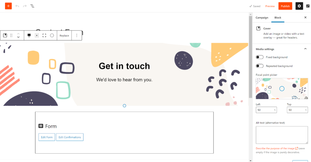
2. Decide on the form layout
While a contact form isn’t the most creative webpage on your site, that doesn’t mean you can’t play around with it. Thanks to advanced technology and powerful tools, the possibilities concerning form layouts are truly endless these days.
Woorise allows you to decide on the form layout that will work best for your company, industry, brand image, or target audience.
Before you go any further in your contact form creation process, it’s essential to decide on the form layout and brainstorm some ideas regarding the look you’d like to achieve with your final product. Even though it may seem like an unnecessary task, it will make your job significantly easier.
3. Use an existing template or create your own
Woorise offers some fantastic templates you can choose from if you want to create your contact forms as quickly and effortlessly as possible.
These existing templates come with all the essential parts of a contact form for a business’s needs, but you can also tailor any template to your preferences by adding or eliminating certain features.
If the templates aren’t your cup of tea and you would like to create a contact form from scratch, that’s also possible. Mix and match different fields, play with colors and backgrounds, and design the contact form that will perfectly pair up with your company.
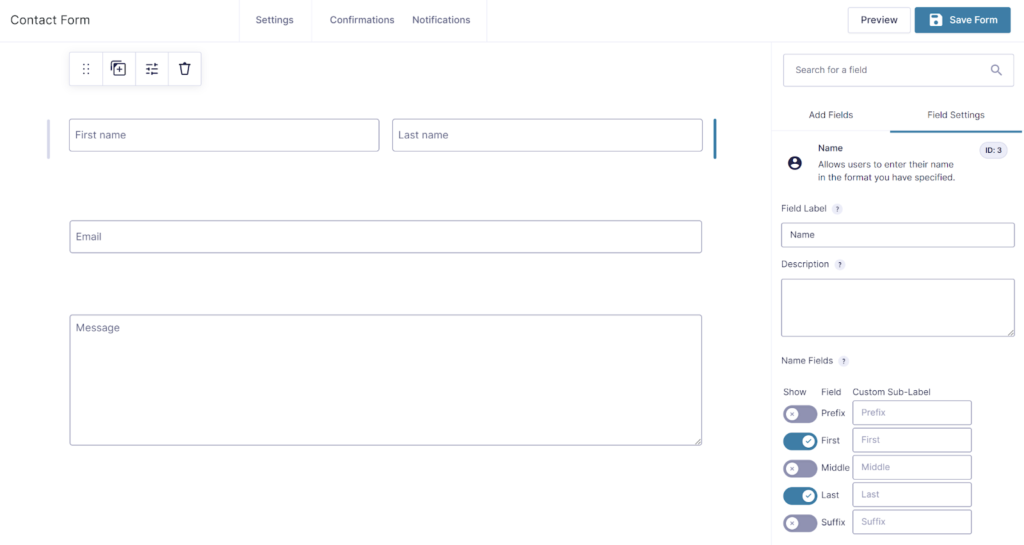
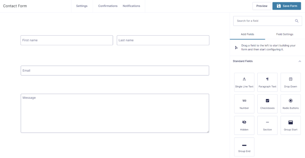
4. Add fields to the contact form
All contact forms include basic information such as the name, email address, and the message of the website visitor. When creating your contact form with Woorise, you can decide which fields to include.
Since there aren’t any rules that you must follow, adding fields to your contact form entirely depends on you. Woorise equips you with various field formats you can implement into your contact form design, from single-line fields and paragraph fields to drop-down menus and checkboxes.
Reorganize and reposition them until you have a cohesive structure that will make for a seamless customer experience.
5. Customize the contact form
Fonts, letter sizes, letter casing, color combinations, and other features are part of the customizable creation process. Woorise lets you explore every aspect of the creative design process without boring you with technicalities.
Using its easy-to-navigate tool, you can create customized and personalized contact forms with just a few clicks. Whether you want to incorporate color gradients, unique font combinations, or brand images, Woorise allows you to do it effortlessly.
When it comes to customization, the sky is the limit, so take advantage of these fully flexible features.
6. Review and test the form
Once you’ve created your ideal contact form, it’s time to review and test it.
Firstly, go over the whole form to see if every detail is where you want it to be. Now is the perfect time to go over the form fields and add final touches to the design. If you’re happy with how your contact form looks, make sure to test it.
Testing is the best way to ensure everything works smoothly. It allows you to streamline all processes before launching them to the public, from entering information and submitting the message to receiving the email in your system.
7. Integrate the contact form to a website and email
Finally, all that’s left to do is integrate the contact form to a website and email, and you’re done!
After completing these seven steps, visitors will be able to share their thoughts, difficulties, ideas, and recommendations with you anytime and anywhere. It won’t be long before you start noticing the numerous benefits of contact forms, so you can be sure the effort will be worth it.
However, that doesn’t mean you can’t go back and make some changes along the way. If you notice some errors or want to change the design after some time, you can always go back to Woorise and upgrade your contact forms quickly and easily.
Bonus: Form Design Best Practices (+Examples)
Filling out an online form is an often necessary aspect of navigating our online world, but a poorly defined form can make the task frustrating.
To help you accomplish this goal, we’ve designed the ultimate guide to form design. The simple-to-implement ideas in this guide will help you improve customer interactions while keeping your form’s design clean and straightforward.
Form design sits at an intersection between art and science. This guide will provide you with the most essential and well-regarded practices for form design, but it is up to you to create the best form design for your specific needs.
Let’s start by laying a foundation of understanding that will enable you to learn everything you need to know about form design.
Before You Start
The first practice for good form design takes place before you even envision the form itself, perhaps you sketch it out briefly or even have a moodboard for inspiration.
It is vital to keep your forms as short and straightforward as possible. You only want to collect the user data that is required. To this end, you want to ensure you know what information you need from your users.
Consider the user experience. Why are they visiting your site, and what are they expecting to accomplish? We recommend trying a journal mapping exercise. Journal mapping is a visualization exercise that allows you to map a user’s action along a timeline to create an idea of the user’s experience.
A journey map can be broken into phases to factor in a user’s mindset, actions, and emotions. A journey map is also a chance to consider opportunities and metrics.
This mental exercise helps you design a form for maximum internal impact and a positive user experience.
Make It Simple
We’ve already mentioned the importance of keeping your forms simple. An overly complicated form will discourage user interaction and force you to manage data you don’t need. So perhaps now isn’t the time for fancy typography or elaborate drawings?
A few tips for making your forms simple include:
- Collect only the necessary data.
- Limit the fields a user has to type into.
- Simplify the design and avoid complex elements.
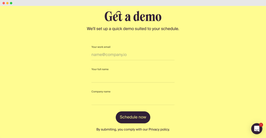
An example of a simple form is a login page containing two fields: username and password. The design avoids any extra design elements and does not require users to enter unnecessary information such as their full legal name.
Take this demo form from flair.hr for example. There’s nothing fancy about it, and that’s what makes it so effective.

Keep It to a Single Column
Related to the principle of keeping things straightforward is the idea of using a single column for your forms. While you can find plenty of sites that use multiple columns for their forms, a multi-column form can be distracting for users.
Studies have shown that users complete single-column forms up to 15.4 seconds faster than forms with multiple columns to further support the idea of a single-column design.
As the side-by-side example above demonstrates, a single-column form helps streamline the process of completing the form.
The multi-column design is visually complex and may even frustrate some users. It could even lead to some users not bothering to complete the form or filling it in incorrectly.
Go the Extra Mile With Copy
It may seem inconsequential given the limited word count, but the copywriting you employ in your forms is a critical component of the design process.
Your copy needs to be clear and engaging at the same time. Doing so makes filling out the form an enjoyable experience rather than a laborious necessity.
You also want to use your copy to create a call to action (CTA) that will make users want to complete the forms.
Choices such as “Submit” or “Done” are unambiguous but may not encourage users to fill out the form. Some common CTA choices are text phrases such as “Contact us,” “Learn more,” and “Sign Up Now.”
The demo sign-up form on Breyta is a great example of a clear call to action. Don’t you just love the way it stands out clearly against the background color?
These phrases are much more active and engaging than the first examples. At the same time, the words are clear and concise enough that the user can still understand the form’s function and why they should provide their information.
Make It Time Savvy
Creating a form that is easy to complete and requires minimal time commitment will result in more users completing the form.
Several ways to make your form more time savvy include:
- Predictive Search: This function uses advanced algorithms to predict or auto-complete search terms as the user types the search terms.
- Auto-fill: Similar to predictive searches, the auto-fill function in an online form can help reduce the time and effort required from a user. The best place to use this function is with non-unique data such as state and city names.
- Placeholder Text: Using placeholder text in the form fields that demonstrate the values and format a user should use simplifies the form and reduces time commitments.
- Field Labels: Field labels appear above the field and help users understand what information they should provide. Field labels are similar to placeholder text, but while placeholder text is not required, you should always use field labels.
Here is an example of a time-saving form function. Rather than requiring users to enter all their location data, this form uses a Zip code lookup to auto-fill the state and city field.
Radio Buttons vs. Checkboxes vs. Drop-Downs
Another great way to simplify your forms to reduce cognitive load and improve conversion rates is using radio buttons, checkboxes, and drop-down menus.
Radio buttons are a fantastic tool when there are a limited number of options, and the user can select only one.
Checkboxes are an excellent choice if there are limited options for acceptable answers, but the user may want to select more than one option, or if you want a person to simply respond ‘yes or no’ like in the sign-up form of Woorise.

Drop-down menus can be a great tool for displaying multiple options when the user can only select one. However, drop-down menus require more cognitive load from the user. If the user perceives the form as being difficult to complete, then the form is not as effective as it could be.
To avoid these issues, form designers prefer radio buttons rather than drop-down menus as long as the number of selectable options is small.
Mandatory vs. Optional Fields
If you have appropriately planned out your form and are only collecting the minimum required data, making every field mandatory is a good idea.
However, if you decide to use optional fields, you must clarify which fields are required and which are not.
There are many ways to accomplish this, but the most common identifiers are either an asterisk (*) or the word “optional,” which you can place beside the field label.
If you decide to use an asterisk, you should also include a line of text explaining what the symbol represents. Adding an asterisk to every field label can create a visually cluttered design.
If every field is required, you don’t need to indicate it with an asterisk for each field.
Consider Multi-Step vs. Single-Step Form
Creating an overly long single-step form with too many fields will frustrate users and cause them to abandon the form before its complete.
Instead, you should build your forms with a multi-step design that groups fields in a logical flow. The dividing line is open to your judgment, but many experts believe that between five and seven fields is the sweet spot for a single-step form.
If your form requires more than five to seven fields, you should split it into a multi-step form. You can choose to achieve this form design using multiple web pages, or you can design a layout that is on one webpage but which you have split into visually distinct steps.
Assuming that multiple pages are not an option for your form, something like the design above still provides distinctive steps that help users feel a sense of progression and make the form more likely to be completed.
Reduce the Number of Clicks
There is a concept known colloquially as the 3-click rule, which states that if a user has to make more than three clicks to get the information they want, they will become dissatisfied and possibly even abandon the site.
Your form may necessitate more than three clicks, but the concept is still true. This concept should be kept in mind throughout the form design process as it will impact your choice of fields, button styles, and more.
Microsoft discovered users were much less likely to properly shut down their computers when it took three clicks as opposed to one. This example highlights how the reduction of clicks can encourage the desired action from users.
In form design, reducing the number of clicks can be accomplished in multiple ways. One example is the zip code lookup function we highlighted earlier in this article. Rather than asking your users to make three different clicks for the city, state, and zip code fields, the zip code lookup function requires that users make only one click to complete all three fields.
Minimize and Justify Sensitive Information
Many users are justifiably concerned about the privacy and security of their sensitive personal information. Before a user chooses to fill out one of your forms, you need to demonstrate consideration for a user’s private information and justify why you are asking for their data.
We’ve already mentioned several times that you should design your questions and form in a way that requires only the minimal amount of necessary information, but how do you justify collecting this data?
The simplest way to explain your data request to users is with clear, concise support text around the data field.
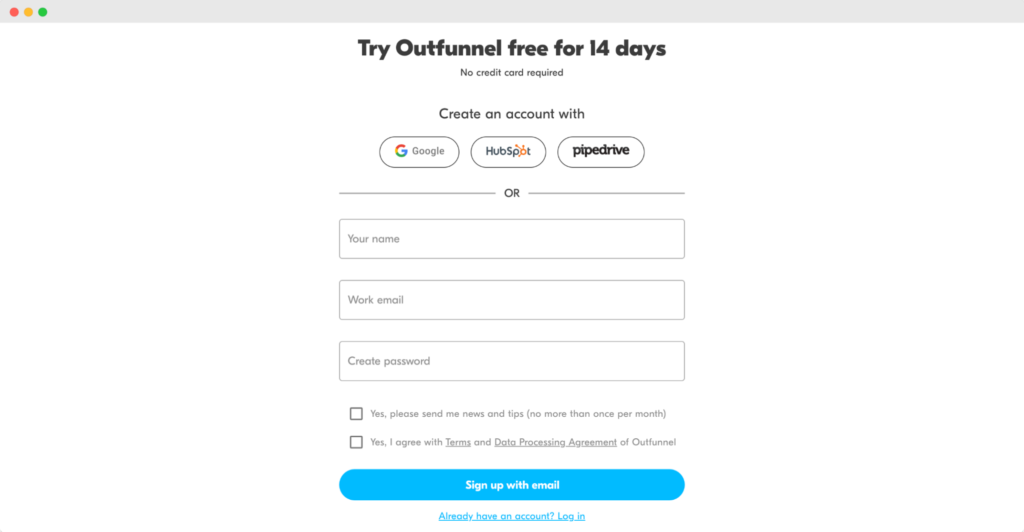
For example, Outfunnel. The company’s trial signup form asks customers to provide an email address and a name. Above the form, it is stated clearly that credit card information is not required.
Justifying your data collection helps establish trust with your users and improves the chances of users completing your forms.
Include Selectable Images
Utilizing clickable images in your online forms helps create a more eye-catching visual element that leads to better user engagement.
A grocery delivery service creates a form for users signing up for their first delivery order. They offer a free bonus order of fruit as an incentive to place the order.
Rather than create a list of text options to choose from, the company could use a series of colorful images with embedded links. This design creates a visually stunning image that grabs the user’s attention and also enhances the clarity of the available options.
Using clickable images makes it fun for the user to complete the form.
Clarity and simplicity should always be at the forefront of your form design process. However, be careful to use images wisely. Using too many images can clutter your form and make it harder for a user to navigate. Additionally, not every question is made more understandable by images.
Minimize Action Buttons
Action buttons are the buttons that trigger a vital function in the form. Some common action buttons include “Submit,” “Cancel,” and “Back.” These are just a few examples, and the text used for action buttons can vary greatly.
Action buttons allow users to move from one page to the next in a multi-step form or to submit a completed form. Therefore, action buttons have a lot of significance in form design, and you need to implement them in a way that is clear to the user.
At the same time, using too many action buttons can distract the user. Instead, you should apply the same principles for determining what questions to ask and how many fields you need on your form.
Ask yourself what the minimum number of action buttons required are to enhance your users’ experience and make the form as easy to fill out as possible. This answer is often only one or perhaps two action buttons, with the necessary amount rarely exceeding three.
Optimize for Mobile
Online traffic is increasingly coming from mobile devices, so it is a smart idea to ensure your forms display and function well on these devices.
A few simple ideas for mobile optimization include:
- Ensuring the keyboard input is automatically set for either letters or numbers.
- Utilizing the devices included functions like geolocation and date picker to simplify user data entry.
- Enabling field focus to enlarge the field users are typing into, thus reducing issues caused by the smaller screen sizes of mobile devices.
The image above highlights the convenience of designing keyboard selection into your form on mobile devices. Automatically bringing up the numeric keyboard for the credit card number field reduces the number of clicks a user must make and improves their overall experience.
Optimize Dialogue
We’ve already mentioned thinking about the copywriting you use, but the overall tone of your dialogue needs to be optimized as well.
Good dialogue for an online form includes providing a greeting to users and perhaps explaining the form’s purpose. It would be best if you also thanked your users after they complete the form.
Another form design best practice as it relates to dialogue is to consider how you structure your error messages. Data validation in forms will inevitably flag errors, so you need to create error messages that are helpful and clear.
The error message must show the user where the error is and explain why it occurred. The message should be visually distinct, easy to find, and located near the field that needs to be corrected.
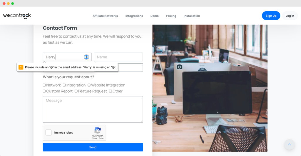
For example, here on the Wecantrack contact form, a person entered an incorrect email address and the error message makes it clear where they went wrong.
Irrespective of what kind of copy you’re utilizing, the tone has to be consistent. You should always strive to write helpful and polite content that makes the user feel comfortable. They should feel the dialogue has a reason to be there, not just as a default copy.
Final thoughts
Integrating a contact form into a website can significantly benefit a digitally-present business. From supplying clients with a 24/7 available customer support solution to reducing spam emails, contact forms offer plenty of beneficial features.
Try to use a combination of the techniques and visual cues listed in this article to create a natural flow and engage the user as they move through the form.
Creating a contact form doesn’t require any special technical knowledge or skills. As you’ve seen in the article above, the steps are pretty straightforward, and anyone can follow them effortlessly.
Form design is constantly growing and changing as designers learn more about how users act and what users want to see. We hope you can use this list of best practices as a launching point to start creating beautiful, impactful forms of your own.
With Woorise, you can create clean and modern designs in just a few minutes. Get started with ready-to-go, mobile-responsive templates and customize them to your needs before making forms from scratch. Try it today to reduce friction and enhance the customer experience!
Remember to always keep your forms as simple and transparent as possible.