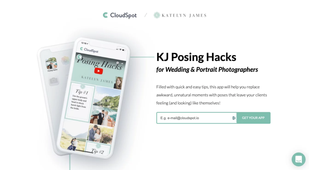
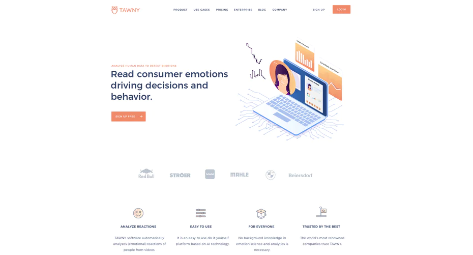
Landing pages are one of the most widely used conversion tools. They are generally easy to make, help teams focus on a specific goal, and succeed in raising awareness about new products and offers.
However, since landing pages are conversion magnets, their main goal is to turn visitors into leads, and this is easier said than done. In this post, we will take a look at the anatomy of a well-performing landing page that might take a website visitor on a journey to becoming a client.
In this article
Before You Build a Landing Page: Things to Consider
The success (or failure) of a landing page depends heavily on the amount of thought you put into designing it. Knowing the reason behind a decision to make one, understanding your target audience, and knowing how a landing page fits into the customer funnel are important considerations for marketing teams.
Here are the things you need to decide on before you start diving into building high-performing landing pages step-by-step:
1. Set landing page objectives
The first step to building a successful landing page is figuring out what customer journey you want it to be a part of. The most common goals for landing pages usually have to do with lead generation (e.g. inviting visitors to a webinar or sharing lead magnets), raising brand awareness, or viral marketing.
Here are the examples of objectives marketing teams set:
Goal type: Lead generation
- The objective for the page: Collect emails to get in touch with prospects via a newsletter.
- Desired end action: Page visitors fill in an on-page sign-up form.
Goal type: Lead generation
- The objective for the page: Collecting customer data and contact information in exchange for a lead magnet (ebook, white paper,etc).
- Desired end action: A visitor fills in the white-paper request form or pop-up.
Goal type: Raising brand awareness
- The objective for the page: Introduce visitors to the company, its products, and services.
- Desired end action: Visitors share the landing page via social media, email, or messages with friends and colleagues.
Goal type: E-commerce
- The objective for the page: A visitor buys a product.
- Desired end action: Visitors choose “Add to cart” and complete check-out.
Note: it’s a good idea to set one goal per landing page (e.g. subscribe to an email newsletter). This way, you will improve its efficiency and will have no difficulties choosing a North Star metric to monitor success.
2. Define and shadow competitors
After you understand the ways a landing page can help you generate leads or spread the word about the company, it’s time to take a look around the market and see how other companies on the market build landing pages.
Conducting a thorough competitor analysis is beneficial in many ways:
- It helps discover and implement best practices in design, performance, and page content.
- It encourages marketing teams to differentiate offers from competitors (after seeing how other brands in your niche market themselves, you will be propelled to come up with a different unique selling point).
- It helps spot where you competitors go wrong and avoid these mistakes. By analyzing the landing pages of other companies, you’ll pick up on their shortcomings (mobile accessibility, lack of a set-in-stone sales funnel, poor copy readability, lacking structure). When designing your page, the team will know better than to repeat these errors.
3. Know your target audience
A target audience is a way to narrow the focus of your landing page and make sure you create compelling design and content. The gist is, it’s not easy to convince a wide group of visitors to consider your offer since most of these people will need different ways to be convinced.
To make sure your landing page converts, have a clear understanding of who will see it. There are several ways to define the target audience for a landing page.
- Collect SEO keywords within your niche and analyze search queries and forum posts that match them. This way, you will know what locations, jobs, and interests the prospective visitors of your page have in common. Also, taking keywords into account when building landing pages helps increase the website’s ranking and domain authority.
- Analyze your company’s existing customer base. The most common way to do it is by designing customer personas based on your client’s personal data, purchase, and engagement history. Through segmentation, you will see patterns among your clients (e.g. most of them are SME owners, work in tech, are located in the US). Marketing teams should use these criteria for defining target audiences for landing pages.
- Define people who are NOT your target audience. If you struggle to figure out who would benefit from your offer, start by cutting off those who wouldn’t. For example, if you are an e-commerce seller distributing products only in Canada, targeting American or UK customers makes no sense. By defining a set of demographic, psychographic, and behavioral criteria your target audience does not meet, you reduce the risk of targeting fully uninterested people.
4. Define metrics to track success
Finally, before a time blocking software saves you some space in the schedule to dive into the technicalities of building a landing page, you should figure out what a “successful” page means. Since there’s no set-in-stone answer, marketing teams have to come up with one themselves.
Generally, we set success benchmarks by knowing which metrics determine the success of a landing page. A few common choices are:
- Views – the number of page visitors. This metric is relevant for pages designed to promote brand awareness but is rarely used as the North Star (highest-priority) benchmark.
- Visitors to contract ratio determines the number of people who filled in the contact form on the landing page or reached out to the sales team directly. This metric makes sure the efforts you put in to attract incoming traffic to the page are not going down the drain.
- Average on-page time. This metric keeps marketers accountable in how engaged landing page visitors are. If on-page content and design are appealing, an average session duration will be in the range of 2-3 minutes. If the content strategy or the design are a miss, you’ll know it as long as you keep capturing the metric.
6 Tips For Building Landing Pages That Convert
If you thoroughly set the goals for the landing page and figure out what user groups you are targeting, you are halfway through your journey to high-performing pages.
The next major step is nailing the technicalities – building a responsive design, working on a tongue-in-cheek copy that hits visitors just the right way, and coming up with an offer prospects can’t help but get excited by.
This might sound complicated but there’s no need to fret. Building a landing page is no rocket science – with platforms like Woorise, designing a high-performing landing page is a few-click job. To make sure your design and copy do an awesome job in attracting leads, be sure to follow these 6 simple tips.
1. Add CTAs
The landing page is not the endpoint of the customer journey but a gateway to the next stage. That’s why, to make sure leads move down the funnel successfully, you need to guide them step-by-step. Adding appealing CTAs to landing pages is a tried-and-true way to do it.
How many CTAs should a landing page have? The consensus in the community is at two. On the one hand, you give visitors a second chance to take your offer in case they scrolled by the first CTA block accidentally.
On the other hand, you reduce friction and hesitation visitors would likely feel if the landing page was chalk-full of buttons and CTA copy.

Tip: designwise, it’s a good idea to put a CTA at the top and at the bottom of the landing page. At this point, it’s almost a convention so visitors expect CTA buttons to be there.
2. Don’t overcomplicate
One thing is certain: website visitors don’t have a ton of time to read landing pages. That’s why marketers should make sure that the gist of the offer is clear even through a quick skimming look.
Here are a few tips for keeping landing pages simple:
- Use white space to separate blocks of content and de-clutter your landing page.
- Don’t use ten-dollar words. Tech marketers might relate to this: sometimes it’s tempting to throw a few buzzwords in to make your copy stand out. The truth is, they are often doing more harm than good: most visitors know how to see past cliches like “innovative solution for streamlining processes”.
- Keep contact forms short. Filling in long sign-up forms takes a lot of time so visitors are likely to bail on them. So, before you design another pop-up that asks prospects for full addresses, full job titles, and other data, take a step back and cut down on all non-essential information. After all, an email or social media account is all it takes to get in touch with a client – you can get to know each other better through emails or texts.
- Keep your copy short. Stay within the limits of 150-200 words per block – even so, make sure to mix copy and graphics to keep the landing page skimming-friendly.
3. Let UX lead the way
Following design conventions might seem dull but it’s necessary. Over years of using the Internet, all of us have developed an intuition over where buttons, navigation menus, and sign-up forms go on a page.
If you stray from that logic, you will likely confuse users and they will leave the page without interacting with it.

To make sure exploring your landing page is convenient, follow basic UX design rules:
- Hierarchy – prioritize copy by formatting the key point as H1, lower-priority ideas as H2, and block text as body. This way, users won’t be challenged when scrolling through text blocks.
- Consistency – stick to a well-defined color palette and fonts to make sure a user is not stressed by abrupt changes in page style.
- Keep landing pages accessible both in different browsers and on widely used smartphone dimensions (there are a lot of tools that do this – take some time to do your research and explore the market).
- Test usability. There’s no better way to know how comfortable users are on a landing page then actually testing it against a focus group.
4. Keep your landing pages turbo
Video sliders and high-resolution images are great in countries like Singapore or Iceland, with next-generation Internet speed. For suburban Internet users, heavy landing pages (no matter how sleek) are not such a good idea.
To rescue bounce rate and not limit your user base to people with the world’s fastest network speed, prioritize lightweight pages. Here are a few ways to reduce the resource strain of a landing page:
- Optimize images using photo editing tools. Cut down image sizes by using optimization tools and upload visuals in web-friendly formats like JPG.
- Add stylesheet references to the top of the HTML code to enable progressive loading.
- Store CSS and JS files externally.
- Cache landing pages to reduce their strain on the system.
5. Test landing pages
While there are recommendations that help marketers succeed in making educated guesses, there’s no telling of how well a page will perform until users start using it for real.
So, if you are stuck between two design options or versions of page copy, there’s no need to settle the argument with “rock, paper, scissors”. Instead, A/B test both landing pages and see which one users resonate better with.
What elements should you A/B test? Here are the key components you should validate in the real-world environment:
- Layout
- Offer
- Headline and copy
- CTA buttons (color, size, number of buttons, and placement)
- Images and video
- Colors and fonts.
To streamline A/B testing, you can rely on many marketing automation tools – they will capture user data in real-time and display it on a dashboard.
6. Add a touch of personality
Landing page copy is often generic. Since you need to keep things simple and prioritize efficiency over creativity, it’s easy to settle on canned CTAs and create subpar content that doesn’t differentiate your company from others.

However, if you want to create a landing page that impresses and resonates with visitors, hyper personalization is key. Here are a few quick ideas for giving landing pages a unique tone of voice:
- Use subtle humor to connect with users.
- Tell personal stories to show the human side behind the copy.
- Keep the flow in your copy. Avoid same-length sentences because they are monotonous. Instead, use a healthy mix of short and long sentences. The reason? They keep the reader surprised and engaged.
Conclusion
Landing pages are one of the most widely used marketing tactics – and there’s a good reason for us to love them. After all, they are easy to make using cheap website builders and fast for visitors to scroll through.
However, the success of your landing page is directly proportionate for the amount of planning and consideration you put into design. By closely following design conventions, prioritizing accessibility and speed, and running A/B testing, marketing teams eliminate guesswork and fuel the pages they roll out for success!


