
If you are using lead generation strategies for your business, then you probably are using a form. Most of the websites on the internet have some kind of form. There is no doubt in the fact that forms are incredibly significant for any online business’ inbound marketing strategy.
Unfortunately, designing forms for conversions can be tricky. We encounter tons of poorly designed, time-consuming, complicated, and frustrating forms every day on the internet. You should ensure that your form is not one of them.
A poorly designed form can significantly lower your lead generation rate. Thus you must take special care while designing your form. Right from the form placement, layout, copy, to the colors, every single thing matters.
A small example of this would be a case study by Econsultancy, where simply changing the inputs from required to not-required resulted in a 31% increase in the number of conversions, which is huge! This is proof of the fact that even simple changes in your design can bring about massive changes in your conversions.
Are you looking for inspiration from top companies who are winning the form design game and increasing their form conversion rates? In this guide, you’ll learn just that. Let’s look at some top form design best practices and examples of taking inspiration from.
In this article
- 1. Give the Users a Motive for Signing Up
- 2. Use Selectable Images to Reduce Form Abandonments
- 3. When in Doubt, Use Multi-Step Forms
- 4. Simplicity Always Wins
- 5. Ensure that your Forms are Accessible
- 6. Optimize your Forms for Speed
- 7. Have an Intuitive Design for your Forms
- 8. Add Social Proof Near your Form
- 9. Address any Expected Concerns and Objections Right Away
- 10. Place your Forms Above the Fold
- 11. Ensure that your Form is Responsive and Mobile-Friendly
- 12. Use Good Copy for your Form
- 13. Use A/B Testing and Heat Maps for Optimizing your Forms
- 14. Personalize the Experience
- Start Working on your Form Design
1. Give the Users a Motive for Signing Up
The main objective of a form is to encourage them to give their details that can help you. If you want something from your users, you need to offer something to them in return.
Offering something in return is essential. You need to persuade the users of the benefit of your offer. Only then will your users be motivated to sign up.
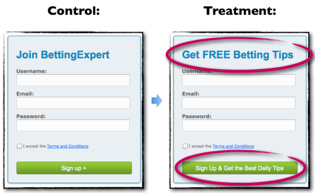
A simple example would be the form by bettingexpert.com. Just by stating the benefits of signing up in the form’s headline and the Call to Action (CTA) button, the company saw a 31.54% increase in the number of signups!
So, ensure that you make your forms benefit-driven. This will give the users a clear motive to sign-up for the form.
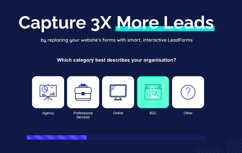
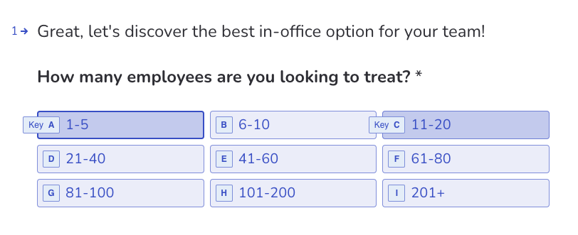
2. Use Selectable Images to Reduce Form Abandonments
A great way to improve your form design and increase its ease of use is by using selectable images. Selectable images are a great, innovative twist to the usual radio button input options on most forms.
Not only does this make your form much more interesting, but it also keeps the user hooked-in, ready to fill in the upcoming questions in your form.
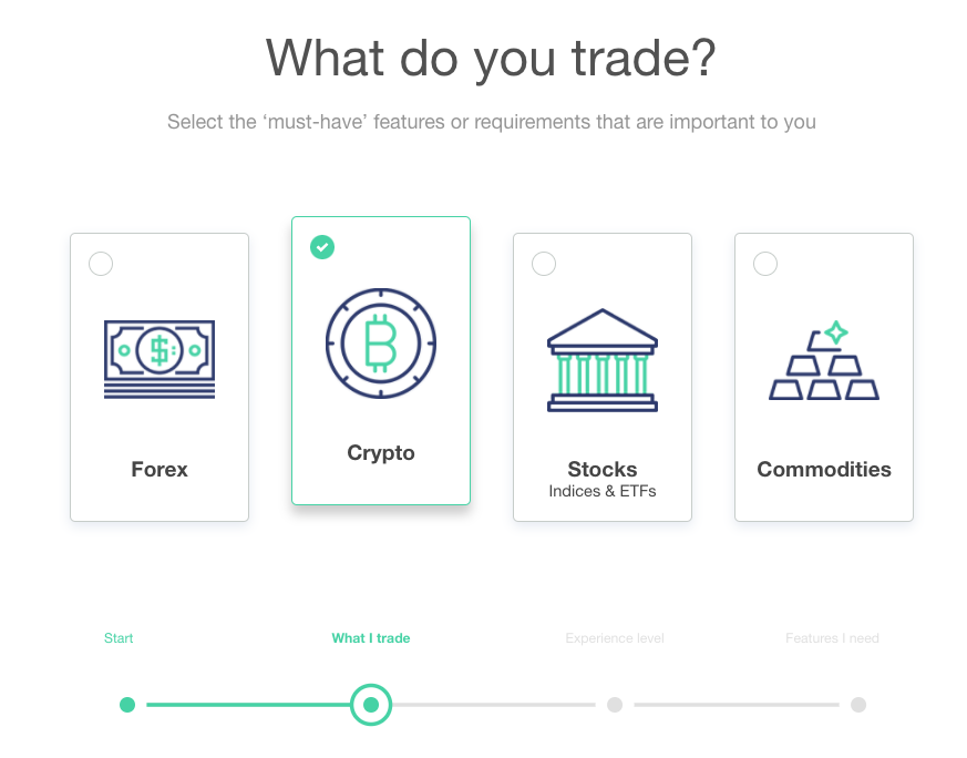
A great example would be the multi-step form. This beautiful form uses images as radio buttons to make the form more exciting and engaging. You cannot resist clicking on one of these image radio buttons.
3. When in Doubt, Use Multi-Step Forms
When you create a form, you may have many questions on your mind.
What if the user gets intimidated by the questions and abandons your form? What if sensitive information such as phone numbers scares your users away? What if your users find your forms too long and tedious?
Well, you are right to wonder about these questions. Users do have similar concerns on their minds while filling your form. And, the best way to combat this is to use multi-step forms.
Multi-step forms are when you ask the users to fill in just one question and then click on the next button to move on to the next question.
With this format, your users would be less intimidated by the form as they wouldn’t know your form’s length. Moreover, a progress bar or indicator can do a great job of motivating the users to complete the form. Crossed the 3rd level; why not just complete the entire form?!
The website Brokernotes does a great job at multi-step forms.
4. Simplicity Always Wins
No matter whatever changes come up in the online world, there is one thing that will never change – no one ever wants to fill up boring, long, unnecessarily-long forms.
You might be tempted to create extended forms and get in as many details as possible. But, this might annoy your users more than you would guess.
So, stick to a simple form design. Limit the number of fields to a bare minimum. Do not ask for over-complicated, unnecessary details. Your form should not take more than a couple of minutes to fill.
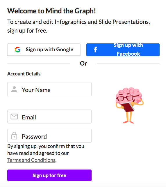
Mind the Graph, a free online infographic maker tool, focuses on a simple form design that makes it easy for users to fill in the form and start using the tool. If they were to ask questions related to their company and other extra details, they probably would be getting much lesser sign-ups.
5. Ensure that your Forms are Accessible
Did you know that 26% of adults in the U.S. are disabled in some way?! These include disabilities such as cognitive impairments, visual disabilities, mental disabilities, etc. Don’t you think it is important to make your form design accessible to this population as well?
Accessibility is a crucial aspect, especially for forms. Disabled people might use means such as screen readers to access your forms.
If your forms are not accessible, you are driving away all these potential customers. Not only is this wrong on moral grounds, but this may also land you in trouble through expensive accessibility lawsuits.
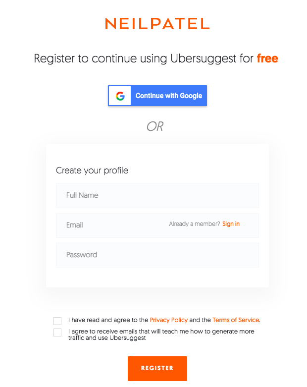
You can ensure accessibility of your form by avoiding CAPTCHAS, ensuring keyboard navigation, using easy-to-read forms, providing clear explanations to every question, and enabling auto-fills. The form for Ubersuggest registration by Neil Patel does a great job of ensuring its accessibility.
6. Optimize your Forms for Speed
Trust the experts when they say that even the tiniest increase in speed can have a massive improvement in your conversions.
Today, all of us are impatient. The last thing we want to do is wait for websites to populate forms and wait for form submissions to get completed. Hence, design your form so that it populates and is submitted at the highest possible speed.
7. Have an Intuitive Design for your Forms
Just like any other UI/UX best practice, having an intuitive design for your form can also help you increase the user experience, ultimately leading to an increased number of sign-ups. You can do this by adding visual cues to your forms.
Visual cues can be added by visually guiding your users through the steps of your form. You can add tooltips and guide users to give them a delightful form filling experience through the form fields.
8. Add Social Proof Near your Form
We all know the wonders that are possible through the strategic use of social proof. You can use the same for your form design as well.
Right before or while filling up the form, users may have several objections, and they may hesitate to click on the submit button. You can try giving the last push by displaying social proof somewhere near the form.
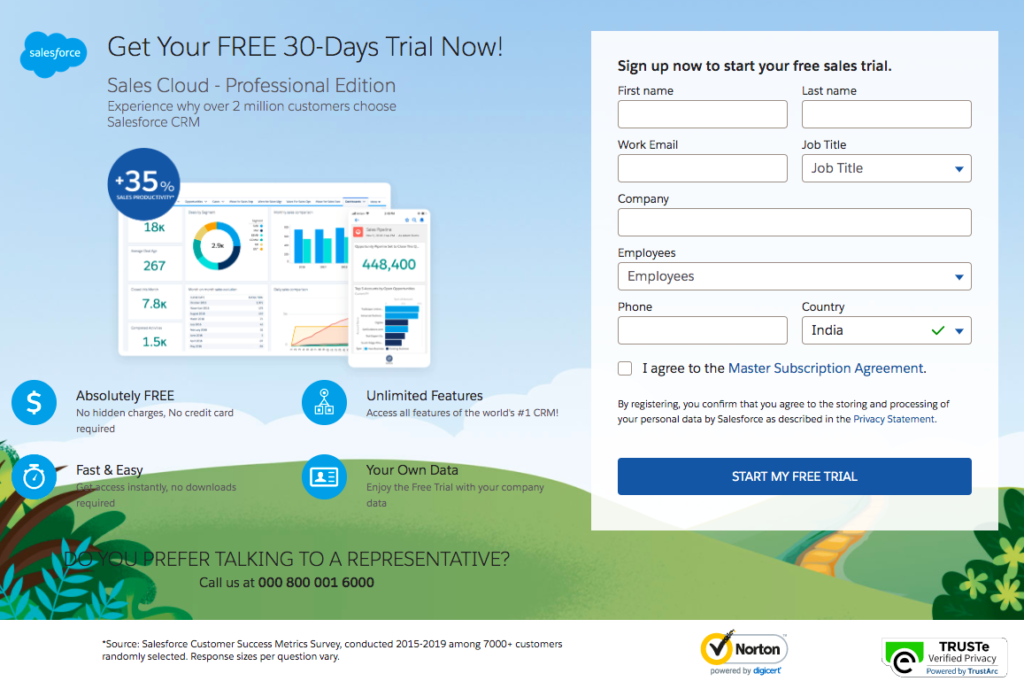
This will urge your prospects to fill in the form and get them excited while doing so. The CRM tool, Salesforce, does an excellent job at this. They strategically place social proof results and benefits right beside their sign-up form.
9. Address any Expected Concerns and Objections Right Away
Addressing the common concerns that your users might face while signing up is an excellent way to increase your sign-up rates.
Users usually have objections about providing sensitive information, credit card details for free trials, unwanted promotional emails hitting their inboxes, etc. You can address these right away in your form. You can either add a link to your privacy policy. Or add a statement such as “No credit card needed” somewhere in your form. This will increase your conversion rates.
The leading eCommerce platform Shopify does a great job at it by telling their users upfront that they won’t have to enter their credit card info for the free trial.

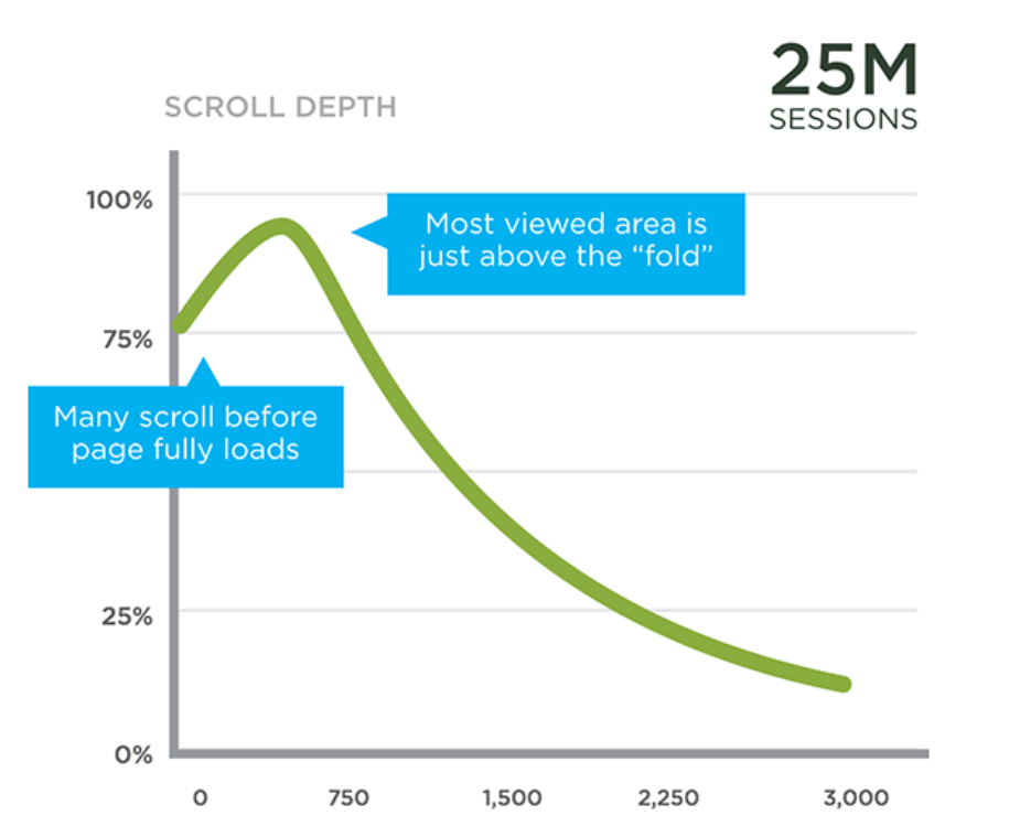
10. Place your Forms Above the Fold
Did you know that placing your lead generation above the fold (the web page area that appears before the user has to scroll down) can skyrocket your conversions?
This is because studies show that engaged time is at a peak above the fold. Hence, any element placed above the fold gets a lot more attention than other elements.
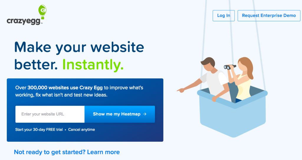
The heatmap tool, Crazyegg, does a great job at placing the form above the fold. In fact, they go a step further by removing all the distracting elements from above the fold and keeping the entire focus on the lead generation form, asking for the website URL.
11. Ensure that your Form is Responsive and Mobile-Friendly
More than 50% of internet traffic comes from mobile devices. This means the majority of your users are going to fill up your form via their mobile devices. Hence, ensuring mobile-friendliness of your form is an absolute must.
For having a mobile-friendly form design, use a responsive design. Test your form in devices of different dimensions to ensure that it loads well.
You must also ensure that the fonts work fine and don’t get cut on devices of all sizes. Also, try to remove design elements such as hover that do not work on mobile devices.
12. Use Good Copy for your Form
Using good copy can make your users perceive you in an entirely different light. Though your objectives remain the same and you ask for the same information, just changing up your form copy can help you gain a more positive response.
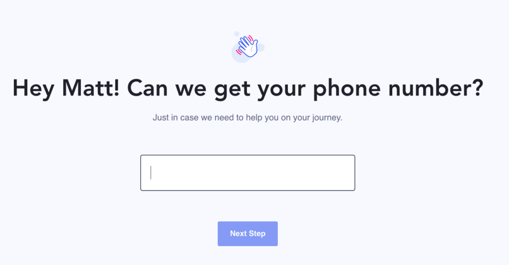
For instance, consider his sign-up form by Active Campaign. They are looking for your phone number, but they are asking for your permission for it.
Imagine if the copy read something like “Enter your phone number” instead! Lots of users might find it an invasion of privacy and end up exiting the form. So, focusing on the form copy is, again, super important.
13. Use A/B Testing and Heat Maps for Optimizing your Forms
Using A/B testing on your forms can reveal eye-opening insights about any areas of improvement in your form design. After A/B testing your forms, you’ll be amazed to see the kind of progress made in the form design and the results that it can lead to.
If you are confused about which CTA color would work better or where you place the form for maximum conversions, the A/B testing or split testing is the method you must consider going for. You can also use heatmaps to analyze the variations of clicks and recordings of users filling your form to know more in-depth insights.
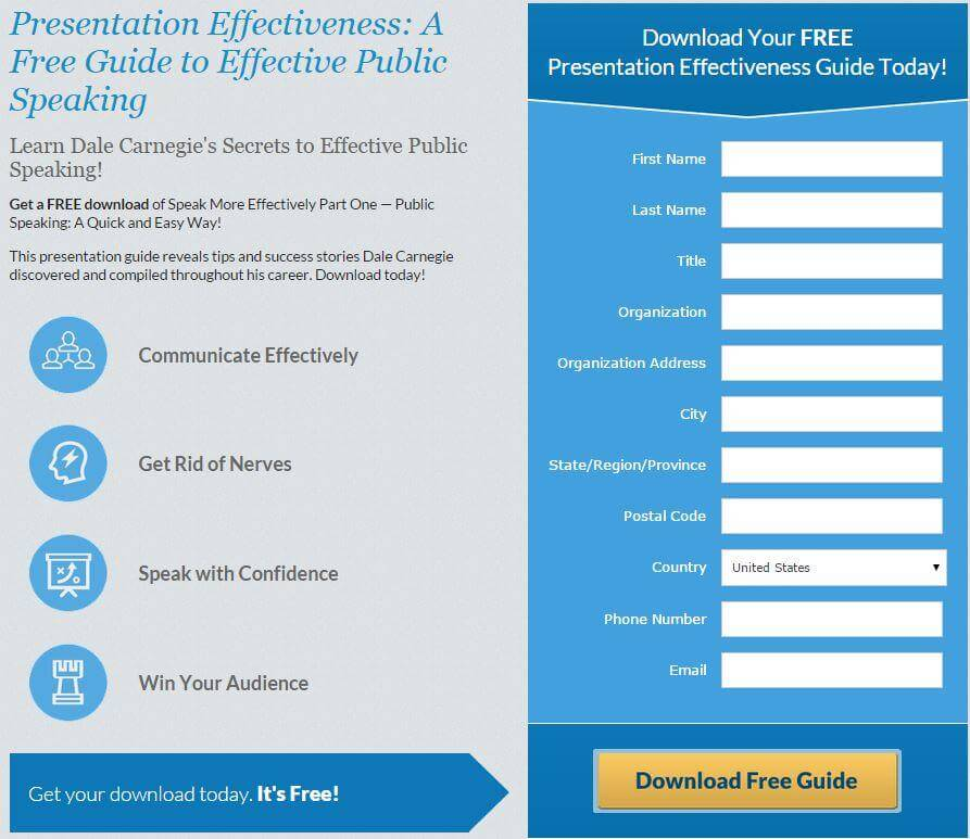
Dale Carnegie, the world’s premier training company, used spit testing to analyze the performance of various forms they used.
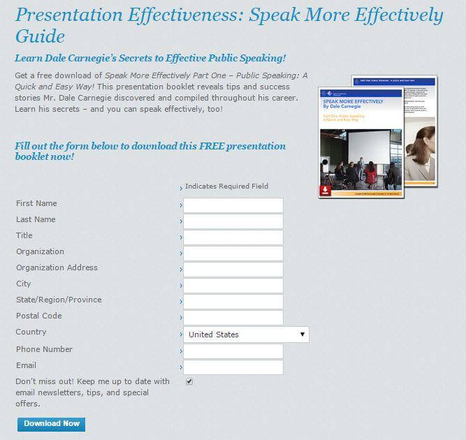
With the help of Optimizely, they made changes such as changing the CTA copy to “Download Free Guide,” placing the download button directly below the form, using bulleted benefit statements, etc. And, they noticed results as high as a 35.5% increase in the number of downloads.
14. Personalize the Experience
In the age of information overload, personalization is what stands out. By offering a personalized experience through your forms, you can significantly improve your conversion rates while improving your user experience.
You can personalize forms by designing different forms for users coming from different traffic sources. For instance, a prospect coming to your site from an email may be completely different from someone who comes to your page from an Instagram advertisement. Hence, personalizing your forms this way can help you generate more sign-ups.
You can also personalize the form-filling experience and make it more engaging by using multi-step forms with conditional logic. Based on the options the user chooses at each step, you can ask the next set of questions.
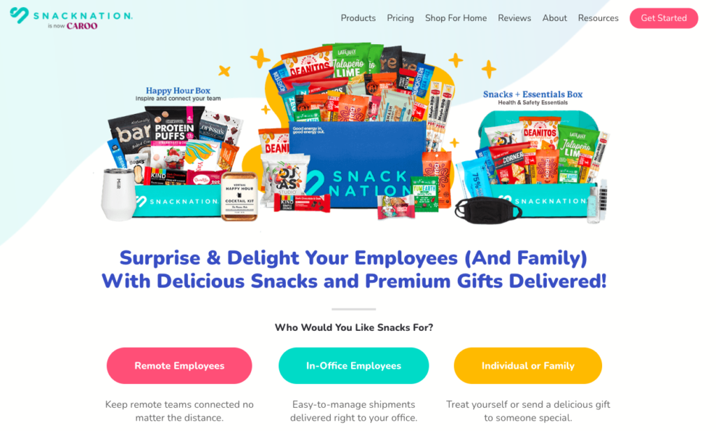
SnackNation, a healthy snack home delivery service, does great personalized forms with conditional logic.
Start Working on your Form Design
Now that you know the best practices and knick-knacks of creating a winning form, it’s your turn now. Start implementing the tricks and techniques provided in the above form examples and increase your form conversion rates.