
Creating a top-notch landing page takes more than just good copy writing skills. You must also understand top trends and research your audience to understand their pain points. On top of that, you should design your landing page in a way that’ll attract visitors and convert them into leads.
For that reason, we’ll cover all there is to know about landing pages and give 10 design ideas to implement into your own strategies and boost your conversions.
In this article
What is a Landing Page?
A landing page is a standalone page on your website used to collect contact details from visitors in exchange for relevant offers like a whitepaper or ebook.
We typically collect the contact info using a lead-capture form where website users enter details such as their name and email address.
Landing pages are usually tailored to the offer and provide information the visitor needs to make an informed decision. As a result, you can turn visitors into leads and nurture them with more personalized marketing campaigns before they convert into customers.
Types of Landing Pages
There are many different types of landing pages depending on the offer a business has. But here are four main types of landing pages that are the most common:
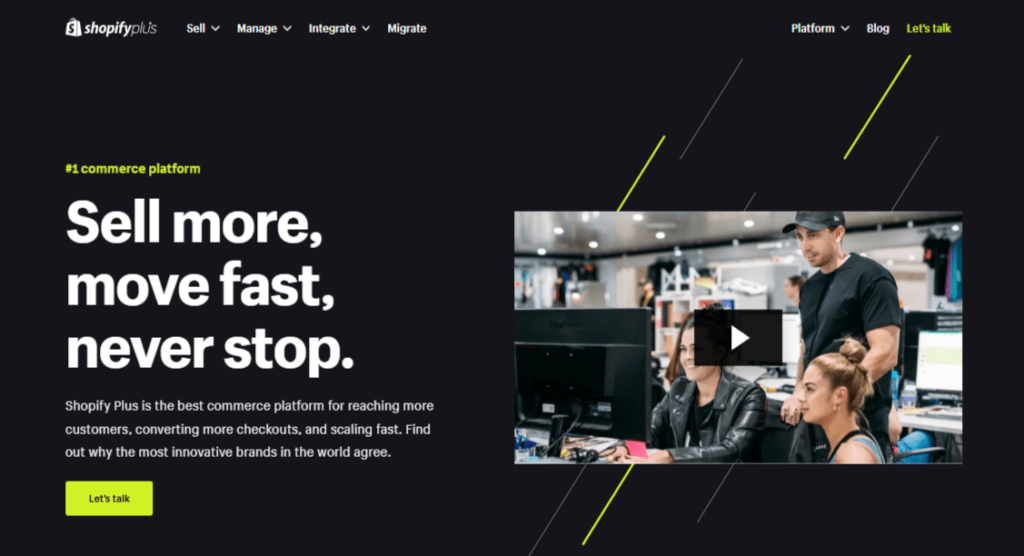
Click-Through Landing Page
A click-through landing page offers value without bombarding customers with a “Buy Now” call to action (CTA) button before they’re ready to purchase. It shares the features and benefits of your service or product with a CTA button encouraging customers to get started, for instance, with a free trial.
After they click on that CTA, they’re directed to another landing page with pricing and payment information to begin the trial.
Here’s an example:
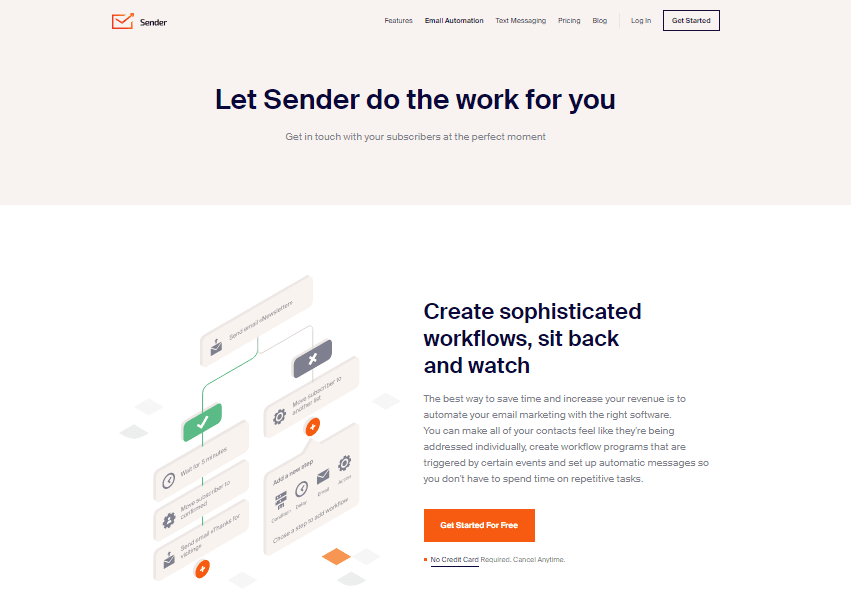
The good thing is that when customers land on the pricing page, they’re already educated on why they should continue with the trial.
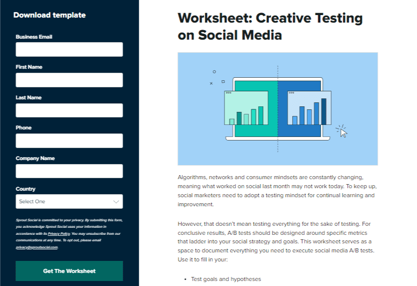
Lead Generation Landing Page
Lead generation landing pages offer something higher up the funnel, like gated content where a person must give their contact details to access the offer.
When the user provides their contact information, they become a lead you can follow up with email or phone to nurture them into customers.
Lead generation landing pages include a form that allows the user to request an offer. After completing the form, they’re directed to a thank you page that confirms the next steps, such as clicking a button to download the file.
Here’s an example:
Get Started Landing Page
With a “Get Started” landing page, the offer is typically above the call to action (CTA) button. For example, the page below explains Netflix’s overarching benefits: Unlimited movies, TV shows, and more. You can also watch anywhere and cancel anytime.
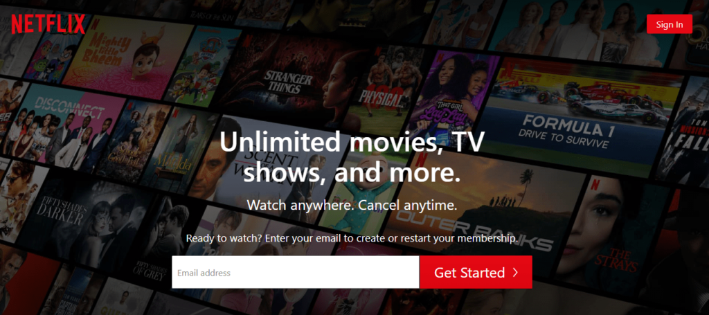
If you need more convincing before getting started, more information will follow as you scroll through a benefit- and feature-laden landing page.
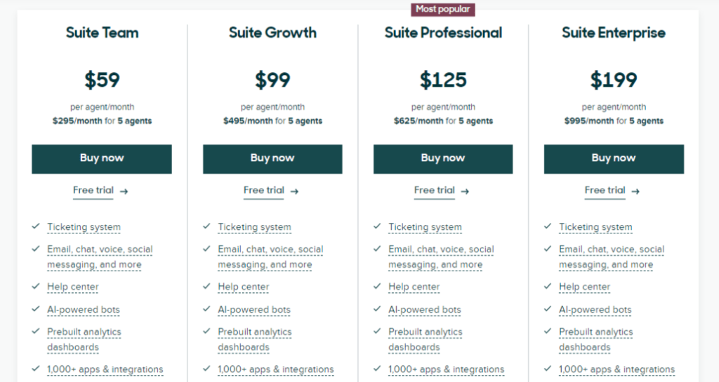
Pricing Page
When introducing a new product or pricing tiers, you should direct customers to your pricing landing page since it’s typically one of your website’s most heavily optimized pages.
For example, the pricing page below clearly outlines Zendesk’s four-tiered packages and includes links to get started.
What Makes a Landing Page Effective?
An effective landing page is typically tailored around one offer. However, 48% of landing pages have more than one offer, which decreases their conversion rates by 266%.
So, if you’ve centered your marketing campaign around an ebook, your landing page should also focus on the ebook. That ensures people know what they’ll get when they share their contact details.
Here are some key practices to follow to create high-converting landing pages:
- Include testimonials and social proof to support your claims;
- Have a single offer with only one primary call to action (CTA);
- Use a conversion-focused layout to make your CTA stand out (use directional cues, whitespace, color, and more);
- Use a clear value statement so website visitors can immediately understand the purpose of your landing page.
Now, let’s look at the 10 best landing page design ideas to boost conversions.
10 Best Landing Page Design Ideas
Landing pages influence the success of a marketing campaign because, if designed well, they convert visitors into sales.
That’s why we’ve shared the 10 landing page design ideas below to help you shake things up and boost your conversion rates.
1. Add Reviews and Customer Testimonials
Customer testimonials and positive reviews help your audience build trust in your services or products.
Here are examples:
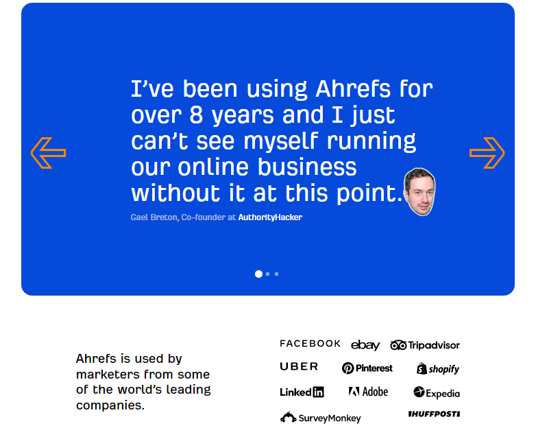
That said, prospects are no longer swayed by a testimonial or review from just anyone since reviews can be easily fabricated. In fact, 62% of people believe they’ve seen a fake review for a local business.
So, here are some ways to effectively incorporate customer reviews and testimonials on your landing page:
- Add testimonials and positive reviews from social media. For example, when you include the Twitter handles of the people giving positive reviews about your product, your prospects can easily verify they’re real people.
- Add the faces of satisfied clients who leave a positive review for your product or service to give leads an easier time connecting with your brand.
- Use authoritative sources to show your worth better and boost credibility.
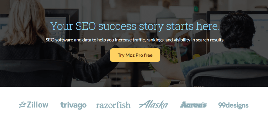
2. Use Trust Signals
Trust signals are elements you display on your website to give customers more security when making a decision to purchase a specific service or product.
In other words, trust signals make prospects feel more comfortable doing business with you. So they play a big part in conversion rate optimization (CRO).
Here’s an example from Moz:
You can use different trust signals depending on your target audience. They include:
- Social proof trust signals — includes everything from word-of-mouth recommendations to customer reviews.
- Trust by association trust signals — featuring the logos of famous brands on your website to show your trustworthiness.
- Guarantee trust signals — assures customers that if they’re dissatisfied with your product, they can always get a refund.
- Membership trust signals — leveraging memberships to professional bodies such as Better Business Bureau to boost your credibility.
3. Include Stats, Numbers, and Facts
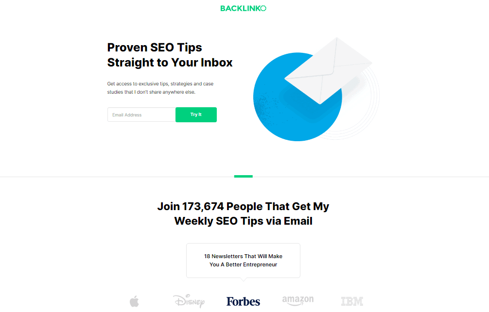
Which of these two sentences do you find more convincing?
“Your conversion rates will skyrocket!”
“In just three weeks, we helped company A increase customer conversions by 74.5%.”
Without a doubt, the second sentence is more credible since it’s more specific.
Anyone can claim how excellent their company is. But it takes a lot of work to provide specific metrics and statistics.
Since facts and figures can be a superb way to grab a prospect’s attention, always include them on your landing pages. They’ll show the value of your service or product and cause users to take action.
You can also offer a guarantee if your company is new and you don’t have stats or figures to share with your prospects. For example, you can give a 30-day money-back guarantee or a 100% satisfaction guarantee to reassure prospects that you’ll offer them value.
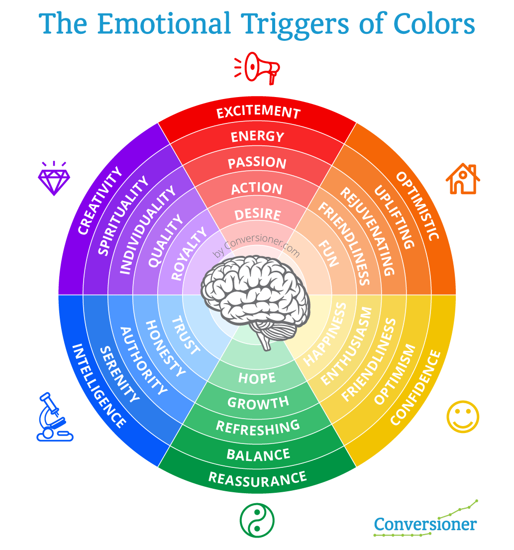
4. Invoke an Emotional Response
The first step in evoking an emotional response from customers is knowing the emotions influencing your audience’s actions since the customer’s emotional need drives every conversion and purchase.
For example, if you design outdoor living spaces, your customer’s emotional needs can be enjoyment or relaxation. Or, if you’re selling a back pain relief cream, your customers would want relief from their pain.
Once you identify the emotions that influence your customer’s purchasing decisions, use the techniques below to trigger an emotional response on your landing pages:
- Use images of real people so customers can identify with the person in the picture.
- Use colors that evoke the right emotions. For example, green shows reassurance, blue shows authority, and orange shows optimism.
- Focus on the benefits so you can offer gratification and connect with the customers’ emotions.
- Remind users of their pain, then present your service or product as the solution.
- Use emotionally-loaded words to trigger an emotional response on your landing page.
5. Add Visual Directional Cues
Directional cues are visual aids such as the eye gaze of a model or arrows that point to the crucial elements of your landing page like:
- CTA button
- Lead capture form
- Customer testimonials
- Video
- The information below the fold
Here’s an example:
Directional cues:
- Strengthen the visual hierarchy
- Enhance the screen or page scannability
- Increase conversion rates
- Improve navigation
Examples of directional cues include:
- Using arrows
- Human eye gaze
- Having a model gesture or point toward a crucial element
- Positioning images so they’re pointed toward a specific focus
6. Give Something Valuable for Free
Many people find it counterintuitive to give something valuable away for free. However, it can be a powerful motivator when used on a landing page.
The free offer is what you give in exchange for your lead’s contact details. Therefore, the offer should be compelling enough for the website visitor to share their contact info but also relevant to your business.
For example, if you’re selling a website design course, your offer might be “10 Simple Ways to Create a Website for Free.” After the user provides their contact info to access the offer, you’ll nurture them before asking them to purchase your website design course.
7. Add a Video
Most online shoppers are skimmers . They want to quickly gather the information they need to purchase.
In fact, 96% of people have watched a service or product explainer video to learn more about it. And 88% of people say that watching a brand’s video convinced them to buy a product or service.
Videos help you to effectively communicate your unique value proposition and message without making users sift through written text. Videos can also develop an emotional connection with prospects and make complex services or products more accessible and digestible.
So, if your business sells complex products like SaaS, video landing pages can be a superb way to explain and cover a lot of information quickly.
8. Use Relevant Images
What’s the first thing that comes to mind when you visit a landing page on an ecommerce website? Is it a detailed description of the product or an image of it?
Relevant landing page images can drive sales since they resonate better and much faster with people than the copy. So always use images that correspond with your campaign goals and convey the right marketing message.
For example, show someone working out if you’re advertising gym classes. Let the visitor imagine themselves doing it.
9. Use Single-Click Sign-Up
Single-click sign-up is one of the best ways to boost your conversion rates since it makes it easy for your visitors to convert.
Here’s an example from Canva:
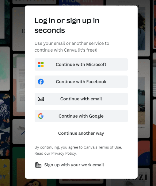
Using a one-click registration form helps visitors get the sense that the sign up process will be quick and they’ll be back to browsing shortly.
This example illustrates how effective it can be when you remove as many obstacles as possible between the prospect and the conversion.
10. Use White Space To Keep Your Landing Pages Clean
Every landing page has various elements: headlines, images, copy, customer testimonials, customer badges, trust seals, video, and CTA buttons.
White space is the space between these page elements.
Each element contributes to the conversion of the visitor. Hence, they all deserve a prominent place on your landing page since balancing them well persuades the visitor to convert into a customer.
For example, you can’t ignore the copy to give your headline the spotlight, nor can you ignore the lead-capture form to make the CTA button stand out.
So, use white space to keep your landing pages clean and draw attention to the key elements.
Final Words on Effective Landing Page Design Ideas
There you have it. 10 landing page design ideas to give you everything you need to build landing pages that convert.
Landing pages help you grow your customer base and increase conversions. So, create a page that meets your users’ needs and an interface that keeps them coming back for more.
They are the first point of contact between a potential customer and a business, and they need to be designed in a way that entices visitors to take action, whether that’s making a purchase, signing up for a newsletter, or filling out a contact form.