In this definitive guide, we’re going to review the best landing page builders to help you build killer landing pages that drive more traffic to grow your leads and build your brand online.
Imagine if you could convert every click on your ad into a lead and every lead into a paid customer.
How sweet would the world be?
Unfortunately, this isn’t easy to achieve. And worse, less than 3 people out of 100 who click an add will take action.
You can reinvent the wheel… And improve your conversion rate.
It’s possible…
When you build a killer landing page.
Landing pages are vital tools when it comes to marketing optimization.
With a good landing page, you can attract visitors, drive leads, increase your online following, and ultimately generate more sales. Close to 68% of B2B businesses use landing pages to drive leads and increase conversion.
To create an effective landing page, you need the best page creator.
But with the plethora of landing page tools out there, choosing the best page builder software can be a nightmare for you.
Ideally, you need a tool that’s easy to use, comes with basic features such as email marketing integration, A/B testing, and affordable for both professional bloggers and online business owners.
We have done the research and pulled out eight of the best landing page builders that can help you build effective landing pages for you.
Read our detailed review of each landing page builder and choose the suitable one for you.
In this article
- 1. Woorise
- 2. HubSpot Landing Pages
- 3. EngageBay
- 4. Leadpages
- 5. Instapage
- 6. GetResponse
- 7. Unbounce
- 8. Lander
- 9. Landingi
- Landing Page vs. Website Homepage: What sets the two apart?
- 13 Design Tips to Create Better Landing Pages
- 7 Examples Of Killer Website Landing Pages (And What You Can Learn From Them)
- Build Professional Landing Pages Today!
1. Woorise
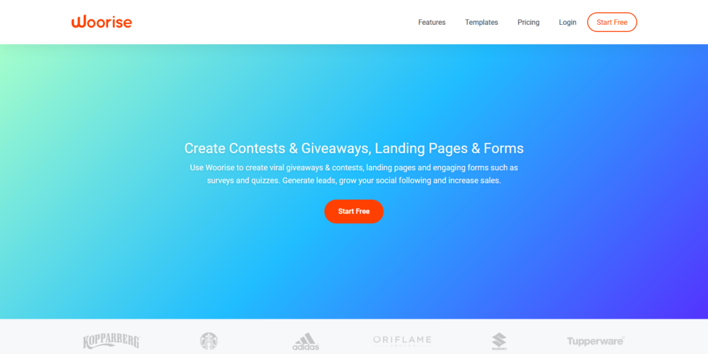
Woorise is the new gem in the SaaS and B2B market and was named one of the 2019’s top 14 HubSpot rivalries.
The landing page builder is easy to use and can help you build attractive and high-converting landing pages for your lead generation and conversion.
The page builder boasts 100+ mobile-optimized landing page templates.
Its intuitive interface is easy to use for both advanced and beginner marketers thanks to their drag-and-drop page builder.
What’s more, the tool lets you publish your landing pages on your website, social media, and WordPress blog.
Advanced users can use HTML and CSS features to customize certain elements of their pages.
Woorise Noteworthy Features
- Live chat support
- One-click integration with popular marketing platforms.
- Suitable for beginners and experts alike.
- Fully-responsive landing builder templates.
Woorise Pricing Plans
Woorise has four pricing plans including a Free plan with many features. The premium plans includes Basic plan at €29/mo, Grow plan at €49/mo and Pro plan starting at €99/mo.
Try Woorise Landing page builder for free
2. HubSpot Landing Pages
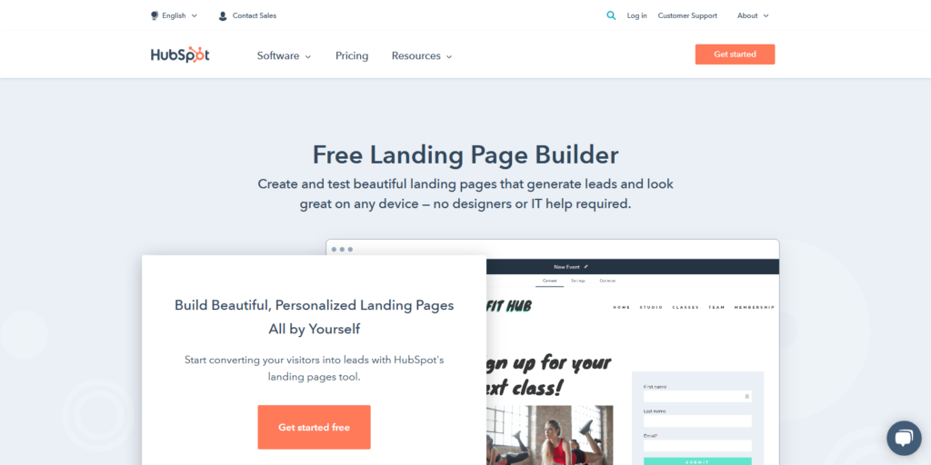
Build stunning landing pages without designer or IT help with HubSpot Landing Pages.
HubSpot is a household name in the SaaS and B2B business world. The landing page builder lets you build and test stunning landing pages without help from designers or IT professionals.
Of course, HubSpot’s price is on the higher side but given the powerful features, the page builder software has, the price is worth it.
The page builder software is easy to use and comes with an intuitive drag-and-drop editor so you can customize your page’s content in no time.
This makes the software suitable for bloggers, online entrepreneurs, and business owners in all types of industries out there.
Once you’re done building your landing pages, you can preview them on different devices before you publish them.
What’s more, HubSpot contains a ton of pre-existing mobile-responsible templates for beginners. You can also use their walk-through process to design your landing page from scratch.
Of course, advanced users are also taken into consideration with the advanced analytics tools, technologies, and testing features.
What we like the most about HubSpot Landing Pages is that the software lets you personalize landing pages for specific visitors. This means that your landing pages can display content tailored to individual visitors and add specific CTAs, and many other things.
If you’re looking to build mobile-friendly landing pages that convert or you want to build professional-looking landing pages from scratch then look no further than HubSpot Landing Pages. Besides, the page builder software is great for large teams, individual users, and agencies.
HubSpot Noteworthy Features
Here are remarkable features that set apart HubSpot from other best landing page builders out there.
- Mobile-responsive page builder templates.
- The software lets you build professional-looking landing pages in no minute- no IT or designer help required.
- Live chat, conversational bots, pop-up forms, etc. to help you capture and convert leads.
- The page builder lets you build landing pages optimized for individual visitors.
Pricing Plans
HubSpot has three pricing plans namely: Starter $40/mo., Professional $800/mo., and Enterprise $3,200/mo. Probably, HubSpot is among the most costly page builder tools out there.
Try HubSpot Landing Pages here
3. EngageBay
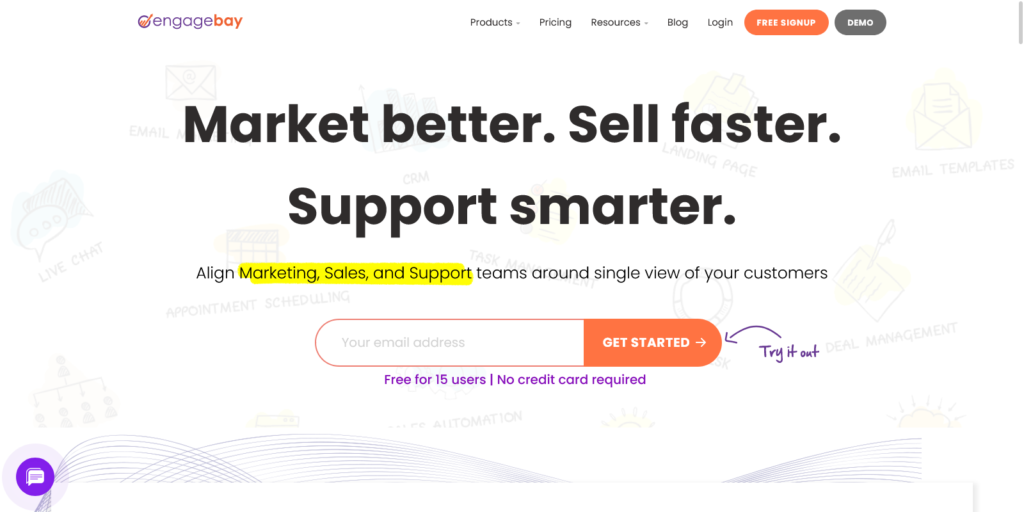
Design and build visually stunning landing pages with EngageBay’s easy-to-use landing page builder.
EngageBay is known for its power-packed features at affordable pricing. The software has a drag-and-drop designer to help you create customized and responsive pages without writing a single line of code. Tweak everything from fonts, colors, styles, and elements – and mirror your brand’s image perfectly.
Keeping the design aspects aside, the platform also lets you set up meta titles, descriptions, and keywords for search engine optimization. The builder allows you to set up triggers to launch an event or window when a visitor arrives at your page so that you can interact and personalize your pages based on the visitor’s behavior.
With just a flick of a button, you can make your pages responsive so that it displays perfectly across devices of different dimensions. Once you complete building your page, you can preview it across devices, interact with it, and then publish it online.
Once you publish your page, data starts to come in. You can monitor your page’s performance right from the platform. You can easily see the number of visitors, subscribers, clickthrough rates, and bounce rates with detailed reporting.
Landing pages improve lead management and nurturing by a whopping 86%. With EngageBay’s landing page builder, you can use pre-built templates to produce responsive landing pages quickly. Just choose one, and start working on it right away.
This is what we like the most about the software: EngageBay’s landing page A/B testing is a game-changer as it uses live traffic to get insightful metrics on your page’s performance. You can tweak elements to create different versions and then divert your traffic to each of these pages. Using A/B testing, you can discover what works and what doesn’t.
You can even link your pages to the CRM and capture leads – making landing pages an essential cog in the overall marketing machine.
EngageBay’s Noteworthy Features
Below is a list of EngageBay’s most noteworthy features that make creating landing pages a breeze.
- Powerful A/B testing tools
- A robust set of pre-built templates.
- Fully responsive landing pages.
- Intelligent data capture and analysis
- Drag-and-drop form builder
EngageBay Pricing Plans
EngageBay has a four-tiered pricing plan. The pricing for the All-in-One plan is mentioned below:
The Free plan is forever-free and comes with basic features such as email marketing and CRM.
The Basic plan starts at $8.99 a month and has features including lead scoring and canned responses.
Their most popular plan is the Growth plan, and starts at $29.99 a month and includes tools such as A/B testing, custom domains, and proposals.
The Pro plan is the most advanced plan offered by EngageBay and is custom priced. It has advanced features such as call scripts, custom reporting, and unlimited contacts.
Try EngageBay landing page builder for free
4. Leadpages
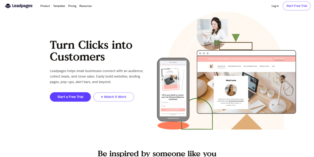
Leadpages is a budget-friendly landing page builder tool but don’t let the price fool you. The software comes with powerful features that let you build code-free websites, effective landing pages, alert bars, etc.
The software is currently used by 40,000+ small business owners and marketing professionals.
What’s more, the page builder comes with a dynamic text replacement, email integration functionality, and 160+ free page templates that let you create unlimited mobile-optimized landing pages.
Their interface and drag-and-drop builder is easy to use and lets you customize your landing pages with no tech skills required.
As if that’s not all, Leadpages lets you integrate pop-up forms anywhere on your website so you can collect leads.
Did we mention that the page builder has advanced features like A/B testing and built-in payments?
Yes, and that’s not all. In case you want to publish converting content on your landing pages, Leadpages’ conversion tool kits allow you to do exactly that without a hassle.
Leadpages Noteworthy Features
Here are notable features of Leadpages that make it one of the best landing page builders for small business owners and entrepreneurs alike.
- Free mobile-friendly templates.
- Advanced features such as A/B testing.
- Social media and WordPress integrations.
- Form creation and page design features.
Leadpages Рrісіng Plans
Leadpages have three pricing plans and you can pay annually or monthly: Standard plan $25/mo., the Pro plan comes at $48/mo. and the Advanced plan costs $199/mo.
Try Leadpages landing page builder free for 14 days today
5. Instapage

Instapage is yet another household name in the landing page builder market out there.
If you’re looking to convert your visitors into actual customers then start building personalized landing pages with Instapage today.
The page builder software is currently used by famous companies such as Verizon, Hellofresh, Verifone, etc.
The page builder software comes with incredible features such as mobile-responsive page builder templates that are optimized for conversions so you can grow your business effectively.
What’s more, their easy drag-and-drop page builder lets you design beautiful landing pages and publish them in no record time.
The good thing about Instapage is that the software lets you design landing pages that integrate easily with the popular email marketing platforms so you can grow your email list fast.
Instapage Noteworthy Features
- A/B testing
- 200+ complete customizable and optimized landing page builder templates.
- Form builder.
- Visual on-page collaboration.
- Complete customization builder to design professional-looking and conversion-ready landing pages.
Instapage Pricing Plans
Instapage has two pricing tiers: the Business plan costs $149/mo. and the Enterprise plan is based on one’s needs.
Try Instapage landing page builder free for 14 days today
6. GetResponse
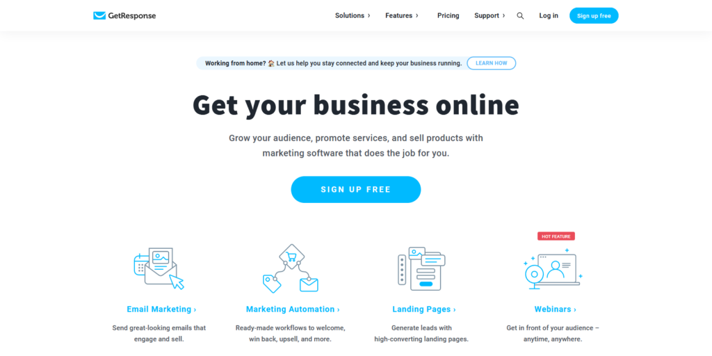
GetResponse is another gem. The software lets build landing pages that convert your visitors into leads and customers. You do not need web design skills or experience either to use this tool.
If you’re looking for a tool to boost your marketing automation then GetResponse is your best software solution.
Get Response is recommended by most paper writing services reviews authors
Besides, building landing pages with this tool is easy. First, pick your preferred page builder template, customize it, publish within seconds, and then test and optimize it for conversion.
The good thing about GetResponse is that it lets you collect emails from your website visitors by offering them exclusive incentives.
It’s also a great tool for promoting your products as it contains ready-made sales funnels you just need to add products or services to your sales pages.
GetResponse also lets you showcase your webinars so you can drive traffic to your registration page in case you are hosting online events.
What’s more, their dynamic template builder lets you create stunning landing pages.
GetResponse Noteworthy Features
- Email marketing integration
- Landing page templates with 5,000 premium images for free
- Webinars
- Marketing automation
- Advances analytics and testing.
- Built-in, intuitive, and easy to use drag-and-drop editor
GetResponse Рrісing Plans
GetResponse has three pricing tiers. Their Basic plan starts at $15/mo. The most popular Plus plan costs $49/mo. and the Professional plan starts at $99/mo. You can also choose the Max plan which is personalized and flexible.
Try GetResponse landing page builder free for 30 days today
7. Unbounce
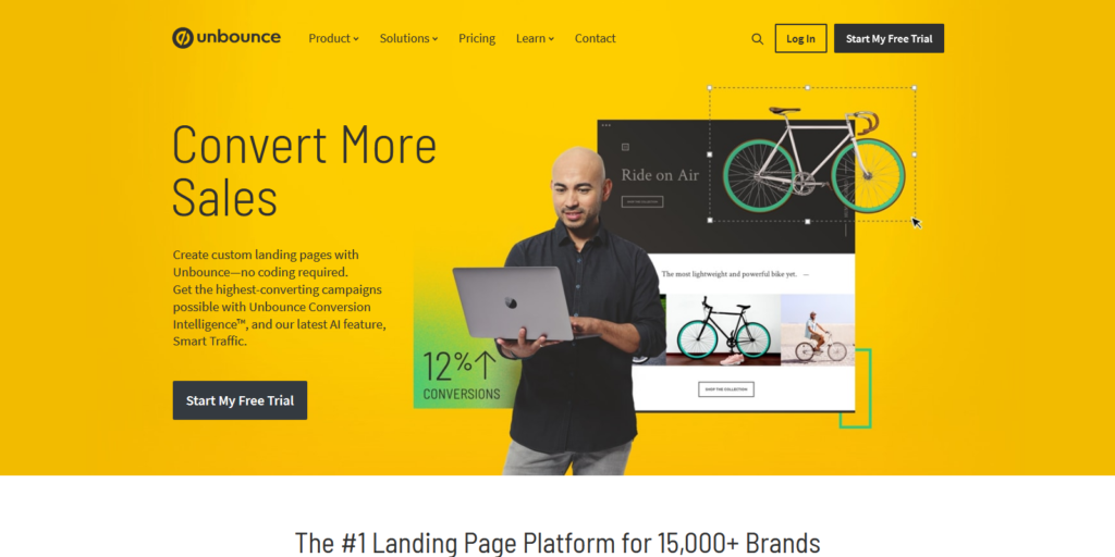
The best landing page creator for SaaS, Agencies, and eCommerce businesses.
More than 15,000 brands are already using Unbounce due to its ability to help users build optimized landing pages that convert prospects into leads and sales.
And that’s not all. Their drag-and-drop editor lets you build and publish landing pages for any campaign.
You don’t need coding skills to use their 125+ mobile-ready templates. Besides, their keyword insertion functionality lets you target your audience with your landing pages based on their search queries.
What’s more, the page builder works seamlessly with other powerful platforms such as Salesforce, Zapier, Campaign Monitor, WordPress, HubSpot, etc.
If you’re looking for the best landing page builder to create high-converting and custom landing pages for every campaign then choose Unbounce.
Unbounce Noteworthy Features
- Sticky bars.
- Intuitive and easy to use drag-and-drop editor.
- Custom domains.
- Dynamic keyword insertion.
- 125+ mobile-ready templates.
Unbounce Pricing Plans
Unbounce has four pricing plans: Launch $80/mo. Optimize $120/mo. Accelerate $200/mo. and Scale $300/mo.
Try Unbounce landing page builder free for 14 days today
8. Lander
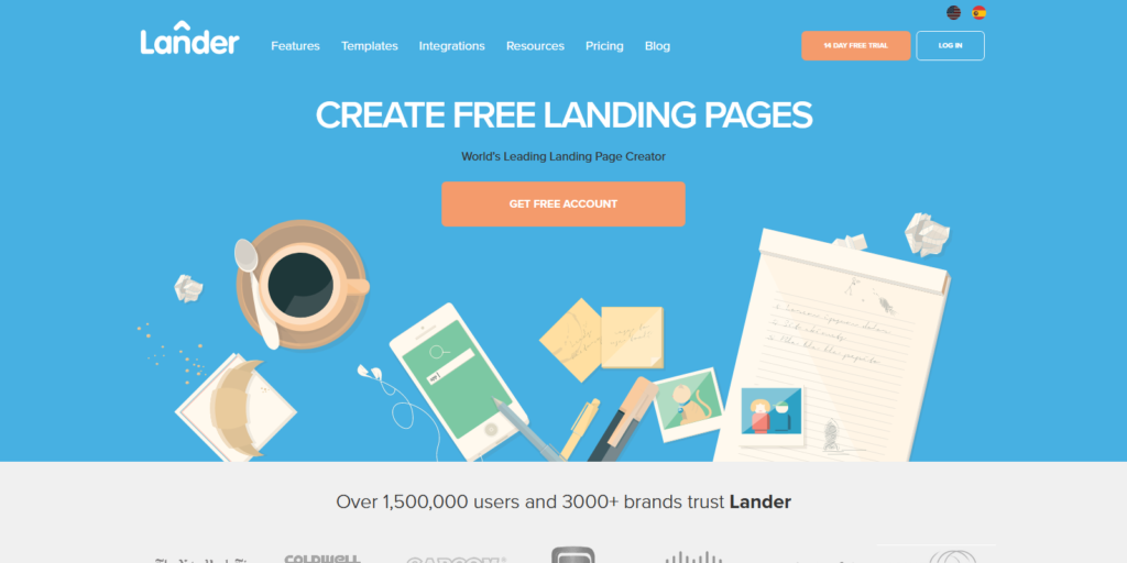
Lander boasts 1.5+ million users, 3000+ brands, and 100+ pre-made landing page templates. Some of the famous companies using this landing page builder include Cisco, Ney York Times, Patagonia, Capcom, etc.
With this landing page builder, you can professional-looking landing pages for capturing leads, promoting eBooks, products and services, and many other scenarios.
The greatest thing about the software is that it integrates with the most popular platforms such as Google Analytics, MailChimp, Salesforce, etc.
Surprisingly, Lander is one of the most budget-friendly landing page builders out there.
Lander Noteworthy Features
- Google Maps tools.
- Unlimited landing page builder templates.
- Pre-made forms to drive more conversions.
- Allows integration of welcome and third party emails
- Intuitive drag-and-drop editor
- Facebook tab.
- A/B testing.
Lander Pricing Plans
Lander has two pricing tiers. The Basic tier costs 16/mo. and the Professional tier costs $83/mo.
Try Lander free landing page builder for 14 days today!
9. Landingi
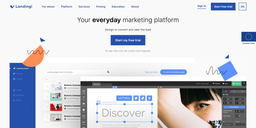
Closing our list of the eight best landing page builders in 2020 is Landingi. Even though we have listed at as the last in our list, the tools, templates, and features that the page builder comes with cannot be underrated. In fact, we wouldn’t have completed this list without mentioning the page builder software.
Besides, you don’t need programming skills to create your own custom landing pages.
Advanced users can use the HTML builder to build custom landing pages as well.
What’s more, it is also one of the most affordable landing page builders out there.
Landingi Noteworthy Features
- 300+ landing page and pop up templates
- Suitable for business owners, marketing experts, agencies, enterprises, and industries such as e-commerce, insurance, finance, etc.
Landingi Pricing Plans
Landingi has three pricing plans for business owners and two plans for agencies. For business owners, the pricing plans include Automate that costs $79/mo. the Create plan starting at $55/mo. and the Core plan that costs $29/mo. and is billed every 12 months.
On the Agency side, they have two plans: The Agency plan that costs $144/mo and is billed every 12 months, and the Agency Pro that costs $245 billed every 12 months as well.
Try Landingi free landing page builder for 14 days today!
These are the landing page builders we recommend for anyone with an online business and want to take it a notch higher.
But before we let you go, here are a few things worth understanding.
Landing Page vs. Website Homepage: What sets the two apart?
A landing page is a web page that visitors land on after clicking a link or an ad. Typically, a landing page is different from your home page and is meant to serve only one specific goal.
Usually, a landing page helps you generate sales, give out a special offer, or capture email addresses of your website visitors. An effective landing page will convince your visitors to take a certain action.
It’s easy to assume that you don’t need to build a landing page because you already have the homepage on your website. After all, the homepage can drive traffic to other pages on your website.
But here is the thing: Even though your homepage can drive traffic to your website, it’s less likely that the traffic will convert the same way as your landing page could.
Most homepages are jammed with a lot of information and may require a visitor to click several other links before they take actions. This could end up turning off the visitors before they take the action you wanted them to.
Landing pages only contain specific information and are meant to direct visitors to take specified actions.
13 Design Tips to Create Better Landing Pages
Landing pages play a crucial role in the success of any business. Landing pages get you the actual numbers, and hence, it is very important to ensure that you have a strategic approach to designing them.
There is no set formula for designing your landing pages. This is because the conversions of your landing pages largely depend on human behavior, which is highly unpredictable. But, you can follow certain tried and tested landing page design techniques that will help you improve your conversions dramatically.
In this guide, we’ll talk about some of the top design tips that will help you optimize your landing pages for maximum conversions. By following these tips, you’ll bring about a drastic improvement in your landing page metrics.
1. Reduce the Number of Form Fields
Landing page conversions largely depend on how users perceive them. If you make the process difficult, there is a huge chance that your users will abandon your landing page. The process of filling a form is uncomfortable and tedious. Hence, you should make the process as easy as possible for your users.
No one likes to fill up large lead generation forms with lots of fields. Not just does this take time, it also feels like you are asking a lot from your users. Even if you have an irresistible offer or lead magnet for your visitors, filling up forms with many fields may repel your users, never to come back to your site.
So, one of the topmost takeaways from this guide is that you must have as few form fields as possible. Try to stick to the bare minimum. Do not ask for unnecessary information in your form fields. Try to avoid fields such as CAPTCHA altogether.
You can consider implementing a multistep form. In such a form, users will have to fill up the first form field before moving on to the next. This way, your form will feel less intimidating to your users. You can use this when you have more than 2 to 3 form fields that your users have to fill up.
2. Do not use your Home Page as your Landing Page
Homepage and landing pages have completely different purposes on any business website. Hence, it is essential that you not use your home page as a landing page. But many businesses make this mistake. A study by Nifty Marketing revealed that 77% of top landing pages were home pages, which is appalling!
But, why shouldn’t you double your home page as your landing page? Your home page consists of about 40 to 60 links on average. This means there is a lot of distraction present on your homepage. Your users may easily get deviated by moving to these links.
For any landing page, the focus should only be one on the link – the CTA. Any other distracting elements and links should be completely removed. With fewer distractions and fewer links to deviate from, users are more likely to fill up your form and convert.
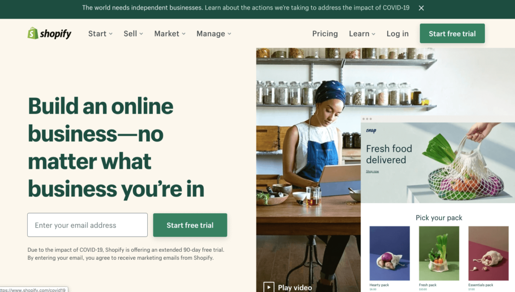
A great example of this would be the homepage and landing pages of Shopify. You can clearly notice the difference between the two. You’d instantly know why these two cannot be combined into one.
3. Ensure that your Landing Page is Accessible
Did you know that one in four Americans are disabled in some way? They may be suffering from visual impairments, hearing impairments, or have cognitive disabilities. Such people may need assistive technologies to access any websites around the internet.
It is important that you work on the accessibility of your landing page to ensure that everyone is able to access your website with ease. Having the Americans with Disabilities Act issued lately, adjusting your landing page to be in compliance with the ADA will help you remain inclusive of more internet users. You’ll also be able to stay away from any expensive lawsuits that might come your way if you fail to work on your landing page’s accessibility.
4. Match your Ads with your Landing Page Messaging
Your value proposition and messaging play a pivotal role in conversions. And consistency is an important thing to consider while working on your messaging.
If you are running PPC or social media ads for your landing pages, you would have a unique value proposition or a hook in these ads. This hook will trigger the users to click on the ad and come to your landing page.
It is important to have the same messaging or hook on your landing page as well. Preferably, you must use the exact same words as you used on your ads. But, why is this important?
Users click on your ads because they are interested in your hook. If you have a different messaging on your landing page, your users might feel deceived and thus will lead to landing page abandonment. So, always try to match your ad copy with the landing page messaging.
5. Use a Minimalistic and Clutter-Free Design
As discussed before, the focus of your entire landing page should direct towards one and only element, that is, your Call-To-Action (CTA.) Hence, you should try to keep your landing page design as minimalistic as possible.
- Do not use distracting colors that move the attention away from your form and CTA links.
- Remove any distracting ads or unnecessary links.
- Use a lot of blank space and keep the focus on the messaging that you want to highlight.
- Make use of white space and try to avoid walls of text that are not easily readable.
6. Place your CTA Above the Fold
If you use heat maps or session recordings to observe user behavior on your landing pages, you’d know that the number of users who scroll down to the bottom of the pages is very few.
Usually, most of the users that hop on to your landing page would have their eyes above the fold. This is the part of your landing page that is visible without scrolling. A good landing page design tip is to add your CTA button above the fold.
The reason for this is that most of your users will pay attention to your landing page’s part that is above the fold. Hence, by placing the CTA above the fold, you have higher chances of converting your landing page traffic.
7. Focus on the Form and CTA Colors
If you aren’t aware of this already, colors have a significant impact on human behavior. We respond to different colors differently. We attach different emotions with different colors. Hence, the varying colors can massively change your landing page metrics.
Pick muted colors for your backgrounds and ensure that your CTA and forms stand out against the background color. Try to use a contrasting color for your CTA. If the colors of your CTA and form blends in with your background color then your conversions will dip.
You can use A/B testing to test different variants of your form and CTA colors. For instance, a case study by Hubspot revealed that color has a significant effect on conversion rate. A red CTA button increased the conversion rate by 21 % as compared to a green-colored CTA button.
8. Ensure that your Copy is Benefit-Driven
The copy and messaging of your landing page have a significant role to play in converting visitors. No matter what colors you use or how small your form is, if the user is not convinced enough, he/she is not going to convert.
So, you should try to have a benefit-driven copy for your landing page instead of having a feature-driven copy. This means, instead of stating what the features of your offering are, try to list out how these features will impact the lives of your target audience.
At the end of the day, users want to tackle their pain points and get closer to their goals. So, if you are able to convince them that your offering will be able to help with that, then you’re a winner.
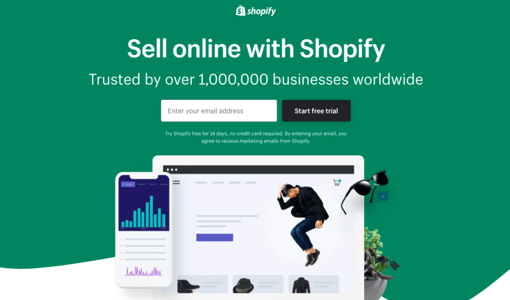
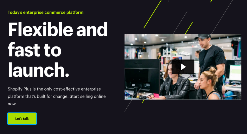
A great example of this would be the landing page by Shopify Plus which is completely focused on how their offering can benefit the users. “Flexible and fast to launch” is their hook that urges the visitors to convert.
9. Add Social Proof
We, humans, like to follow others and conform. This means we naturally gravitate towards tendencies to follow the herd. So, when you add social proof to your landing page, you are convincing the users about exactly that.
There are lots of ways to add social proof to your landing pages:
- Testimonials
- Customer success stories in the form of text or videos
- Social media followers
- Numbers in the form of statistics that add to your credibility
- Customer brand logos
- Any visual proof of your results
Try not to go overboard with social proof. Try to experiment with some of the most prominent forms of social proofs that you have and see which ones get your better results.
10. Increase your Landing Page Speed
Most internet users today are impatient. We all want web pages to load instantly, or else we lose our patience and move on to the next task. Hence, page speed is a vital part of landing page design optimization.
Studies have shown that 53% of users will move on from your web page if it takes more than 3 seconds to load. You definitely don’t want that to happen. So, you must try to optimize your landing page load speed.
- Ensure that you use CDN and caching mechanisms to reduce your landing page load speed.
- Optimize your images or videos before uploading them.
- Use Google’s Pagespeed Insights tool to analyze your landing page speed and work on the suggestions provided.
11. Have a Mobile-Friendly and Responsive Landing Page
More than half of the pages on the internet are opened on mobile devices. So, having a mobile-friendly and responsive design is essential if you want to have good conversion rates.
- Make sure that you use a mobile-friendly and responsive CMS or theme for your landing page.
- Extensively test your landing pages on all possible screen sizes to ensure that everything looks readable and visually appealing.
- Use the same version of landing pages for both the desktop and mobile versions because Google uses mobile-first indexing to rank your pages.
- Try to avoid elements such as hover that are not compatible with mobile devices.
12. Avoid Stock Images
Many businesses use stock images on their landing pages. While using these may sound harmless, they make your landing page look less human. This is because we are used to seeing stock images everywhere. They give an impression of a brand trying to convince us of an offer.
So, if you have a stock image on your landing page, try to replace it with a real image, preferably an image of a real person. This will add much more credibility and authenticity to your landing page. Your business will look more human, and visitors will connect with your brand and your offer better.
13. Use Heatmaps to Make your Landing Page Design Better
Heatmaps are an excellent way to understand how your users are navigating through your landing pages. Heatmap is a data visualization technique that color codes any web page based on user behavior.
For example, if many users click on a particular link on your landing page, this link will be shown in red color to indicate increased activity. Heatmaps can help you visualize how users interact with your landing pages.
You can even set goals and document observations based on heatmaps. This will help you make design changes to your landing page to achieve maximum conversions.
For instance, if you find that only around 60% of users are scrolling down to the bottom of your landing page where you’ve placed your CTA, then there is massive scope for improvement here. You can move up your CTA, and you’d definitely see a bump in your conversion rate.
7 Examples Of Killer Website Landing Pages (And What You Can Learn From Them)
Lead generation involves introducing someone to your business and encouraging them to spend their money with you. And the process will typically include sending them to a high-quality service or landing page on your website.
Ideally, your landing pages should provide all of the information a prospective customer needs. And they should do a great job of leading users through the conversion process so they do eventually make a purchase. But what if your landing pages aren’t converting?
You might have mastered marketing campaigns, placed the perfect ads, and nailed your social media presence. You’ll be able to tell that this is the case if you’re driving a lot of traffic to your site. But, if you’re not making any sales, your landing pages are probably to blame.
Here, I’m going to provide you with my expert tips for creating better landing pages. And, to give you plenty of inspiration, I’ll do it by showing you seven examples of brilliant landing pages that do everything they should.
Let’s get started!
FreshBooks uses the power of FOMO
FreshBooks is an accounting software vendor that also provides resources for a variety of business concerns, including project management, invoicing, and payments.
Their landing page for service rendered invoice templates attracts their target audience with useful resources that can be used immediately.
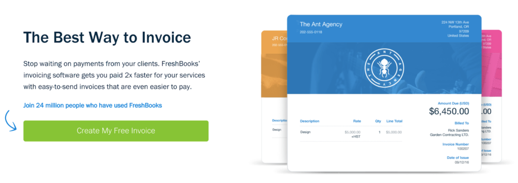
Perhaps the best thing about this landing pages is that it convinces customers to convert by making them feel like they’ll be missing out if they don’t. The fact that they say “Join 24 million people who have used FreshBooks” creates a sense of FOMO — or fear of missing out — that will deter people from clicking away from the page.
The copy on this page also states that the free templates help freelancers and small businesses get paid two times faster. This statistic addresses a huge pain point for their clientele.
Solving pain points and relieving headaches is a great way to optimize your landing page and build conversions. It shows that you understand your customers and are dedicated to helping them.
The templates they provide can also be adjusted to fit a variety of invoicing needs. Scrolling down the page helps to clarify what different invoices should be used for, what they look like, and what template to use for each.
This demonstrates their expertise and further helps convince visitors to join FreshBooks to simplify their invoicing needs. After using their templates and developing a trust for the organization, people are more likely to come back to FreshBooks in the future for more accounting and project management services.
An important point to learn from this example is to design each landing page around a specific goal. Every single service you offer can’t be sold in one place — that could lead to information overload. Instead, pick one thing. It could be a bestselling product, an economic service bundle, or a free and helpful template.
Customers will come back for more when they’re satisfied with your first pitch.
Looka gets straight to the point
Looka is a design company that provides branding tips, logo design ideas, and a patented logo maker.
The landing page for this logo maker puts the product front and center. Visitors don’t have to go looking to find the resource they need.
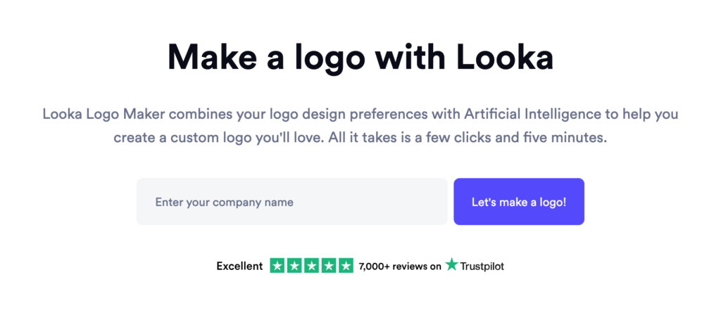
Their process is explained right away and looks quick and easy to follow. Reviews are also visible above the fold and, with overwhelmingly positive results, it almost seems too good to be true.
Those still uncertain can follow the steps in the process with a walkthrough, and see examples of some of the amazing results Looka has achieved for other businesses. Helpful FAQs round up the content on the webpage, and help address any outstanding concerns.
The quiz format is accessible and fun, and the cheery CTA “Let’s make a logo!” gets customers excited about starting their Looka logo journey.
The logo maker shows how you can turn a quiz function into an effective landing page feature. It only takes about three steps, and lets you input your company name, pick a base style, and then adjust colors, symbols, and orientation to get a product you’ll love.
To add this type of feature to your landing pages, check out Woorise’s quiz maker tool. Not only can a quiz help engage your visitors, but it can also provide you with additional consumer data.
If you choose to create any quizzes for your website, make them relevant and accessible. Show how easy and fun they are to use. Then, demonstrate their amazing results and add a powerful call to action. Sometimes, it really is that simple!
Venngage highlights how easy it is to work with them
Venngage is another web design software company, but it’s one that specializes in infographics and eye-catching structured data presentations.
Their sign-up page makes joining simple and accessible and does a brilliant job of demonstrating to visitors how easy it is to work with their software.
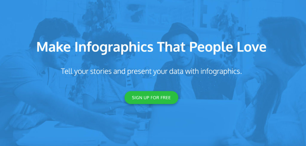
With just three steps from the template to the final product, telling stories and presenting data couldn’t look easier.
The page also presents a gallery of template options and advice on how to get the most out of their product. Increasing viewer interaction, improving presentation quality, and getting access to impeccable customer service are also phenomenal additional perks.
Their simple CTA button, “sign up for free” gives visitors a no-risk trial to find out if the service will work for them, too.
To utilize these tactics, balance emotional messaging with practical value. Your product has an aspirational quality (e.g. helps tell stories), and solves a clear need (e.g. increases clicks or improves presentations). Further, it’s easy to start using. And, with great customer service and a no-risk commitment to try it out, visitors will want to convert and sign up with your company to find out if it’s really that easy for them to reap the benefits.
Loganix addresses common customer concerns
Loganix is an SEO service provider that helps clients perfect their digital marketing strategies.
Their landing page for SEO packages demonstrates this clearly and effectively. They take the process out of your hands with services so reliable that you won’t feel the need to micromanage. This simple statement is a great way to address a common customer pain point when it comes to outsourcing business operations.
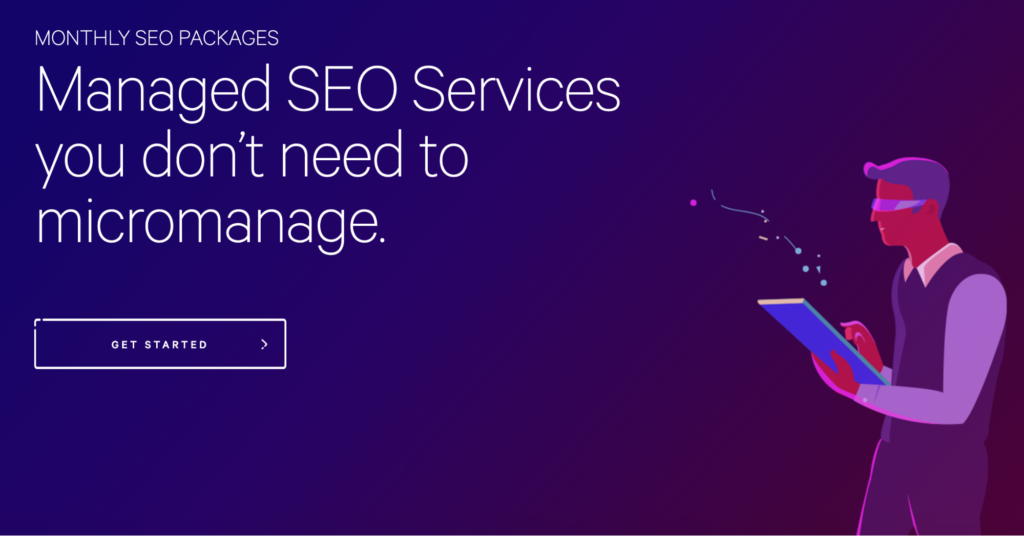
Before presenting the pricing for their services, they explain exactly what they stand for. By providing comprehensive audits and strategic content creation, Loganix helps businesses jump-start their search engine optimization without having to break the bank in the process.
They describe their process, present powerful testimonials, and explain what to expect in working with them. Then, they list the pricing for different services and additional FAQs alongside contact information, in case further clarification is needed.
These are landing page strategies that big brands follow. The system works because it’s straight to the point, transparent about procedures and policies, and demonstrates that the process works. Quoted testimonials serve as social proof, which also helps reassure potential clients that they can trust the organization and will be satisfied with the results.
Furthermore, questions and concerns are readily answered, and contact information is accessible for additional help. This lets visitors know that they will be heard, they will be understood, and their problems will be taken care of.
Wave calls out their competition
Another accounting and business software provider, Wave, has a landing page dedicated specifically to its competitors. Their FreshBooks vs. QuickBooks vs. Wave comparison page shows how the different companies stack up against each other.
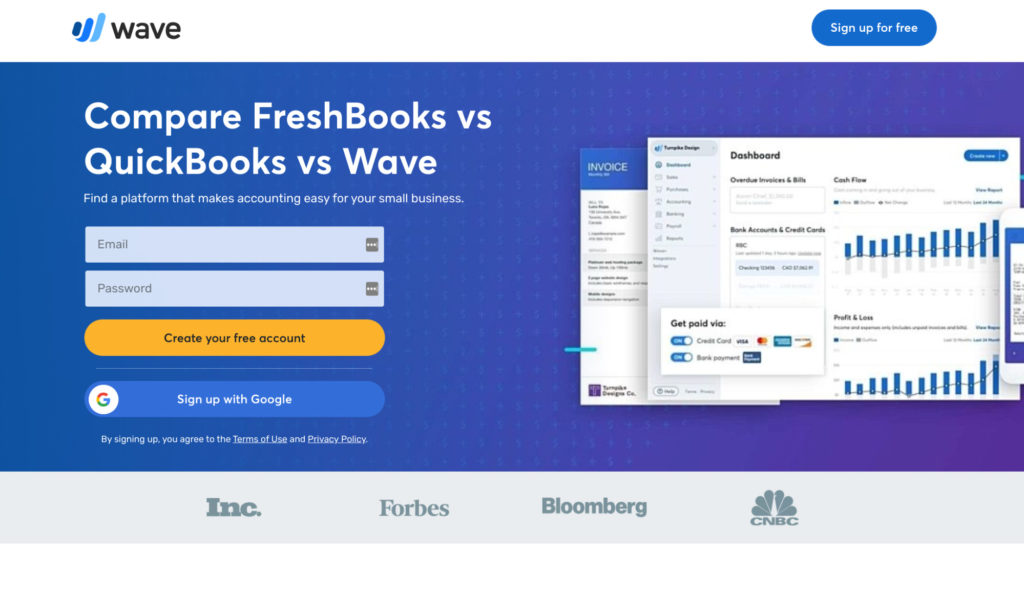
First, this works because it saves visitors time by presenting all of the relevant information in one place. The table makes it super easy to compare the different options and visualize the differences between the services.
They also have other pages with one-on-one comparisons, making the differences simple to identify.
This landing page design is useful for companies with a few strong competitors. By making a direct comparison, this style of presentation can attract potential customers from two camps. First, it targets visitors just learning about the topic and trying to disentangle the differences between prominent competitors. Second, it also directly targets customers dissatisfied with the service they’re receiving from competitors.
In order to most effectively utilize this tactic, make the differences simple and clear. List tangible dimensions of comparison, and use a table or other graphic to make the winner obvious.
With additional testimonials, strong CTAs, and a thorough explanation of your services, you are sure to pick up customers while your competitors trail behind.
Roadside Dental Marketing let the stats speak for themselves
Roadside Dental Marketing specializes in digital marketing for dental services. Their landing page for PPC/SEM ads does what any good marketer should: presents the facts first.
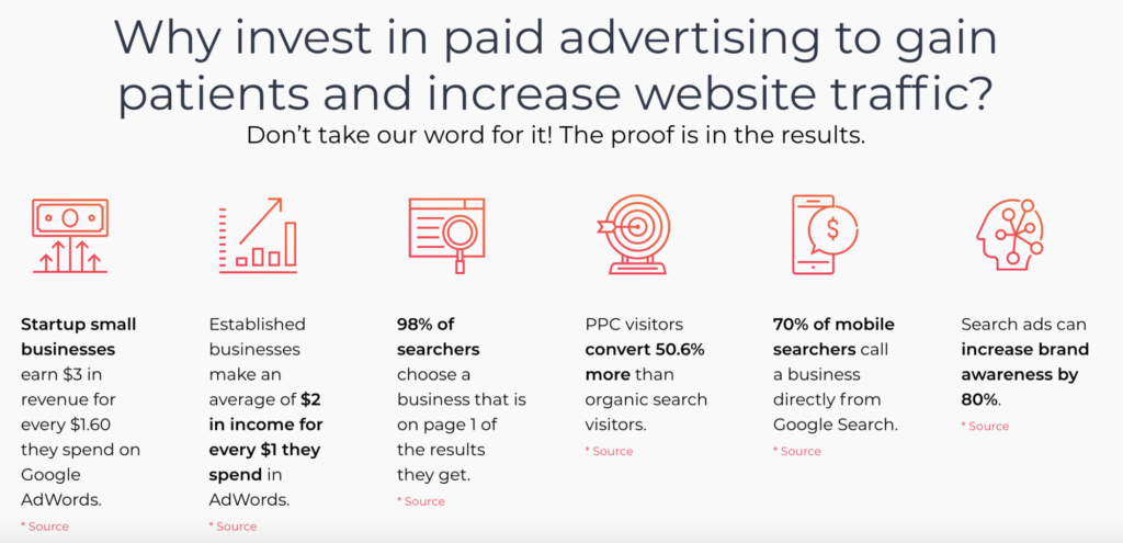
They present relevant statistics clearly and professionally, providing links to the sources so visitors can learn more. The most important facet of each is bolded to catch the eye of the reader, and the most important concerns are addressed first.
Small businesses and startups will often wonder whether paid ads are worth it, but the statistics speak for themselves. Further, with such an impressive ROI from paid advertising, it’s clear that the money invested is worth its value.
Another standout feature on this landing page is the “Request Marketing Info” form field, which offers a low-stakes way to continue connecting with the company. This also allows visitors to tailor their experience to the services they need.
To effectively boost conversion rates on your landing pages, present the facts first. Explaining the mathematical reasons why your business is worth the investment makes working with your organization the obvious answer.
Additionally, structure information in a way that makes it immediately noticeable at first glance. Bullet points, numbers, and graphics are all great tools for catching the attention of your readers.
Finally, if you’re using one contact portal for potential customers to request more information, make sure that you use a selection format to allow visitors to choose which information they want, and which information they don’t. This lets you segment your consumer questions and direct them to the proper departments. Further, it ensures that any resources you distribute to survey responders target their particular interests and demonstrate how your organization is uniquely positioned to address their needs.
Bay Property Management Group target the right people with location-specific landing pages
Bay Property Management Group helps people to rent out their properties in Washington D.C., Virginia, Maryland, and Pennsylvania. Their Manassas Rental Property Management page perfectly demonstrates how to market multiple physical locations.
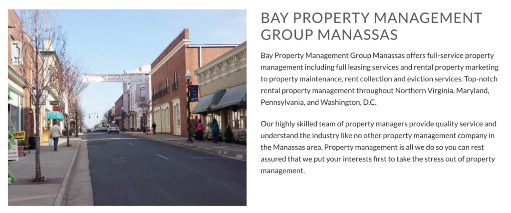
Although they serve three states and the capital, each county or district receives its own landing page explaining how the business benefits its customers. That’s a lot of locations — and a lot of landing pages — but making each one distinct is important.
A template that allows you to switch out the address and some local buzzwords isn’t going to cut it. Bay Property Management Group knows this, so they have created high-quality copy specific to each location, alongside identifiable images and embedded maps to help people locate their offices.
If your business has multiple brick-and-mortar locations, this is the template to follow. Give each location its own page and showcase what sets it apart from the rest of the business.
While you want to have one consistent brand and one consistent message, each location should have its own identifiable personality that presents it as a part of the surrounding community. This is important because each location is inherently different. The same storefront, personnel, and connections can’t serve every location equally.
You want your location pages to show that your business fits seamlessly into its neighborhood. Connecting with your immediate surroundings and showing an understanding of the personality of the people who live and work at each location will help personalize your customer experience, and lead visitors to consider you an important part of their locale.
Build Professional Landing Pages Today!
So there you have it. The best landing page builders that let you build high-converting landing pages without any coding skills and IT help.
If you’re looking to grow your online business, you need to design effective landing pages on your website.
These landing page builders aren’t only easy to use but they also come with powerful features that let you build landing pages quickly.
Remember that experimentation is key to optimizing your landing pages. So, no matter what techniques you implement, try to run A/B tests, and you’ll definitely get some amazing results this way!